Table of Content
Discover the Atlanta Falcons Logo History and Its Evolution Over the Years
The Atlanta Falcons are a professional football team that plays in the National Football League. Playing since before the AFL-NFL merger, the franchise has a rich history in the sport, despite not winning any championships. However, they have made the playoffs 14 different times, and have been crowned Conference and Division champions multiple times.
Their logo is an interesting one, portraying values like speed, energy, and strength, symbolized by a streaking falcon with its talons at the ready. Compared to the Philadelphia Eagles logo, which features a somewhat similar iconography but with a portrayal of ferocity, this logo is milder, but no less dangerous in its message.
But what is it about this symbol for the Atlanta Falcons that make it such a massive hit with its fans? Is it something about its sleek design, or the incredible color scheme? Or is it something else entirely? Whatever that element may be, it has an incredible power to keep the fan base hooked despite the team’s incredible bad luck at wining the NFL Championship in nearly six decades of gameplay.
Let’s dive in and discover the secrets and the history of the logo, and see how a professional logo design company can use these insights to improve their designs.
History of the Atlanta Falcons – From Inception to the Present Day
It was 1962 when the city of Atlanta got its first taste of football, when the American Football League (AFL) arranged two preseason exhibition matches in the area. Due to the excitement it generated, the AFL came back in 1964 for another exhibition, stoking the fires for Atlanta to enter the world of professional football.
And thus, with that vision in their eyes, Atlanta built the Atlanta Stadium in 1965, believing that the time was now ripe for them to pursue their dream of a local team. Some of the bigger businesses negotiated with the AFL and were awarded a franchise, but only if they managed to secure exclusive stadium rights. The NFL commissioner at that time, Pete Rozelle, was spurred into action by this news, and got together with the city officials, forcing them to choose between the AFL and NFL.
Finally, the city of Atlanta signed on with the NFL, choosing a local businessman Rankin Smith Sr. as its owner with unanimous support from the other NFL franchises. Paying $8.5 million for the franchise, Rankin became the owner of the most expensive NFL until that time. And for the 1966 NFL season, the Atlanta Falcons became the 15th team to play in the League.
Despite getting some good players in their early years, the end of the 60s saw the team rack up only 12 wins. In fact, their first twelve years in the league saw the team record only two winning seasons. And it wasn’t until 1978 when the Falcons qualified for the Playoffs for the first time. Two years later, they posted their franchise-best season record of 12 – 4, winning their first NFC West title. However, a loss a week later ended their successful run.
After another eight years of stagnation, the team signed star cornerback Deion Sanders, who remained with the team for the next four seasons, setting multiple franchise and league records. Nicknamed “Prime Time” for his flashy personality, Sanders helped bring much needed media attention to the Falcons, who were arguably one of the most unknown teams in the league at the time. That, combined with him playing in both the NFL and the MLB at the same time, brought a lot of attention to him and the Falcons.
Over the years, there have been seasons where the Falcons have been considered solid contenders for the Super Bowl. However, despite some great players on the roster, the team has been plagued with bad luck, losing out horribly in all their Super Bowl appearances. Despite that, they and their fans have persevered, holding out hope that one day; they too will face the sweet taste of Super Bowl victory.
Understanding the Atlanta Falcons Logo and Its Significance
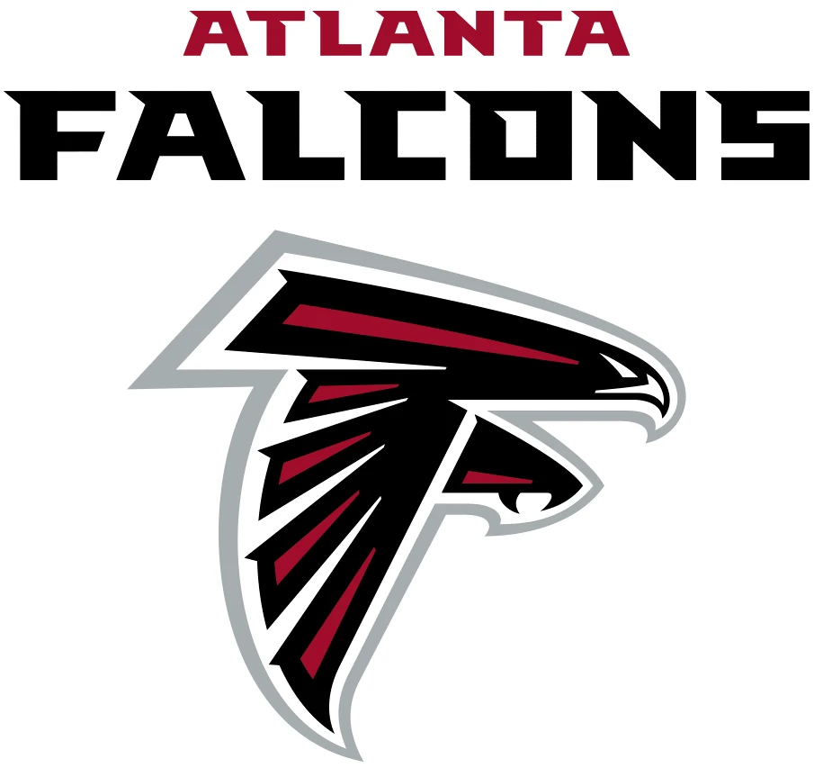
The logo that we all know Atlanta Falcons by has been representing the team and the franchise for a couple of decades now. And it has been represented well, with little need to change or tweak the design in that time.
That is because at its essence, the Atlanta Falcons logo perfectly represents the core of the team. Let us elaborate on what that means. The animal chosen to represent the team is a falcon; a regal bird who is considered one of the top aerial predators in the world. Despite their small sizes and harmless appearances, they are highly efficient predators who perform miraculous feats of nature.
That is because of their tenacity, focus, and determination. All of them values that can be found in their namesake NFL team. The Atlanta Falcons may not be the richest franchise, or the most powerful one, or even that popular in the wider NFL world. However, they utilize the maximum potential of their available qualities to try to win their matches.
All of the NFL logos we see today represent something about their respective teams. Some represent the legacy of their home state, some the values and history of their team and city. Essentially, they all represent values of their core identity.
With its bold and aggressive lines, that still somehow manage to portray sleekness, is something that very few of the NFL’s symbols have managed to implement. However, the examples of symbols like that for the Atlanta Falcons, or the Denver Broncos logo, show that it can be done successfully, without affecting the resultant design’s meaning.
Evolution of the Atlanta Falcons Logo Over the Years
Now that we have looked at a brief history of the Falcons franchise, as well as taken a look at the iconic Atlanta Falcons logo, let’s dive in and discover the evolution of the design over the years. The franchise has now been playing in the NFL for nearly six decades now. And like all other teams currently on the roster, their logo design has changed and evolved too.
From the 1960s to the present day and age, the technology behind the design of brand logos has changed a lot. Moreover, so has the design aesthetic for the fans and the people in general. The simple, hand-drawn design of the past decades no longer hold the same power as the ones made according to the modern logo design trends.
Therefore, in order to keep up with the times, the team has introduced new and improved logos to ensure that both new and old fans are able to connect with the brand and the team. Let’s take a look at this evolution.
1966 – 1989
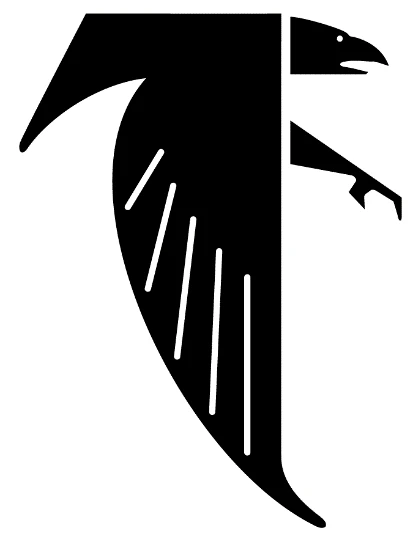
With the team’s debut in the 1966 NFL season, that was also the year that the first logo for the Atlanta Falcons was revealed. Paying homage to the name of the team, one chosen from a number of options received by the franchise from Atlanta locals, the design featured a basic, geometric-like design of a falcon in flight. With its wings flapping down, the falcon has its talons extended, about to snatch its unsuspecting prey.
The design was done in all black over a white or red background, and made in the style of monogram logos. And while it may have been suitable for that time and era, looking at it now, you would imagine it was a crow rather than a falcon. However, despite that, the design was good enough that it represented the team for 23 seasons, one of the longest-running designs for the team as well as the league.
1990 – 2002
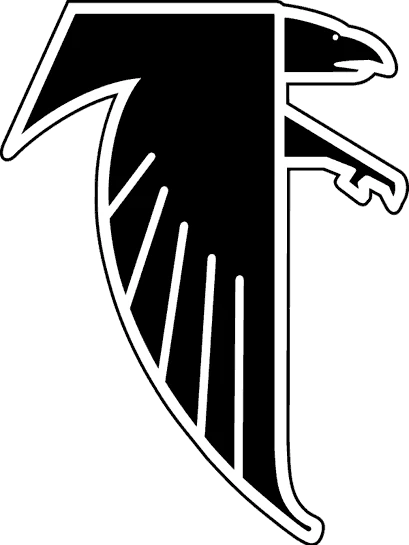
After playing twenty-three seasons with the same design, a revamped Atlanta Falcons logo was revealed in 1990. This design was just an enhancement of the previous design, adding a band of visible outline to the design for better visual acuity. It was a time in the NFL that the uniforms, as well as the design aesthetics of the teams was changing.
The improved design technology, combined with the digital design aesthetic of the late 80s and the 90s meant that the logo needed a refresh from its simple, cutout-like design. In order to do that, the team streamlined the outer edge of the previous design, making it look streamlined and sharper, and incorporated elements of a negative space logo.
Moreover, a thin black line bordered the entire design, with a band of whitespace a millimeter thick between the eagle design and the outline. Now, one of the ways they managed to make the design look visibly prominent and appealing, is that while the inner design was made sharper, the outline was smoothly rounded.
This design trick, combined with the band of whitespace between it and the design, made the eagle pop out in all its glory immediately when viewed. The eye is immediately drawn to its sharp extremities, making for a more aggressive stance than the one previously portrayed.
2003 – Present
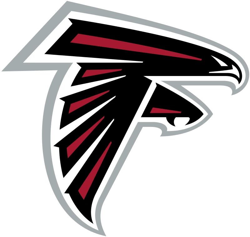
Finally, 2003 was the year that the team decided to change its logo again. Keeping up with the renaissance in the NFL on logo ideas, the team changed it logo design again for a better one.
The new design looked perfect for a brand in the modern 21st century, making it look great on all available mediums, from uniforms to merchandise. And they weren’t alone. With everything about the NFL changing for the modern aesthetic of the present world, many teams too looked to get a head start in capitalizing on this evolving aesthetic.
Team symbols like that for the Arizona Cardinals or the New Orleans Saints logo saw a change for the better too. But unlike the Atlanta Falcons logo, they didn’t go for a massive redesign. The reason for that was that unlike the Falcons, their logo was not as outdated, meaning that it just needed a revamp rather than an entire redesign.
The new logo featured an eagle that was built along the same general outline as the previous one. However, rather than one single design, this eagle was built using multiple different elements with whitespace in between, giving a more ferocious stance. This time however, the design did look like an eagle, and a great one at that.
The design was predominantly black, with the middle of each element featuring a tapering bar of deep red, more like an accent than a primary color. The beak of the eagle had a very slight yellow tinge to it, similar to an actual falcon. The edges of the eagle still had that band of whitespace, but instead of a thin black outline, it now featured a thick band of silver-gray that made the entire design pop visually.
The design is so good at representing the old values from its previous iterations, that despite its drastically new visuals, it still manages to connect with old fans, without alienating the new ones.
1998 – 2002 Wordmark Logo

Many teams in professional sports use a set of two logos, one with a symbol, and the other that is a wordmark. The reason for that is that for the most part, sports like the NHL, NFL, or the NBA have players that are moving around constantly throughout the game. In that scenario, using a wordmark primarily can be counterproductive, as it would not be as clearly visible for people to read and recognize.
However, a symbol would be instantly recognizable, making it effective as a team representative symbol, as in the case of the Dallas Cowboys logo. In case of the Atlanta Falcons, they too have used a number of wordmarks over the years, the first of which was revealed in 1998.
The 1998 Atlanta Falcons logo wordmark featured a predominantly white wordmark design, with inner accents of light gray. The outer edges of the logo had thin red outlines that accented the sharp edges of the design, similar to how the wings of many falcons are tipped and outlined in bright colors.
The outside of the entire wordmark was covered in a thick black outline, that perfectly encircled the entire wordmark without any whitespace or gaps. With the wordmark broken into two pieces, the name of the city, that is Atlanta, was written in a stylized, italic typeface with ample space between each letter, and written in all uppercase. The name of the team however, had a much more stylized typeface, which featured designs that made it look fast and sleek, representative of a falcon’s aerodynamic shape.
The first part of the wordmark was writer in a smaller size, and placed at the center top of the second part of the wordmark. Overall, it was a design that would have been perfect even with the modern Atlanta Falcons symbol.
2003 – 2019 Wordmark Logo

In 2003, to complement the new primary logo for the Atlanta Falcons, the team introduced the new wordmark logo. The new design was in line with the style of logos used by many of the modern NFL wordmarks, such as the Detroit Lions logo wordmark.
The design featured a serif typeface, with all the serifs located on the same spot and orientation for the entire wordmark. The serifs were designed to make it seem as if the design is moving swiftly towards the right, as the top left of all the letters featured a small sharp serif pointed towards the left.
The name of the city was written in a dark red, while the name of the team was done in black. Overall, it was a great wordmark for the team.
2020 – Present Wordmark Logo

In 2020, the team revamped their design again for the wordmark. This time the only change to the wordmark logo design was that the font was made thicker and bigger, and the red color of the city name was lightened a few degrees.
This design change, while not too big, was done to make the wordmark more prominent visually, with the lighter red making a sharper contrast to the black of the other half of the wordmark.
FAQs
| When did the Atlanta Falcons logo last change? The last change made to the Atlanta Falcons’ logo was done in 2003, to update their design according to modern aesthetic. |
| What does the Atlanta Falcons logo represent? It represents a falcon in flight, ready to strike and attack its prey. It shows a sense of ferocity, strength, and speed. |
Conclusion
To sum up, the Atlanta Falcons logo is a good study in brand design, showcasing how to effectively incorporate a brand’s identity into its logo and symbols. From the small design flairs, to the emotions and values incorporated within the design meant that the Falcons logo perfectly portrayed the small, unfortunate team, and its drive to beat all odds despite a string of bad luck.
That is why, if you are looking for inspiration for your sports logos, the Atlanta Falcons logo history is a great place to start that journey.

Logopoppin
Logopoppin is a graphic design agency that specializes in logo designing, web development, video production and advanced branding services. We love to innovate businesses with new age technologies, allowing them to improve their visual reputation.


