
Table of Content
Discover How the Modern Audi Logo with Its Iconic Four-Ringed Design Came to Be
Audi, a renowned German luxury car brand, has captivated the world with its sleek designs, automotive advancements, and exceptional performance in consumer and motorsports. And the Audi logo, a distinctive symbol of the brand, has played a crucial role in shaping its identity and appeal.
Over the years, the Audi brand logo has undergone several transformations, reflecting the company’s evolution and its enduring commitment to innovation and excellence. This can be seen in the innovation of cars like the Quattro that introduced and popularized the Torsen all-wheel drive platform.
Join us as we explore the history of the Audi automotive logo, tracing its journey from its early days to its current incarnation. By examining the each logo variant and understanding the symbolism behind them, we can understand how Audi’s logo design agency ensured that they retain a timeless appeal.
Exploring Audi – From Inception to Its Rise as a Top German Car Brand
Audi AG, founded in 1909, emerged from the merger of four independent automobile manufacturers: Audi, Horch, DKW, and Wanderer. These companies were pioneers in the German automotive industry, each contributing unique technologies and expertise. The decision to merge was driven by a shared vision of creating a strong and competitive German automotive brand.
The early years of Audi were marked by innovation and technological advancements. The company introduced several groundbreaking vehicles, including the Audi Front, a six-cylinder front-wheel-drive car that was ahead of its time. Audi also played a significant role in the development of always on all-wheel-drive technology, which would later become a defining feature of the brand.
Throughout the 20th century, Audi faced numerous challenges, including economic downturns and two world wars. However, the brand’s resilience and commitment to quality allowed it to survive and thrive. In the 1980s and 1990s, Audi experienced a resurgence, gaining recognition for its stylish designs and advanced technology. The introduction of the Audi Quattro, a groundbreaking all-wheel-drive system, solidified Audi’s reputation as a leader in the luxury car market.
Today, the brand is part of the Volkswagen Group, and is known for producing some amazing vehicles, for consumers and motorsports both. In fact, Audi is set to enter the world of Formula 1, often considered the pinnacle of motorsports, from the 2026 F1 season, taking over operation of Sauber Motorsports AG.
Evolution of the Audi Logo – A Journey Through Its Transformative Timeline
No matter where in the world you go, the Audi logo is one of the most well-known car logos, accompanying the likes of Mercedes-Benz, BMW, Toyota, Honda, and more. But with a long history that spans more than a century, that logo has surely changed a few times.
So, join us as we dive in and explore these Audi symbols, looking at designs from its inception in 1909, to the current logo we all know and love today. Let’s begin.
1909 – Audi Logo (Pre-Launch)

Before the official launch, Audi experimented with various logo designs. One early concept featured the word “Audi” in a stylized font, reflecting the company’s name and identity. The logo fonts were bold yet curving, mimicking the design of scripts, suggesting elegant strength and determination.
1909 – Primary Audi Logo
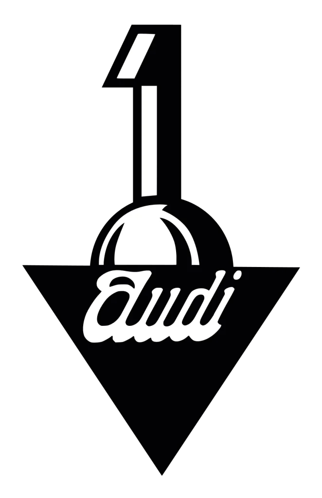
As we saw, the pre-launch Audi logo was a straightforward cursive inscription. Later in the same year, the company unveiled a new design featuring a prominent number ‘1’ emerging from a semi-sphere shape, with a downward-pointing black triangle.
This Audi symbol’s design displayed a more abstract and contemporary aesthetic compared to its predecessor, as well as many other logos from that era. The white cursive lettering in all lowercase letters against a black background added an element of elegance and sophistication to the overall design.
1910 – Audi Logo Redesign
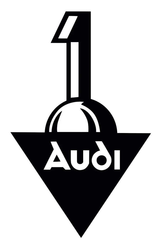
Although contemporary and unique, the earliest production Audi logo barely lasted a year. In 1910, the company revealed a new logo design that was kept the same as the previous version, more or less, except for the wordmark. Instead of a cursive, all-lowercase wordmark, the new wordmark logo design featured a distant predecessor to the Audi wordmark logo that we know today.
1932 – The Introduction of the Four Rings Audi Logo

One of the most significant milestones in Audi’s logo history was the introduction of the iconic four rings in 1932. The four rings symbolized the unification and merger of four German automotive companies: Audi, Horch, DKW, and Wanderer. Each ring represented one of the companies, signifying their shared history and commitment to excellence. The four rings Audi logo was a bold and innovative design that immediately became associated with the Audi brand for decades to come, and signaled the rise of one of the most famous German sports car logos.
1949 – New Audi Logo as the Auto Union Badge

After World War II, Audi became part of Auto Union. The company adopted a new logo featuring the four rings with the name of the new company within them. This logo represented the unification of the Auto Union brands and represented power, strength, and freedom, reflecting the company’s aspirations for the future. However, this logo was short-lived, as Audi soon reverted to the plain wordmark design.
1969 – The Audi NSU Logo

In 1969, Audi merged with NSU, a German motorcycle manufacturer. The new Audi logo incorporated elements of both Audi and NSU, featuring a simple “Audi NSU” wordmark within a rectangular frame with a white on black color scheme. The design was a nod to NSU’s heritage in the motorcycle industry. However, this logo was not widely used and was eventually replaced by the four rings logo.
1969 – New Audi Logo with Four Rings

Shortly after the merger with NSU, Audi reintroduced the four rings logo, solidifying its identity as a unified brand. The four rings logo was a powerful symbol of Audi’s heritage and its commitment to quality and innovation, and is one of the most popular logo symbols in the auto industry today.
1969 – Audi Wordmark Logo

In addition to the four rings logo, Audi also introduced a wordmark logo featuring the word “Audi” in a stylized font. The circle logo design was used alongside the four rings logo, providing additional brand recognition and reinforcing the company’s name.
1978 – Audi Wordmark Logo
The Audi wordmark logo underwent a minor redesign in 1978, featuring a slightly different font, a different color, and a more modern aesthetic. The new wordmark was designed to complement the four rings logo and enhance the overall brand identity, and became the only entry for Audi in the list of red logos.
1995 – Audi Logo and the Inception of the Modern Audi Symbol
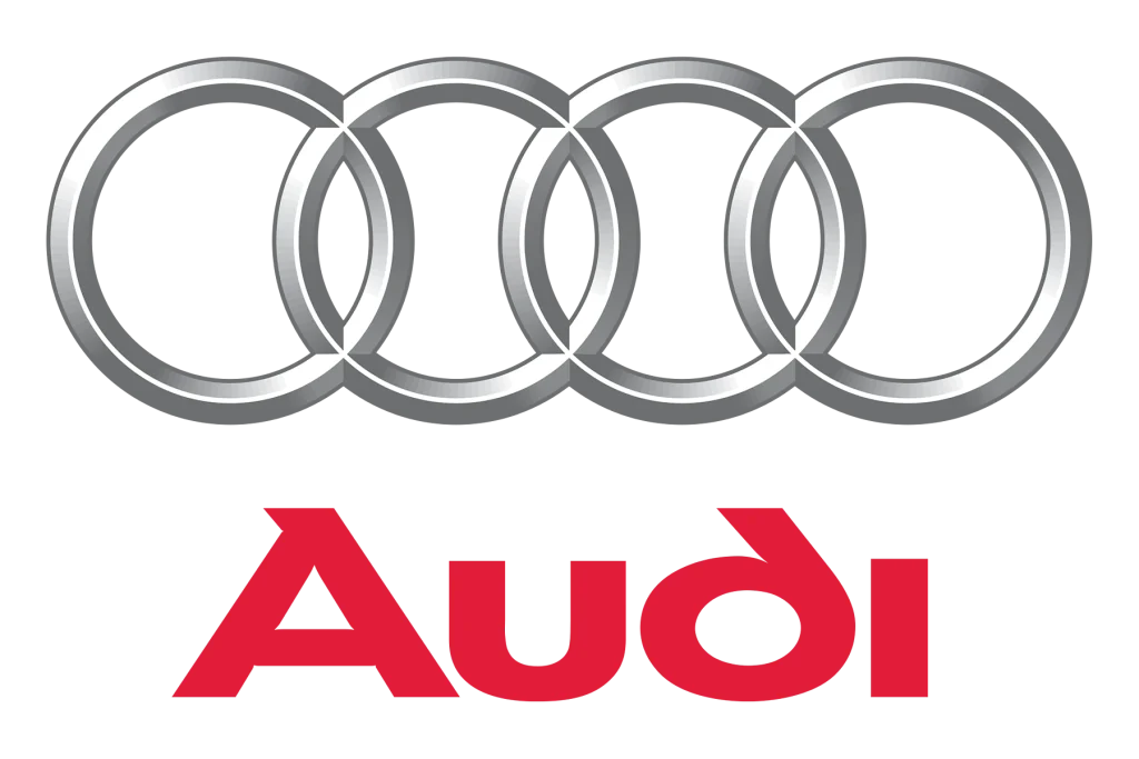
In 1995, Audi introduced a new logo that simplified the four rings design and made it more modern and recognizable. The four rings and the wordmark were made slightly larger and more prominent, while the overall design was streamlined and modernized. This new logo became the foundation for the Audi symbol that we know today, similar to the Honda logo from that era.
2009 – Audi Logo Redesign
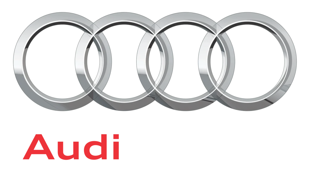
In 2009, Audi updated its logo to make it even more contemporary and visually appealing. The four rings were made slightly thicker, while the overall design was streamlined and modernized. The new logo also featured a slightly different shade of silver, adding a touch of modernity.
2016 – The New Audi Logo

In 2016, Audi introduced a new, flat-design for one of the most popular circular car logos. This logo removed the three-dimensional effect of the previous logo, making it more versatile and adaptable to various applications. The new logo also featured a slightly different shade of silver, adding a touch of modernity.
Conclusion
The Audi logo has evolved significantly over the years, reflecting the brand’s growth, innovation, and changing market dynamics. From its early days as a simple “A” within a circle to its current incarnation as the iconic four rings, the Audi logo has become a powerful symbol of the brand’s identity and values. The logo’s enduring appeal lies in its ability to convey a sense of quality, innovation, and performance, making it a recognizable and respected emblem in the automotive industry.

Logopoppin
Logopoppin is a graphic design agency that specializes in logo designing, web development, video production and advanced branding services. We love to innovate businesses with new age technologies, allowing them to improve their visual reputation.


