
Table of Content
Discover the Various Iterations of the Avengers Logo Through the Years
The Avengers logo, primarily featuring a stylized letter “A,” has become a shorthand for heroism, unity, and the unwavering defense of the planet against formidable threats. Its evolution, particularly in its transition from the comic books to the silver screen, reflects not only changing design aesthetics but also the growing cultural significance of this superhero team and the expanding interconnection of the Marvel Universe.
From its initial, more text-based appearances in early comics to the sleek and dynamic iterations seen in modern films and merchandise, the Avengers logo has undergone a fascinating transformation. Each version has aimed to capture the essence of the team – a diverse group of powerful individuals coming together for a common purpose.
The logo serves as a visual anchor, instantly associating various media, from comic books and animated series to blockbuster movies and video games, with the core ideals of the Avengers. In this article, we will explore the key stages in the Avengers logo’s evolution, tracing its design changes from a professional logo design services eye, particularly focusing on its prominent appearances in the MCU era.
Let’s begin.
History of the Avengers Team – From Comics to the MCU
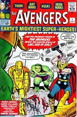
The Avengers first assembled in the pages of Marvel Comics’ The Avengers #1, published in September 1963. Created by the legendary duo of writer Stan Lee and artist Jack Kirby, the initial lineup consisted of Iron Man, Thor, Hulk, Ant-Man (Hank Pym), and Wasp (Janet van Dyne). This alliance was forged out of necessity when the Asgardian god of mischief called Loki attempted to manipulate the Hulk into causing trouble, thus drawing the other heroes together. Recognizing their combined strength, they decided to form a permanent team to face threats that no single hero could handle alone, famously declaring themselves “Earth’s Mightiest Heroes.”
The early years of the Avengers in the comics were characterized by a constantly shifting roster, a hallmark that would continue throughout their history. Iconic members like Captain America joined early on, solidifying the team’s core. The Avengers tackled a wide array of villains and threats, from superpowered individuals to alien invasions and cosmic entities, establishing their role as the primary protectors of Earth in the Marvel Universe.
The comic books explored complex interpersonal dynamics, internal conflicts, and the individual struggles of its members, adding depth and relatability to the superhero team concept. Over the decades, numerous iterations of the Avengers have existed in the comics, including the West Coast Avengers, Secret Avengers, New Avengers, and more, each with their unique lineups and missions, reflecting the vast and ever-expanding nature of the Marvel Comics universe.
The Rise of the Marvel Cinematic Universe (MCU)
The journey of the Avengers reached a new level of prominence with the establishment of the Marvel Cinematic Universe (MCU). Producer Kevin Feige envisioned a shared cinematic universe that would end in the formation of the Avengers, mirroring their comic book origins. This ambitious plan began with the solo films of Iron Man (2008), The Incredible Hulk (2008), Thor (2011), and Captain America: The First Avenger (2011), strategically introducing the key players.
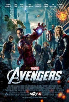
The crown jewel of this initial phase was the release of The Avengers in 2012, directed by Joss Whedon, which brought together Iron Man, Captain America, Thor, Hulk, Black Widow, and Hawkeye to combat the threat of Loki and the Chitauri invasion. The film was a critical and commercial success, lifting the Avengers into mainstream global consciousness and solidifying their status as pop culture icons.
The MCU continued to expand the Avengers’ story through subsequent films like Avengers: Age of Ultron (2015), Avengers: Infinity War (2018), and Avengers: Endgame (2019), each further cementing the team’s legacy and their iconic “A” symbol as a beacon of hope and heroism for audiences worldwide. Moreover, it made the Marvel logo itself quite famous, especially compared to its counterpart, DC Comics.
Evolution of the Avengers Logo Through the Years
The Avengers logo, while consistently featuring the prominent letter “A,” has seen various stylistic interpretations throughout its history, particularly as the team transitioned from the comic book page to the dynamic world of modern cinema. Let’s explore them in greater detail.
2012- Present Main Avengers Logo
The logo that has become most synonymous with the Avengers, especially in the wake of the MCU’s success, is a stylized, bold uppercase “A” often enclosed within a circle or a semi-circular design. This emblem made its debut in the promotional material and opening title sequence of The Avengers (2012) and has remained the core visual identifier for the team across various media since then.
The central element is the distinctive “A,” which not only stands for “Avengers” but also carries a sense of collectiveness, representing the coming together of diverse heroes. A key feature of this design is the elongated left leg of the “A,” which extends horizontally to the right, often ending in an arrow-like point. This arrow can be interpreted as symbolizing progress, momentum, and a forward-moving, determined stance against threats.
The clean, bold lines of the design contribute to a feeling of strength, reliability, and heroic purpose, thus cementing its legacy as one of the best superhero logos of our time.
2012 Marvel’s Avengers Logo
Alongside the main Avengers team logo introduced in the 2012 film, the marketing and branding for the Marvel’s Avengers video game, released in 2020 but with significant build-up starting around 2012, featured a distinct logo that, while still centered on the “A,” presented a different visual approach.
This logo also prominently featured a stylized uppercase “A,” but its design differed from the MCU’s primary logo. The “A” in the game’s branding often had a more angular and geometric structure. The horizontal bar of the “A” was typically thicker and did not always extend into a distinct arrow shape. Surrounding the “A” was a broken circular element, which added a sense of dynamic tension and potential conflict.
2015-2017 Marvel’s Avengers Logo
For the second Avengers film in the MCU, Avengers: Age of Ultron (2015), the primary Avengers “A” logo underwent a subtle but noticeable alteration, primarily in its color and the inclusion of a reflective element.
The core design of the stylized “A” with the arrow-tipped horizontal bar enclosed within a semi-circular element remained consistent with the 2012 logo. However, the metallic shading was replaced with a bright, maroon-red color, closely mirroring the color often associated with the “Marvel” title card that precedes the film.
A significant addition was a prominent white reflection or highlight at the top of the “A,” giving it a slightly more three-dimensional and dynamic appearance. Moreover, this style also appeared on many of Marvel’s comic book covers at that time, cementing how the two universes were in in sync.
2018 MCU Avengers Logo
The logo for Avengers: Infinity War (2018) introduced another subtle but distinct variation, primarily focusing on the encompassing circular element around the central “A.” The stylized “A” with the arrow remained the central focus. The key change in this iteration was the partial removal of the circular element surrounding the “A,” particularly at the bottom.
This created a more open and perhaps slightly more urgent feel to the logo, as if the “A” was breaking free or facing an imminent threat. The overall design felt slightly less contained compared to the previous versions. The arrow within the “A” continued to suggest forward momentum, even in the face of the formidable antagonist, Thanos. Moreover, the golden color was quite similar to the one used in the Iron Man logo, hinting at the important role that the character would play in this two-part ending of this saga.
2019 MCU Avengers Logo
The logo for the culmination of the initial MCU saga, Avengers: Endgame (2019), brought back the complete circular element around the “A” but introduced a significant stylistic change in its presentation.
The stylized “A” with the arrow was once again fully enclosed within a complete circle, perhaps symbolizing the coming full circle of the initial Avengers storyline and the team’s ultimate stand. The most striking change was the introduction of a textured, almost dusting or ash-like effect applied to both the “A” and the surrounding circle. This visual treatment directly referenced the devastating consequences of Thanos’s snap in the previous film, where half of all life turned to dust.
Conclusion
The evolution of the Avengers logo is a testament to the power of visual branding in capturing the essence and journey of a beloved cultural phenomenon. From its initial association with the Marvel’s Avengers video game’s unique aesthetic to the subtle yet impactful changes reflecting the narrative arcs of the MCU films, the central stylized “A” has remained a consistent and recognizable symbol of Earth’s Mightiest Heroes.
Each iteration, whether through changes in color, surrounding elements, or stylistic treatments, has served to visually communicate the specific tone and context of the Avengers’ adventures in different media. The enduring impact of the logo, particularly the sleek and dynamic design that has become synonymous with the MCU, underscores its effectiveness in embodying the unity, heroism, and unwavering spirit of the Avengers, solidifying its place as an iconic symbol in the landscape of popular culture.
Logopoppin
Logopoppin is a graphic design agency that specializes in logo designing, web development, video production and advanced branding services. We love to innovate businesses with new age technologies, allowing them to improve their visual reputation.
