Table of Content
Discover What the Top Bakery Logo Ideas Have to Offer to Inspire Your Brand Symbol
Imagine you are in a market one day, hungry after a day of shopping through the weaving throngs of people. Suddenly, your senses are assailed by the most wondrous scent – the scent of fresh baked Panettone. You look around, but you cannot seem to pinpoint the source of that aroma. Suddenly, a sign catches your eye, with a loopy font, bright colors, and a picture of a cupcake.
You are drawn towards it, the tasty-looking treat on the sign promising sweet delights. That is the power of well-designed bakery logos. Most of the time, a logo for a patisserie of a bakery is often a play on words representing a special item they produce, the baker’s name, or something similar.
But unlike other brands that often rely on their logo as a first contact with potential consumers, a bakery logo is more of a symbol to boost memorability or recognition. That is why it is necessary that your logo’s design should conform with what you are, or would like to be known for.
Let’s take a look at some of the best bakery logo ideas famous bakeries and patisseries are using around the US. You may also check out some of the best bakery website designs here for inspiration.
Bakery Logos and Their Significance in Making a Bakery or Patisserie Popular
Take a look at the Krispy Kreme donut box. What is it about that logo that makes it so recognizable? Essentially, if we look at it, the design is quite reminiscent of the brand’s first store and its color scheme, which automatically helped people connect the logo with the doughnut shop at a glance.
However, its continuous fame is due to the fact that it’s a simple, no-frills design that states its purpose – Krispy Kreme Doughnuts. And for a simple logo to do that, you need a professional logo design company who knows how to add value through minimalism.
For a business, any business, its logo is part of its brand identity. And any part of you that is essential to your identity, is by definition significant for you. While it would the quality of your products that would make the customers return, it is your logo that would help them remember your brand, and set it apart in a sea of competitors.
Best Bakery Logos in The World That Represent What a Logo Should Be About
While it is true that logos from the same industry often have similar design elements, there is no reason why a logo that looks different from the rest of the pack cannot be successful. Similarly, there are many bakery logo ideas around us that might not use the typical imagery we associate with a baker’s shop or a patisserie, yet have become cultural and geographical landmarks today.
Some of the examples below, especially those that exemplify artisanship or one-of-a-kind experiences, use elegant yet simple logos that showcase the vibe of the business. Yet, despite this simplicity, their logos still personify the charm and delectable appeal that we expect from classic bakeries and pastry shops.
Let’s take a look at some of the popular bakery logos, and discover what it is that makes them so well-liked.
Mah Ze Dahr
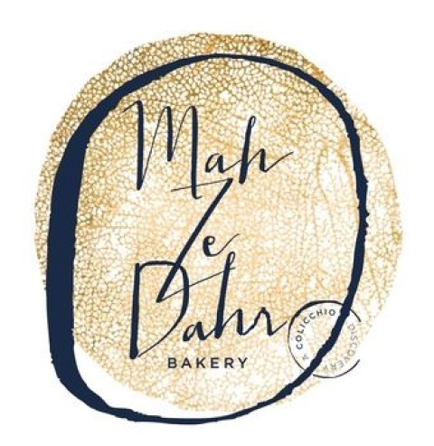
The first entry on our list is a small yet famous bakery that traces its roots in New York, called Mah Ze Dahr. Started by financier-turned-baker Umber Ahmed, born to Pakistani immigrant parents, it first began as an online baked goods and patisserie.
While the name itself is unique, derived from the owner’s native language Urdu, the logo is on another level. A simple design that can be construed as a rough navy-colored mark on sand-colored rock, it can also feel like a primitive seal printed over a sheet of baking paper.
All in all, the contrast of colors, the logo fonts used, and the visual weight provided by the changing stroke width makes this one of the most unique designs on this list.
Patisserie Tomoko NY
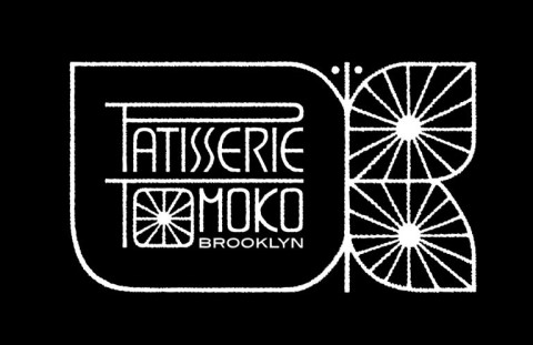
Patisserie Tomoko in New York is a high-end pastry shop that specializes in a fusion of Japanese and French baked culinary delights. Started by expert pastry chef Tomoko Kato, who has previously worked at a number of high end, haute cuisine places like Le Bernardin, the bakery is known for its dessert tasting menu which can be paired with fine wines, smooth organic coffees, or a variety of teas.
The logo for this bakery-slash-restaurant uses a mix of elements that take inspiration from both French-style bistros and Japanese restaurants, and is one of the more unique and artistic restaurant logos on this list. The elaborately styled letters of the wordmark with a simple, lightweight stroke, combined with the floral idea of the outline and the rays of the sun in the center of the letter O, combines to make this one of the best looking bakery logos on this list.
Lloyd’s Carrot Cake

Lloyd’s Carrot Cake has one of the most unique types of logos that you’ll see on this list. Unlike the previous two bakery logos we’ve discussed, this logo for a cake shop is a little more lighthearted and fun.
Named after the original owner Lloyd Adams, the bakery first started its business by baking their signature carrot cakes out of a makeshift kitchen in the basement of a five-story building owned by Lloyd’s father-in-law. But soon, the pace of their business outgrew their facilities, and they moved to their flagship storefront in Riverdale.
The new storefront was the first time they launched a logo for their bakery, which featured a dancing carrot between the business’s name. And what a logo it is. With a mix of modern and vintage fonts, the wordmark stands out, especially with its black on white color scheme. However, it is the addition of the carrot that brings a splash of welcome color to the logo design.
Magnolia Bakery
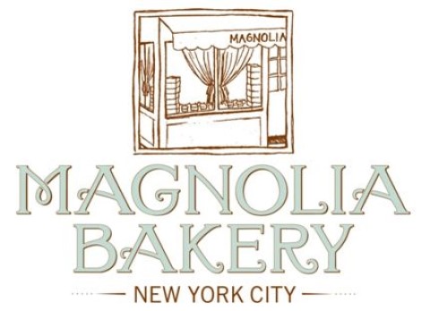
Anyone who has ever been to New York has heard the name of Magnolia Bakery. This Big Apple staple is a must have for people with a sweet itch they cannot scratch, with items such as their highly-acclaimed banana pudding. Today, the bakery is so famous that people come from far and wide to buy its desserts for themselves or their loved ones.
While the brand recently changed its logo to a stylized wordmark, the original logo showcased above featured a red-brown image of their first storefront in the West Village area of New York, with the wordmark underneath it. And while the logo went against conventional logo design trends due to its intricate structure, it nevertheless has made its mark as a much-loved culinary outlet in New York.
The Buttery ATL
The Buttery ATL is an Atlanta-based bakery, patisserie, creamery, and butcher shop that aims to provide high-quality, fresh culinary ingredients for a taste of the good life. Owned by Chef Linton Hopkins and Gina, they shop is run effectively with the help of a team of culinary experts who are well versed in the art of good food and drinks.
Their logo is one of the simpler ones on this list of bakery logos. Designed in the form of a round monogram, the name is written in a highly stylized curved font, in all lowercase letters. Forming a circle around the name are adjectives that describe their products, like “Incredibly Pleasing, Delicious Things”.
The color used is a light blue, which keeps the design light and airy, making its visual impact softer without losing its efficacy.
Bouchon Bakery
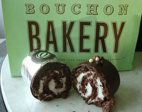
Bouchon bakery is a part of the Thomas Keller restaurant group. Owned and operated by Chef Keller himself, the bakery is known for its artisanal items, especially the different kinds of traditional desserts from France.
The business makes a variety of tarts, cakes, pastries, cookies, sandwiches, and a variety of other food options. Their bakery logo is a heavy, somewhat three dimensional wordmark design that goes well with the vintage vibe of the shop quite well.
Levain Bakery
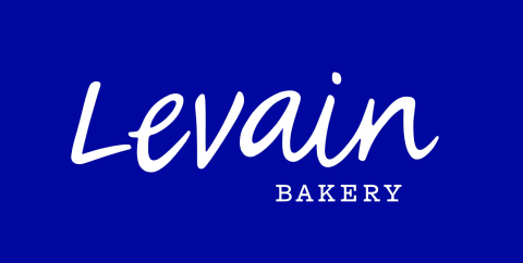
Levain is popular among the aficionados of great chocolate chip cookies in New York city. Known for its fresh, gooey chocolate chip cookies with a tantalizing crunch, the bakery logo represents a must-visit site for the people visiting NYC.
The logo design is a simple, stylized wordmark that spells the bakery’s name in modern fonts style that also embodies a touch of the classic. Another one of the simple yet effective bakery logos on this list, the shop is quite famous across the different New York boroughs among people looking to score a heavenly cookie.
Tartine Bakery

Tartine Bakery is owned and operated by pastry chef Elisabeth Pruett, and her husband Chad Robertson, a highly regarded baker in the US. Trained in the Culinary Institute of America, the couple opened their bakery in San Francisco, baking heavenly bread and other baked goods for their clientele.
This logo uses one of the more unique futuristic fonts for its design, which makes it different from the others on the list. However, despite looking so different than its competition, it still manages to make its mark and establish itself as a unique yet identifiable bakery logo for the modern San Franciscan.
The Sycamore Kitchen

The Sycamore Kitchen is bakery-slash-café in Los Angeles which is a staple for people looking for a tasty treat to make their day special. The shop is owned by Quinn and Karen Hatfield, and is highly regarded among both the locals as well as tourists who come to the city for its rich culinary variety and history.
As the shop is located in Los Angeles, the logo is influenced by the different culinary cultures rampant in the area, especially the street vendors with their handwritten signs and logos. The logo for The Sycamore Kitchen is a slightly stylized wordmark, where the word The is set vertically against the left side of the logo. All in all, it is a unique yet effective bakery logo that fits the LA vibe perfectly.
Creating Perfect Bakery Logos Every Time
Designing great bakery logos every time can be a little challenging, especially if you are not well-versed in the different elements that can be incorporated into the designs in order to elevate the impact. However, if you follow the three steps written below, you will be able to know how to design a logo that represents a bakery shop perfectly.
Let’s take a look.
Creating Proper Design Briefs for Your Bakery Logos
Creating a proper design brief is a necessity for any kind of design project. And when you are working on something as critical as a logo, you need a proper structured set of instructions in order to create the logo design well suited to the brand it needs to represent.
Choosing Your Logo Designing Resource Carefully
Another factor that can affect the quality of your logo is your choice of logo design resource. You need to vet the design resource your hire thoroughly, in order to judge the quality of their work. It can also help you figure out if your hired resource has the necessary experience to understand what’s required to create a beautiful logo for a bakery or patisserie.
Keep Tweaking the Design Throughout the Process
Finally, throughout the design process, you need to tweak your logo’s design mockups to create new and additional versions. And while it may seem counterproductive to many, as you will be second guessing what could be the perfect design, this process will help you decide if your bakery logos are truly the ones representing your brands perfectly.
Tips for The Perfect Bakery Names and Logos
Now that you’ve had a look at some truly great bakery logo ideas, you might be asking: How do I come up with the perfect bakery names and logos that would ensure that my patisserie stands out?
Well, while there is no guarantee that the names or food logos you come up with would be a hit, there are ways to ensure that your chosen brand name and symbol have a fair and fighting chance to prove themselves in a highly competitive industry.
Let’s take a look at some of the top tips to help you choose the right brand identity for your bakery business.
Using the Right Imagery
The first and foremost tip when coming up with a business name or a symbol, is to ensure that they both portray the right imagery. Now an image can be understood as portraying the intended message, but how can you ensure that your business name gives the intended image? You need to use words and imagery that help readers connect your business to your industry.
Choosing Colors That Go Well with Your Brand
The right color combinations can make or break any design, especially a powerful branding tool such as a logo. you need to create a brand guide with a chosen color palette that goes well with your business model and perception, as well as your industry, in order to have a consistent and powerful impact. For example, a sweets shop with a gray and black logo will have a better impact with a brighter color palette.
Showcase Your Expertise and Experience
Next, you need to ensure that your logo or your business name showcases your specialty. For example, as a bakery owner, you’ll find that your generic brand name and symbol will be lost in the crowd. But with the right food branding strategy, such as the carrot cake from Lloyd’s Carrot Cake shop listed above, you’ll have a greater chance of standing out.
The Right Design Ideas and Trends to Make Your Bakery Logo Ideas Pop
Graphic design trends are often seasonal. However, there are some trends that have transcended and have now become popular practice among expert designers looking to elevate their art. You need to ensure that you use design practices that would help you create a logo that connects better with your intended audience.
Frequently Asked Questions
| 1- How do I make a bakery logo? In order to make a bakery logo, you can opt for: – An online logo maker for a quick and easy, yet generic design – Hire a professional logo designer to create a unique and impactful logo. |
| 2- What are some cool bakery names? Some cool bakery names include: – D’Oh – Buns and Roses Bake Shop – Choux’ger Factory |
| 3- How do I make a free bakery logo? In order to create a free bakery logo, you can use an online logo maker tool to design a quick and easy brand logo. |
| 4- How do I choose a bakery name? For good bakery names, they should have the following features: – Choose words that connect with your consumers – It should be easy to spell and should be memorable – It should look unique and distinct |
Conclusion
Knowing what good bakery logos look like can help you chart a strong strategy to create a powerful brand logo yourself. For example, if the majority of successful brands within your industry use an illustrated logo design strategy, then you too can benefit from the same.
However, choosing the right brand symbol can be a little difficult, and time consuming. But if you are patient, and take that time to study the industry and your business, you will be able to come up with a brand identity that would have greater chance of success compared to one you might think of in the spur of a moment.

Logopoppin
Logopoppin is a graphic design agency that specializes in logo designing, web development, video production and advanced branding services. We love to innovate businesses with new age technologies, allowing them to improve their visual reputation.

