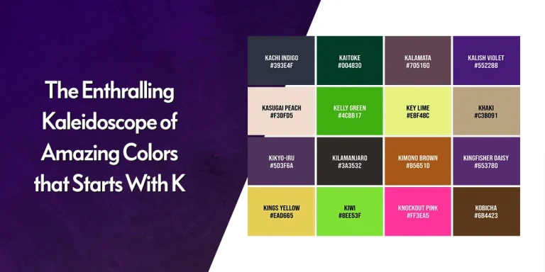
Table of Content
Discover Top Balance in Design Examples and Learn How to Achieve It in Art and Design
Balance is something that we as humans crave. It is something that calls to us in everything we do. When something is well-balanced, it just appeals to consumers, while something that is out of sync just doesn’t sit well with us. And for something intrinsically visual like art, balance in design is critical. Look at the art around you, in nature as well as man-made, and you will see a number of balance in design examples portraying how looking at them just feels right.
Anyone who considers themselves a designer or an artist knows the importance of having balance between the different elements of their design. Despite that, there will be times when you look at an illustration or a design, and you’ll feel as if something just isn’t right with it.
When that happens, more often than not, there is something wrong with the balance of the elements in that design. And especially with mobile screen driving well over half of all online traffic in the past few years, it is essential that our designs today are well-balanced even on screens as small as our modern smartphones.
Let’s take a look at different balancing concepts in design, and see how professional graphic design services leverage them to boost the impact of their creations.
What is Balance in Design?
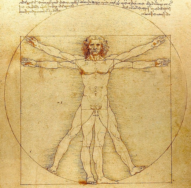
Balance in principles of design refers to the act of distributing the visual elements in a way that makes the design or piece of art seem cohesive. As humans, our minds are better suited to follow order, both visually and otherwise. That is why we often find ourselves attracted to people with symmetrical facial features, or objects that are shaped symmetrically, showing our affinity to balance design.
There are two major concepts that affect our balance in design. Only once you know how each of these concepts affects the balance of your design, will you be able to create flawless pieces of art including various types of logos.
- The first of these concepts is called visual weight. It is the perceived weight and density of a design element in an illustration. This can be tweaked by changing the color, shape, texture, and size of the element in question.
- The second concept is that of visual direction. Visual direction refers to the way the element influences the direction of the gaze. To tweak it, designers can change the structure or the location of the element in question.
Now, in order to understand what each of these concepts does to the balance of design, the best way is to play around with the different attributes to see how each of them changes the balance. And once you are familiar, and comfortable tweaking them to get the design you want, you can start implementing them in your design.
How Many Types of Balance in Design are there in Graphic Design?
You can incorporate balance in design within your art a few different ways, with the easiest and most common way being the tweaking of the design layout. For the majority of balance in design examples we will look at today, layout would be the first step a designer would take to incorporate them in art.
For example, compound designs that incorporate both text and imagery often highlight and center one of the two elements, and then arrange the other elements around them using the float property.
The biggest argument in favor of layout being the easiest way to balance an image, is the fact that many graphic designers often use a grid to arrange the elements of their design. UI structures and web layouts too are often designed using grids, allowing for a balanced placement of design elements throughout the whole structure.
You often see pages where the eye automatically flows from text to image and back to text smoothly. That is a great balance principle in design example, where the UI design is something that intrinsically allows our minds to visualize the pattern or flow of the page, thus making it easy for us to explore.
Now, balance can be found in many different forms. Some of the most commonly used include:
- Symmetrical Balance
- Asymmetrical Balance
- Radial Balance
- Mosaic Balance
- Off-Balance Design
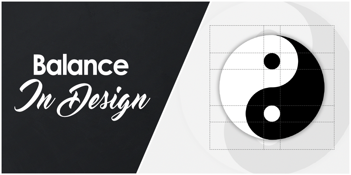
Symmetrical Balance in Design with Examples – What is It?
Symmetry in design is all about structuring the design that mirrors itself across a central plane, as much as possible. For example, if you have a grouping of a few small elements on one side, you will need to incorporate a similar group on the other side of the design too. It is also one of the most common balance in design examples you will find in nature.
In symmetrical design, centering the design elements is a great way to ensure that the design you will end up creating will be symmetrical. However, an experienced designer will also be able to balance the design by using different design elements, with similar weights however, such as a bold and strong image with a block text with heavy logo fonts.
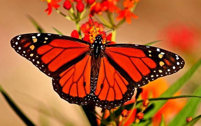
Symmetrical balance in design is something we see a lot in nature. From the shape of the plants to the design on a lady-bug’s shell, and even the intricate patterns on the wings of a moth or butterfly, we see designs that mirror and balance each other across a central plane.
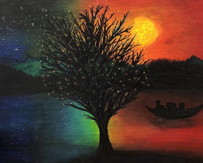
Asymmetrical Balance Principle of Design Example – What Does It Represent?

Asymmetrical design is somewhat complicated to implement. That is due to the fact that with no elements placed around a central line, the image can have the tendency to feel somewhat unbalanced. Let’s take the image above as an asymmetrical balance principle in design example.
The tree in the image starts out far from the centerline, but the canopy of the tree spans the entire top of the design. to balance that, the small house is placed close to the centerline, and near the bottom of the image. Moreover, as the framing of the shows the tree in the foreground, the house is designed to be viewed at a distance.
This is how asymmetry can be used in art to bring balance in design to your creations, without conforming to the somewhat boring symmetry we often see around us.
Radial Balance in Design Examples – Understanding the Charm of Circular Balance
Radial balance refers to the placement of design elements around a central point or nucleus. Elements are placed along the different radiuses emerging from that central point, and they are generally well balanced in terms of weight across the whole image.
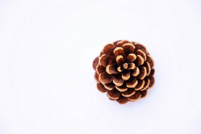
Radial balance is another one of the popular balance in design examples in nature. From the arrangement of the frills on the pinecone above, or the arrangements of petals in a rose, are all examples of radial symmetry.
The concept behind creating a radial balance in your art is to have a strong central element, that draws the gaze immediately. All around it, placed evenly and equally, are the other elements that support that central design by boosting its impact, without taking away from its own visual impact.
This kind of balance design can only be incorporated in specific scenarios, and can be somewhat complicated to implement if the designer is not as experienced in creating such designs.
Mosaic Balance in Design Examples – What is It But An Abstract Concept?
Mosaic balance can be construed as simply, finding order within the chaos. Essentially, this type of balance requires a rare genius to implement, as it requires the designer to create a sense of order and symmetry out of complete disarray.
One of the ways to do that is by spacing out design elements of equal weight throughout the design, but in a seemingly haphazard fashion. However, once surrounded by truly chaotic design elements, those elements that you spaced out earlier will act as focal points for the gaze, bringing with it a sense of balance. And as the placement of the focal elements was natural, it doesn’t strain the eyes or the minds of their viewers.
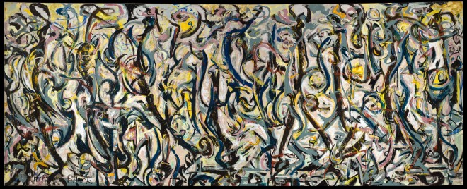
The abstract exhibitionist painter Jackson Pollock often incorporated this type of balance in design in his masterpieces. And his balance in design examples and ideas can be used by designers to create subtle backgrounds that boost the impact of actual design elements they want their viewers to focus on.
Unbalanced or Off-Balanced Designs: Can No Visual Balance Actually Bring a Design Together?
The last major type of balance in design is the concept of off-balanced designs. Now, this is one of the less common balance in design examples you will come across in nature. Sometimes, the designer might not be sure that the different types of balance design concepts would be of use to boost the impact of your piece of art.
However, by creating a deliberate tip in the balance of the design, the designer could create a discordant balance, which would create a design that would appeal visually, but would lack any sense of conventional balance.
However, one thing to note is that while asymmetrical balance and off-balance might sound similar, they are two entirely different concepts. In asymmetry, the balance is shifted slightly by altering the perspective. But in discordant or off-balance balance in design examples, the balance is shifted so much that it creates a sense of unease and incompleteness in those who view it.
That is why finding the right balance between intrigue and unease is what dissuades many designers to try to attempt creating designs with a discordant balance. And if you want to incorporate such an idea into your logo design, you need to learn how to design a logo that could use discordant balance in design to its benefit.
How Can You Achieve Balance in Design Effectively – An Expert Designer’s Perspective
Knowing the different balance in design examples is just one part of the battle in implementing your choice of balance design. You also need to know about the different elements and techniques which can be used to create your preferred balance.
Let’s take a look at the design elements that can help us bring the desired balance to our art and design.
Visual Balance in Design Examples Through Colors and Tones

Balancing a design using color is one of the simplest way to tweak your design’s balance. By combining small areas of bright shades with larger areas of darker shades, designers can use the concept of color psychology, and leverage the various color meanings to boost the impact of your design.
Moreover, designers can also bring balance by incorporating small elements of warm tones with larger areas of cooler tones, or vice versa, to create a visual appeal. This will draw the eye to the focal elements without taking away from the image as a whole.
Achieving Balance in Graphic Design Examples Through Shape
Designers can also create a balance design by tweaking the shape of elements in a way that suits their preferred mode of visual balance. They might create a contrasting symmetry, or they might use different shapes to create an asymmetry that helps focus the gaze onto the main part of the design.
Visual Balance Principle of Design Example via Proper Positioning

Another way to create balance in design is by tweaking the placement of different elements in a way that creates a beautiful, yet simple case of asymmetry in design. If you take the image above, the larger imagery of the temples to the right are offset by the longer line of smaller camel silhouettes. Yet despite this disparity, the design feels balanced.
Adding Visual Texture to Bring Subtle Balance in Design
Another way to give your art a sense of dynamic balance in design is to give it a little texture. Now, texture is often quite subtle in terms of a visual element. Yet it also requires the addition of a larger area of flat, non-textured surface to have the desired impact visually. That, and the required addition of other design elements, is often why this is considered one of the hardest elements to tweak for balance designs.
Achieving Balance in Design by Directing the Viewer’s Gaze

Sometimes, balance in design can be achieved by using directed visual cues to help the viewers find the focal elements. Often, pointed design elements or flowing lines serve to draw the gaze, and if implemented well, can also bring a good balance to the design on their own. This technique is especially good for those who want to attract the gaze without making their design heavy visually.
Leveraging Element Size to Achieve That Perfect Visual Design Balance

A somewhat simple way to emphasize specific elements or to add depth to your design is to play with the size of different elements. This brings a visual depth to the overall image, making it have a better impact, while it also is a subtle way to balance the dimensions of various design elements.
Frequently Asked Questions
| 1- How balance is used in design? Balance in design is brought about by tweaking different design elements like shapes, colors, textures, placement, and more to create a balanced piece of art. |
| 2- Why is balance in design important? Balance in design helps improve the visual impact of the design. If your art lacks balance, your consumers will be left uneasy. And uneasy consumers are something no brand wants, as without a fulfilling experience, they are less likely to patronize your business. |
| 3- What are the three major types of balance? The three major types of balance in design are: – Symmetrical – Asymmetrical – Radial |
Summation – Finding the Balance in Design That Suits Your Needs
Finding the right balance in design examples can be a little complicated, especially if you want to implement one of the rarer types of balance design into your art. However, it doesn’t matter what balance principle of design example you want to use. If you understand the concept behind each of them, understand color theory, and know exactly what elements can help you achieve that balance, you will be able to make a design that is appealing.
On the other hand, if you want to hire a professional graphic design agency to bring your artistic idea into reality, our expert designers are here to help you. With years of experience helping clients from a number of industries, they are well versed in creating designs that appeal to the target demographic.
Latest news you want to know!
Subscribe for cutting-edge design inspiration at Logo Poppin! Elevate your brand with updates on logos, branding, web design, and video animation.
Note that by clicking “subscribe,” users may agree to our privacy policy and consent to Logo Poppin to use your contact data for newsletter purposes.
Logopoppin
Logopoppin is a graphic design agency that specializes in logo designing, web development, video production and advanced branding services. We love to innovate businesses with new age technologies, allowing them to improve their visual reputation.