
Table of Content
Discover The History of the Barbie Logo’s Evolution and the Meaning Behind It
The Barbie brand, a cultural icon for female empowerment for the last generation, has undergone a remarkable evolution since its inception in 1959. More than just a toy, Barbie has become a symbol of a woman’s ability, beauty, and aspiration.
The Barbie logo, a visual representation of its brand identity, has played a crucial role in shaping the perception and appeal of the company. And over the decades, that logo has evolved, reflecting the changing times, cultural trends, and the brand’s evolving message, and culminating into the design we see today.
Join us as we explore the Barbie logo history, following its journey from its earliest days to its most modern incarnation, ala the Barbie movie logo for the highly anticipated 2023 movie. We will also look at the key elements of the logo from a pro designer’s eye to understand the symbolism behind its various iterations.
Only then will be able to gain insight into the Barbie brand’s evolution and its long-enduring appeal. Let’s discover how a pro graphic design agency incorporate the same aesthetic into their feminine designs.
A Brief Overview of the Barbie Brand and What It Represents Today
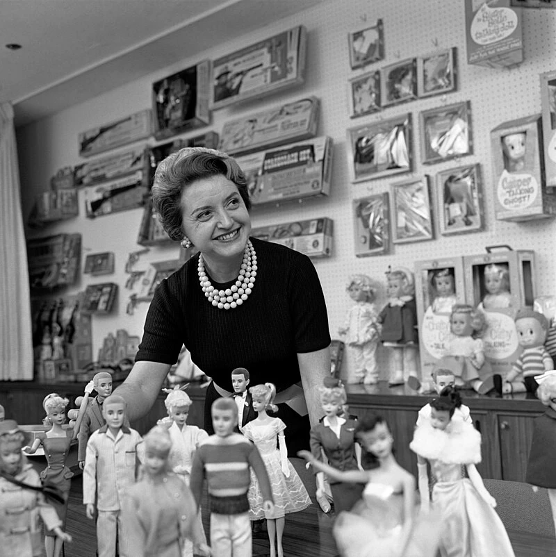
Barbie, the iconic fashion doll created by Ruth Handler, has captured the imaginations of girls worldwide for decades. Initially conceived as a companion/counterpart for action figures popular among young boys, Barbie quickly transcended them to become a symbol of aspirational femininity. Over the years, Barbie has evolved to represent diverse body types, ethnicities, and professions, reflecting the changing landscape of society. And while some of the earlier versions had issues with promoting problems like body dysmorphia, its drive for inclusivity in recent years has been a source of inspiration for many brands.
Today, Barbie is more than just a toy; it’s a cultural phenomenon that has influenced fashion, music, and popular culture. The brand’s logo has played a significant role in shaping its identity and appeal, serving as a visual shorthand for the values and aspirations associated with Barbie.
Evolution of the Barbie Logo Through the Years
The Barbie logo has undergone several transformations over the years, reflecting the brand’s evolving identity and cultural context. The key iterations for Barbie’s wordmark logo design represent the five distinct phases of the Barbie logo history:
- Early years (1959 to 1975)
- The Rise of the Barbie brand (1975 through 1991)
- The peak 90s (1991 through 1999)
- The changing style post-Y2K (1999 through 2004, 2005-06, 2005-09)
- The modern iteration (2009 to today)
Let’s take a look at them in a little more detail.
Early Barbie Logo (1959-1975)
The original Barbie logo featured a simple, sans-serif type with a playful, childlike quality. This early logo reflected the brand’s positioning as a toy for young girls, with its pink color and loopy typeface.
- Simplicity and Playfulness of Design: The original Barbie logo featured a simple wordmark, written in sans serif fonts with a playful, childlike quality. This early logo reflected the brand’s positioning as a toy for young girls.
- Limited Color Palette of That Era: The logo was typically presented in black and white, if not its original pink, further emphasizing its simplicity, adaptability, and visual appeal.
1970s Barbie Logo (1975-1991)
In 1975, Barbie adopted a more sophisticated logo, rather a more complicated design featuring a cursive script that emphasized the doll’s elegance and femininity. Not only was the logo cursive, but the lettering was designed to show the letters as three-dimensional, resulting in a more robust brand symbol.
This Barbie logo aligned with the growing popularity of fashion and beauty trends in younger girls, as well as the thicker, more chunky aesthetic of that era’s graphic design trends.
- Increased Sophistication of the Logo Design: In 1975, Barbie adopted a more sophisticated logo featuring a cursive, loopy script that emphasized the doll’s and its brand’s elegance and femininity.
- Expanding the Color Palette: The logo was now introduced in a variety of colors and color combinations, including pink, blue, and yellow, to match the vibrant and colorful world of Barbie.
1990s Barbie Logo (1991-1999, 1999-2004)
The 1990s saw the introduction of two different Barbie logo variants. The first was a bolder, more modern logo featuring a thick sans-serif typeface and a stylized “B” that incorporated stylistic elements focused on prominent curves and straight lines. Released in 1991, this logo reflected the brand’s increasing emphasis on diversity and inclusivity, slowly moving away from the now-problematic designs of the decades past.
Finally, as Y2K neared, and conspiracy theories like the world coming to an end were flying around rampantly, a new Barbie logo was revealed. This one was a stark departure from the previous designs, heralding the company’s departure towards the new era in business post 1999. It featured a return to the handwritten design format, albeit one that was more streamlined than the previous one.
The result was a more modern looking Barbie logo that looked as if written in a flowing handwriting of calligraphic logos, with a bright pink sharpie.
- Modernization of Design and Boldness: The 1990s saw the introduction of a bolder, more modern logo featuring a sans-serif typeface and a stylized “B” that incorporated bold, in-your-face aesthetic.
- Emphasis on Diversity: The first Barbie logo from the 90s reflected the brand’s increasing emphasis on diversity and inclusivity, as portrayed by its thicker, rounder design.
2000s Barbie Logos (2004-05, 2005-09)
In the 2000s, the previous iteration of the Barbie logo introduced in 1999 was used up until 2004. That year, the company decided on a logo redesign, enhancing the delicate feminine aspect of brand symbol. The logo introduced a simplified design featuring a bold, sans-serif typeface and a more prominent stylized “B” than the previous iterations, with a flower atop the letter “i”.
Moreover, the characters featured a sharper design, and departed from the connected cursive style of the previous Barbie logo. The color scheme too was changed, swapping out the nude-pink of the previous design to brighter, more vivid shades of pink color.
However, that iteration of the redesign was used barely for a year before the company decided to touch it up again. Gone was the flower atop the letter “i”, and the color too was now sharpened to a darker, more eye-catching shocking pink.
- Simplification and Clarity: The 2000s saw the introduction of a simplified logo featuring a bold, sans-serif typeface with no interconnections and a stylized “B”, and a star atop the letter “i”.
- Continued Emphasis on Diversity: This logo marked the continuous drive for the company to promote inclusivity among its consumers, featuring dolls from different ethnicities and body types. Moreover, this was also the era when Barbie dolls with different professional themes were released, serving as aspirational tools for young girls.
2010s Logo (2009-Today)
The latter half of 2009 saw the introduction of a more minimalist Barbie logo featuring a simple, sans-serif typeface and a stylized “B”. The design was less loopy then the previous variants, bringing back the interconnectivity between characters. Moreover, the logo also used the now ubiquitous Barbie pink color for its logo, resulting in the iconic brand symbol we know today.
- Minimalism and Modernity: 2009 saw a new minimalist logo featuring a simpler sans-serif design and a stylized “B” in line with modern logo design trends.
- Focus on Empowerment: This logo featured as the brand’s increasing focus on female empowerment and self-expression.
Design Elements of the Barbie Logo
Now that we have gone through the Barbie logo history, you might have uncovered some common elements that unite them all into a story that describes the evolution of the Barbie brand. These common elements are what define the transformation of all great brand symbols, showing their history no matter the types of logos sported over the years.
The Barbie logo typically incorporates several key elements:
- Typeface: The logo often features a prominent, sans serif, stylized typeface that is both modern and iconic.
- Stylized “B”: The “B” in the logo is often stylized as a type of trademark. No matter the style of logo sported, whether it was script-like or display, that “B” was the first thing that popped in the viewer’s vision.
- Color Palette: The logo is typically presented in a vibrant color palette, often featuring shades of pink and blue. In fact, the primary color of the logo is a vivid shade of shocking pink called Barbie Pink.
The Barbie Movie Logo Explained – Breaking It Down
The Barbie movie logo for the 2023 blockbuster is both a departure from previous iterations, while still incorporating that iconic Barbie vibe. It features a bold, sans-serif typeface that is reminiscent of the 1975s Barbie logo, but with a more modern and edgy twist. The “B” in the logo is stylized to resemble a stylized “B” from antiquity, yet the overall look is one of modern lavishness. The overall design is striking, reflecting the movie’s bold and empowering message.
Conclusion
The Barbie logo has undergone a remarkable transformation over the years, reflecting the brand’s evolving identity and cultural context. From its early days as a simple toy logo aimed at young girls, to its current incarnation as a powerful symbol of female empowerment, the Barbie logo has played a crucial role in shaping the brand’s perception and appeal.
By understanding the key elements of the Barbie logo history and the symbolism behind its various iterations, we can gain insights into the brand’s enduring popularity and its ability to adapt to changing times.
Latest news you want to know!
Subscribe for cutting-edge design inspiration at Logo Poppin! Elevate your brand with updates on logos, branding, web design, and video animation.
Note that by clicking “subscribe,” users may agree to our privacy policy and consent to Logo Poppin to use your contact data for newsletter purposes.
Logopoppin
Logopoppin is a graphic design agency that specializes in logo designing, web development, video production and advanced branding services. We love to innovate businesses with new age technologies, allowing them to improve their visual reputation.
