
Table of Content
Take a Look at the Evolution of Batman Logo in Detail Below
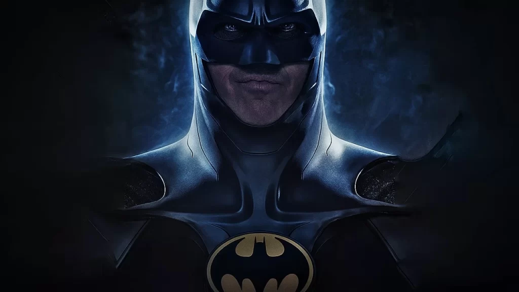
When it comes to rank top superheroes known in the comics, the name of batman always comes first on the list. It is one of those characters that is loved by everyone and has now become a top symbol of DC movies and comics. From adults to kids, the persona of Batman is fan-favorite of everyone, which is what gives it’s logo a huge prominence. People simply love the batman logo due to its great bold designing. This logo has changed quite a lot over the years, but it still looks highly classy among all the other superhero logos.
Speaking about Batman, the character is regarded as one of the most famed superheroes of DC. It is quite popular among the kids, because they see Batman as the savior of innocents. He is a ferocious vigilante that fights crime and bring justice for the deserved. This intrepid bold nature has made Batman a great hero in the comics. In fact, the films developed on Batman have also gone very successful, as the nature of character is shown perfectly in all of them. From Batman Begins to The Dark Knight Rises, every film has depicted a bold style of Batman, giving audience a perfect look of his famed personality.
In this blog, we will be looking into the details of this character more and will study how the famous Batman logo evolved over the years. This will certainly be a good read for all the comic fans who wants to know about the complete history of Batman logo.
Let us first take a look at the early introduction of this character in the comics world. These facts are little known to many people, so let’s dive into it quickly.
Emergence of Batman
Batman is one of those characters that is rolling in the comics from last many decades. Some people think that Batman and other superhero characters were introduced just a few years ago. Well, it must be said that all of them have very little knowledge about these characters because they are entertaining us from last many decades. Though they became prominent after 70s or 80s, but they were still active in the industry in the form of short comics and cartoons.
Speaking about Batman, the history of this great character is also quite long. You might be thinking that it came to limelight after Michael Keaton starrer Batman movie released in 1989. Well, that is certainly not true because the character was well established in the industry way before that. People basically knew about Batman when it was first introduced in comics in 1939. At that time, it was the only source that gave a brief illustration of Batman to the people. However, things started to change for the character in a more positive manner after the release and success of Michael Keaton’s Batman.
During all these years from 1939 till to date, the attire and logo of Batman saw a great change. It evolved from time to time, giving respect to the trends and practices of the relevant era. All these changes gave Batman a resounding persona, allowing it to grab the attention of people at the first glance. It is the core reason why the legacy of this character is still strong, encompassing many other names of top superheroes known in the industry.
Evolution of Batman Logo
The Batman logo has been changed many times over the years by taking different logo design services. It has a great history in the industry that needs to be understood properly. Today, the young generation hardly know about the story of the inception of Batman. They do not know how the logo first looked when it got introduced way back in 1939.
Well, below we have tried to cover this history in a quick manner, so that you can know how the famous Arkham Batman logo evolved over the years. Let’s take a look at it below.
Batman Logo: 1939 – 1945
The first Batman emblem was introduced in 1939 when no one literally knew nothing about this character. It was presented in the form of a sign of vigilante that fights for crime and justice. It instantly got the attention of market and comic fans started to talk about it regularly. Later in 1940, the logo was doubled in size, showcasing the masked-head of the dark knight. This logo looked different from the earlier version, as it was made in a stunning intrepid style.
In 1941, the logo was again changed and this time it received a more gothic look. Instead of head, the upper part of the logo was altered with the actual bat head. This was done to bring authenticity in the design and make it more relevant with the character. Some versions also show that blue linings were included inside the wings of the logo. This new adaptation also became highly popular, allowing the character to get recognition in the market quickly.
Batman Logo: 1946 – 1950
Coming to the 1946, the logo of Batman was altered with a more intrepid style. Its wings were crafted with a more pointed look that gave the logo a highly bold style. The size of the logo was also changed and it became a bit small as compared to other versions introduced before. Many people said that the logo didn’t had anything new, but the fact was that it was done with a purpose to keep the identity of the logo similar.
This logo was then left unchanged till 1950, as the character was still establishing in the industry, so further changed were not required. It was the time when Batman was becoming popular in comics, so DC didn’t went for too many alterations in the logo.
Batman Logo: 1950 – 1956
With the start of 1950s, the logo design trends started to change in the industry. It was the time when the design world was evolving rapidly. Though this evolution was slow, but still it was paving the path for a great future. The popularity of Batman was also rising quickly, so the company though to give the logo a slight new look.
With this concept, they decided to perform little tweaks in the Arkham Batman logo. This was done in the form of making bat wings more rounded. The edges were kept sharp as it looked great and didn’t required much changes. This new logo was also appreciated by audience, as it kept the enchanting identity of Batman intact.
Batman Logo: 1960 – 1964
The logo introduced in 1960 was quite large from the previous one. The reason is that size of the bat in this logo was made a little bit large. The original theme of the logo was still the same, but due to size, it looked a bit different. Also the wings of the logo was again made sharp to give the visual a sharp look. The head of the bat was also rather high, as it didn’t required much changes.
The color combination used for this version was also jet black. It was not altered because black was always suited perfect for bats. Though many people called for a change in the color of the logo at that time, but DC comics didn’t opted to do much experimentation in the logo during that period.
Batman Logo: 1966
The Batman logo was always termed perfect, however, its monotone color styling was becoming a bit outdated due to change in trends. The original bat figure was still very much popular, but it needed something fresh in the background. To cope with this challenge, DC comics decided to introduce a yellow ellipse in the background of the logo. It could be said as a container in which the logo was kept to give it a little new look.
The color chosen for the background of the logo was yellow, as it made a perfect contrast with the black color. This new logo got immense appreciation from the fans, as it finally listened to their demands. Like the Spiderman logo, it definitely looked like a modern emblem that had all the ingredients of a classy look.
Batman Logo: 1980 – 1999
Coming to the 1980s, DC comics again decided to do some changes in the logo. They did not overhauled the complete design of previous logo, however, did some little teaks. It included enhancement in bat wings, sharper edges, flashy color styles and more others. They did all these changes bit by bit, so that the logo do not gets completely altered at one time.
Some people called this experimentation a success, while some criticized the move. Overall, these changes received a mixed response, as people had different opinions about the logo. Thankfully, the original bat figure was not changed, as it looked perfect for every logo.
Batman Logo: 2000 – Present
The new era of 2000 brought a significant change in the branding strategy of Batman logo. At that time, the character was on its peak due to the success of multiple Batman films released before. The first part starring Michael Keaton became highly popular, influencing producers to go for more sequels. The logo of Batman introduced in 2000 was therefore introduced keeping that prominence in mind.
It was quite different from the previous logos, precisely in terms of size. It was first introduced in the comics, then it showed up in the famous take of Christian Bale’s ‘Dark Knight’ in 2008. It was such an iconic movie that its characters, especially Joker played by Heather Ledger got huge applause by the audience. According to many character fans, it is still the best Batman movie that became very special due to the stunning villainous role of Heather Ledger a.k.a Joker.
Frequently Asked Questions
| Why is the Batman logo so popular? The Batman logo is quite popular because it represents the identity of a famous dark vigilante of Gotham. This is the character that is loved by everyone, and is simply ranked on top of superheroes globally. |
| When was the first Batman logo was introduced? The first Batman logo was introduced in 1939 when no one knew much about superheroes. It is therefore regarded as the one of the first characters that introduced the trend of superhero comics and movies. |
| How many Batman logos have been introduced over the years? Over the years, many Batman logos have been introduced in the industry. All of these logos are created with the same theme, as that represents the main face of the famous dark knight. |
| Which color combination have been used in the Batman logo? The main color theme of Batman is black, as it relates directly with the color of bats. So, it has been used as a primary color in all logos, however, some have been altered with a yellow and red background to bring some uniqueness. |
| What does the Batman symbol mean? The meaning of Batman symbol is very simple. It stands for a character that fights crime and is looking to bring justice for every innocent. |
Final Words
That takes us to the end of this blog in which we have discussed about Batman logo in detail. This is indeed an iconic character that has got a big history in the industry. Many people certainly do not know about it, which is why we have tried to cover some of it in this blog. It has given a good overview how the Batman logo has evolved and got prominence in the world during the last few decades.
If you also want to design a classy superhero logo like Batman for any comic event, get in touch with us today. We have got experts who can help you to create all types of logos as per the needed requirements.
Latest news you want to know!
Subscribe for cutting-edge design inspiration at Logo Poppin! Elevate your brand with updates on logos, branding, web design, and video animation.
Note that by clicking “subscribe,” users may agree to our privacy policy and consent to Logo Poppin to use your contact data for newsletter purposes.
Logopoppin
Logopoppin is a graphic design agency that specializes in logo designing, web development, video production and advanced branding services. We love to innovate businesses with new age technologies, allowing them to improve their visual reputation.

