
Table of Content
Discover the Evolution of the Bentley Logo into a British Automotive Luxury Icon Today
Some automotive brands have an iconic and deep relation with their country of origin. And to think of them is to remember their homeland. Take Chevrolet or Mustang for example. Both are obvious and iconic American car brands, there is no argument. Similarly, carmakers like Aston Martin bring to mind classic British icons like the suave spy James Bond.
However, Aston Martin isn’t the only British car brand known to the world. Two of the world’s foremost luxury automobile manufacturers, namely Rolls-Royce and Bentley, are classic British brands that have made a massive impact on the automotive world. In fact, unlike Rolls-Royce, which is known for its ultra-luxe offerings, the Bentley logo is associated with far more, having a rich racing history that includes five 24 Hours of Le Mans wins between 1924 and 1930.
Despite that, they are still considered a leading automaker in the ultra-luxury category globally. The question is, how did this automaker with limited production cars, become a global phenom? And how did it manage to establish a comprehensive identity while simultaneously manufacturing top automobiles for both ultra-luxury and performance, two highly demanding niches?
Discover the inception and social impact of the Bentley symbol, and discover how it pioneered design conventions that modern logo design services use to uplift their design’s impact.
History of Bentley – A Pioneer of Britain’s Luxury Automotive Renaissance
The Bentley Motor Company is the brainchild of Walter Owen Bentley. Better known as W.O., Bentley sold French DFP cars with his brother in North London before the First World War. However, even at that time, what Bentley wanted most of all, was to design and build his own cars.
During his time with DFP, he came up with the idea of using aluminum as a suitable lighter replacement to cast iron for engine pistons. That idea was extensively tested and the first Bentley-produced aluminum pistons were used in the engine for the British Sopwith Camel fighter in World War I.
In January 1919, the day the Paris Peace Conference began, Bentley formed the Bentley Motors Limited, which was registered as a company in August later that year. In October of the 1919, he exhibited his first car, albeit with a dummy engine, at the London Motor Show. Later, team member and former RFC officer Clive Gallop developed a reliable engine for that car, with an innovative 4-valves-per-cylinder configuration.
Ready for production by December of 1919, the car had originally been planned for delivery by June 1920, but the overall development of the car took longer than expected, and the estimated time of delivery was pushed to September 1921.
Issues with the year-long delay were quickly squashed however, as the reliability of the car was unprecedented, and people were quick to praise it. So impressed were its buyers with the performance and reliability, that many took part in hill climbs and other amateur races like those at Brooklands.
The next year of its production saw the company enter their first Indianapolis 500, where the car finished 13th after starting 19th, and completing the entire 500-mile race reliably. The same year saw the company enter their first RAC Tourist Trophy in England, highlighting the reliability of the vehicle.
Funded mainly by Bentley himself, Bentley became the first British marquee to win at Le Mans, winning their first cup in 1924, with drivers John Duff and Frank Clement. However, with a constant drive for excellence, and with barely enough money to scrape by, the company was looking for investors.
Inspired by their 1924 win, the company was acquired by Captain Woolf Barnato. A heavyweight boxer and amateur racer who had achieved great success with his Bentley car at several Brooklands races, he believed in the brand and kept it from going bankrupt.

Then came the era of the Bentley Boys. The Bentley Boys were a group of independent car enthusiasts that exclusively used Bentley cars. With most of them independently wealthy and with military backgrounds, these enthusiasts made it their duty to showcase the performance and reliability of the company automobiles. Incidentally, it was their dedication to this mission that Bentley won their next four Le Mans races from 1927 to 1930, even beating out other established automakers.
Another record for the company was when Barnato, in his formal Bentley saloon, raced the Blue Train from Cannes to London, and beat it and win a bet worth £100. This was done as an answer to Rover’s Rover Light Six, which had beaten the Blue Train’s time, rather than racing the train itself.
As the popularity of the car increased, the Bentley started to feature in fiction as well, with the earliest James Bond novels featuring the car as Bond’s vehicle of choice. Moreover, the car was also featured in the classic British show The Avengers, driven by the lead character John Steed.
However, by the early 1930s, the car’s popularity had outstripped Barnato’s funding capabilities, especially after the Wall Street Crash in 1929, and Bentley was put up for sale. Rolls-Royce, afraid of the newly introduced Bentley eight-liter, bought the company to prevent it from competing against and hurting the sales of their flagship Phantom II.
From 1931 to 1970, Bentley was produced under the marquee of Rolls-Royce. However, despite manufacturing exquisite vehicles, that was the era that Bentley’s popularity saw a slump. With most Bentleys of that era manufactured using a Rolls-Royce platform, fans accused them of being just rebadged Rolls-Royce automobiles. It was also during this time that W.O. Bentley, who was unhappy with his new role under Rolls-Royce’s control, left the company to join Lagonda, a rival automaker.
From 1970 to 1980, after Rolls-Royce Motors Limited had been separated from the main parent company, the car production was focused more on those with Rolls-Royce badges than Bentley’s. The situation was so bad that by 1980, Bentley had fallen so far in popularity that it made up just 5% of the total car production of Rolls-Royce.
Bought by Vickers in 1980, the car regained some of its former glory, releasing a range of new vehicles for its consumers. In 1998, Vickers decided to sell the company, where BMW was outbid by the Volkswagen Group to take control of Rolls-Royce Motors Limited. After splitting the Rolls-Royce brand from the company and handing it over to BMW, VW retained its rights to manufacture cars under the Bentley marquee.
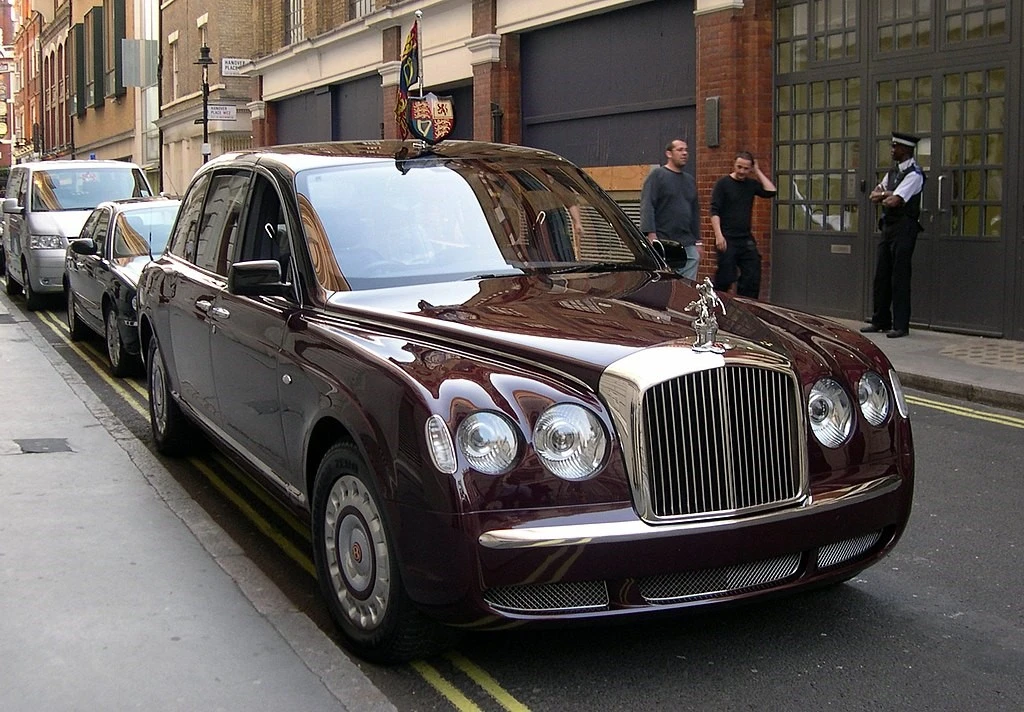
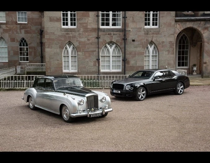
Since then, the Bentley brand has seen a resurgence, with even the royal family, including Queen Elizabeth II’s Bentley State Limousines, which were in use by the monarch until her death in 2022. And it has cemented its place as premier luxury automaker, represented by one of the most iconic car logos with wings.
The Meaning Behind the Winged Bentley Logo and Its Significance
When we talk about the winged Bentley logo, it could refer to either the badge used by the company, or the hood ornament displayed on the top-model Bentley today. In both cases, the wings have different representations, and have different meanings.
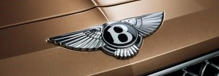
The idea behind the winged badge used by the company was to represent its history as an innovative airplane engine manufacturer during the First World War. The design of the wings is similar to aviator wings of the early pilots, and that represents its connection with the British Sopwith Camel fighter plane, the backbone of the British Air Force in WWI. In the middle of the logo, the bold stylized “B” refers to the founder, just like the bow in the Chevrolet logo refers to Louis Chevrolet, and the complete design endearingly called the “Winged B”.
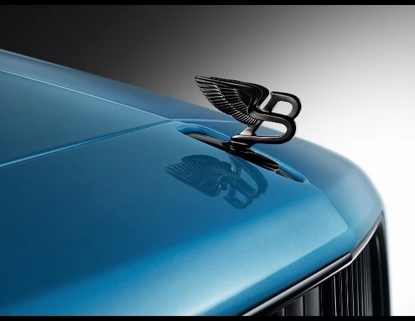
The hood ornament, which features a stylized “B” with wings spread open and behind to showcase smooth, swift, and powerful movement, all qualities embodied by the car. And both symbols, combined, represent a luxury automobile company that has always prided itself on merging luxury with performance and reliability.
History of the Bentley Logo – A Look at Various Shapes It Has Sported Over the Decades
Now that we have taken a look at the Bentley logo’s significance, as well as the rich and interesting history of the Bentley brand, let’s take a look at the various forms taken by that logo. As we mentioned earlier, the company has two different symbols that have been used together and independently by the company for its brand symbol.
Let’s take a look at the evolution of these symbols, and see how they inspired the company logo today.
The Winged B – The Earliest and Oldest-Running Conception of the Bentley Logo Since 1919
The earliest version of the Bentley logo was the Winged B. This logo was designed by W.O. Bentley’s fried, called F. Gordon Crosby. Its design was quite similar in style to other automaker logos of that era, such as the Chrysler logo.
Crosby, who was then known as one of the world’s foremost authorities on motoring designs before the First World War, and used his artistic abilities to come up with an iconic and timeless design. Released in 1919, the symbol represented the Bentley symbol and the cars it represented to be powerful enough to fly. Moreover, the wings also payed homage to Bentley’s history of aeronautical engine manufacturing.
The most interesting thing about this design is that it has a small and subtle way of preventing theft of its design, a practice that was common in the earlier days. Crosby gave each wing of a logo a different number of feathers, ensuring that counterfeiters would have a hard time copying it.
Variants of the Classic Bentley Logo
Over the years, the Bentley logo called the Winged B has seen slight modification, especially with the shape of the wing feathers or the color of the oval inside the wings. The black or blue colored ovals were displayed on the vast majority of the Bentley cars, except for the high performance variants produced by the company. The wings however, remained the same color, a bright silver-chrome that complements the car’s luxury heritage. This meant that unlike other performance luxury marquees and their symbols, such as the Ferrari logo, Bentley went for subtlety over instant impact.

The top-tier of Bentley cars, most often the ones offered as performance variants, used a slightly modified version of the Bentley logo. The wings had a slight curve to the feathers, and the inner oval was colored a bright red instead of the usual blue or black. This styling was designed to make the performance models stand out in a subtle manner, without compromising the brand’s luxury aesthetic. Incidentally, the two Bentley State Limousines manufactured especially and gifted to Queen Elizabeth for her Golden Jubilee also sported these red badges, representing that they are performance variants designed for ultra-luxury.
Alt: Bentley’s centenary Winged B
For the centenary of the company, Bentley released a special edition of the Winged B. It featured the classic symbol for the brand, with the letter B and the oval surrounding it outlined in a special shade of gold called Centenary Gold. On both sides of the letter were the years spanning the centenary, with the left showing 1919 and the right 2019. This use of gold was also an homage to Crosby himself, the man who created the original design and made it such an iconic logo.
The Flying B – The Bentley Logo Hood Ornament Rivaling the Spirit of Ecstasy

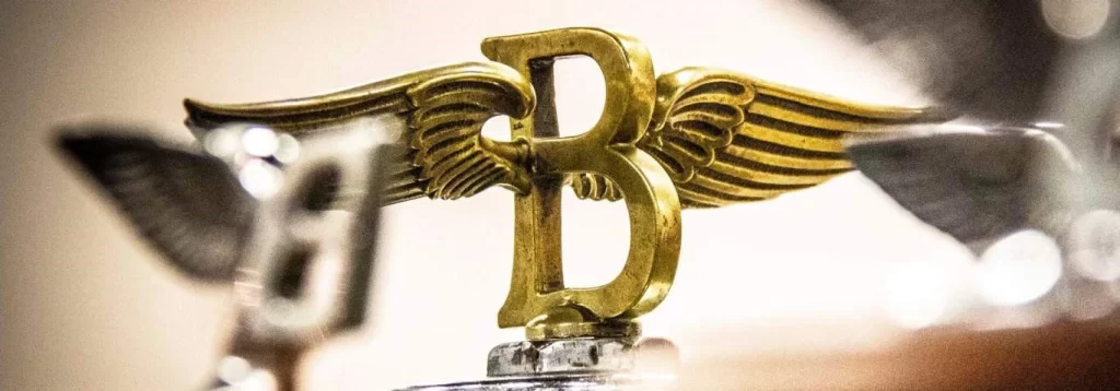
Besides the Winged B, the company had another symbol they called the Flying B. This three-dimensional symbol was used as a hood ornament, similar to the Spirit of Ecstasy used by Rolls-Royce. The original design had a carved, uppercase letter B, made in the same style as the letter B in the Winged B design. on both sides of the letter’s spine were wings spread out to both sides. This was a design inspired by Icarus of Greek mythology, signaling the brand’s rise into legend.
This 3D iteration of the two-dimensional brand symbol was a great hit, giving the Bentley cars a regal charm that was lost in the later years when pedestrian safety laws banned the use of hood ornaments. However, a few years ago, Bentley came up with a new technique where the hood ornament would retract into the hood in case of an accident, signaling the return of these 3D logos on the cars.
Variants of the Flying B and Its Sudden Fade into Obscurity

Just like the Winged B, the Flying B has seen various iterations used over the years, despite the decades-long hiatus due to pedestrian safety laws. However, before that, after Rolls-Royce’s acquisition of the Bentley brand, it was decided that a new mascot needed to be designed.
Inspired by the moniker “the silent sports car” given to its vehicles in the 1930s, Charles Sykes, known for the Spirit of Ecstasy, and the designer commissioned for this task, came up with something new. He redesigned the letter B with a smaller, forward-leaning profile, and a pair of wings that were fuller in design. Paying homage to its nickname, Sykes created the wings after owl wings, known for their silence and speed.

After World War II however, people needed something new. The logo was redesigned, with the letter B made wider and more rounded, while at the same time a bit sleeker. This rounded shape was more reminiscent of the owl, and complemented both the rounded and angular design of the cars until 1970, when the hood ornaments were banned.

In 2006, after Bentley came up with a new mechanism to make the hood ornament completely retractable, the top-model variants started to sport a redesigned version of the Flying B. with a sleeker, more prominent profile than its predecessors, it complemented the new style of Bentleys produced under Volkswagen’s supervision. Unlike the previous versions, which were offered in chrome only, these new variants were offered in a few different shades, including a dark, carbon gray, as well as a light gold one.
The Modern Resurgence of the Flying B

In 2019, to commemorate the centenary celebration of Bentley, the brand redesigned the Flying B to complement the new special design of the Winged B Bentley logo. This was an avant-garde take on the Bentley symbol, which featured a more angular design, with glowing acrylic-embedded wings, and the lower curve of the B disconnected to the spine.
This design is one of the sleekest iterations of the Flying B, and was the closest to its inspiration of a gliding owl. The disconnected lower curve was designed to mimic the legs of the bird, while the base of the symbol was curved and made to mimic the widening wake of the flying bird over water. Overall, this was the best iteration of the Flying B in a year of Bentley’s production.
The Digital Revamp of the Bentley Logo – 2002 to 2022
Coming back to the corporate identity design, a digital iteration of the Bentley logo was created to represent the business. The design is simple, clear, and a perfect amalgamation of classic logo design with modern aesthetics. The monochrome design is one that would need little change, even with the modern, flat iterations of logos as created by brands, such as the Cadillac logo.
This corporate variant of the logo was used from 2002, when VW retained exclusive rights to the Bentley brand, until 2022, when the company felt that a rebrand was needed to represent its new direction.
The Introduction of Modernism with the Gen B – 2023
To celebrate its direction towards a cleaner, more efficient automotive direction with a push for electric vehicles, the Bentley brand decided to create a new, simpler logo for a modern aesthetic. This new corporate logo featured the letter B from the Winged B logo design, blown up and colored a medium tint of blue-gray. This design, named the Gen B, represented a new chapter in the life of the automotive brand, with a look that rivals other famous sports car logos like Bugatti.
Conclusion
To sum up, the Bentley logo is one of the best-known car logos of all time. From its iconic winged design of the badge, to the beautiful, highly memorable design of its cars, the brand has an unforgettable legacy.
The Bentley brand, like Dodge in America, has proved itself a true British automotive phenomenon. What bigger accomplishment could a car maker boast of, then that their automobiles were used by the ruler of the world’s largest monarchy?
That is what Bentley’s Winged B and Flying B represent, a legacy so great that one could never believe that it started with a common man’s dream to build an iconic performance automobile.
Latest news you want to know!
Subscribe for cutting-edge design inspiration at Logo Poppin! Elevate your brand with updates on logos, branding, web design, and video animation.
Note that by clicking “subscribe,” users may agree to our privacy policy and consent to Logo Poppin to use your contact data for newsletter purposes.
Logopoppin
Logopoppin is a graphic design agency that specializes in logo designing, web development, video production and advanced branding services. We love to innovate businesses with new age technologies, allowing them to improve their visual reputation.

