Table of Content
Discover How the Top Avenir Font Pairings Intertwine to Create Beautiful Typography
Typography is one of the most critical elements of design that incorporate text. A well-chosen font or font group can dramatically influence how the viewers perceive a design, by evoking specific emotions and enhancing readability. The Avenir font family, renowned for its versatility and modern aesthetic, offers a range of possibilities for creating visually compelling and impactful typographic compositions.
However, many design applications require more than one font to have the visual impact desired, calling for suitable font combinations according to that time’s font trends. Coming back to Avenir, its versatile design is one of the reasons why it is so popular in the design world. However, the problem arises when its time to find suitable Avenir font combinations that suit your design’s overall aesthetic.
That is where your experience and understanding of the fundamentals of typography comes into play. Let’s explores the Avenir font family and take a look at a curated selection of font pairings used by professional graphic design services that can elevate your design projects to new heights.
Let’s begin.
A Brief Overview of the Avenir Font Family

Before we go any further, it’s important that we explore the font in question, as that will help us understand why the various Avenir font combinations we will discuss work so well together.
The Avenir font, designed by Adrian Frutiger, is a geometric sans serif typeface that has become a staple in the graphic design world. Its clean lines, neutral proportions, and exceptionally high legibility make it a versatile choice for a wide range of applications, from branding and editorial design to digital interfaces.
The Avenir family includes multiple weights and styles, allowing designers to create cohesive and adaptable typographic systems. However, despite its versatility and adaptability, Avenir, like many similar fonts, does not pair with just any random types of fonts. What it needs for it to be considered among good Avenir font pairings is a typeface that complements Avenir’s design, while providing a foil to make it stand out just enough to be memorable.
And that is what the font combinations we are going to discuss today represent.
How Does Using the Avenir Font Allows Our Designs to Be More Versatile?
Avenir’s versatility stems from its clean, modern aesthetic of sans serif fonts and its adaptability to various design styles. The font’s neutral character makes it a suitable companion for both classic and contemporary designs, its clean lines ensuring that it stays legible even at minuscule sizes.
Its geometric structure and open forms contribute to its legibility, ensuring clear communication across different mediums. Additionally, Avenir’s availability in multiple weights and styles provides designers with flexibility, allowing them to create cohesive and visually appealing typographic compositions by choosing the styles that suits their needs.
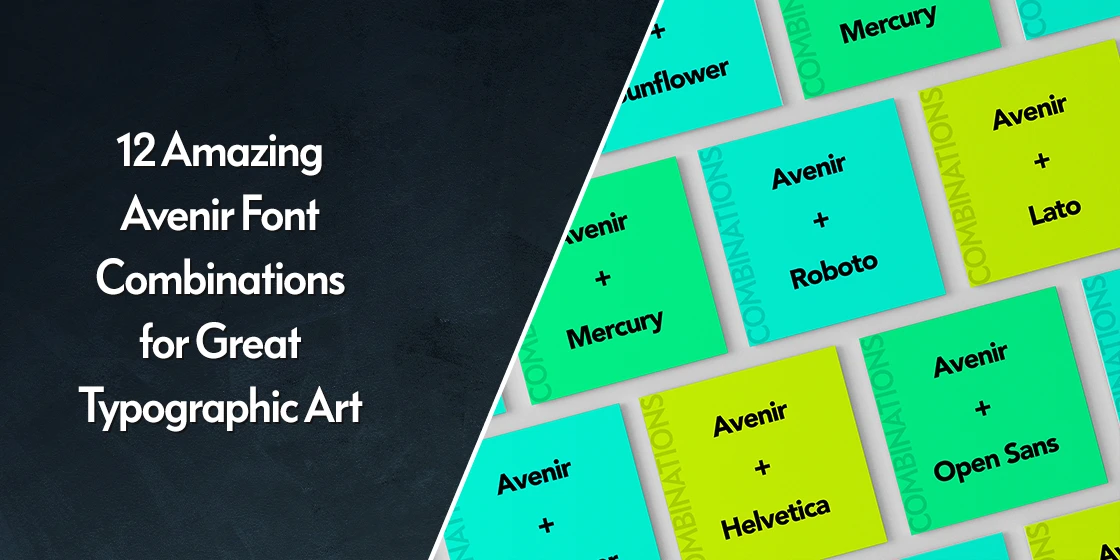
Top 12 Aesthetic Avenir Font Combinations You Should Definitely Try Out
Pairing fonts effectively is essential for creating visually harmonious and impactful designs. Avenir, with its neutral character, can form different Avenir font combinations with various typefaces to achieve specific aesthetic results.
The question is, is there some special trait that guarantees a font will pair well with Avenir? Let’s take a look at a few examples of successful Avenir font pairings, and see what it is that ties them together.
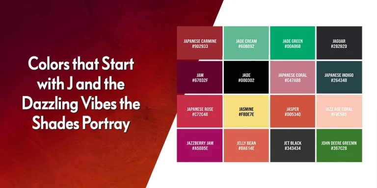
Source Sans + Avenir
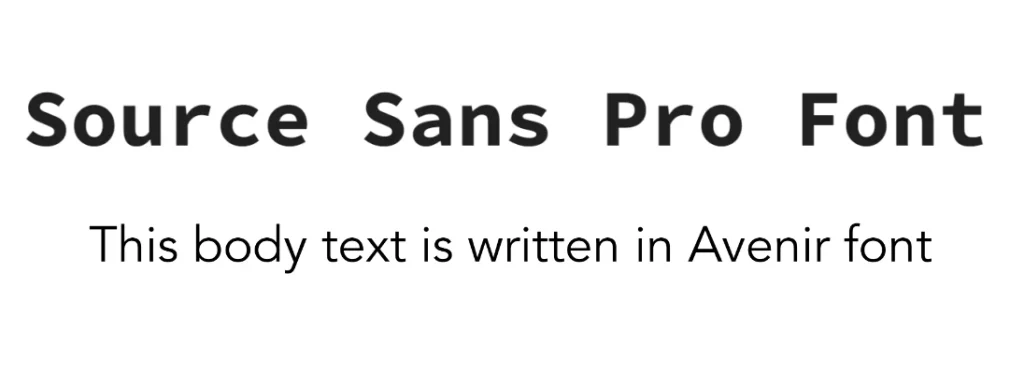
The first entry in our top Avenir font combinations offers a harmonious and modern aesthetic, putting aside the debate of serif vs sans serif fonts being the perfect Avenir font pair. Both typefaces share a similar geometric structure, creating a cohesive and balanced design that complements and highlights each other’s subtleties. Source Sans, with its slightly rounded forms, provides a subtle contrast to Avenir’s more angular geometry, adding just enough visual contrast to make the people notice.
Lato + Avenir
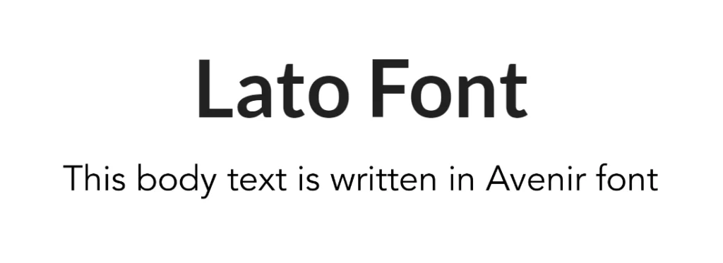
Combining Avenir with Lato creates a contemporary and energetic look. The contrast between the geometric structure of Avenir and the humanist sans serif design of Lato adds visual interest. Among the Avenir font combination we will look at today, Lato’s slightly more rounded forms and open counterforms provide a gentle counterpoint to Avenir’s more angular geometry.
Public Sans + Avenir
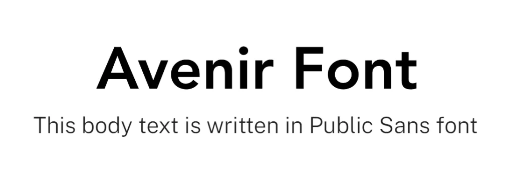
This pairing offers a clean and modern aesthetic, combining the rounded fonts style of Public Sans against the angular design of Avenir. Both fonts share a similar geometric structure up to a point, creating a cohesive and balanced design. Public Sans, with its slightly condensed forms with prominent rounded features and neutral character, complements Avenir’s versatility and makes it suitable for a wide range of applications.
Playfair Display + Avenir
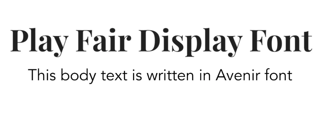
This combination of vintage fonts style of Playfair Display and the modern minimalism of Avenir creates a sophisticated and elegant look. The contrast between the geometric sans serif of Avenir and the serif of Playfair Display provides a timeless and visually appealing composition. Playfair Display’s classic and elegant character adds a touch of sophistication to the pairing.
Open Sans + Avenir
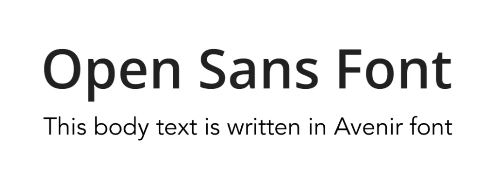
This pairing offers a harmonious and modern aesthetic. Both fonts share a similar geometric structure, creating a cohesive and balanced design. Open Sans’ slightly rounded forms and neutral character complement Avenir’s versatility, making for one of the most understated Avenir font combinations on this list.
Roboto + Avenir
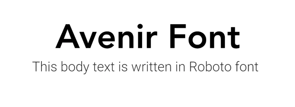
The combination of Roboto from Google Fonts and Avenir creates a contemporary and tech-inspired look, perfect for the modern age. The subtle complement between the geometric sans serif of Avenir and the geometric sans serif of Roboto adds visual interest. Roboto’s slightly more rounded forms and open counterforms provide a counterpoint to Avenir’s more angular geometry, while maintaining that same feel of minimalist efficiency.
Poppins + Avenir
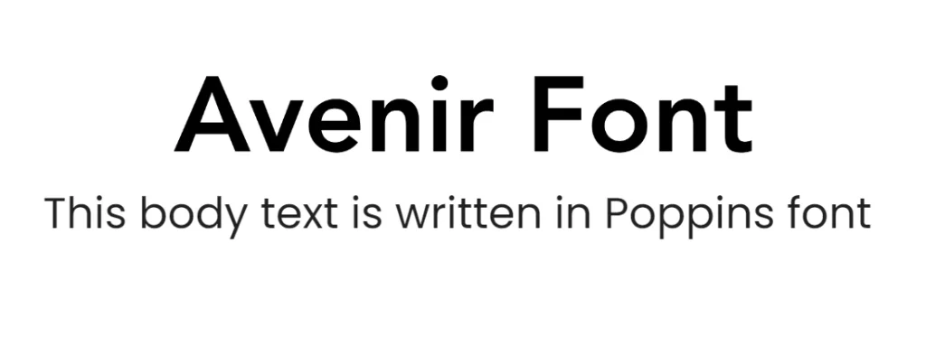
Of the various Poppins font pairings, the combination of Avenir with Poppins offers a harmonious and modern aesthetic. Both fonts share a similar geometric structure, creating a cohesive and balanced design. Poppins’ slightly more rounded forms and neutral character complement Avenir’s versatility perfectly.
Caveat + Avenir

Combining Avenir with Caveat creates a playful and contrasting look. The contrast between the geometric sans serif of Avenir and the handwritten-style of Caveat adds a ton of visual intrigue. Caveat’s expressive and organic forms provide a counterpoint to Avenir’s more structured appearance, resulting in one of the most aesthetic Avenir font combinations you will see.
Lusitana + Avenir
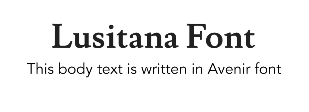
This pairing between the minimalist Avenir font and the masculine fonts vibe of Lusitana creates a sophisticated and elegant look that perfectly balances the modern with the vintage. The contrast between the geometric sans serif of Avenir and the classic serif of Lusitana provides a timeless and visually appealing composition. Lusitana’s classic and elegant character adds a touch of sophistication to the pairing.
Baskerville + Avenir
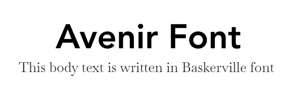
This combination of Avenir and Baskerville creates a classic and timeless look. The contrast between the geometric sans serif of Avenir and the timelessly elegant serif of Baskerville adds visual interest. Baskerville’s elegant and refined character, often used for formal typography such wedding fonts, provides a counterpoint to Avenir’s more modern aesthetic.
Sunflower + Avenir

Among the Avenir font combinations we have discussed today, the pairing between Avenir and Sunflower creates a playful and energetic look. The contrast between the geometric sans serif of Avenir and the monospaced fonts style of Sunflower adds visual interest. Sunflower’s expressive and organic forms provide a counterpoint to Avenir’s more structured appearance.
Cormorant Garamond + Avenir
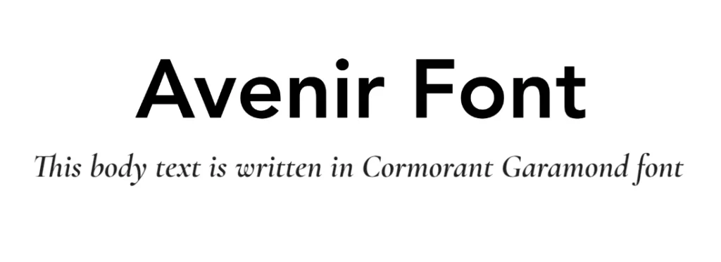
The combination between Avenir and Cormorant Garamond creates a sophisticated and elegant look, but one that requires a little finesse in using. The contrast between the geometric sans serif of Avenir and the handwritten-style of Cormorant Garamond provides a timeless and visually appealing composition. Cormorant Garamond’s classic and elegant character adds a touch of sophistication to the pairing, one of the reasons why it is among the popular logo fonts for simple yet elegant wordmarks.
FAQs
| What is Avenir font good for? Avenir’s clean lines and high legibility means that it works for nearly all textual applications. However, it shines when used in prominent spaces such as headers and body text. |
| What are some free alternatives to Avenir font? Considering that the Avenir font is a paid font, some of the best free alternatives to it include: Montserrat Eau Figtree Nunito |
| What famous brand uses Avenir font in their branding? Toyota, the Japanese automaker, is famous for using the Avenir typeface for its brand caption, showing the versatility and premium feel of the font. |
Conclusion
Avenir has established itself as a versatile and popular font choice for designers. Its clean, modern aesthetic and excellent legibility make it a strong foundation for various design projects.
By carefully choosing the perfect Avenir font combinations that complement each other, as demonstrated in the pairing examples above, designers can create visually compelling and impactful typographic compositions. Experimentation with different font combinations is key to finding the perfect pairing for your specific design goals.
Latest news you want to know!
Subscribe for cutting-edge design inspiration at Logo Poppin! Elevate your brand with updates on logos, branding, web design, and video animation.
Note that by clicking “subscribe,” users may agree to our privacy policy and consent to Logo Poppin to use your contact data for newsletter purposes.
Logopoppin
Logopoppin is a graphic design agency that specializes in logo designing, web development, video production and advanced branding services. We love to innovate businesses with new age technologies, allowing them to improve their visual reputation.