Table of Content
Ranking the Best Fonts for Logos and other Branding Materials
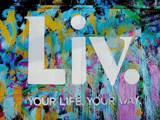
Logo fonts are a great way to add value to the designs of your logos. With the right blend of fonts and typography, you can boost your logo’s impact on portraying your brand message to the consumers.
On the other hand, using the wrong font for logo can be a recipe for disaster. And it can be straightforward to choose a font that does not enhance your brand impact, what with the thousands of fonts available nowadays.
The best way to ensure that your logo incorporates a suitable mix of fonts is to hire a professional logo design agency. However, if you plan on designing your logo yourself, or are new to the logo design world, then read on. Let’s find out what makes good logo fonts and how you can avoid the pitfalls of choosing the wrong typeface for your logo design.
Importance of Fonts in Logo Designing
Choosing the right font for logo design is crucial because typography directly influences how a brand is perceived. Fonts convey emotions, tone, and personality—whether it’s elegance, strength, friendliness, or professionalism. A mismatch between font style and brand identity can confuse the audience or dilute the intended message, making it harder for a company to establish a strong presence.
Additionally, font choice impacts readability and memorability. Logos must be instantly recognizable and legible across various media, from digital screens to print materials and physical signage. A font that’s too ornate may look impressive at first glance but could be difficult to read or scale poorly, reducing its effectiveness. Clear and well-balanced typography ensures that a logo remains versatile and functional in different sizes and contexts, enhancing the overall user experience and brand visibility.
Meanwhile, the uniqueness of a font can set a brand apart in a crowded marketplace. Custom or carefully chosen typefaces help avoid generic-looking logos and allow businesses to create a distinct visual identity. Consistency in typography also supports cohesive branding across marketing materials, fostering brand trust and loyalty. In essence, the right font is not just a design element—it’s a strategic tool that shapes how a brand is perceived and remembered.
How to Pick the Right Logo Fonts for Your Logo?
Now, there are various types of fonts and styles to choose from, all of which tell their own story. Any well-designed sports logos would have no use for the stiff and formal font’s standard for corporate business logos. Similarly, a corporate consulting firm would never use an artsy font in garish pink against their traditional aesthetic.
After you find out your brand’s value, the next thing to do is put up those values against different fonts and choose those that portray similar values and aesthetics.
Now, there are various logo font styles to choose from, all of which tell their own story. Each type has specific uses that can enhance the impact when used correctly. Therefore, always select the font style that goes well with the logo that you have thought out.
Best Typeface for Logo with Serifs
Best logo fonts with serifs are considered classic and traditions. Serifs are the decorative strokes at the end of the character strokes, increasing readability by helping the eye travel along a specific line. Using this font can help your logo embody a classic and well-established feel.
Best Logo Fonts without Serifs
On the other side are the sans serif fonts, meaning that they are devoid of any such flourishes at the end of the character strokes. These fonts are excellent when used for logos that focus on modern minimalist designs. According to a survey, nearly three-quarters of the Fortune 500 companies prefer a san serif font for their logos.
Best Fonts for Logos with Slab Serifs
If the aim is to have your logo’s font be instantly visible, then using a slab serif font is the way to go. These masculine fonts have prominent characters with a bolder serif for a more easily visual viewing experience.
Script-style Logo Fonts

These logo fonts have design elements such as loops and flourishes designed to mimic handwritten characters. The fonts in this style come in formal and casual techniques and can be used according to your logo design needs.
How Many Logo Fonts Are Recommended When Designing a Logo?
Depending on your design’s needs, you can use some of the best logo fonts together, given that they complement each other rather than clashing together.
You can use a combination of logo fonts for your emblem, but there should be no more than three logo fonts used in a single design. No matter how complimentary, too many fonts can end up muddling the message the logo tries to portray by making it look not very easy.
Deciding how many fonts your logo design needs depends on the amount of text present in your logo. Let’s suppose you have a brand name and a tagline to incorporate within a single symbol. You can use one font to make the brand name prominent and another for a complimentary yet different company tagline.
Most custom fonts do not come bundled with design software, and require external downloads. Therefore, for an amateur designer, learning how to add fonts in Photoshop is going to be quite valuable in the long run.
What Defines Best Fonts for Logos Pairing?
A set of logo fonts that pair well can make a massive difference to a design’s impact. Complementary fonts share some basic design features that provide a sense of conformity while being distinct enough to stand out as intended.
Finding the right combination of similar fonts yet have enough different characteristics to provide the asymmetry required to make them stand out individually.
Understanding the best typeface for logos is very important when choosing complementary fonts to find the best way to combine the aesthetic provided by each type together within a single logo.
Some people might think that using fonts from the same family or style would perfectly balance differences and similarities, but they are wrong. They would provide no contrast between the text elements and would make the resultant design look weak.
Things to Remember When Choosing Fonts for Logos
If you are adamant about using logo fonts from the same family, then using different weights for each font is the way to go. For example, when designing an athletic logo, using a mix of bold serif typeface paired with a light italic serif style can work great at making both sports fonts stand out.
Another thing to remember when choosing a set of fonts is to keep these fonts’ visual style in mind. A retro-style font cannot be used with a sharply angled modern font, as they both portray a different message.
How Can You Successfully Combine the Chosen Logo Fonts?
As we have discussed before, the chosen fonts must be compatible with each other’s aesthetics.
The best way to do this is to select one font as your primary font representing your brand’s aesthetic. That font is supposed to be highly visible and stylish, as that will be your brand’s first impression.
Any additional logo font that you choose should be subtle instead of taking the attention away from the main font.
- Always pair prominent fonts with a somewhat simpler and subdued font, preferably of a sans serif type.
- A great way to get around these issues is to use the logo fonts in different weights and styles.
- Always avoid combining primary forms, like two script-style fonts, bold font with a serif font.
These are just a few things to remember when trying to pair fonts together for your logo successfully.
Best Logo Fonts You Should Choose For Your Design
With so many logo fonts available nowadays, both premium and accessible, it can be hard to find the right font, let alone a pair of fonts. To help you on that journey, we have listed some of the best logo design fonts. These options go well together or are available in various weights to allow a logo designer to mix and match.
Modern Logo Fonts

Best fonts for logos are based on minimalist design trends, which have been quite popular in recent years. They are characterized by smooth strokes, with minimal decorations and a clean look.
These fonts are some of the best choices available for a brand looking to portray a sense of modern minimalism.
Choplin
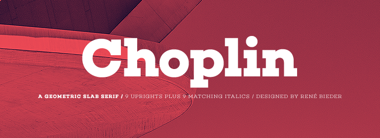
This modern font is based on the somewhat unorthodox Campton font family. The characters are designed using a geometric slab serif created by the German font designer René Bieder.
It is one of the best fonts for logos that has been designed to look robust and clean. The characters’ design takes inspiration from well-known fonts such as the Gill Sans or the Johnston Sans, combined with their spin to form symbols that stand out.
Its bold and absolute visual impact is an excellent font for branding purposes. It works well with a mix of images and various text sizes.
What We Recommend
We recommend using this font to design logos for magazines, journals, and newsletters which can benefit from its bold and punchy look.
This logo font will work exceptionally well for such instances, especially when combined with a visually distinct font style. For example, cases where a regular serif font needs to have a sense of commonality while still being specific enough to be considered a separate entity.
Aileron
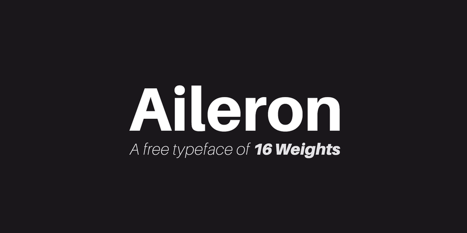
Aileron font is designed in a neo-grotesque sans serif font with an iconic lowercase L with a very slight curve. It was inspired by the design of commercial aircraft from the 1940s.
With airplanes starting to get more powerful engines to fly higher and longer and the concept of aerodynamics getting popular in the world of flight, the font this era inspired can easily be called classic modernism.
Created by Brazilian designer Adison Gonzales, he liked this design concept. He developed this logo font that combines a retro aesthetic with a modern minimalist approach.
What We Recommend
The Aileron logo font looks quite similar to the Helvetica font and the Univers font in design, which means these fonts can be paired together successfully. This font is an excellent choice if you want your logo to look sleek and futuristic yet straightforward.
That makes it an excellent choice for clothing logos.
Bodoni Egyptian Pro
This font was designed for one single purpose – to throw conventional font trends into disarray. This font accomplished this by taking the basic Bodoni font and modifying it into a single-stroke weight style.
This is one of the best fonts for logos made up of a single line of pixels. Moreover, the other seven styles available make it wonderfully distinct from different logo fonts.
What We Recommend
Considering it has such font styles, using different weights can provide excellent contrast while still being similar enough to circumvent clashes.
This multifaceted font is an excellent choice for businesses who want to move towards a more modern approach and wish to embody their past and heritage within their logo.
Professional Logo Fonts
The professional world has different ideas and beliefs regarding what fonts work best in the corporate world. These fonts sport a no-nonsense design, which translates well to simplicity, austerity, and corporate elegance.
So if your emblem needs to embody your brand’s straightforward, no-nonsense business ethic, then the fonts for logos listed below are some of your best options.
Garamond
The Garamond is a relatively older and popular font, which has spawned numerous variants such as the Adobe Garamond, the Stempel Garamond, and many more.
Rather than covering each variant separately, we have used Garamond to refer to all the popular variants of this logo font. Based on the original Garamond typeface, a majority of the variants are classically professional logo fonts.
Initially designed by Claude Garamond and Jean Jannon in the 1500s, the font features an elegant design that combines grace and simplicity in each character. It is a serif font, with each serif being unique in design.
What We Recommend
The addition of serifs to this otherwise straightforward font allows it to be used in various situations, especially professional or corporate scenarios. Also, the characters’ sharp lines make it a great option to pair with a stylistically different font effortlessly.
Timeless elegance is this font’s forte, and using it for your logo can help your brand embody those qualities.
Nunito Sans
This font belongs to the Nunito family of typefaces and fonts, consisting of perfectly balanced sans serif characters. While all the good logo fonts in this family are san serif, Nunito Sans named Jacques Le Bailly created this font as an extension of the creative persona of this typeface.
Available at the Google Fonts Library, it is one of the most popular sans serif fonts in that collection. The font characters are characterized by a high x-height (distance between the baseline and top characters) and short descenders (the tails of letters extending below the baseline like j and g).
What We Recommend
This font can work for many professional scenarios available in fourteen different weights, whether corporate or conventional. Its typefaces also allow it to merge well with other classic logo fonts like the Montserrat and Theano Didot.
If you want to portray a sense of constant evolution and growth through your brand logo, this font is a great choice to add to your logo’s font set.
Rockwell
A veteran font used for almost a century now, Rockwell has seen its popularity wane within the past few years. Despite that, it is a classic, tried-and-true font option for corporate logos for decades.
The design of the characters is quite simple. Featuring an evergreen slab serif font for logo, the serifs are unbracketed. Each serif is the proportional weight to the symbol being used.
Based on the concept of minimalism and simplicity, the characters of Rockwell are a great visual treat. The font looks clean and uncluttered, and looking at a logo using the font does not distract you with useless visual flairs.
What We Recommend
If your logo needs to portray a sense of practical business practices, this is the correct font. Combine two different weights of this font, or add another complementary font to get an impactful logo without embellishments.
Famous Logo Fonts

Several fonts have influenced some of the most well-known logos globally or have been used to design custom typefaces for some big businesses.
Suppose you are looking to open a new business that serves a product or offers a service similar to a big and famous brand. A great way to benefit from their success is to use a typeface that looks similar to the one used by the famous competitive brand.
Have a look at the logo fonts below, which have been the inspiration for many famous logo designs over the years.
Bodoni
This is one of the best fonts for logos that defines how the combination of thick and thin lines can create an alluring and stylish font. It can work very well for fashion and lifestyle logo scenarios.
The designer, Giambattista Bodoni, used this concept of thick and thin lines to create this font that features stroke widths from both extremes of the spectrum. This stylized font has inspired many wordmark-based logos such as Vogue and Calvin Klein.
What We Recommend
The success of logos with a similar typeface to Bodoni shows a great option to use from couture, style, and fashion logo fonts.
Similar in character style to the Didot family of typefaces, this logo font can be combined with fonts from the Didot family to enhance the impact of the logo you are designing.
Suppose your logo represents a fashion-related brand that wants to redefine the industry’s limits. In that case, using this font for your logo is a great start.
Didot
Named after the famous French family from the 18th century, composed of painters, punch cutters, and publishers, Didot is logo font known for its elegance and subdued class. The family created many variations of the Didot font. A few modified further to create the logos for famous brands like Giorgio Armani.
Like the Bodoni font, the contrast between the thickness of the lines creates a visual allure that makes it a good choice for designs where subtlety is required.
What We Recommend
Like Bodoni, this font is usually found in fashion and lifestyle applications. However, unlike Bodoni, the font is more subdued, making it the ideal choice for those brands who want their logos to embody a calm sense of reassurance.
Futura
This is one of the best fonts for logos that have seen widespread use during the last century. Airlines, banks, and even logistics companies have used this font to improve their brand logo’s impact.
The clean and straight lines, sharp angles, and geometric shapes make this a lovely and visually assertive font of choice. That makes it an excellent option for those looking to base their logo around a wordmark.
Designed based on Germany’s artistic expression at that time, this font is all about function and order.
Conformity between all characters and their design and the bold and blocky font’s ability to assert itself into the consumer’s view is what this font is all about.
What We Recommend
As a classic bold sans-serif font, this is a great choice where the logo is based entirely around a wordmark. This font can increase the impact of a wordmark logo, as can be seen in FedEx and Swissair.
Frequently Asked Questions
| How many logo fonts should you use in a logo? You can use more than one font for your logo design, but it is generally recommended not to use any more than three fonts in a single project. |
| How to combine logo fonts? Combining logo fonts requires balancing the similarities and differences between the fonts you have chosen for your design. It would be best to balance fonts, which are not too similar or too different. |
| What makes a good font pairing? A good font pairing is where the fonts are similar enough to allow a sense of conformity. However, they need to be different enough to stand out independently of each other without losing the logo’s overall impact. |
| How to choose the right font for your logo? Choosing the right font requires that you realize the requirements of your logo. These requirements include the consumer demographic, the tone of the business, the product or service you sell, and much more. The font that can help your logo embodies the qualities according to the perfect logo font requirements. |
Best Fonts for Logos Can Make or Break Your Business
After going through the entire article, you now know why the perfect logo font is hard to find and why finding it is so important.
With the list of best logo fonts before you, you can now find the best font or fonts that would enhance your brand logo easily. Using the right mix of typography and imagery will help you make your brand visible to a broader range of people.
Different people may perceive an image differently, but a company name or motto is written down; now, that cannot be perceived differently. That is why suitable fonts are so important in the field of logo design.
If you are looking to get an attractive and appealing logo for your business, Logo Poppin’s expert design services will deliver the best logo to represent your brand perfectly.
Logopoppin
Logopoppin is a graphic design agency that specializes in logo designing, web development, video production and advanced branding services. We love to innovate businesses with new age technologies, allowing them to improve their visual reputation.