Table of Content
Discover the Elements and Features That Form Cool Sports Logos
Be it corporate or sports logos, elements such as color palette, simplicity, negative space, and typography are essential, as they complete the entire logo design and make them memorable.
But it’s necessary to know that it’s the dynamism that makes a logo stand out. If you explore sports logos history, you can identify the trait in various sports team logos.
When designing a logo for a sports team, it needs to demonstrate history, vigor, identity, and culture. Take typography as an example.
Meanwhile looking at the fonts used in logos, you will find that they are bold and weighty. The reason to keep the fonts bold is to symbolize the sports team’s strength, courage, and zeal.
So, let’s take a look at some examples of cool sports logos designed by professional chicago logo design services agency, and discover how to use them as inspiration to come up with your own cool design.
Best Sports Logos in the NFL
When it comes to the National Football League, no can deny that sports some of the best sports logos of any American sports league. From the Detroit Lions logo to the abstract Washington Commanders symbol, there are many options to choose from.
However, here we are going to include a few of those sports symbols, especially the ones that many NFL fans agree have something special in their design. Let’s find out what they are.
NFL Logo
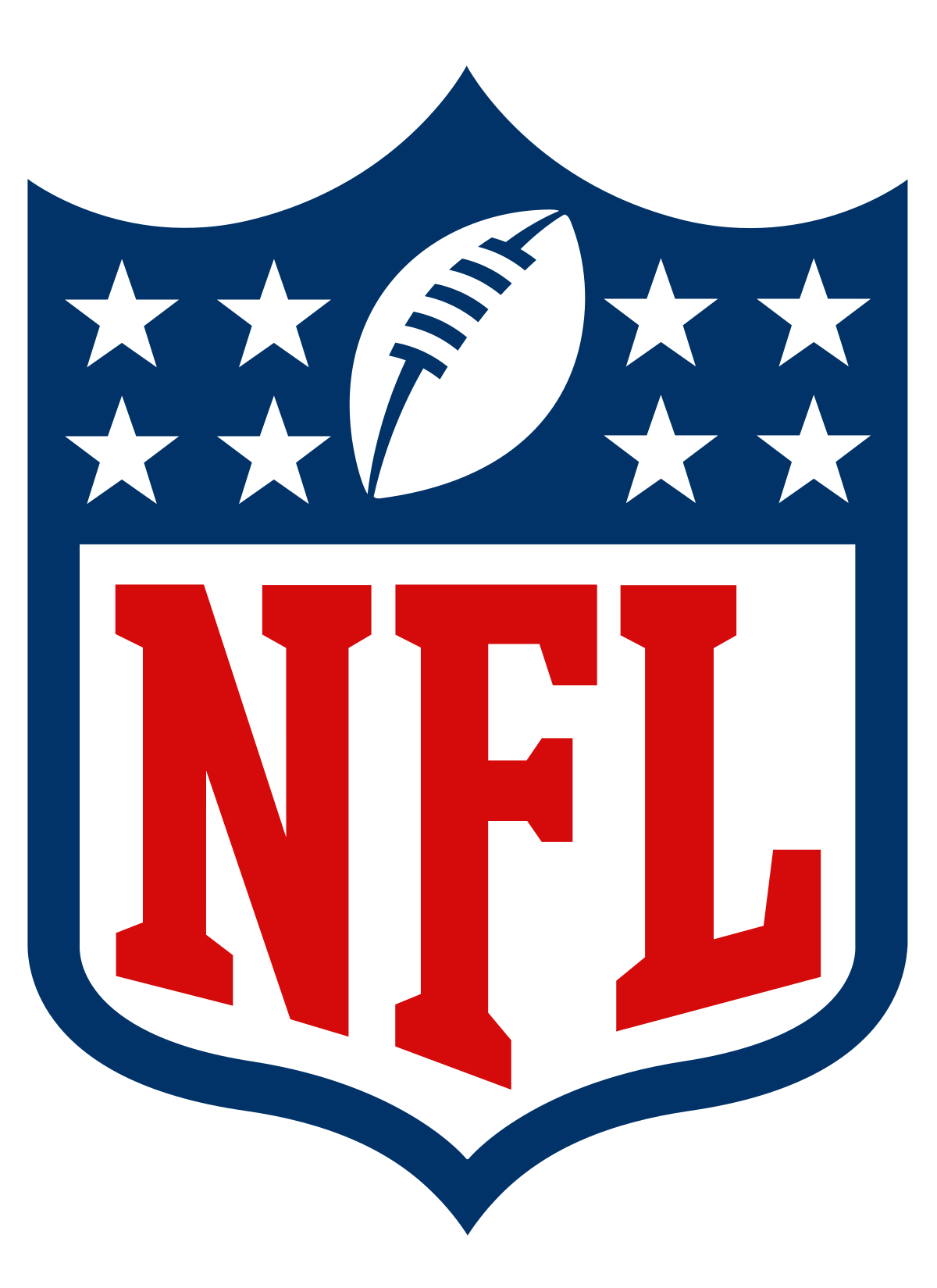
When it comes to iconic sports logos, no one can beat the class of NFL logos. It represents a sport that is highly popular among the Americans. From youngsters to adults, everyone likes to go crazy in the support of their favorite teams in NFL. The logo itself showcases a true bold image of the league. Though, it has seen some minor changes in the last few years, but still it remains a symbol of elite sports in US.
Philadelphia Eagles Logo
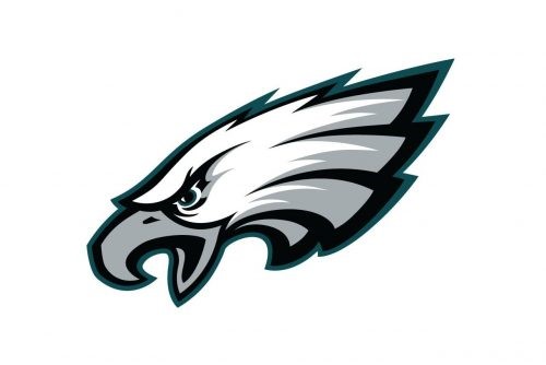
Have you ever thought about why logo designs feature animals? You can find plenty of logos carrying bears, lions, and other wild animals. Similarly, the Philadelphia Eagles logo features a stunning eagle. The reason for choosing a fierce eagle emblem for a sports team could be the wild bird’s strength and determination.
No doubt, the logo represents excellence and history. The featured eagle and franchise’s name was inspired by the Blue Eagle symbol of the New Deal Stimulus Program, introduced in the 1930s. Moreover, the logo is memorable, one of the factors that see it added to nearly every list of cool sports logos.
New York Giants Logo
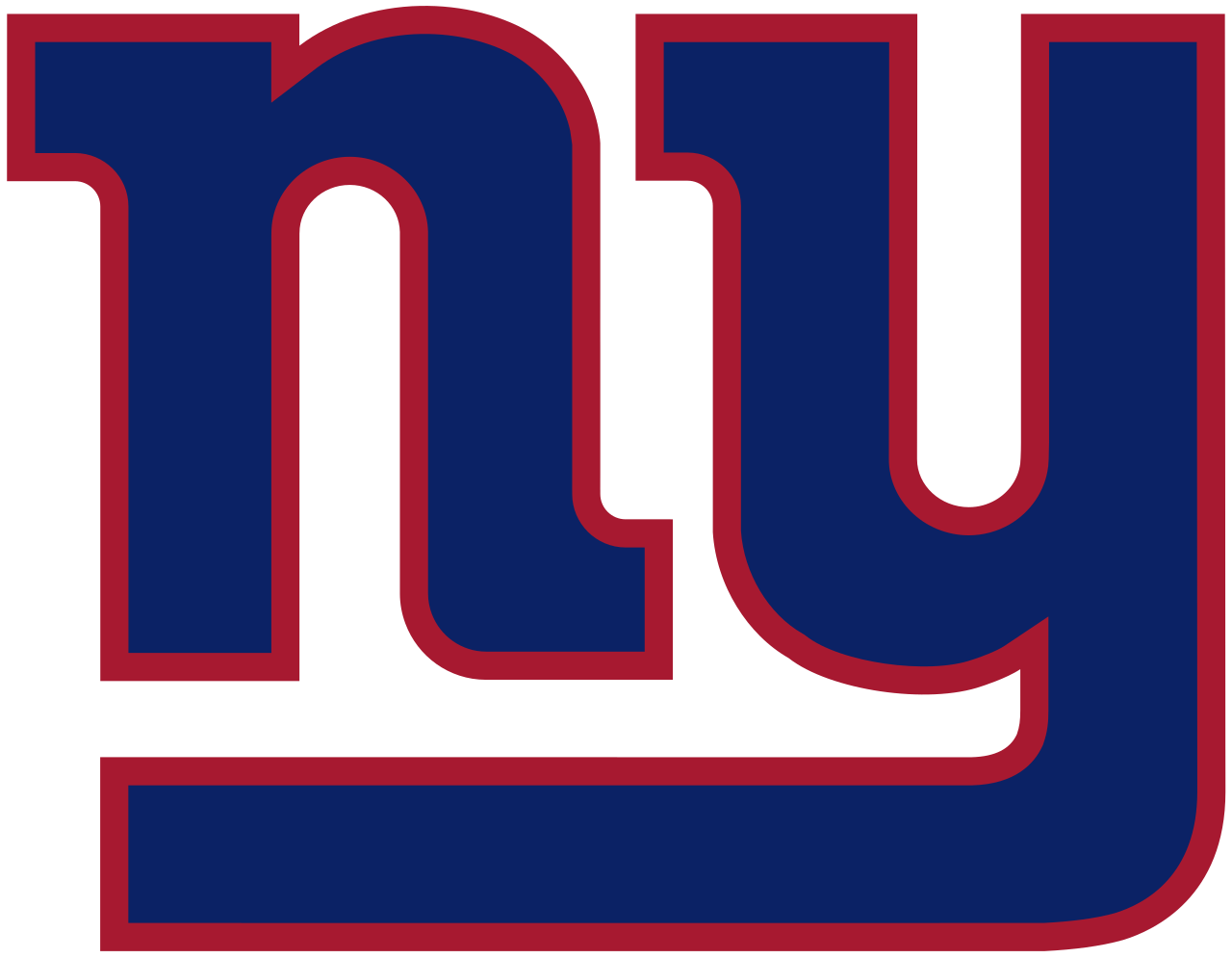
With a captivating red and blue color scheme, the New York Giants logo with lowercase letters “N” and “Y” grabs attention instantly. The current version was developed in the year 2000. The design makes it a great example of a simplistic yet aesthetically pleasing logo.
However, the New York Giants logo has gone through various levels of modification and has faced controversies too. In the early 70s, the logo featured the acronym of New York “NY”, which was changed to “Giants”, when the team was moving to New Jersey.
Chicago Bears Logo
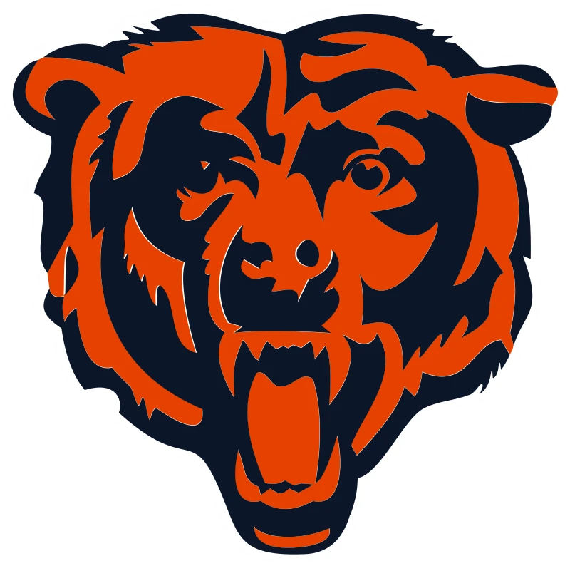
Chicago Bears is a famous NFL franchise based in Chicago, US. The team has won countless titles in the national football circuit, showcasing its true dominance in the field. It is the major reason why the team has got thousands of followers in the country. The sports logo of the franchise is highly popular among the fans. The bear face portrayed in the Chicago Bears logo shows a flare of exquisite boldness. This makes the whole emblem highly energetic, showcasing the true values of the franchise.
Miami Dolphins Logo
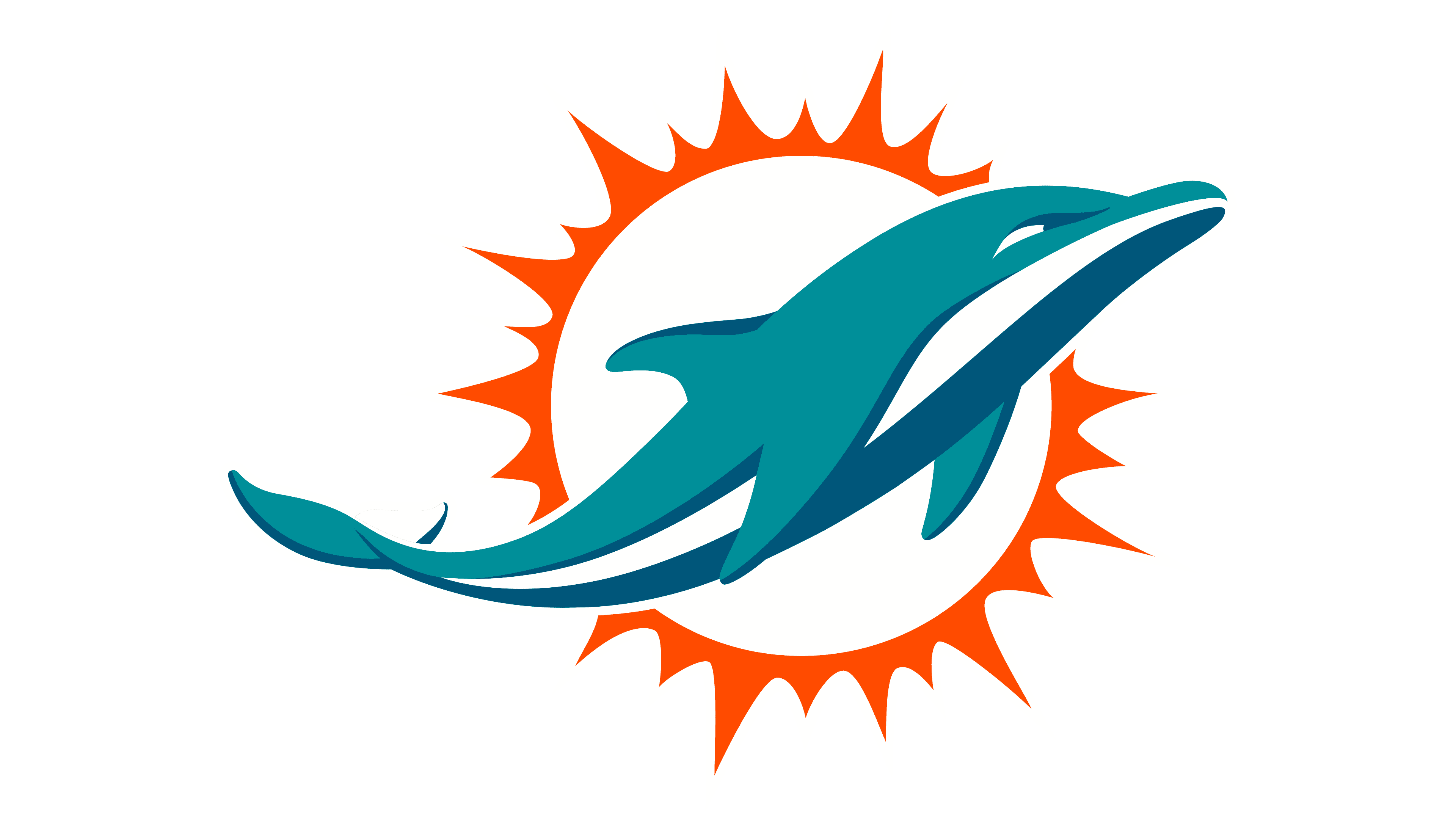
Miami Dolphins is yet another a popular NFL franchise known due to its powerful gameplay. The iconic Miami Dolphins logo is unique as compared to the other teams. The representation of a dolphin in the sports logo makes its whole identity standout among others. This design has seen few moderations in the last decades. The primary thing that remained constant in the logo is the demonstration of an endearing dolphin.
LA Rams Logo

The Rams has always remained a top name in the American NFL circuit, whether it was as part of Cleveland, St. Louis, or Los Angeles. The full name of the franchise is Los Angeles Rams, but it is mostly referred to by the name of Rams. The logo of the franchise is quite simple as compared to other sports logos in the NFL.
It uses an combination wordmark incorporating the profile of ram horns into the flared design. Yet, the overall presentation of the LA Rams logo is very impactful, demonstrating a strong branding of the club.
Top Sports Logo Ideas in the NBA
Like the NFL, the National Basketball Association has a vast fan following, both in the US and abroad. The association has long fielded a variety of teams playing a number of matches, far more than the NFL, in a single regular season.
With such a popular sport, the probability is high that there will be more than a handful of cool sports logos on the roster. So, let’s see what basketball logos from the NBA have a great design.
NBA Logo
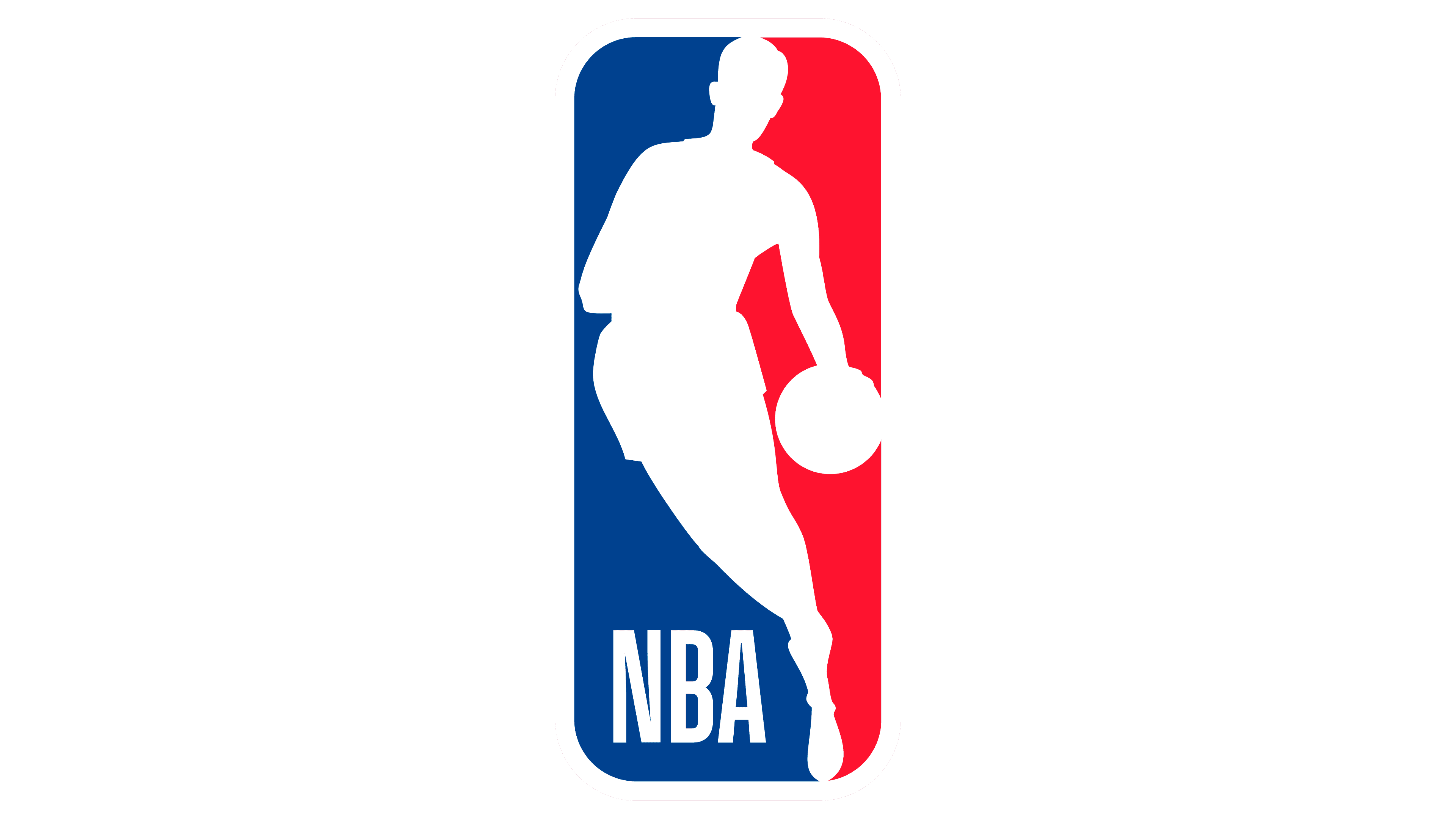
The NBA represents yet another a popular sport in US i.e. basketball. Unlike football, which requires a lot of equipment to play, basketball is a relatively casual sport, which is why children across the world play it. This is the major reason why NBA logo is also quite renowned in the sports circuit of America.
It has a very distinctive look as compared to other sports logos in the Big-Four group. The design is clean, simple and draws the eye. Over the years, it has seen various types of modifications due to the changing trends. The modern NBA logo was introduced in 2017, and it is indeed termed the best version of all the early predecessors.
Golden State Warriors Sports Logo
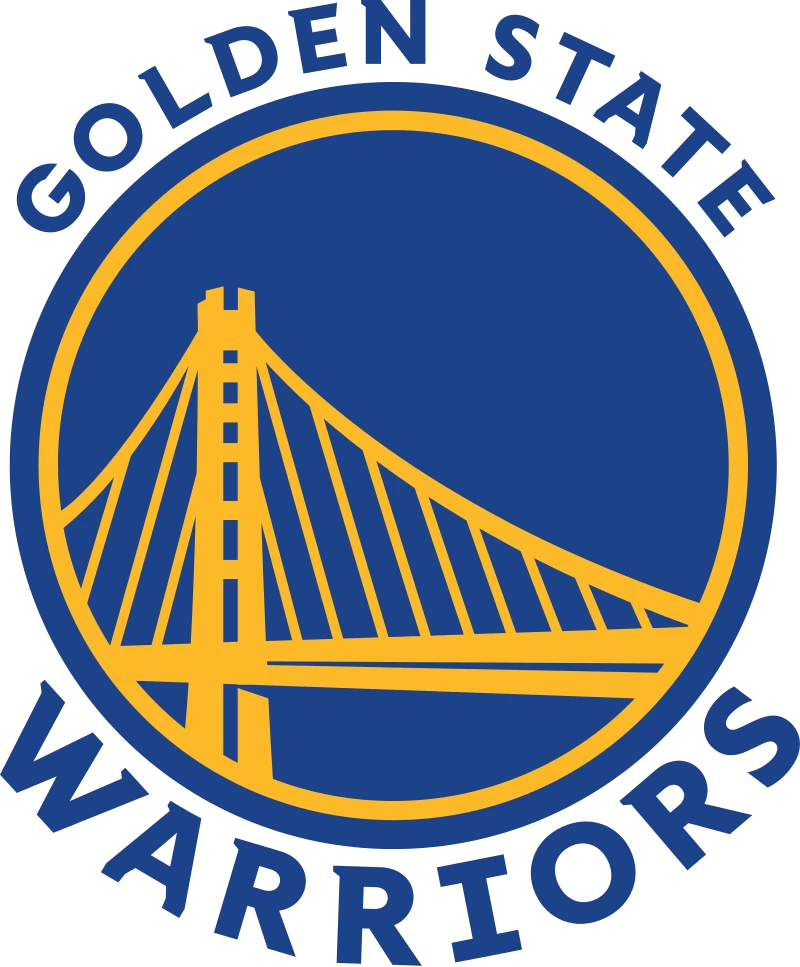
The Golden State Warriors make a great example of cool sports logos without names. It features the Bay Bridge, a bridge that crosses the entire San Francisco Bay in California, as a central feature of the stunning logo. The design elements of this amazing mix of circular and triangle logos makes for an easily-recognizable logo for any NBA fan, with the contrasting shapes making it easily legible at long distances.
While talking about the team, you cannot ignore the high contrast colors in the logo. The subtle combination of the yellow and blue background adds meaning to the bridge and incorporates aesthetics to the overall design.
Milwaukee Bucks Sports Logo
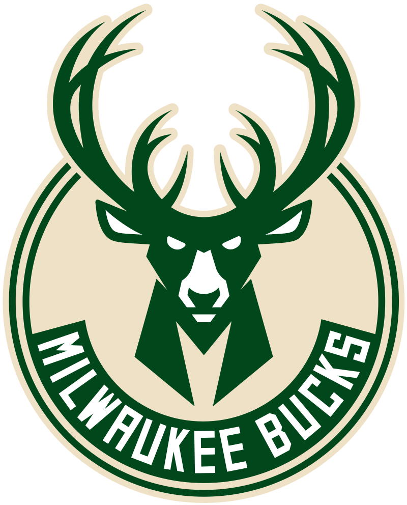
Do you want to add strength, vitality, dynamism, and strength to your sports logo – all in one design? You need something like the Milwaukee Bucks logo.
No doubt, the buck serves as the fundamental element of the team’s logo. But have you looked at the buck’s eyes? They depict the team’s determination and unity, which make it one of the best sports logos in the NBA.
The logo has other elements hidden in it, such as the shape of basketball in the middle of antlers. Moreover, you can spot the letter “M”, written in an edgy font representing Milwaukee and connecting to the buck’s head.
Boston Celtics Logo
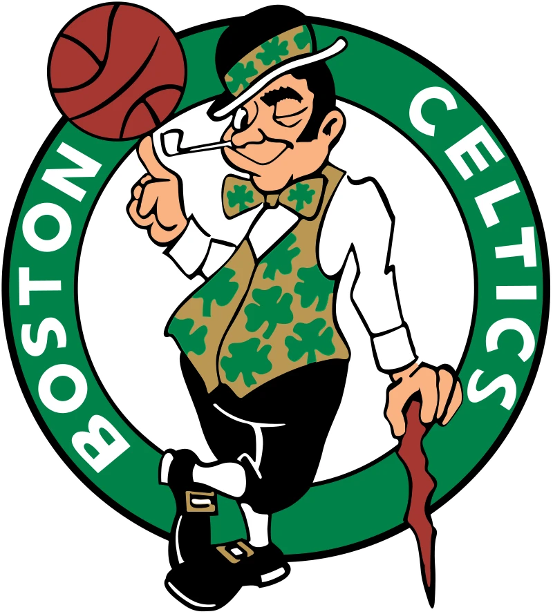
Boston Celtics logo is unique in various ways. Most importantly, the designer, Zang Auerbach, successfully incorporated elements of Boston’s Irish origins into the logo. You can see the generous use of green color with the shamrock symbol in the design, as well as the leprechaun. These elements represent the team’s Irish roots.
The logo was designed in the 1950s, but the elements and careful selection of color scheme made it one of the most famous logos for the sports teams. You can also try incorporating elements as you see in the Celtics logo that made it iconic
Atlanta Hawks Sports Logo
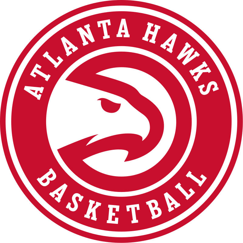
The Atlanta Hawks logo is one of the few sports logos on this list that follow the monogram logo design. The circular design of the logo with the symbol in the middle and the name around it makes it perfectly versatile for use on a variety of medium, from merchandise to uniforms. Moreover, the logo features a semi-circle that resembles Pac-Man, a hidden detail we will discuss later.
These elements don’t only draw attention to the logo but showcase the high level of creativity used to develop a fantastic logo.
Do you know why the semi-circle looks like Pac-Man? It’s because, in one of the seasons, the Hawks recorded the highest sales for the Pac-Man gear.
Following the example of other sports logos, the franchise incorporated the eponymous character into its design to stand out.
New York Knicks Logo
It wouldn’t be wrong to say that New York Knicks’s logo is highly recognizable – thanks to its dynamic stature. It will remind you of a superhero’s emblem placed on the front of his costume. Designed by Michael Doret, a native New Yorker, it was designed to show New York Knicks as superheroes of basketball to the fans.
The team logo also features the franchise name, making it a fantastic example of three-dimensional sports logos with names. If you’re looking for ways to incorporate a team’s name in a logo, you can observe the New York Knicks logo for inspiration.
Chicago Bulls
Do you want to demonstrate power, strength, and aggression using your logo? Take the Chicago Bulls as an example. Most sports teams opted for aggressive mascots to develop an eye-catchy and remarkable logo. Choosing aggressive mascots is an excellent idea for various reasons, and one that Chicago seems to have taken to heart, especially when we consider their logo in the NFL as well.
Here, the angry mascot makes them look like a powerful and strong team that intimidates opponents and excites fans, compared to a lighthearted design like the Miami Dolphins’ gives a more playful vibe.
The edge horns and ears in the Chicago Bulls logo incorporate uniqueness into the overall logo design and turns it into one of the most dynamic emblem logos.
Best Sports Logos in European Professional Soccer
One of the top European sports that spans across the Americas as well is soccer, or as non-Americans call it, football. Many of the teams playing in some of the older leagues have designs that can be considered grandfathered, used for decades unchanged.
Let’s take a look at some of the best sports logos from European soccer leagues.
Real Madrid CF Logo
Real Madrid has various visual elements in its design, which make it one of the most popular initial logos in the world of sports. These elements carry important messages, which may leave you awe-struck. Let’s start with the crown, which exemplifies the Spanish region of Castile. Moreover, you can see the initials strategically arranged across the crest, representing Real Madrid Club de Futbol.
When it comes to the color scheme, it also has meaning to it. For example, the blue color stands for excellence, red indicates passion, and gold represents rich tradition. These elements make it one of the best sports logos with hidden meanings.
Liverpool FC Sports Logo
Do you want to incorporate two or more colors into a logo for a new and impactful look, but you do not want to use flat matte colors for your design? You can take Liverpool’s symbol as one of such logo examples, with a dark red and greenish teal color scheme following a polished metallic design.
No doubt, the colors yellow, teal, and red go well together. You can spot the liver bird in the logo too, which represents Liverpool and relates to the rich culture of the club.
Manchester United FC Logo
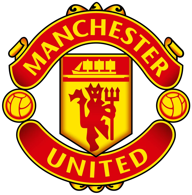
You look at Manchester United’s logo and think it looks like an embassy’s symbol to some extent. However, the elements such as the footballs on either side of the logo indicate that the logo belongs to a football team.
On the other hand, you might find it surprising to know that there’s a connection between Manchester Army Consulate and Manchester United.
As you can see, the coat of arms was made after drawing inspiration from the former. Moreover, the ship on the top of the logo showcases that Manchester is England’s chief port community. making it one of the most expressive sports logos in the country.
Arsenal FC Sports Logo
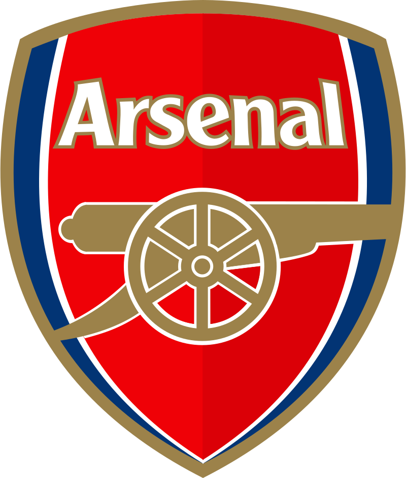
You don’t always have to use an exaggeratedly aggressive mascot in your logo to demonstrate your valor and strength. There are more subtle ways to do it too.
In this case, the logo for the Arsenal Football Club can become a great source of inspiration. It doesn’t feature an angry mascot or regal elements, but incorporates a canon as an excellent design idea to highlight the element of aggression, as well as a callback to its name.
Moreover, placing the design in a shield frame is another way of adding depth to the logo, adding weight to the name of Arsenal. The idea of using the shield helps showcase strength and fortitude, which is a great vibe for older sports logos.
Cool Sports Logos in the MLB
Major League Baseball is often considered less popular than the NBA or the NFL. And to some extent, that is true in the modern age. However, there is a reason that baseball is still known as “America’s favorite pastime”, despite NFL viewership numbers far exceeding that of the MLB.
So what are some amazing sports logos used by the MLB teams, inspiring little league and softball logo ideas for the younger generation? Let’s find out.
New York Mets Logo
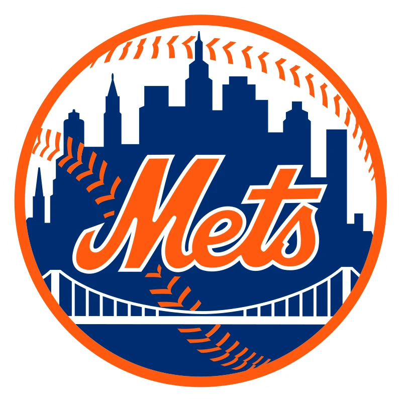
Ray Gatto designed the logo for the New York Mets in 1961, and it is nothing less than a masterpiece. When you observe the logo, you will see the team’s rich history summarized in it. The New York Mets logo features the four boroughs that connect New Yorkers, representing the entirety of New York City.
Moreover, in the middle, you can spot the Empire State Building. The tallest skyscraper in Brooklyn can be seen in the logo too, which is the Williamsburg Savings Bank. This makes it one of the most expressive MLB logos on this list.
Boston Red Sox Sport Logo
Did you know the red stockings or red socks are the primary elements of the Boston Red Sox logo since the early 90s? The red socks in the logo have been modified several times since 1931. They have played a significant role in defining the team’s success. If you’re genuinely enthusiastic about baseball, you take only a few seconds to recognize these iconic red socks.
Los Angeles Dodgers Sport Logo
Since its original inauguration in 1899, the logo for the LA Dodgers has been modified and tweaked a number of times. It’s safe to say that the Dodgers logo is one of the best sports logos in MLB history. The current variation is apparent and has a contemporary appeal to it.
The design features a baseball with lines emerging from it, which is simple but works well for a sports team. Moreover, the classic baseball-style script typography completes the whole design and adds aesthetics to it.
Suppose you want to incorporate a specific aesthetic into your logo without making it look cluttered. In that case, you can play with various baseball fonts and choose the one that complements the entire logo design.
NHL’s Amazing Sports Logos
The National Hockey League is the fourth sporting association in the US, rounding up the Big-Four sports leagues in the country. Ice Hockey is a sport that is not played across the entire US, due to the fact that it is hard to manage an ice hockey rink in the warmer areas of the countries, especially those that see no sub-zero temperatures.
Despite that, the sport has a large following across US and even Canada, with children as young as 2 or 3 years of age learning to play. So, let’s take a look at some of the cool sports logos representing this icy sport.
NHL Logo
Just like basketball, ice hockey is also a favorite sport of many Americans. It has got a great history in the country, which is why people are really passionate about it. The NHL is therefore a highly famous sports entity in the US and Canada.
Despite the fact it is not played across the entire country, unlike the other three sports, you will not find any American without basic knowledge of the NHL. The shiny red and black combination in the NHL logo looks really fantastic, illustrating a strong and cold identity of the league.
Calgary Flames Sports Logo

The Calgary Flames logo for the Canadian ice hockey team represents several truly astonishing. The transformation of the letter “C” to the flames is one of the attention-grabbing elements of the logo. The flames in the logo represent the town of Calgary that was burnt during the Civil War.
The designer, Patricia, did a great job by incorporating flames in the logo. Because Calgary is well-known for its oil industry, these flames make it an appropriate representation of the cosmopolitan city in Alberta. This simple design has made it one of the few evergreen and iconic NHL logos still used today.
Philadelphia Flyers Logo
This wing-like symbol belongs to the ice hockey team, Philadelphia Flyers. The stylized wings and color combination of black and white have nothing to do with the city. If you observe the logo, you will see that the wings make the notion of the letter “P”, which is transforming into action.
The logo makes the best example of adding unique elements to a logo and making it perfect. The way the designer placed and designed the letter “P” to the logo showcases utmost creativity.
Detroit Red Wings
Did you know one of the essential principles of having a logo is memorability? With sports logos, it often gets difficult to stand out, as the majority go for the same design playbook.
However, the logo for the Detroit Red Wings broke all stereotyping associated with its sports logo design. And the result is a recognizable design adored by the sports team’s fans. It also tells you to think outside of the box and not be afraid to experiment.
The flying wheel in the logo looks unique, and the detailed feathers and intricate wheel hubs incorporate aesthetics to the logo design.
Honorable Mention – New Zealand Rugby Union Sports Logo

What if we tell you it’s possible to use your logo for dual purposes? Don’t believe us? Let’s take a look at the New Zealand Rugby Union logo.
Since Rugby is the national sport of New Zealand, there’s no denying that the governing body might have invested in its logo to serve its purpose correctly. The logo also represents the rugby team and the organization that manages those teams.
Moreover, it satisfies the requirements of both a business and sports logo, which is truly inspiring. The New Zealand Rugby logo has the best of both worlds when it comes to color combinations and typography.
The simplistic black and white colors with artistic visuals make it a perfect design. Lastly, you can’t ignore the attention-grabbing typography, as it makes the logo unique.
Tips to Design Cool Sports Logos
Do you think brainstorming and researching are enough to develop a cutting-edge logo for the sports team?
The sports team logos need to be inspiring and engaging, and developing the kind of logo can be challenging, especially when we consider how they will work with our sports website design ideas.
Following tips can help you design a fantastic logo that will intimidate the rival team and excite the fans.
Add Aggressiveness in Your Sports Logos
Most sports teams follow the trend of having an aggressive version of their mascot. It could be a bear, like the Chicago Bears logo, or it could be lighthearted like the Boston Celtics logo.
For example, historical figures such as Romans and Spartans can make the best aggressive mascots. You can think about medieval knights, pirates, or ninjas before choosing a mascot for your logo.
Go for Edgy Points
According to creative designers, the human eye instinctively follows the lines of a design. This practice contributes to adding emotional connotation to the specific shapes.
For example, a circle is considered a playful shape. Your eyes also move while you look at it. Similarly, sharp or edgy points help create specific spots to arrest a viewer’s attention.
The sharp edges and points make the image visually interesting and help make the viewer attentive. Also, the sharp edges aren’t for mascots only. To add edgy vibes to any sports team logo, you can play with spikes, blades, and other aggressive imagery to spice things up.
Go for the Right Sports Logos Fonts
Incorporating typography into your logo design is helpful. This is because you can’t rely on just an image to convey the tone you want. However, you need to be careful when choosing the right fonts because if it doesn’t align with the imagery, the logo won’t create an impact.
You can also leverage the style of the typography to embody the desired emotions and vibe. Sharp serifs, bold slabs, and rounded edges are all elements that can affect a logo’s perception.
Moreover, you can emphasize the middle word by buckling it, and bend the first and last letters to create an arch. This idea will create a slightly 3D effect, make it fun to read and recognizable.
Think About Framing in Sports Logos
Framing in logos is essential as it keeps the elements of a logo together. It combines the visuals and texts to incorporate unified vibes, keeping the image aesthetically pleasing. Using frames also draws attention to the focal points of the logo design.
Moreover, a sports team also needs to unify its fan base. When it comes to framing, you can go for anything from circles to shields.
Look for a Suitable Symbol
No doubt, everyone knows about various big-league teams. For example, every football fan knows about the Dallas Cowboys and their unique NFL logo. However, this isn’t the case for local or club teams.
They need to inform their viewers of the sport they play before they want people to come to their games. The majority of these teams incorporate symbolism into their logos, which showcases the sports they play and the values they stand for.
As a team owner, you can also enhance the symbolism further by adding elements depicting what you play. However, you need to ensure that the elements you use do not turn your brand symbol into an example of generic logos.
Frequently Asked Questions
| Are sports logos copyrighted? Brand archetypes are 12 different kinds of business personalities that can evoke certain emotions in customers and relate to them deeper. |
| Are popular sports logos trademarked? Yes, they are. You shouldn’t use logos without prior permission of the club or franchise. For example, the logos of various NFL teams are trademarks, and the NFL owns them. You can only use the trademark logos without liability after the owner’s permission, which is called the license. |
| How to design an amazing sports logo? Designing a sports logo involves a series of steps: – Begin with brainstorming. – Conduct research. – Find inspiration from various types of logos. – Choose a suitable font. – Draw a few logo designs. – Refine ideas & seek feedback. – Pick the best design, and start using it. |
| How do I get permission to use popular sports logos? First, you need to find whether or not permission is necessary. Then, if the logo is protected under a specific law. You need to be clear on the usage and ensure it wouldn’t violate the law. Identify the trademark owner and the required rights. You also need to contact the owner and get permission for a written agreement. |
Final Words
The best way to design cutting-edge sports logos is to remember that no one roots for a team that doesn’t inspire. A sports team logo also helps in making the first impression on sports fans. If your logo showcases bravery and power, people are likely to be a part of your community.
Moreover, focusing on typography, color palette, and other elements can also help you create a captivating logo for your sports team.
Indeed, designing sports logos with hidden meanings and adding visual appeal to the design doesn’t happen overnight. And it isn’t easy to incorporate athleticism and passion across your logo, either. But don’t worry! We can bring your logo design idea to life, showcasing the elements that help you stand out.

Logopoppin
Logopoppin is a graphic design agency that specializes in logo designing, web development, video production and advanced branding services. We love to innovate businesses with new age technologies, allowing them to improve their visual reputation.

