
Table of Content
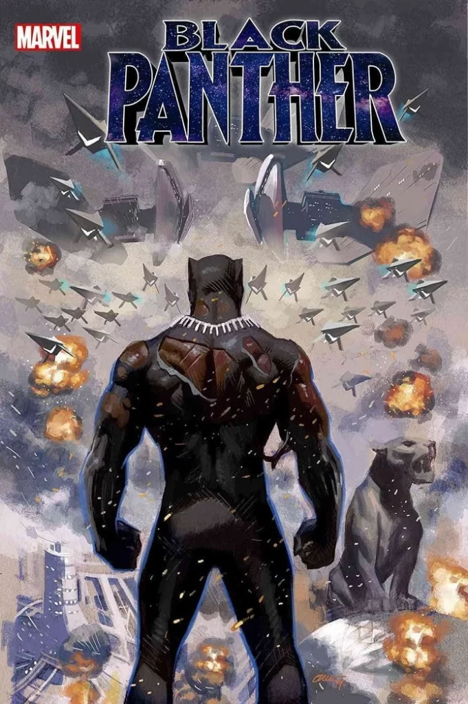
Discover How the Black Panther Logo has Evolved Over the Years
The majority of fans of the superhero genre today started out with the live-action or animated adaptations of their favorite characters. As such, it often happens that these fans do not know the rich history behind some of the more recent additions to the rosters, whether its DC or Marvel.
Take, for example, the character of Black Panther. For cinematic adaptation fans, he was a new and exciting character added to an steadily growing cast of characters. However, for fans of Marvel’s comics, the Black Panther logo has been a mainstay for quite a while. From standalone storylines, to overlaps with the Avengers, the X-Men, and even the council of geniuses called the Illuminati.
Over the years, different storylines have introduced different versions of the Black Panther. From the one from 1,000,000 BC who joined Odin and Agamotto in defeating the Fallen, or Olumo Bashenga, who united a number of warring clans to form the nation of Wakanda, there have been many.
So, how does the comic books and other adaptations represent this character? What does the logo attributed to the character tells the viewers? And how can someone offering logo design services capture that for their own designs?
Let’s find out.
Black Panther – An Overview of the Iconic African Superhero and Its Inception
Black Panther is an African superhero who rules the technologically advanced nation of Wakanda in Africa. Given their superpowers via a spiritual connect to the panther goddess Bast, as well as the imbibing of a heart-shaped herb; the Black Panther protects his people from threats, internal or external.
Making their debut as the first mainstream superhero of African descent in comic books, Black Panther paved the way for many others in the Marvel Universe and DC. That includes characters like Luke Cage, X-Men’s Storm, Goliath, and more.
However, unlike other characters like Iron Man, Mister Fantastic, or more, the character Black Panther is kind of a mantle or position that is held by the Wakandan ruler. Now, the version of the character that most people are familiar with is T’Challa, who introduced the character of Black Panther to the wider world in the Marvel Universe.
What is so unique about the character and its popularity is that it was released in mid-1960s. That was an era in American history that was rife with racism, social inequality, and downright violations of human rights against the African-American citizens in the country. And at that time there was some worry among Marvel execs and Stan Lee as to how far they could risk promoting and displaying the character. This theme was also explored when they were introducing the X-Men logo and storyline earlier.
However, despite those misgivings, the character and his storylines continued to be produced, depicted fighting against enemies such as the Ku Klux Klan, or the Nazis. The storylines proved popular among the comic books’ African-American fans, as well as college students who were more open-minded and neutral on the subject.
Despite that, the conservatively cautious attitude of the comic book creators and the resultant tame storylines meant that the stories didn’t gain the widespread acclaim of other superheroes from that era. And it wasn’t until writer Christopher Priest and artist Mark Texeira created The Black Panther Vol. 3, and introduced characters like US State Attorney Everett Ross, that the gaps between the white fans and the POC fans began to improve.
Moreover, the involvement of the character with other American superheroes like the Fantastic Four and Daredevil also helped improve the character’s popularity. That, combined with the recent portrayal of the character in MCU helped bring the character into the limelight for a large number of fans.
Demystifying the Black Panther Logo Symbol– What Does it Represent
When we talk about the Black Panther logo, many of the MCU fans may be confused as to what it is. Unlike say, something like the Captain America logo, which is quite intuitive in its idea as the symbol for the character, what could be the symbol for Black Panther?
Well, to put it simply, the primary logo for Black Panther is a wordmark. Now, the reason it is a wordmark is because when selling comic books, the company needs to have something on the cover that is easily visible and decipherable. And the best way to do that is to use a wordmark over a symbol.
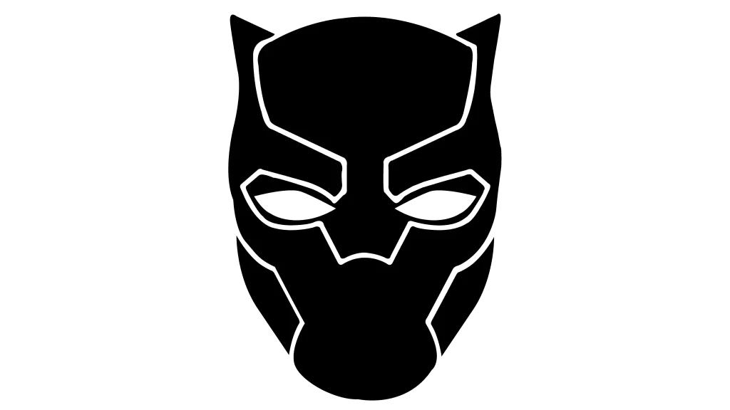
However, there is a symbol that is used by the MCU, even if it is barely seen. The design is that of the Panther’s facemask, complete with the cat ears and the vibranium seams over the design. Just like the Iron Man logo symbol that features the outline of their helmet, the Black Panther symbol is a great representation of the hero and what they stand for.
But what does it represent? Well, it represents the multifaceted African culture that follows various pantheons. Moreover, it challenges the predominant belief at the time that Afro-Americans and other people of color were inferior human beings compared to the predominantly white Americans.
The storylines also generated discourse on the subject of how western military and capitalist entities exploit these cultures, and portray them as the aggressors should they retaliate. All of these storylines helped bring the plight of African-Americans and other people of color out to a multitude of people, via a neutral medium like comics.
The result was the inclusion of more superheroes of color, such as Marvel’s Blade and Falcon, or DC’s Black Lightning, Cyclops, and more into mainstream comic book storylines.
Evolution of the Black Panther Logo
Now that we have seen the inception of the Black Panther character, and the idea behind their iconic symbol, let’s take a look at the Black Panther logo. Although introduced in the mid-1960s, it wasn’t until the middle of the next decade that the first logo for the character was revealed.
So, without further ado, let’s take a look at the evolution of that symbol, from the one released in the 1970s to the MCU version we know today.
Jungle Action Volume 2 Black Panther Logo 1972 – 1976
In 1972, Marvel Comics the second run of their Jungle Action series. The series was quite popular among college students, who were more accepting and amenable to reading fiction and comics featuring people of color as leading characters.
The start of Jungle Action Volume 2 in 1972 first introduced people to the logo for Black Panther. The wordmark was written in a distinctly wild style, with big, blocky letters spelling out the words. The edges and lines of letters, rather than being smooth and clear, had a rougher edge to it, giving the perception of being a little primitive.
The color combinations used were a little interesting. The letters were colored white, with a black outline. The design of the letters made it seem as if they floating above the canvas, casting a shadow underneath. And to portray that shadow, the designers used a bright red.
The overall perception of the logo was to portray a sense of primitive savageness, a perception you would expect to see in a storyline featuring a black character as the protagonist.
Volume 1 Black Panther Logo 1977 – 1979
While initially reluctant to give Black Panther and other black characters more visibility, by 1977 Marvel had to face the reality that Black Panther had become a popular character. In fact, it had fans enough that it now merited a standalone series, one of the few characters Marvel had individual runs for.
There was another reason for this decision too. Marvel execs, as well as Stan Lee was worried about the backlash of the people if they gave the character a bigger role in the Avengers or other comic runs. However, deliberately benching a popular and one of its kind character in the Marvel roster, or scrapping them entirely would be a gross betrayal of the company values. Moreover, it would have served to alienate the numerous African-American designers and other employees at the company.
The standalone series served to fix both issues, and this hallmark event called for a new logo. This Black Panther logo featured blocky, sans-serif letters that made up its wordmark. Short in height, and written in all uppercase, the logo aimed to reduce the savageness that was portrayed by the previous design.
The result was a bright yellow wordmark, with a thin black outline, and the shadows underneath colored a dark blue. The final logo was one that was something that well matched the Marvel logo of that era.
Volume 2 Black Panther Logo 1988
Volume 2 of the Black Panther standalone series was released in 1988, with the character appearing in other runs of Marvel including with the Fantastic Four and the X-Men during that time. This typeface had the wilder feel of vintage logo design that were often used to depict the savageness of Africans and other non-whites in traditional western media and animations.
Colored white with a black and light blue outline, it was designed to mimic the wild and savage nature of the black panther. From the color theme of the outline, to the rough, torn, and uneven edges of the letters, it was a great depiction of the animal for which the character was named.
Volume 3 Black Panther Logo 1998 – 2003
The next iteration of the Black Panther logo was revealed almost a decade after the previous one. Revealed along with the release of the Black Panther Volume 3, the new logo was one that spanned into 21st century, showing that it was one of the more iconic versions of the logo.
If you look at the design of that logo, you will find that there are a lot of similarities between this and the MCU version of the logo we are familiar with. That in itself is a testament to the logo’s capability of capturing the essence of what it meant to be the Black Panther.
The design features blocky, serif logo fonts, with sharply angled serifs on its letters. The design is quite angular, with sharp lines and spiky angles that somehow brought the essence of a panther, one of nature’s most dangerous predators, and combined it with the African element.
Keeping with the theme of the sharp viciousness of the logo, the design featured a metallic, dark to light brass gradient logo design. The result was that the letters looked as if they had been sharpened and polished to a brighter, whiter finish.
Volume 4 Black Panther Logo 2005 – 2008
2005 saw the logo revamped again. The release of the Black Panther Volume 4 cam with a few new changes to the design aesthetic of the Black Panther logo. With storylines like Illuminati and the conflict with Namor and the Atlanteans, this series featured a greater focus on the Black Panther in his role as a protector, and ruler of a great nation.
With war imminent, and conflict between different factions influencing Black Panther from all around, this logo is a great representative of that scenario. The result is a thick, sans-serif wordmarkwith bold lettering.
The design is a great examples of well-prepared red logos, and shows the letters colored in shades of red that made it seem as if they featured scenes seen from the eyes of a predator. Moreover, the letters were outlined in thick black, which made the impact of the wordmark more prominent on the viewers.
Volume 5 Black Panther Logo 2009 – 2010
In 2009, the logo for Black Panther was tweaked again with the release of the Black Panther Volume 5. This time, the design was more along the lines of traditional superhero logos, which is surprising considering that there wasn’t much that was different from the previous iteration of the logo.
The primary differences was the removal of the red from the design, leaving it completely white with a bold black outline. Secondly, there was a slight shade of black added all around the logo, designed to mimic a light shadow being thrown by the wordmark.
This shows that sometimes, less can be more when it comes to brand logos.
Volume 6 Black Panther Logo 2016
The release of Black Panther Volume 6 brought with it a new version of the Black Panther logo. The design was elegant and futuristic, quite similar to the modern Fantastic Four logo wordmark. The design of the letters was minimalist and modern, with no wasted lines, and sleek, yet angular design.
This logo had an animalistic vibe, something that suited the Black Panther aesthetic quite well. You will often notice many artists using similar concepts when creating designs that have a wild nature to them. And we believe, had this logo been used for the MCU’s Black Panther, it would have gone over quite well.
Volume 7 Black Panther Logo 2018 – Present
The latest release, also called the Black Panther Volume 7, was introduced in 2018, around the release of the MCU Black Panther film. Although the character had debuted in 2016’s Captain America: Civil War, it wasn’t until two years later that the first Black Panther movie was released.
With the movie and the comic books dropping in the same year, the logo used for the comics here was almost identical to the one used for by the MCU. This was similar to a version of the Spiderman logo that created a logo similar to the MCU’s version to connect the storylines for the audience.
The design released in this iteration had a dark, mystical air to it, colored a celestial purple with twinkling stars and other heavenly bodies swirling inside its letters. The serif fonts used is angular and sharp, quite similar to the logo released in 1998.
MCU’s Black Panther Logo 2016 – Present
Finally, as we mentioned earlier, the MCU version of the Black Panther logo is quite similar to the latest comic book logo. However, it has a few differences that add a little mystique and elegance to it.
For example, the letters are designed to look as if they are carved out of gold or brass, an homage to the 1998 logo that serves as the inspiration. However, the letters are colored is a shifting gradient of vibrant and deep blues, which gives the wordmark a visual appeal like no other.
FAQs
| What does the black panther logo represent? It represents courage and strength, and rising above the animalistic nature to retain your humanity. |
| Who is the female Black Panther? The first female black panther is Shuri, who is the younger sister of the previous Black panther, T’Challa. |
Conclusion
To sum it up, the Black Panther logo has a rich and complicated history in highlighting the African-American civil rights movement, as well as the problems and issues faced by people of color. Moreover, it signals a significant shift in the American public’s perception, as it became the symbol for the first superhero of African descent in the mainstream comic book world.
In any case, whether you like the character or not, you can not deny that it has had a significant cultural impact on the viewing habits of Americans and the western world in general.
Latest news you want to know!
Subscribe for cutting-edge design inspiration at Logo Poppin! Elevate your brand with updates on logos, branding, web design, and video animation.
Note that by clicking “subscribe,” users may agree to our privacy policy and consent to Logo Poppin to use your contact data for newsletter purposes.
Logopoppin
Logopoppin is a graphic design agency that specializes in logo designing, web development, video production and advanced branding services. We love to innovate businesses with new age technologies, allowing them to improve their visual reputation.

