Table of Content
Why do book covers matter?
A book cover design is the visual representation of a story: the first thing that readers notice when they walk across shelves in a bookstore amid the sweet smell of books. Or when they swipe through a gigantic library on Amazon. Not judging a book by its cover applies to almost every occasion except for when you’re actually hunting for books – because it’s human nature to judge, inevitable.
It’s safe to say that book covers can massively contribute to a book’s success. Sometimes becoming more iconic than the story itself. See, a book cover is like a salesperson that has to persuade readers to pick up the book and read; when it succeeds in attracting a potential reader, its primary function is served.
Why do I say primary? It’s because a great book cover does more than help in the sales of your book. It can be seen as a graphical embodiment of your entire manuscript, ideally being ambiguous and open to interpretation, so that it keeps revealing new secrets to its readers over time. Most iconic book covers are like that.
Before You Begin Working on Book Cover Design Ideas:
Beginners usually jump straight into the design process without thinking about some important aspects that can help them in their approach towards it. Before you begin, consider the two important aspects below for a good head start:
Medium of Publishing

The medium of publishing plays an important role in approaching a book cover design. The author must decide whether they’ll be publishing a hard copy of their book or a soft copy. Usually, writers who are new and are on a low budget opt for a softcopy for cost-effectiveness and easier accessibility. In any case, deciding the medium of publishing gives a direction to the designer as both mediums demand a different approach to their book cover design.
When it comes to hardcopy books, room for creativity is vast. Whereas for a softcopy, a designer’s approach to the book cover design could be very limiting. Because when E-readers browse through the catalog of books, they can’t flip them to read the back cover for a synopsis or for testimonials. Conversely, hardcover books have a dust jacket, and their inner sides provide more real estate for detailed information. Authors usually have their introduction placed inside one of these dust jacket sleeves. But the options for utilizing that space are endless. For instance, in books with a vast fictional world, a colored illustration of its map inside one of the sleeves can work as a quick referencing guide.
Your Book’s Genre
Almost all genres have their own established style of book cover designs. Therefore, before starting to work on a book cover, one must be well aware of its genre. The targeted market usually dictates the book cover style. A lighthearted cover design for a chicklet is obviously different from a YA Paranormal book. Necessarily, a designer must study the book covers of a genre and take notes of their similarities.
Here, I must stress that the established style of a genre should not be seen as a yardstick for creating a book cover that looks relevant to its genre. Because if your book fails to stand out, it will not sell. The key is to make a horror novel book cover look like one but with a distinct style. One that sets it apart from other books of the genre. For instance, if the horror genre were to have the majority of book covers with a black background, using a white one would instantly pull readers’ attention. All other elements, such as the background image and the title text, can help make the book cover design idea relevant to its genre.
Recipe for a Good Book Cover Design:
All great things require the right blend of ingredients. Anyone who disagrees needs to watch the Powerpuff Girls! Read further to learn how the elements listed below work as a recipe for good book cover design:
Typography:
The typography on a book cover has to be its most prominent element, so it needs to be legible and catchy, with an appealing typeface that defines the tone of a book. You can further explore typography book cover ideas here for inspiration.
Children’s book cover design typically has a comic typeface, while horror books typically use blood-dripping creepy fonts to represent its tone and genre. However, you have the freedom to use simpler texts, disregarding the trends of a genre, focusing on the font readability. After all, the title typeface is crucial for communicating with the audience, and undermining its importance can cause all other efforts to be in vain. Among the most popular choices are serif fonts, recommended not only for book covers but also for the body text, as they are known to be easier on the eyes.
In case one chooses to be more creative, a unique typeface can even become an important part of the author’s brand identity; readers may just need a glimpse of the title to recognize its author. And, if other authors and designers begin to take inspiration from that style, you may even become a trend-setter.

Look at Harry Potter’s title typeface as an example. The HP logo is now symbolic in itself. The book has become so popular that the fans may find the use of that typeface unacceptable even if J.K Rowling uses it herself on another of her series. The brand, thus, transcends the author. And we, at Logo Poppin, strongly believe in this as our ebook cover design services are focused on boosting our clients’ brand identity.
Color and Contrast:
As mentioned earlier, a smart choice of colors can help your book cover pop up among all others. Similarly, in creating a good cover design it’s important to create a color palette. Colors of a book cover should blend well together, but not so much so that one element begins to override the other. A balanced use of analogous and complementary colors is, thus, very important. Yellow contrasts well with its complementary color, purple. But in case we use light green text on a yellow background, it would barely be visible.

Moreover, colors not only help in creating a visual hierarchy but also set the tone of a book. So, understanding color psychology is crucial for creating meaningful art. Red represents passion, love, revenge etc. Whereas yellow represents joy and energy. The colors of a book cover can thus allude to the themes of a story.
Think of an object that is central to the story. For instance, in the case of a story that revolves around a boy who has gained powers through a green emerald charm, choosing green as the book’s color can symbolize the importance of the stone, which may not be revealed by the author until the very closing chapters. Anyone who is able to decipher that the answer to how the boy got his powers was right there on the cover will surely give a deeper look at the cover of your next book. Leaving hidden Easter eggs in your book covers could be fun! Speaking of fun, here’s a fun fact! All of the original US editions of Harry Potter alluded to the death of a character or creature in each book. The beauty of such well thought book covers is that even 13 years after the seventh HP book was published, they still made headlines!
Layout and Composition:
A good book cover has to have a good layout that keeps a balance between all elements. For a book cover that only features typography on it, the focal point will naturally be the title text. Otherwise, for a cover with many elements, it is necessary to decide how you will create a focal point to ensure all elements are shown in a balanced way. Book covers can easily look cluttered without adequate whitespace and a hierarchy of elements, which can create hindrance in achieving the perfect balance in composition, making it difficult for readers to focus on the important elements.
Readers don’t approach a book cover with the same engagement that they do when reading a book. Browsing covers is like browsing CVs; we can’t expect readers to have a deep interest in going through all the details at once. You only have a few seconds to grab their attention, before they feel inclined to get into the nitty gritty of your book. So it’s important to carefully place information on the cover, and create a hierarchy of elements. To achieve the best results, the designer needs to know about the book’s themes, symbols, characters etc. The knowledge of these elements is important for effectively conveying the story of a book.
Mastering the art of book cover composition can take years to achieve. This is why we recommend authors to hire an expert for coming up with great book cover designs. Nevertheless, for beginners we shall look into some basic composition methods:
The Rule of Thirds:
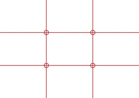
The rule of thirds, or the golden grid rule, is a popular method of approaching a design layout. In fact, you must have come across this kind of grid while using a mobile camera. In this method, two horizontal and two vertical lines are drawn on the canvas that intersect together to create 9 portions of an image. The key to creating a great image is to treat the intersections as focal points. Instead of center aligning the subject, the designer should align it on either side of the top focal points. Of course, an object can be placed right in the middle of a canvas, if need be. But if it’s neither center aligned nor placed on (or in close proximity to) one of the hot spots of the canvas, it loses its appeal and the balance that it could achieve even in an asymmetric layout.
The Diagonal Method:
The diagonal method was introduced by Edwin Westhoff, a dutch photographer and lecturer. It is another design technique that takes advantage of the way humans process visual information. Designers use the diagonal method to guide viewers through an image, using diagonals to draw the eye from one element to another in an image. This creates a sense of motion and can make your artwork more dynamic. The method
Unlike rule of thirds, in this method, the importance is given to an object of interest (for the readers or author) rather than the intersecting lines. However, it is necessary that the object of interest must be placed exactly on the diagonal line.
The Gutenberg Diagram:
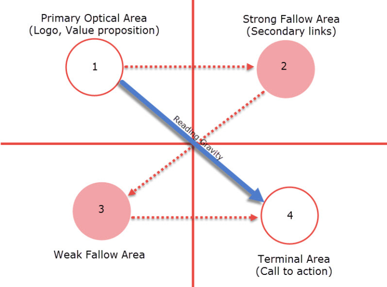
As shown in the diagram, the Primary Optical Area is where readers intuitively lay their eyes. This is where the title usually appears, leading the reader to scan the book cover from left to right. Here a small teaser can also be placed, providing a value proposition to the readers, making sure to grab their attention at a glance.
Moving forward to the right leads the reader to the Strong Fallow Area. The lower left side of the book cover is considered a weak spot according to the Gutenberg diagram. The reading gravity works in a diagonal scan, leading the reader to the Terminal Area. It’s recommended to place a Call to Action in this area, otherwise a reader may be inclined to take action before they can properly scan the book cover.
Thus, the Gutenberg diagram is like the best of both worlds: the rule of thirds and diagonal method combined.
Examples of Good Book Cover Designs:

The symbolism in the book covers of the twilight saga is phenomenal. The Third book of the series showcases a torn red ribbon, which symbolizes a conundrum faced by Bella – She must choose between Edward and Jacob. Moreover, the still-intact ribbon symbolizes Bella’s inability to lose her human self, despite her strong urge to become a vampire. The torn red ribbon, thus, perfectly encapsulates the important themes of the book.

They Both Die at The End by Adam Silvera has a brilliant book cover. The unconventional title that screams ‘Spoiler Alert’ successfully grabs the attention of readers. It begs them to ask the question: is the title referring to the two characters shown on the book cover, if yes, do both of them really die at the end?
But wait, the reflection of their shadows depicts a grim reaper. So are they the villains, or the victims, or both? To solve the mystery, the reader is compelled to read the book.

Dina Nayeri’s novel, A Teaspoon of Earth and Sea is about an Iranian girl who is captivated by America. The book cover uses the gestalt principle, with a double exposure design, to beautifully depict the story of a young woman, based in a pastoral setting.

The cover of Albert Camus’ The Fall exhibits a visual illusion through the use of contrasting black and white colors. The monochromatic blocks depict an abysmal void within the book cover design.
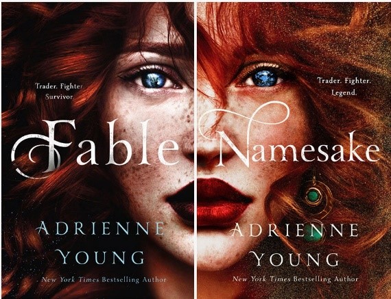
Creativity knows no bounds, but add a rule of thirds grid in the mix, and you can come up with an ingenious design. When placed side by side, covers of Fable and Namesake create a unified image – their beauty enhanced by the use of a rule of thirds grid.
Notice how both books have their teasers placed near the top left and right hotspots, respectively, the two strong focal points according to the rule of thirds.
Further Reading:
Conclusion
By now, we hope you understand that book cover designing is an art form that takes years of experience to master. The more you learn, the better your design skills become. So be sure to take heed of all the important aspects of book cover designing that we’ve discussed in this article.

Logopoppin
Logopoppin is a graphic design agency that specializes in logo designing, web development, video production and advanced branding services. We love to innovate businesses with new age technologies, allowing them to improve their visual reputation.


