
Table of Content
Discover the Transformation of Britain’s Elite Fashion Brand’s Iconic Symbol
Fashion history is written in logos, and few emblems tell a story as compelling as the Burberry logo. From its noble equestrian origins in 1901 to its contemporary minimalist iterations, this iconic symbol has weathered over a century of fashion revolutions while maintaining its quintessentially British character.
The Burberry logo isn’t just a brand marker—it’s a cultural artifact that reflects changing tastes, marketing strategies, and the very essence of luxury fashion itself. Unlike many luxury brands that have remained static in their visual identity, Burberry has undergone five major logo transformations, each reflecting the zeitgeist of its era.
This willingness to adapt has kept the brand relevant across generations, from Edwardian aristocrats to modern streetwear enthusiasts. The story below reveals deeper truths about branding, heritage marketing, and the delicate balance between tradition and innovation in luxury fashion. Let’s take a look at it from the perspective of a professional logo design agency and see what insights it has for us.
Foundation of British Luxury: Burberry’s Brand Journey from 1856 to Global Recognition
Burberry’s journey starts in 1856 when Thomas Burberry opened his draper’s shop. His approach to fashion was quintessentially British – functional and understated. His popular invention of a tightly woven, water-resistant fabric called gabardine caught the attention of British aristocrats who needed reliable outdoor clothing for hunting and other sporting activities.
By 1890s, Burberry had established itself as the premier outfitter for explorers and adventurers. The brand clothed polar explorers like Roald Amundsen and Ernest Shackleton, aviators, and military officers. Eventually, it transitioned from functional outerwear to luxury fashion gradually through the next few decades. Burberry opened its first London store in 1891, with its association with British royalty, military heroes, and famous explorers creating an aura of prestige.
What distinguished Burberry from other clothing manufacturers was its understanding of storytelling and brand mythology. The company didn’t just sell coats; it sold protection, adventure, and British heritage. And by 1901, Burberry was ready to create its first official logo, which became a symbol of its iconic position in fashion, and one of the most iconic luxury fashion brand logos today.
The Early Years: From Draper to Fashion Pioneer
The Burberry story begins in 1856 when 21-year-old Thomas Burberry opened a small draper’s shop in Basingstoke, Hampshire. His revolutionary contribution wasn’t initially about logos or branding—it was about function through his invention of gabardine, a tightly woven, water-resistant fabric.
Key early achievements:
- Invented gabardine fabric for weather protection
- Attracted British aristocrats seeking reliable outdoor clothing
- Became the premier outfitter for explorers and adventurers
- Clothed famous figures like Roald Amundsen and Ernest Shackleton
Military Heritage and the Trench Coat Legacy
When World War I erupted, Burberry’s practical yet sophisticated trench coats became standard issue for British officers, earning the garment its enduring name. This military connection would prove crucial to the brand’s identity and eventual logo design.
Military milestones:
- Trench coats became WWI officer standard issue
- Association with British royalty and military heroes
- Created aura of prestige beyond mere functionality
- Established narrative of protection, adventure, and British heritage
Expansion into Luxury Fashion
The transition from functional outerwear to luxury fashion house happened gradually through the early 20th century, one of the earliest rebranding examples that was a success. Burberry opened its first London store in Haymarket in 1891, designed by noted architect Walter Cave, signaling ambitious growth beyond provincial markets.
Burberry decision to create an iconic logo would launch one of fashion’s most recognizable brand identities. The company’s commitment to quality and British cultural values provided the perfect foundation for a logo communicating tradition, reliability, and aspirational luxury.
The Iconic Partnership: How Burberry’s Plaid Became Synonymous with Luxury and Status
The connection between Burberry and its iconic plaid pattern represents one of fashion’s most successful branding partnerships, though it began quite by accident. This led to the brand featuring it in some of the most successful popular outerwear, making it a symbol of the brand.
The Accidental Icon: Birth of the Burberry Check
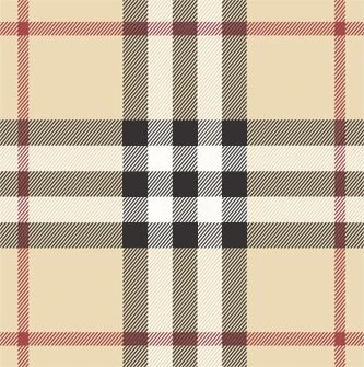
The relationship between Burberry and its famous check pattern began by accident in the 1920s. Originally used as lining for trench coats, the pattern became globally recognized when a Paris store manager displayed coats with the lining facing outward.
The original Burberry check features:
- Distinctive camel, black, red, and white tartan pattern
- Inspired by Scottish clan tartans
- Created by Thomas Burberry himself
- Registered as trademark in 1924
From Hidden Lining to Status Symbol
The transformation of the check from hidden quality marker to visible status symbol represents one of fashion’s most successful branding partnerships.
Key evolution moments:
- 1967: Famous Burberry scarf created after customer demand
- 1970s-80s: Became synonymous with “Sloane Ranger” British style
- 1960s: Pattern became visible feature beyond lining
- Present: Functions as secondary logo alongside primary brand mark
The Challenge of Success
The check pattern’s visibility created both opportunities and challenges for the Burberry logo:
Opportunities:
- Instant brand recognition independent of logo
- Multiple layers of brand identity
- Visual signature that works alone or with logo
Challenges:
- Vulnerability to counterfeiting
- Risk of overexposure and brand dilution
- Need to balance pattern prominence with logo visibility
The Nova Check tartan became to Burberry what the double C is to Chanel. It was an instantly recognizable brand signifier that demonstrates how successful luxury brands create multiple touchpoints rather than relying on single design elements.
The Continuous Evolution: Tracing 122 Years of Burberry Logo Transformations

Now that we know how the business grew into an iconic brand, you might be wondering how this rise affected the evolution of its iconic Burberry logo. Let’s take a look at this transformation and the various types of logos it consists of in greater detail.
The Equestrian Foundation (1901-1968): Establishing Brand Heritage
The first Burberry logo emerged from a public competition in 1901, featuring an equestrian knight that would define the brand for nearly seven decades.
Original design features:
- Knight in armor on galloping horse
- Shield and banner with Latin “Prorsum” (meaning “forward”)
- Rich detail work in classical style
- “Burberry” in serif typeface
- Often included “Established 1856”
The equestrian imagery perfectly matched Burberry’s target market and brand values:
The reason why the knight worked:
- Represented protection, innovation, and progress
- Appealed to aristocrats engaged in hunting and riding
- Symbolized chivalry, tradition, and strength
- Balanced heritage respect with forward-thinking message
This original logo’s 67-year run represents unprecedented consistency in fashion branding. The design appeared on everything from coat labels to advertising materials, building invaluable brand equity that would benefit all future iterations.
Modernization and Simplification (1968-1999): Responding to Changing Times
The 1968 redesign reflected broader cultural shifts of the 1960s, when traditional institutions faced questioning and brands needed youth appeal.
Key modifications included:
- Knight became solid black silhouette
- Lost ornate detail for contemporary look
- Abandoned capital letters for refined lowercase
- Added “OF LONDON” for international appeal
- More understated, approachable luxury feel
This period established important precedents for future Burberry logo evolution:
- Demonstrated willingness to adapt while maintaining core elements
- Showed heritage symbols could be modernized
- Proved brand equity could survive significant visual changes
- Set pattern of balancing change with continuity
Heritage Revival and Global Expansion (1999-2018): Balancing Tradition with Ambition
The 1999 redesign brought back detailed imagery and assertive typography, reflecting Burberry’s growing confidence as a global luxury brand.
Visual improvements included:
- More detailed knight with white outline restored
- Capital letters returned in upscale serif font
- Increased letter spacing for premium feel
- Dropped possessive ‘s’ from “Burberrys”
- Changed from “OF LONDON” to “LONDON”
These changes supported Burberry’s transformation under leaders like Rose Marie Bravo and Angela Ahrendts, with strategic objectives like:
- Project heritage authenticity and contemporary relevance
- Signal confidence and global ambition
- Maintain British geographical association
- Differentiate from newer luxury competitors
- Support international expansion efforts
Digital Age Minimalism (2018-2023): Embracing Contemporary Luxury Trends
Riccardo Tisci’s 2018 redesign marked the most dramatic transformation in Burberry logo history, completely removing the knight and embracing minimalist trends.
The new design approach included:
- Bold, sans-serif typeface by Peter Saville
- Complete removal of equestrian knight
- Geometric, digitally-optimized design
- Aligned with brands like Calvin Klein and Celine
- Prioritized global accessibility over heritage
The minimalist approach reflected broader luxury fashion trends but generated significant debate.
Its supporters argued for:
- Necessary modernization for younger consumers
- Better digital functionality and versatility
- Competitive positioning against contemporary brands
However, the critics contended that it:
- Sacrificed unique heritage for generic modernism
- Lost distinctive brand elements built over decades
- Could apply to any contemporary brand
The 2018 redesign proved that established brands could make dramatic visual changes without losing core equity, while also demonstrating the risks of abandoning distinctive heritage elements.
Heritage Renaissance (2023-Present): Daniel Lee’s Return to Roots
Daniel Lee’s 2023 redesign represents the most sophisticated approach to balancing heritage and modernity in Burberry’s history.
New design elements include:
- Reintroduced 122-year-old Equestrian Knight Design
- Refined serif wordmark inspired by historical logos
- “Knight” blue color alongside white
- “Established 1856” replaces “London, England”
- Thoughtful combination of historical and contemporary elements
Lee’s approach acknowledges changing consumer preferences, market conditions, and trends driving change like:
- Growing appreciation for classic luxury branding
- Increased value placed on authenticity and heritage
- Cultural movements toward sustainability and longevity
- Desire for meaningful brand relationships over purely contemporary aesthetics
The 2023 redesign positions Burberry to appeal to multiple consumer segments.
Its target audiences include:
- Longtime customers who value tradition
- New consumers seeking authentic luxury experiences
- Heritage-conscious luxury buyers
- Digitally-savvy consumers who appreciate craftsmanship
The Enduring Legacy: How the Burberry Logo Continues to Define British Luxury

The Burberry logo’s journey offers profound insights into luxury brand management and the delicate balance between heritage and innovation.
Critical success factors include:
- Deep appreciation for brand equity and consumer psychology
- Understanding of cultural context and market conditions
- Willingness to adapt while maintaining essential character
- Recognition that visual identity must support business strategy
The most recent iteration under Daniel Lee suggests luxury fashion may be entering a new phase where heritage and authenticity become increasingly valuable competitive advantages.
Market indicators include:
- Growing consumer appetite for authentic brand stories
- Increased value of genuine heritage in digital age
- Premium placed on craftsmanship and longevity
- Cultural shift toward meaningful consumption
For anyone studying brand management, fashion history, or cultural identity, the Burberry logo evolution provides a masterclass in visual symbol development with lessons that include:
- Successful brand symbols can adapt while maintaining core identity
- Heritage can be competitive advantage when properly leveraged
- Logo evolution must reflect broader brand strategy
- Cultural context significantly influences design effectiveness
- Multiple brand touchpoints create stronger recognition than single elements
FAQs
| How many times has the Burberry logo changed throughout its history? The Burberry logo has undergone five major transformations since its inception in 1901. These redesigns occurred in 1968, 1999, 2018, and most recently in 2023 under creative director Daniel Lee. Each change reflected the brand’s adaptation to contemporary fashion trends while maintaining its British heritage. |
| What does the knight in the Burberry logo represent? The equestrian knight in the Burberry logo represents protection, innovation, and the brand’s forward-looking spirit. The knight carries a banner with the Latin word “Prorsum,” meaning “forward.” This symbolism reflects Burberry’s heritage as a protective outerwear brand and its commitment to progress and innovation in British luxury fashion. |
| Why did Burberry remove the knight from its logo in 2018? In 2018, creative director Riccardo Tisci and designer Peter Saville removed the knight to create a minimalist, digitally-optimized logo that aligned with contemporary luxury fashion trends. The bold sans-serif design aimed to appeal to younger consumers and improve the brand’s digital presence, similar to redesigns by Calvin Klein and Celine. |
| When was the Burberry check pattern first introduced? The iconic Burberry check pattern was first introduced in the 1920s as a lining for the brand’s trench coats. The pattern became visible to the public in the 1960s when a Paris store manager displayed coats with the lining facing outward. The famous Burberry check scarf was created in 1967, making the pattern a standalone fashion statement. |
| What changes did Daniel Lee make to the Burberry logo in 2023? Daniel Lee reintroduced the historic Equestrian Knight Design in 2023, bringing back the 122-year-old symbol alongside a refined serif wordmark. The new logo features “Knight” blue coloring, replaces “London, England” with “Established 1856,” and represents a return to the brand’s heritage roots while maintaining contemporary sophistication. |
Conclusion
The Burberry logo’s continued evolution will likely reflect broader trends in luxury consumption, digital technology, and cultural values. However, its century-plus history demonstrates that well-managed brand symbols can navigate dramatic changes while preserving their essential meaning.
The story continues to unfold, promising new chapters in one of fashion’s most compelling brand narratives—a testament to the enduring power of thoughtful design, strategic thinking, and respect for authentic heritage in luxury fashion.
Logopoppin
Logopoppin is a graphic design agency that specializes in logo designing, web development, video production and advanced branding services. We love to innovate businesses with new age technologies, allowing them to improve their visual reputation.
