Table of Content
Discover How the Burger King Logo Transformed Over the Years
Burger King, a global fast-food chain, has been satisfying hunger cravings with its flame-grilled burgers for decades. As one of the world’s most recognizable fast-food brands, Burger King’s logo has played a significant role in shaping its identity and appeal. Over the years, the Burger King logo has undergone several transformations, reflecting the brand’s evolution with the times and its commitment to being one of the top fast food chains in the US and the world.
The evolution of the Burger King brand logo is a fascinating journey that mirrors the growth and development of the fast-food industry in the US and abroad. From its humble beginnings to its current iconic status, the Burger King logo has become a symbol of American food culture, as has also become a pioneering fast food brand around the world.
Join us as we explore the history of the Burger King symbol, tracing its journey from its early days to its current incarnation. By examining the key elements of each logo version and understanding the symbolism behind its variations, we can gain insights into the brand’s enduring appeal. Moreover, we will explore how a professional logo design agency could incorporate a similar aesthetic into modern fast food restaurant branding to make them as timeless as Burger King.
Let’s begin.
A Brief History of the Burger King Logo and the Fast Food Brand It Represents
Burger King, originally known as Insta-Burger King, was founded in 1954 in Jacksonville, Florida. The company’s signature flame-grilled burgers quickly gained popularity, and the brand began to expand rapidly across the United States. In the 1960s, Burger King introduced its iconic “Home of the Whopper” slogan, which became synonymous with the brand.
The Burger King logo has evolved over the years, reflecting the changing tastes and preferences of consumers. Early versions of the logo were simple and text-based, featuring the brand name in a distinctive font. As the brand grew in popularity, the logo became more complex and visually appealing. Yet so iconic was its brand imagery from the end of 1960s to the 1990s that after a brief, 21-year departure from that design, the company decided to return to a modern twist of that from 2021. This drive for a return to the nostalgic past has been seen in other brands too recently, such as the Taco Bell logo.
Spread across the world in different countries, Burger King enjoys a global fame like McDonald’s and KFC. In Australia, the company is known as Hungry Jack’s, named after the owner of that country’s franchise license.
And despite taking on McDonald’s in many of its offerings, it has still managed to carve a distinct niche identity for itself. In fact, its popularity has made it into popular urban fiction as well, with the restaurant being the favorite fast food place for Jim Butcher’s eponymous character from his hit series “Dresden Files”.
Evolution of the Burger King Logo – Exploring Its Transformation Over the Years
As can be expected of a brand this old, the Burger King logo has undergone several transformations over the years, reflecting the brand’s evolution and its changing marketing strategies. Some have been quite successful, while others, not so much.
Let’s take a look at some of these amazing Burger King logo iterations, and see what makes all these food logos so special.
The First Burger King Logo (1953-1954)

The earliest Burger King logo, dating back to 1953, was a simple, straightforward design. It featured the full name “Burger King” in a bold, sans-serif font. The logo was primarily black and white, reflecting the minimalist design trends of restaurant logos at the time, accompanied by an illustration of a rising sun, with triangular rays. This early logo focused on clearly conveying the restaurant’s name and brand identity, which had just recently been another brand called Insta-Burger King.
Introducing the Wordmark-Only Burger King Logo (1954-1957)
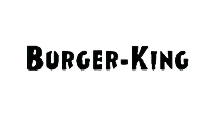
In 1954, the company dropped all signs of “Insta” from its branding completely and adopted a new Burger King logo. This logo featured a stylized “Burger King” text in bold, sans-serif fonts. The letters were often arranged in a circular or oval shape, giving the logo a more dynamic and eye-catching appearance. This logo was a significant step in establishing the brand’s identity and setting the stage for future logo designs.
The Sitting King’s Burger King Logo (1957-1969)
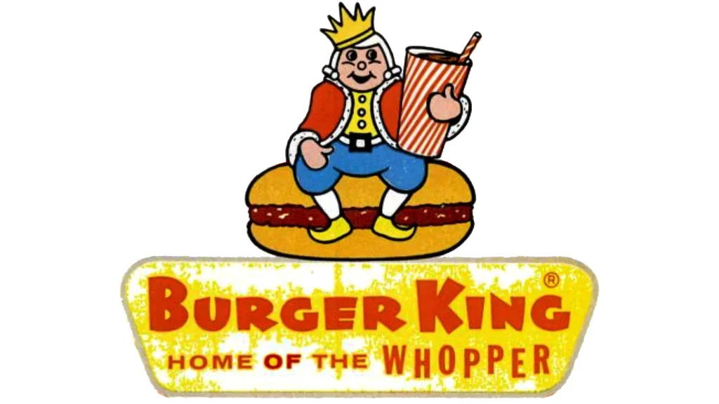
The 1957 logo introduced a more stylized and iconic design. It featured the word “Burger King” in a distinctive, slanted font, with the “B” and “K” extending up beyond the rest of the letters. This bold and dynamic design helped to differentiate the brand from competitors, introducing the first instance of the iconic Burger King, one of the most popular types of logos in fast food, AKA mascot logos. The logo also incorporated a simple, geometric shape, often a circle or oval, to frame the text.
The First Bun-Based Burger King Logo (1969-1994)
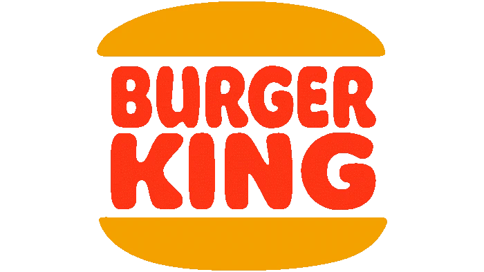
One of the most iconic Burger King logos was introduced in 1969. This logo featured a stylized “Burger King” text in a bold, bubbly sans-serif font, with the words arranged one over the other in the form of stacked burger patties. The logo also included a distinctive top and bottom to mimic the classic plain hamburger bun, signifying the Burger King logo as one representing a burger joint. This logo became synonymous with the brand, adding it to the list of top brand positioning examples, and helped to establish its identity as one of the world’s fast-food giants.
Redesigning the Burger King Logo for a Bolder Appearance (1994-1999)
In 1994, Burger King introduced a revamped version of their logo that was designed to be more modern and streamlined. The logo featured the word “Burger King” in a bold, sans-serif font, with a simple, straight lined and rounded edges design. The buns were made thicker, and the overall design was made darker and more vibrant. This Burger King logo was designed to appeal to a younger audience and to reflect the brand’s commitment to innovation.
The Evolution of the Burger King Logo for the 21st Century (1999-2021)
In 1999, nearly 30 years after the hamburger-based design was first revealed, Burger King unveiled a new logo that featured a bold, Burger King logo within a circular-shaped frame. The logo text was now bigger than the bun design, extending out to both sides, while the typography balanced sharp edges with rounded corners. The color was lightened, while the overall design was made shinier in line with the design aesthetics of the 21st century. This Burger King logo was designed to be more dynamic and visually appealing, and it helped to revitalize the brand. and it wasn’t until two decades later that a new variant was introduced.
Returning to the Nostalgic Roots of the Most Famous Burger King Logo (2021 – Now)
In 2021, Burger King introduced a new logo that is a simplified version of the older, simpler, hamburger-based logo. The logo features the word “Burger King” in a bold, sans-serif font, colored in dark shades of maroon color. The typography is again a bit bubbly, while the overall design is made according to minimalist standards of today. This Burger King logo is designed to be more versatile and adaptable to various applications, while still maintaining the brand’s iconic identity.
The Aesthetic of the Modern Burger King Logo Used Today
The current Burger King logo is a bold and iconic design that reflects the brand’s commitment to quality, taste, and innovation. The logo features a hamburger-based design of the 1970s and 80s, and the words “Burger King” in a bold, sans-serif font. The simple yet iconic design denotes its status and position as a leader in the fast-food industry.
That, along with the dark, burnished color combinations, emphasizes the brand’s unique cooking method and its commitment to providing a superior taste experience.
The color palette of the Burger King logo is predominantly red, green, brown, and black. Red is a powerful color that is associated with passion, energy, and excitement. That, accompanied by the other dark colors, makes for a passionate impact unlike any other fast food brand. The combination of these colors creates a visually striking and memorable logo.
Conclusion
The Burger King logo has evolved significantly over the years, reflecting the brand’s changing identity and its commitment to innovation. From its humble beginnings as a simple, blocky design to its current iconic status, the Burger King logo has become a powerful symbol of the brand’s success.
By understanding the history and symbolism of the Burger King logo, as well as the food branding tips its iterations represent, we can gain a deeper appreciation for BK’s rich heritage and its enduring appeal.

Logopoppin
Logopoppin is a graphic design agency that specializes in logo designing, web development, video production and advanced branding services. We love to innovate businesses with new age technologies, allowing them to improve their visual reputation.


