
Table of Content
Discover the Evolution of the Symbol for One of US’s Oldest Automobile Companies
Cadillac is one of the oldest American automobile manufacturing companies that is still active today. One of the pioneers of mass manufacturing of automobiles alongside Oldsmobile and Buick, the company has a rich and interesting history, especially the connection it shares with Henry Ford.
Cadillac is a marquee that has always been associated with the luxury and appeal of a higher class of automobiles. Even today, the regal Cadillac logo graces the hoods of some of the top luxury consumer vehicles in the US, competing with the likes of Infiniti, Mercedes-Benz, and more.
With over a century of manufacturing under its belt, its history is full of surprising turns, insights, and more. To survive that long in the industry, especially in an era with two major world wars, global and local economic crashes, gas crisis, and a changing consumer dynamic is no easy task.
Yet Cadillac persevered, where its fellow pioneering companies like Oldsmobile and Studebaker failed. So how has it managed to do that? What role did the rapidly evolving Cadillac shield emblem have to play in its success? And what lessons does this evolution teach a smart logo design services provider?
To find out the answer to these questions and more, read on.
The Formation of Cadillac and a Brief History
Before we get on with the history of the Cadillac logo and the evolution of its design, let’s take an in-depth look at the inception of the company.
Cadillac started out from the remains of the Henry Ford Company. After Henry Ford and his investors had a falling out due to some disputes, an engineer by the name of Henry Leland was bought in. His job was to appraise the company before it could be sold on in order to recoup the investors’ money. However, once he appraised the company, he told the investors that it would be better to manufacture and sell automobiles
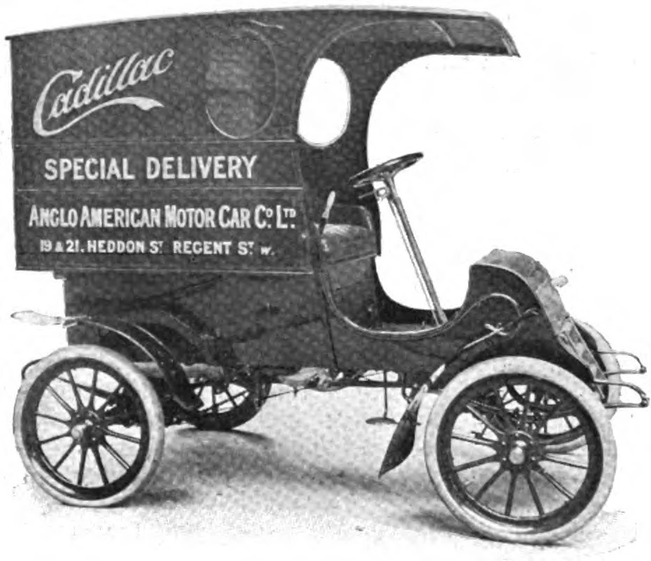
Taking his advice, the company rebranded themselves as Cadillac, and started the manufacturing of cars that used Leland’s popular and reliable single cylinder engine. The first cars produced by the company were the Cadillac Turnaround and the Tonneau, released in 1902. They were powered by a 10HP single cylinder Leland engine, and were basically different styles of horseless carriages fitted with an internal combustion engine.
The company impresses the public with its precision engineering, which produced vehicles that were far better in quality than most of the competition. This was seen in the 1903 New York Auto Show, where the display vehicles were enough to get the company 2000 confirmed orders.
Their precision is also what allowed them to pioneer the practice of parts interchangeability in volume engineering, which won them the Dewar Trophy. And in 1909, the company was acquired by General Motors, who were looking for a luxury marquee for its prestige or luxury division, and found Cadillac to be perfect for it among all other American car brands.
Continuing their drive for constant innovation, they were also the first automakers to develop and use an electrical starter system in their automobiles, phasing out the crank system. A few years after their acquisition by GM, the company also launched a new V8 flathead engine that had the cylinder banks at a 90-degree angle, making 70HP.
The power output of those engines was so high that the roads at that time could not cater to the speeds of their cars, which could reach up to 65 miles per hour. In 1918, they also pioneered the dual-plane crankshaft, and a decade later, they introduced the first clashless synchromesh manual transmission.
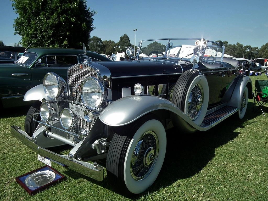
In 1930, Cadillac also introduced the V16 engine, their top of the line offering that had a power output of a 165HP, known as one of the most powerful and quietest engines is the US at that time. During that era, the company also developed a V12 engine, with the three engine types setting the standard for US automakers across the world. And this drive for innovation helped the company develop the first overhead valves engine in 1949, which revolutionized the American automotive industry in later years.
During the Depression Era, in order to boost sales numbers that were historically dangerously low, the company also overturned their policy of not selling vehicles to African-Americans. That move alone saved Cadillac from folding, boosting sales by 70%.
Over the years, the company and its cars have been known to pioneer many things in the American automotive industry. From the iconic Dagmar bumpers, to the elegant tailfins that represent an amazing era of the industry, Cadillac has been at the forefront of the drive to enhance and grow the automotive industry in the US.
During that time, the Cadillac logo also evolved to represent the pinnacle of personal luxury vehicles in the American industry. From the old-school shield to the modern abstract design, the logo design has been one that exudes luxury and elegance at each version.
The Origin on the Cadillac Logo
Now that we have looked at the history of the Cadillac company and its impact on the American automotive industry, let’s discuss the logo that accompanied it through that journey.
To understand the origins of the Cadillac logo, you need to know the origins of the company’s name. Originally known as The Ford Motor Company, the company renamed itself after Henry Ford’s departure. Naming itself after the founder of its parent city, Detroit, Michigan.
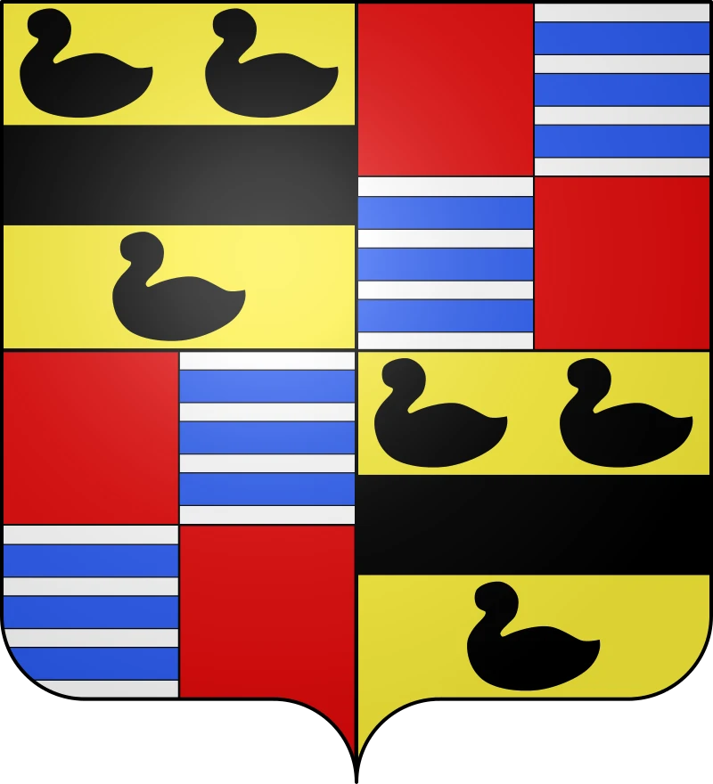
The founder of the city was a French explorer and traveler named Antoine de la Mothe, sieur de Cadillac. Now with the company named after him, the founders of the company thought, why not use a symbol already associated with that name.
Therefore, the company used the coat-of-arms of monsieur Cadillac, which had a shield-like design that we see today. However, for the first few years of the company, the cars produced featured an exact replica of Cadillac’s coat-of-arms as the company logo.
The design featured a four-quadrant shield, with alternating quadrants mirrored in order to bring balance in design of the heraldic symbol. The top left and bottom right featured a yellow background with a thick black band in the middle of the quadrant, placed horizontally. Above that band were two ducks, and one below the band.
The top right, and bottom left featured a quadrant division along the same lines as the shield’s design. It featured alternating quadrants of solid red and horizontal white and light blue alternating lines.
And an elegant recreation of that was used for the first few iterations of the automotive logo. Over time, the design was simplified and made more aesthetically pleasing, such as with the removal of small design elements like ducks.
Studying the Evolution of the Cadillac Logo
By understanding the inception of the Cadillac logo, we can start discussing the evolution of that logo into its current form. Now, do understand that for a company this old, there would be multiple modifications and variants to discuss. In fact, the Cadillac emblem has seen nearly thirty different variations over the yearly, showing that it has experimented with testing customer aesthetics to see what works, and what does not.
So, let’s dive in and take a look at this evolution, to understand what changes the logo has made over the years and decades, to appeal to their luxury personal vehicle target market.
1902 – 1905
The first Cadillac logo featured the coat-of-arms of the La Motte family, a famous French family associated with Antoine Cadillac. The aristocratic design, combined with the wreath around it, makes it an interesting automobile logo to look, especially when we look towards its contemporaries in the market.
1905 – 1908
Just three years after its release, the logo was reworked to make it look similar to the coat of arms, yet still have a design that was distinctly Cadillac’s. The wreath was removed, and the shield was turned round instead of its usual shape.
The circular design now featured a crown over it, making it look more aristocratic than before. Moreover, the addition of heraldic designs to border all around the logo made the logo more visually appealing, yet complicated at the same time.
1908 – 1914
Again, the second version of the logo lasted only three years. The third iteration was released in 1908, and it featured the old style shield enclosed within a round, badge-like circle. Above the shield was a more complete design of the crown, which had the name of the company curving over it.
Underneath the shield were the words “STANDARD OF THE WORLD”, which represented Cadillac’s impact on the industry in such short of a time.
1914 – 1915
At the start of World War I, the team decided to redo its wordmark that often accompanied the emblem. With the shield now known far and wide in the USA, the company decided to rework the wordmark so that it could add onto the impact of the symbol.
The resultant design featured the wordmark now enclosed in a dark oval. The font and style of typography remained the same, however, the addition of a badge outline and dark coloration to the background improved the visual impact. Moreover, the rounded design now better complemented the car designs of that era, which had become more rounded compared to the angular designs of the earlier days.
1915 – 1920
The latter half of the First World War saw the company redesigning their logo again as the country started gaining more of a pacifist mindset. While the company had been involved in the war effort, Cadillac decided that in order to soften the destructive association with war that may impact their luxury aesthetic, a softer designed was called for.
The addition of leaves to the design, as well the return of the wreath, shows that the company put in efforts to make their logo associate with peace, prosperity, and strength. And as one of the most iconic cars of the US at that time, this was a great move to implement.
1920 – 1925
The next iteration of the logo was made in 1920, and the wreath was replaced with a beautiful ring of tulips from the first logo. The design was also made cleaner, with the crown at the top of the design made more prominent for better visibility.
1925 – 1926
A year later, the logo was redesigned again. This time, the rounded design was encased within an octagonal shape, similar to that of a nut. Gone was the wreath and the tulips, with the central shield and crown visible inside. The inner design was quite similar to the one from the 1915s, which had the words “STANDARD OF THE WORLD” written in it.
1926 – 1930
In 1926, the Cadillac logo was redesigned again. Now, the wordmark and all other design elements except for the shield and the crown were removed. Instead, those elements were enclosed within another shield, which emphasized the badge-like look of the emblem.
1930 – 1932
Four years after the last redesign, the Cadillac symbol was refreshed again. The outside shield was removed, and the overall design of the inner shield was made bigger and more prominent. The lines of the logo were made sharper, especially those of the crown to make the design more impactful.
1932 – 1933
The next iteration of the Cadillac logo was released in 1932, and it took a rather weird turn in its design. the shield with the crown was enclosed by a double ring, with the background colored black. From both sides of the shield, and coming out the sides of the double rings were a pair of wings that were traced out.
1933 – 1939
Now committed to the winged design with American advancements in aviation, the company redesigned their logo again in 1933 to give it a more streamlined shape suitable to their luxury aesthetic. The rings and the black outline was gone, with the shield now the central feature of the new logo.
The crown at the top was changed, with just the tines of the crown showing in a straight line over the top of the shield. The wings on either side were made more geometric, giving the overall design clean lines and better visibility.
1939 – 1942
The start if World War II brought a lot of changes. While the US was not actively a part of the war at that time, the industrial drive brought on many industries to bring out the more practical side of themselves. The new Cadillac logo was an example of this. Gone were the wings that represented the last few iterations of the logo. Instead, they were replaced by an elongated, downward-facing triangle that had the shield inside it.
The crown was redesigned to be more elaborate again, and it extended beyond the end of the triangle. The entire design had a metallic chrome shine, including the shield and the triangle, which highlighted the clean lines of the design, and made it look modern.
1942 – 1947
In 1942, with the war in full flow, the logo was redesigned again with a more militaristic approach. The triangle from the background was removed, and were replaced by an outside shield which had upturned wings on the side. This design was one of the weirdest car logos with wings that we have ever witnessed.
The wings were polished chrome, which was a stark contrast to the rest of the design that featured colors like golden-yellow, black, and dark red.
1947 – 1949
In 1947, a few short years after the end of World War II, the Cadillac logo was redesigned again. The coat-of-arms with the crown now featured at the top of the design, with the lower half of the shield overlaying two interlocking triangles that were made to look like a three dimensional arrowhead.
The arrowhead pointed downwards and had a tapering V that outlined its sides, with the edges of the V extending beyond the ends of the arrowhead’s ends. This was the first time that the letter V would feature in the logo for Cadillac, an important design element that would be seen on and off up until 1971.
1949 – 1953
Just two years after the addition of the V to their logo, the company decided to refresh the logo again. This time, they wanted to emphasize both the shield and the letter V, which represented their iconic V-format engines. Incidentally, this imagery also featured in many of the early American sports car logos, as it depicted sleek power.
The new design now featured the shield made prominent and at the center. The top edges of the shield, just below the crown, were extended out slightly, designed to look like the flying edges of the letter V, if it the shield and it had been overlapped.
Below the shield was a tapering letter V whose top edges ended at the level of the shield’s extended edges. The design was colored in a metallic gold-bronze, with the entire logo featuring metallic shades for its primary and accent colors.
1953 – 1956
For 1953, the logo was revamped again. This revision featured the shield from the previous iteration being blown up in size, now displayed front and center. The V below it was removed, so that nothing distracted from the core design element that was the Cadillac shield logo.
1956 – 1960
In 1956, the V made another comeback. But the overall design featured a sharp turn in aesthetic. The entire Cadillac logo now looked as if it had been squished flat, with the shield and the V now compressed vertically to practically half its previous height. This design complemented the design of the cars of the era, which had wide bodies and thin and long hood ornaments to complement that.
1960 – 1963
In the early 1960s, the traditional style of the shield was not used in the new redesign. The new shield now featured a v-shaped design, with the top of the logo featuring the style of an elongated V. The quadrants of the shield also featured a gradient-like design, rather than the exact design from the coat-of-arms.
The crown at the top was also modified. Now, rather than the traditional tines of the crown, the new design featured round elements that had small black dots at the top. The overall design was colored a dark silver-chrome, and looked quite sophisticated.
1963 – 1964
The 1963 iteration of the Cadillac logo is arguably the most iconic one of all, as it became the primary corporate identity for decades to come, even when the badges on their cars had a modified design. The coat of arms was back, along with the silver wreath.
The shield was one of the most regal ones designed so far, with the segments colored brightly in metallic yellow-gold, blue, and red. The design was accented with black, white, and chrome accents, which made the overall logo look wonderful.
1964 – 1965
However, despite the visual beauty of the logo created in 1963, the badge was changed again in a year later. The reason was that automobile styling was changing at a fast pace. And as those designs changed, so did the company symbols that accompanied them.
The 1964 version of the logo again featured an-all silver color scheme, by keeping the design of the shield the same as the previous iteration, but without the colors and the silver wreath. This resulted in an embossed-like design to show on the logo, which looked quite aesthetically pleasing.
1965 – 1971
The logo was again redesigned a year later. This time, the designers decided to add a layer of depth to the design. The shield now featured the iconic color combinations again, as well as the addition of a large stylized V in the design.
However, there was a small caveat. For the shield, the addition of depth was shown by turning the right side of design perceptibly darker than the left. However, for the dark gray metallic V, the opposite end was darker. This was the last time when the large, independent V was used in the logo.
1971 – 1980
In 1971, near the end of the Vietnam War, the Cadillac logo was redesigned again. This design was quite a departure from the traditional shield logo that we had grown used to for the past six decades. The logo looked similar to a bayonet or dagger with a deep grooved channel throughout its length.
The hilt of the logo featured the Cadillac shield, with its elongated sides making up the cross guard of the dagger. The etched design on the two sides of the blade were reminiscent of stylized wings, similar to a design used in the early 1900s.
The entire design was colored a gray-metallic color, with the edges shinier, and perceptibly sharper than the rest of the logo.
1980 – 1985
The 1980 Cadillac logo was a callback to the design of 1963. However, the major difference here compared to that design, was the muted shades of colors used here. Rather than using colors to denote the gradients and edges of the design, the die cast metal badges resulted in smaller details like the ducks on the logo to be lost in the background, devoid of any distinct lines or colors to identify them.
1985 – 1995
The 1985 variant was a little better in terms of design clarity. The wreath was made bigger and more prominent, with the color gradient extending from dark gold to the bottom right, to light silver-gold on the top left.
The logo shield too saw a return of more discernable shades like the ones used in earlier designs. The overall look was one of luxurious regality, and was perfect for the Cadillac cars of that era.
1995 – 1999
The Cadillac logo of 1995 was a stark departure of the badge-like emblem used by the company since its inception. Representing a minimalist, two dimensional design, the logo took the basic layout of the previous iteration and just rendered it onto a two-dimensional plane.
The result was a logo, that besides anything else, had amazing clarity for each design element, whether it was the ducks, or the individual edges of the wreath that surrounded the shield. Underneath it, the wordmark of the company written in the now iconic script, was added to the logo again. This was a major surprise, as a wordmark had not accompanied the emblem for the past seven decades.
1999 – 2009
As the end of the 20th century loomed ahead, and the impending changing aesthetic of the consumers hanging over many different companies, Cadillac decided to change their logo again. The new design featured a simplified but modernized version of the previous shield and wreath logo.
The small design elements of the shield, such as the crown, and the ducks, were removed. This made the shield look as if made up of geometric shapes, which was a good design choice. Similarly, the wreath two was made into a single, wounded element, rather than being made up of two interlocking branches.
2009 – 2014
After a decade of use, the Cadillac logo was modified again. This time, the change was to make the logo more visible, with better lines and depth to the elements to make it look and present better. Moreover, the design also featured a sharper chrome shade all over the design, as well as better, more visible shades of colors for the logos.
2014 – 2021
In 2014, just five years after the last redesign, the emblem saw another refresh. The wreath was gone, and the shield was elongated to give it a distinct look that matched the new fascia of cars like the CTS. The elongated logo fit the wide hood of the cars perfectly, and the accompanying wordmark from a few logo iterations earlier made the design more visibly striking.
2021 – Today
In the past few years, many companies have gone for the EV or hybrid concept, as consumer trends are changing in response to climate change. With that in mind, the Cadillac logo saw another refresh in 2021 where the new EVs by the company will feature this new logo.
The new design features a monochrome, black and white design similar to the previous iteration. However, to make it look better, the company has decided to fit the logo with accent lights that make the geometric design pop. Similarly, the modern approach dictated that the wordmark be changed too, which resulted in the iconic script-like wordmark to be written in a sans serif font.
The Shift to a Monochrome Design – Cadillac’s EV Logo Concept
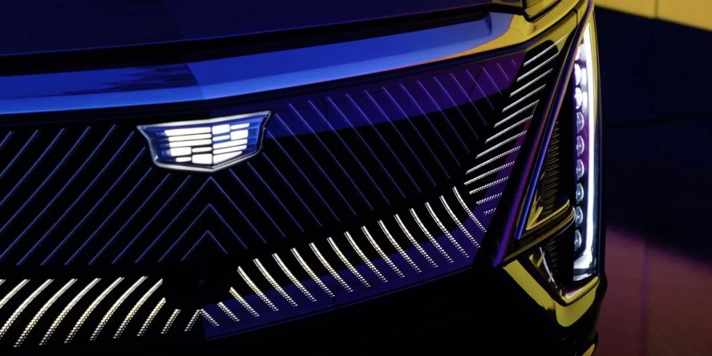
To showcase a shift in company direction as a response to changing consumer habits, Cadillac decided that they needed to do something that set them apart from their previous identity of large displacement engines that guzzle fossil fuels.
In order to do that, the company decided to redo its logo, eschewing classic design trends to go for something sleek, simple, and minimalist. And that is where the monochrome logo with the backlight was envisioned and implemented. Today, this version of the logo can be found in Cadillac’s 2023 EVs.
FAQs
| What does the Cadillac logo mean? The Cadillac logo represents the La Motte family, as it is the coat-of-arms for the French aristocratic family. Antoine Cadillac adopted this symbol as his own when he founded Detroit, Michigan. And inspired by that, the company decided to name and represent itself by his name and symbol. |
| What is the Cadillac badge? The Cadillac badge is the coat-of-arms for a French aristocratic family, which features a mix of colors like yellow, blue, and red, and accented by black or white. |
Conclusion
To sum it up, the Cadillac logo history is an extensive study in design that requires a much greater depth of detail. In fact, today it can be said to be one of the top car logos in the world, not just America. However, if you wanted an overview of how the logo for that giant of an automotive company has evolved, then this article is a great place to start.
Latest news you want to know!
Subscribe for cutting-edge design inspiration at Logo Poppin! Elevate your brand with updates on logos, branding, web design, and video animation.
Note that by clicking “subscribe,” users may agree to our privacy policy and consent to Logo Poppin to use your contact data for newsletter purposes.
Logopoppin
Logopoppin is a graphic design agency that specializes in logo designing, web development, video production and advanced branding services. We love to innovate businesses with new age technologies, allowing them to improve their visual reputation.

