
Table of Content
Discover How You Can Choose the Best Calligraphic Logo Design to Suit Your Brand Image
There are many different styles of logos that are being used by different businesses’ today. Depending on their niche and target market, each of these businesses sports a specific kind of logo representing their brand.
Now, there are several types of logos you can choose from for your business. However, depending on your niche, not all of them would be suitable. Let’s say there is a financial consulting firm who needs a logo. Would a mascot logo be suitable for them? No. it would not. These types of businesses need professional corporate logos that matches their business perception.
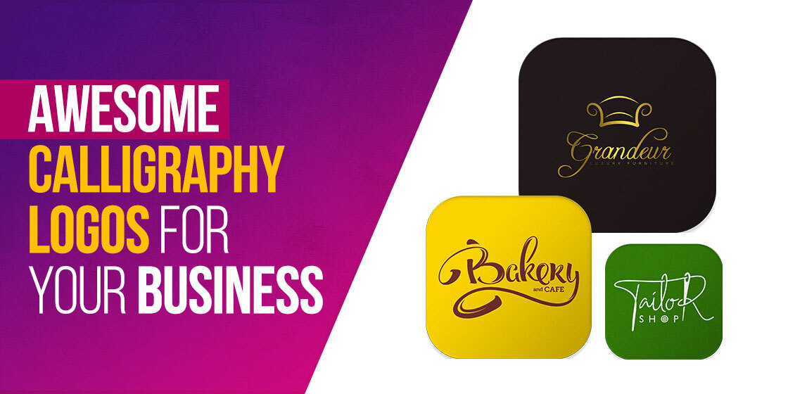
One of the most popular options used by the top logo design services nowadays are calligraphy logos. That is because they offer the professional look of a lettermark or wordmark logo, while at the same time the stylistic calligraphic design gives it a creative and unique flair.
Let’s take a look at how you can create some awesome calligraphy logo designs for your brand symbol, and how to give them the right impact.
What is a Calligraphic Logo?
Calligraphic logos, as their name suggests, are brand symbols that are designed using the style of calligraphy. Now, you might ask – what is calligraphy?
Calligraphy is a style of visual art that relies of artistic brushstrokes to create beautiful and intricate lettering. There are different types of calligraphic styles used by designers, with eastern or Arabic style lettering being the most popular options among the logos we see around us today.
Depending on how you use it, calligraphy logos have the ability to embody a variety of different emotions and messages within them, slight hints that can boost the impact of your brand logo. And that is especially necessary when creating lettermark or wordmark logos.
In their plain form, these logos often have the tendency to be bland or plain looking. However, the addition of a calligraphic script can do wonders to uplift the look and impact of the resultant logo. Look at Coca Cola’s logo and you will see. The classic red and loopy script that we associate with the company is as much a part of the brand and its image as is everything else. A simple font would not have had as iconic of an impact as the one they use now.
What Types of Businesses Could Benefit From a Calligraphy Logos?
Essentially, you can use calligraphy logos for many different businesses. However, the style of calligraphic script you choose can dictate where you can or cannot use that logo. Most of the time, calligraphic logo designs are used to add a touch of elegance or creativity to an otherwise plain brand image.
Now, you will most commonly find that upscale restaurants and cafes, beauty and fashion brands, and even businesses like high-end salons and boutiques use these types of logos, among others. Even highly professional businesses sometimes use subdued or understated wordmark logos done in calligraphic designs to give their brand image a unique flair.
So, we can say that while any business that can use a wordmark or a lettermark logo can use calligraphy for it, but there are a few industries where the practice is more common.
The Two Main Styles of a Calligraphic Logo
Calligraphy logos may look good, but this style of iconography does not pair well with all types of logos. Some, like mascot logos, do not generally do well with an intricate calligraphic font accompanying the design. That is why designers often opt to use this style of creative fonts in a few specific logotypes.
Let’s take a look at what types of logos usually incorporate calligraphy within their logo designs.
Lettermark Logo
First on this list are lettermark logos. These logos are often called monogram logos too, because the use of your business initials in a stylized way for a logo often looks quite business-like. This style of logo is quite useful in scenarios such as that of a business where the business name is too large for a conventional logo design.
One of the most popular examples of an initial logo using calligraphic script is the fashion brand H&M. the design of the logo is not too complicated or intricate, yet the calligraphic style of this monogram logo is quite apparent.
Now, people use monogram logos to give their brand symbol a clean and minimalist look. However, that often results in a lackluster design that needs some jazzing up. And calligraphic logo design practices are a great way to do that.
Wordmark Logo
Unlike lettermark logos, wordmark logos tend to spell out the entire business name. There are many examples, in fact more so than can be found for lettermarks, for wordmark calligraphic logos in the market today.
Just like lettermarks, a simple word-based logo design with boring logo fonts isn’t the best way of representing your brand. It needs to have a little flair, something that attracts the eye of the viewer. Calligraphy logos can help you boost your brand visual’s impact, making for a great wordmark logo.
Unlike lettermarks though, wordmarks allow designers to unleash the full impact of these calligraphic scripts, as the flowing lines, abrupt strokes, and unique designs can catch the eye instantly. Look at the logo for Ford, Wendy’s, Kellogg’s, and many others, and see how it was their unique design using a calligraphic script that made them so iconic.
Combination Logo
The third type of logo where you can use your calligraphic style of logo design is a combination logo. The scripts used here are often simplistic and subdued, and are rarely intricate in design. That is because when learning how to design a logo that represents a brand essence effectively, you will find that designers need to strike a balance between the visual elements. Both the imagery and the font cannot have strong impact individually, as they would clash with each other and muddle the overall impact of the logo.
A great example of this is Wendy’s logo. The wordmark part of the logo is written in broad, marker-like style with smooth strokes. This makes it a fitting representation of a brand symbol that molded and changed the idea of calligraphy logos to suit its need.
Giving Your Brand Calligraphy Logos That Suit Their Aesthetic
Now that you know the different types of logos that can use calligraphic logo design to their advantage, the question arises – how to create one that suits your brand aesthetic.
Let’s take a look at how you can design a suitable calligraphy logo for your business and boost its visual impact at the same time.
There is No Need to Make Your Logo Plain
Many people believe that when using a calligraphic style for their logos, they need to keep the design plain in order to help the logo shine. However, that is not the case. You can add some creative flair to the design itself, such as crafting the letters into am abstract shape or molding the design of the letters to make a combinational design with each other, just like the logo above. It depicts the company’s initials, while mimicking the design of a hotel layout.
Give it a Color or Gradient for a Little Panache
Monochromatic logos done in black or white look good, especially when done well. But in some circumstances, a little variety of color can go a long way. Let’s say that a French bakery specializing in various iced pastries and sweets has a simple monochromatic calligraphic logo. Adding a dash of color to it to whet the appetite of the audience would result in a stronger impact by the logo. You can choose from a wide variety of color combinations or gradients depending on what suits your brand aesthetic. Conversely, adding a metallic sheen to your monochromatic logo can have similar impact as well.
Add a Border or a Line to Highlight Your Wordmark
Often, we need to give our wordmark logo small visual cues in order to attract the eye of the audience. That can be in the way of adding a little color to brighten up a focal spot in an otherwise simple logo. It can even be a border framing your lettermark. Or it can be something as simple as an underline.
Take Virgin’s example. The logo is quite simple, yet striking. Try envisioning the logo without the underline. Doesn’t work as well, does it? That simple feature has made a simple wordmark like Virgin’s so visually striking, that people cannot even fathom it without the underline. And that makes Virgin’s design one of the simplest yet most effective business logo ideas today.
People Also Ask (FAQs)
| 1. How do you make a logo with calligraphy? There are multiple ways to make you calligraphic logo designs, such as: – Using an online logo maker tool to create it – Download a calligraphy logo template to create one yourself – Hire a professional logo designer to make it for you |
| 2. What are calligraphy logos? A logo that uses a script-like font for their wordmark or lettermark can be considered a calligraphic logo. Some popular examples include Barbie, Coca Coal, and Kellogg’s etcetera. |
| 3. Which is the most popular font for calligraphy? For a modern style of calligraphy logos, Arizona is a great choice of font with bold upwards strokes, and tapering downwards strokes. |
Conclusion
In short, there are many benefits to using calligraphy logos as your brand image. Besides giving your logo a unique look, that differentiates you from the competition, it allows you to create a clean brand visual that strikes hard and draws the attention of your target audience.
And while it may seem difficult to incorporate a fitting calligraphic logo design with your brand visuals, if you follow the tips above, you will end up with a great brand symbol.
Latest news you want to know!
Subscribe for cutting-edge design inspiration at Logo Poppin! Elevate your brand with updates on logos, branding, web design, and video animation.
Note that by clicking “subscribe,” users may agree to our privacy policy and consent to Logo Poppin to use your contact data for newsletter purposes.
Logopoppin
Logopoppin is a graphic design agency that specializes in logo designing, web development, video production and advanced branding services. We love to innovate businesses with new age technologies, allowing them to improve their visual reputation.

