
Table of content
Discover the Transformation of the Calvin Klein Logo Design Through the Years
Calvin Klein, a name synonymous with minimalist design and provocative advertising, has etched an undeniable mark on the global fashion industry. Founded in 1968 by Calvin Klein and his childhood friend Barry K. Schwartz, the brand started with understated coats and dresses before expanding into a diverse range of apparel, underwear, and fragrances.
Throughout its journey to becoming a leading fashion house, the Calvin Klein logo has served as a crucial visual identifier. Its evolution has been subtle yet significant, reflecting the brand’s changing aesthetics and its enduring appeal. This wordmark, starkly minimalist, has become instantly recognizable, featuring on everything from high-fashion pieces to everyday apparel, playing powerful role in cementing the brand’s iconic status.
Each change reflects a specific era in the brand’s history and a deliberate effort to communicate its core values and target audience. Understanding this evolution from the perspective of a logo design agency provides valuable insight into how a top brand leverages its visual identity to maintain relevance, adapt to changing times, and solidify its position as a global icon. Let’s begin.
History of Calvin Klein and Its Transformation into a Leading Fashion Brand
The Calvin Klein brand was born in 1968 when Calvin Klein and Barry K. Schwartz established Calvin Klein Limited, a coat shop within New York City’s York Hotel, with a modest investment of $10,000. Klein’s initial designs were characterized by their youthful and understated elegance, quickly gaining recognition within the New York fashion scene.
A pivotal moment came in September 1969 when Klein graced the cover of Vogue magazine, signaling his arrival as a significant force in American fashion. The 1970s saw the brand’s first major expansion, with Klein receiving his first Coty American Fashion Critics’ Award in 1973, the youngest designer to do so at the time.
This decade also marked the introduction of Calvin Klein Jeans, which ignited a designer-jeans craze by prominently featuring the brand name on the back pocket, a move credited by some to his design assistant Jeffrey Banks. By the late 1970s, annual revenues had soared, and the brand had ventured into licensing for various products, laying the foundation for its future diversification.
The 1980s witnessed Calvin Klein’s groundbreaking entry into the men’s underwear market, transforming it from a purely functional product into a fashion statement. Provocative advertising campaigns featuring celebrities like Brooke Shields further cemented the brand’s bold and often controversial image.
The Troubling 1990s for Calvin Klein and Acquisition by PVH Corp
The 1990s presented financial challenges for the company, but it successfully rebounded, largely due to the immense popularity of its underwear and fragrance lines, as well as the introduction of the “ck” sportswear line. All of this turned the Calvin Klein logo into one of the top luxury fashion brand logos.
This era also saw the pioneering of boxer briefs in men’s underwear under the leadership of menswear design head John Varvatos, famously advertised by Mark Wahlberg. Despite facing financial headwinds at times, Calvin Klein consistently pushed boundaries in design and marketing, solidifying its reputation for minimalist aesthetics and sensual appeal.
In 2003, Calvin Klein Inc. was acquired by PVH Corporation that marked a new chapter for the brand, while Calvin Klein himself remained involved as an advisor until 2017. Under PVH’s ownership, the brand has continued to evolve, maintaining its core identity while adapting to contemporary fashion trends and consumer preferences.
The Calvin Klein brand today encompasses a wide range of product lines, distributed globally and recognized for its clean lines, modern sensibility, and impactful advertising. Its journey from a small coat shop to a global fashion powerhouse is a testament to Calvin Klein’s vision, the brand’s adaptability, and its consistent ability to capture the zeitgeist, all while being visually represented by its evolving yet always recognizable logo.
Evolution of the Calvin Klein Logo Over the Years
The Calvin Klein logo, a seemingly simple wordmark, has undergone several subtle yet significant transformations throughout the brand’s history. And each iteration reflects the prevailing design trends and the strategic direction of the company through effective brand storytelling. Let’s take a look at this journey in greater detail.
1968-1975 Calvin Klein Logo
The original Calvin Klein logo, introduced in 1968, was a straightforward and elegant representation of the brand name. It typically featured the full name “Calvin Klein” rendered in a refined, sans-serif typeface, often in black against a white background. The lettering was characterized by its thin, clean lines, conveying a sense of understated sophistication that aligned with the brand’s initial focus on minimalist and elegant designs.
This early logo was simple yet impactful, establishing a clean and modern aesthetic from the outset. The choice of a sans-serif font contributed to a contemporary feel, setting it apart from more ornate fashion logos of the time. This initial iteration laid the groundwork for the brand’s visual identity, emphasizing the designer’s name as the primary identifier.
1975-1992 CK Logo
In 1975, the Calvin Klein logo underwent its first notable evolution. While still featuring the full brand name, the typeface became bolder and more impactful. The letters were thicker, giving the logo a stronger and more assertive presence. The font used during this period is often described as being similar to OL Round Gothic-Bold and ITC Avant Garde Gothic Pro Book, suggesting a move towards a more geometric and visually striking design.
This change coincided with the brand’s growing prominence and its expansion into new product lines, including the highly successful jeans. The bolder logo reflected the brand’s increasing confidence and its desire to make a stronger statement in the competitive fashion landscape. This era also saw the consistent use of black lettering on a white background, a color scheme that would become synonymous with the brand’s minimalist aesthetic.
1992-2017 Calvin Klein Logo
The logo experienced another significant shift in 1992, coinciding with a period of both financial challenges and renewed success for the brand, particularly with its underwear and fragrance lines. The typeface was refined, appearing somewhat softer than the previous bolder version, often described as being similar to the Bambino Light font.
A key development during this era was the prominent introduction and widespread use of the “ck” monogram, often rendered in lowercase. This interlocking “ck” became an instantly recognizable emblem of the brand, similar to the Louis Vuitton logo concept, appearing on everything from clothing labels to advertising campaigns.
The use of a monogram provided a more concise and versatile visual identifier, particularly for products like underwear waistbands, where space was limited. While the full “Calvin Klein” wordmark continued to be used, the “ck” monogram gained significant prominence and became deeply ingrained in the brand’s visual identity, representing a more intimate and contemporary facet of the brand.
2017-2020 CK Logo
In February 2017, under the creative direction of Raf Simons, Calvin Klein unveiled a new logo designed in collaboration with renowned British graphic designer Peter Saville. This marked a significant departure from the previous lowercase monogram and the softer wordmark.
The new logo featured the brand name rendered in all uppercase letters using a condensed, sans-serif typeface, often described as being reminiscent of ITC Avant Garde Gothic Pro Book, the same font used in the 1980s. The letters were placed closer together, creating a solid and robust visual block.
This redesign was described by the brand as “a return to the spirit of the original” and “an acknowledgment of the founder and foundations of the fashion house.” The shift to uppercase aimed to convey a sense of authority, confidence, and a more direct and impactful brand presence, aligning with Simons’ vision for the brand’s future direction while also referencing its heritage.
2020-Present
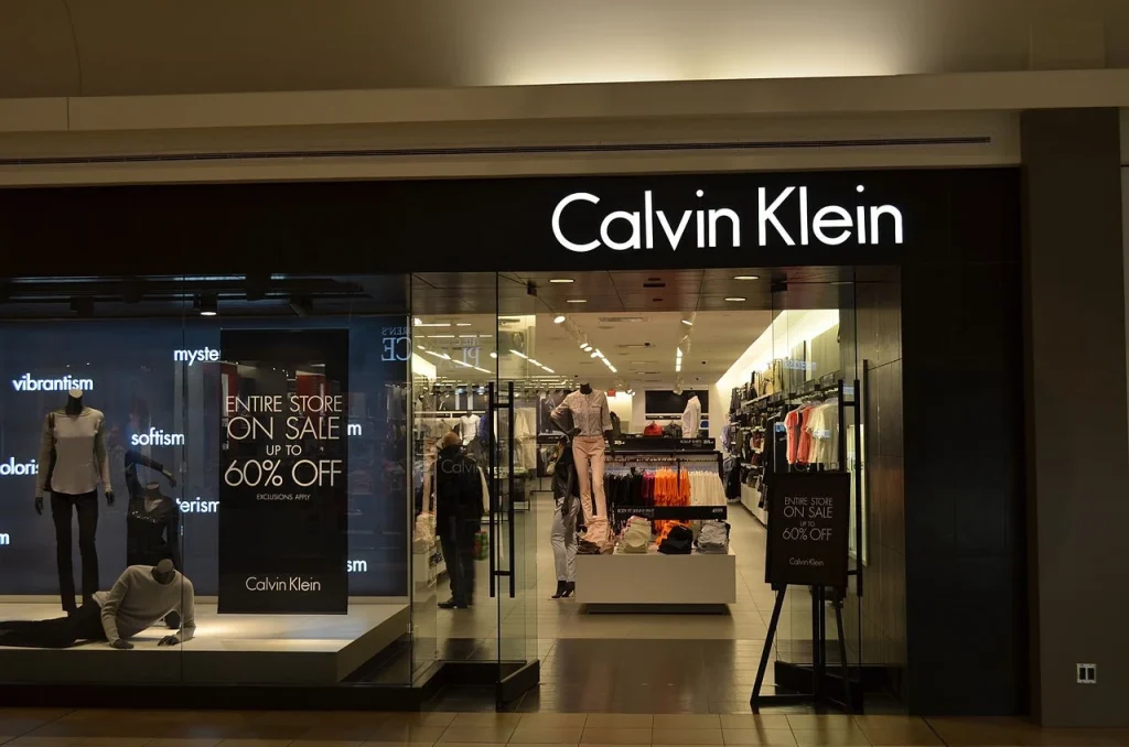
Following Raf Simons’ departure, the Calvin Klein logo has largely retained the all-uppercase, condensed sans-serif design introduced in 2017. This bold and modern wordmark continues to serve as the primary visual identifier for the brand across its various product lines and marketing efforts. While subtle variations in weight and spacing might occur depending on the application, the core aesthetic of strong, capitalized lettering remains consistent, reminiscent of the top clothing logos.
This contemporary logo reflects the brand’s ongoing commitment to a clean, minimalist aesthetic while projecting a sense of strength and global recognition. The continued use of this design underscores its effectiveness in conveying the brand’s modern identity and its position as a leading force in the fashion industry. The emphasis remains on the power of the brand name itself, presented in a clear and impactful visual form.
FAQs
| What is the well-known symbol for the Calvin Klein brand? The Calvin Klein brand is often represented by the lettermark wordmark “ck”. |
| How to check if a Calvin Klein product is original or not? The simplest way to check for cheap knockoffs of Calvin Klein is to carefully observe monogram placement. On the original items, there is a specific placement for the monogram, carefully designed for maximum visibility. On knockoffs however, the logo is placed randomly or askew, showing a lower quality control. |
| Is Calvin Klein considered a luxury fashion brand? Yes, Calvin Klein is considered among the top fashion brands in the world today. |
Conclusion
The evolution of the Calvin Klein logo is a compelling reflection of the brand’s journey from a fledgling coat shop to a global fashion icon. Each iteration, from the elegant simplicity of its early days to the bold, uppercase statement of its current form, represents a strategic step in shaping and reinforcing the brand’s visual identity.
Moreover, throughout these changes, the core principles of minimalism and clean design have remained central to the Calvin Klein aesthetic. The current logo’s relevance in the ever-evolving world of fashion is a testament to the power of thoughtful branding and the enduring appeal of the Calvin Klein name.
Logopoppin
Logopoppin is a graphic design agency that specializes in logo designing, web development, video production and advanced branding services. We love to innovate businesses with new age technologies, allowing them to improve their visual reputation.
