
Table of Content
Discover the Top Canadian Football League Logos and Learn What They Represent
We all know about the NFL, American football’s top professional league. Even if you are not a football fan, you would at least be familiar with its branding and logo, what with the sport enjoying such a massive fan following in the country. But did you know that our neighbor to the north, Canada, has a pro football league of its own?
Called the Canadian Football League or CFL for short, it currently features nine franchises spread across two divisions. The CFL follows Canadian football rules, rather than the American football rules, with both sets having some subtle yet significant differences. And many American football players have successfully made the transition over to that style of play. The biggest difference however, is in the CFL logos sported by the league and its teams, which go in an entirely different direction to the NFL logos.
So, let’s dive in and take a look at the history of the league, and understand what drives the designs of these Canadian Football League logos. Moreover, we will take a look at some of the old logos from the CFL’s previous seasons, and see how the aesthetic of logo design services has changed over the years.
Canadian Football League – An Overview
Canadian football has its origins in rugby football, which saw its origins in the country in 1860. This meant that many of the earliest Canadian football teams started playing under the rules of the Canadian Rugby Football Union, or the CRFU, founded in 1880. After 1909, nearly three decades after CRFU was renamed the Canadian Rugby Union; Governor General Earl Grey donated the Grey Cup, to be used as the winning trophy for the “Senior Amateur Football Championship of Canada”.
By that time, the sport being played in Canada was remarkably different from rugby, and had independently started taking a form that was similar to American football. Now, while American pro football had taken on a franchise model since its earliest days, Canadian football followed an intra-union model through much of the early 1900s.
It took nearly two decades, between 1930s and 1950s, for the various football unions to turn themselves into pro leagues, ensuring that amateur union teams were no longer eligible for the Grey Cup. 1954 is considered the first time when the two top leagues, namely the Big-Four and the WIFU, were the only two professional leagues in contention for the trophy, ushering in the era of modern era of Canadian football.
Since then, the Canadian Football League has embarked on many different projects aimed to bring the sport up, including a shortlived and ultimately unsuccessful bid to raise franchises in the United States. However, due to Canada having a much different sporting environment, as well as a number of other sports that are vastly more popular in the country, the CFL hasn’t been able to match the NFL in terms of size or scope.
Today, there are still nine teams playing for the league, with four teams in the East Division, and five in the West Division. And as of 2024, the regular season consists of 21 games, with each team playing 18 games, and has three bye weeks.
Overall, while not very huge, the CFL is still successful enough to have attracted many of the smaller talent who couldn’t make it in the NFL due to the sheer competition. And despite its smaller size, has managed to not only survive, but thrive financially, where many smaller leagues like these failed in the US due to the NFL’s competition.
The CFL Logo – Representing the League and All Canadian Football League Logos
Talking about the CFL logos, the first one we need to talk about is the league’s symbol itself. Now, while the NFL symbol is a beautifully designed shield that shows that it represents a premier sporting league of the world, the CFL logo falls flat in comparison.
In essence, it looks like a square-cropped image of a light gray football, with the initials of the league under the stitching, under which is a partial image of a maple leaf. Designed to represent its Canadian connection, the two-dimensional, light-toned logo doesn’t represent the fast-paced, aggressive vibe of football.
In fact, it doesn’t make any sense according to commonly held color meanings, as light grays like these are designed to serve as a neutral backdrop for something more visually striking. However, despite that, the league and its symbol is well known in the Canadian market.
Design of CFL Logos for Teams Currently on the Canadian Football League Roster
Now that we have discussed the logo for the Canadian Football League itself, its time to take a look at the CFL logos sported by the teams currently playing in the league this season.
With an idea that the design aesthetic between the CFL and its American counterpart is vastly different for the sport, let’s begin and see what each of these logo designs represent.
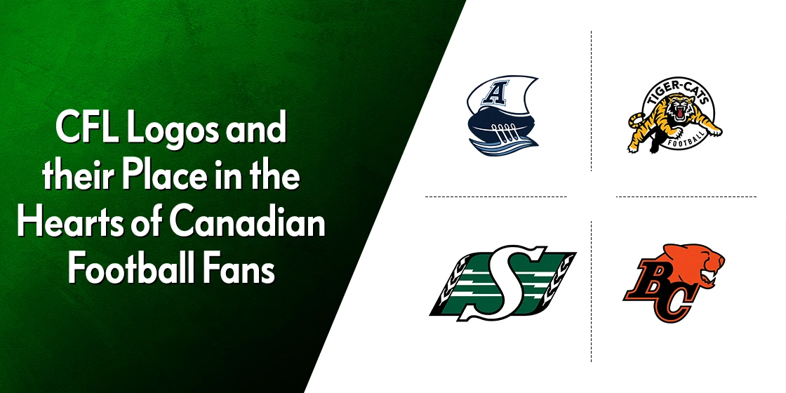
BC Lions
The BC Lions is a Canadian football team that is based out of British Columbia. When it comes to their team symbol, it looks like the designs commonly seen in American college logos for the varsity sports teams.
The simple design of a cougar’s head from the side, along with the simple lettermark with the initials of the team’s city to the side, make for a simple and efficient design. Combined with the color combination of orange and black, it is one of the more subtle of the CFL logos.
Calgary Stampeders
While the design for the BC Lions still had some sort of design flair, the design for the Calgary Stampeders is the simplest of the CFL logos we have seen so far. It features the outline of a galloping horse, somewhat similar to the Ford Mustang logo.
The outline is colored a dark gray, while inside the horse is colored white. Although some might think that the design is simple, it seems to work well for the Stampeders, and incidentally the Mustang brand as well.
Edmonton Elks
While the logos for Lions and the Stampeders were simple to the extreme, the Edmonton Elks decided to go for something a little more unique. The new logo for the team is one of the most beautiful of the CFL logos we have seen so far, and is designed to look like an elk is drawn using a paintbrush and acrylic paint. The strokes are smooth, with the ends looking like the lifting edge of the stroke.
Colored a beautiful fern green from colors that start with F, and accented with yellow, the design is beautiful.
Hamilton Tiger-Cats
The Hamilton Tiger-Cats are based out of the city of Hamilton, and are named the Tiger-Cats because of the merger of two Hamilton-based teams, called the Tigers and the Wildcats. The design features a snarling tiger in mid-jump, in a profile that is highly reminiscent of a cougar jumping on its prey.
Simple, expressive, and quite easy to relate, this design is one of the most memorable of CFL logos today.
Montreal Alouettes
The Montreal Alouettes are the third iteration of the team from Montreal, originally starting out as the Alouettes, then renamed the Concordes, then back to the Alouettes. Their logo uses some stylings from the native Inuit and First People, using their style of art to draw the flying-bird profile for their logo.
The design is encased in a dark blue circle, with the letters a dark crimson. This design is one of the few ones from the CFL logos that could be considered using the style of monogram logo design.
Ottawa RedBlacks

The Ottawa RedBlacks are the third team from Ottawa to have joined the Canadian Football League. The original team from the area, called the Ottawa Rough Riders, was forced to fold in 1996 after nearly 120 years of playing in the sport. Then in 2002 a new franchise called the Renegades popped up, which too failed within the next four years.
It wasn’t until 2013 when a new franchise didn’t start playing from Ottawa. Named the RedBlacks, the name refers to the red and black check flannel shirts worn by the lumberjacks from the area. Incidentally, the design of the logo too represents this heritage, as it is made to look like the blade of a rotary saw. Overall, this is the first of the CFL logos that we can honestly say looks somewhat like what you would expect from American football logos.
Saskatchewan Roughriders
The Saskatchewan Roughriders are a Canadian football team for the CFL, who hail from the area of Saskatchewan. Their logo features the designs commonly found in the traditional handicrafts of the First People of Canada, who are quite prolific in the Saskatchewan area.
The design features a green banner design, with both left and right sides having a black bar with traditional designs on the edges. The middle green part features three horizontal white lines, with a large white “S” superimposed over the design. Overall, while simple, it represents the history of their region and the people in a way that teams like the Washington Commanders logo from the NFL failed to do.
Toronto Argonauts
The Toronto Argonauts are one of the oldest Canadian football teams in the Canadian Football League. In fact, it is older than many of the oldest teams currently playing in the NFL. Founded in 1873, it started by playing the modified form of rugby that came to the region in the latter half of the 19th century.
Their logo features a ship in the form of a football, with a mast that has the sail mounted on it displaying the team’s initials. Moreover, the eyelets for the football’s stitching are made to look like portholes with oars coming out of it.
Named after the band of Greek heroes from ancient mythology, the team represents one of the most successful of the leagues franchises, with one of the best CFL logos on this list.
Winnipeg Blue Bombers
Finally, the Winnipeg Blue Bombers have the second simplest design of all the modern Canadian Football League logos. It represents one of the three community owned teams in the CFL, similar to the Green Bay Packers from the NFL. Incidentally, the Green Bay Packers logo is quite simple too, especially when compared to its compatriots in the league.
The logo represents the team that started its journey in 1930. The design features a large, blocky letter “W”. The outline is colored a dark blue, while inside the design is white. Compared to the Stampeders design of the CFL logo, this may look simpler. However, while that design would be harder to recognize at a distance, the logo for the Winnipeg Blue Bombers would have no problem being visible, no matter the size or distance.
And that is what makes it so special. In the end, the purpose of CFL logos is to help people recognize the team, both on and off the field. If your logo is simple, but doesn’t have the benefits that come with simplicity, then there is no point to it. However, if your logo is designed to be simple so that it boosts its visibility and memorability, then the simplicity can be justified.
FAQs
| What is the oldest of the CFL logos and teams? The oldest of the CFL teams represented in the league today are the Toronto Argonauts. |
| Is the CFL older than the NFL? Yes, many of the CFL teams predate the NFL by several decades, and is more closely aligned to the original rules for gridiron football compared to its American counterpart. |
| Have any football games featured NFL team symbols against CFL logos? Between 1950 and 1961, six games were held between Canadian football teams and the NFL football teams. |
| Is the Canadian Football League gaining in popularity? Yes, the CFL is gaining in popularity. Average game day revenue for teams like the Argonauts, Lions, and the Alouettes are up 26% year-by-year through week 10 of the season. |
Conclusion
In summation, the CFL logos portray a different vibe to the more popular NFL symbols. In fact, the design aesthetic matches the style of the old XFL logos more. However, that aesthetic seems to work well for the Canadian Football League, as it contains teams that predate any of the existing NFL franchise, and are still playing the game.
In the end, it doesn’t matter what we think about their logos’ likeability. What’s important is that their target audience like and connect with their favorite Canadian Football League logos. And the CFL has shown that despite its smaller size, it has a loyal fan base, meaning that it is here to stay.
Latest news you want to know!
Subscribe for cutting-edge design inspiration at Logo Poppin! Elevate your brand with updates on logos, branding, web design, and video animation.
Note that by clicking “subscribe,” users may agree to our privacy policy and consent to Logo Poppin to use your contact data for newsletter purposes.
Logopoppin
Logopoppin is a graphic design agency that specializes in logo designing, web development, video production and advanced branding services. We love to innovate businesses with new age technologies, allowing them to improve their visual reputation.

