Table of Content
Discover How the Iconic Captain America Logo Became a US Patriot’s Icon
Captain America, known as Steve Rogers, is a superhero who belongs to the Marvel team The Avengers. For the fans of MCU, or the Marvel Cinematic Universe, the “Cap”, as he is affectionately known, is the leader of the Avengers.
Known for his iconic vibranium shield, developed by Howard Stark, the Captain has been the USA’s poster boy for American might against the Axis forces during WW2. So iconic was this accessory, that when the Avengers assigned each member a symbol, the shield became the Captain America logo.
The legacy of that shield is quite interesting, as it became the symbol of the superhero even after Rogers decided to hang up his boots, so to speak, and the mantle passed to other holders. But what was it about that shield that made it so memorable? Wouldn’t the giant five-point start emblazoned across Captain America’s chest be a better identifying symbol for the hero?
Let’s dive in and discover the inception and the evolution of the Cap’s logo, and find out what was it about the shield that made it a central part of the design. We will also find out how a professional logo design company can help your brand develop such an iconic logo that transcends the individual’s legacy.
Origins of Captain America – The Inception of the Marvel’s USA Golden Boy
Captain America is one of Marvel’s most successful and popular characters, hero or otherwise. He has been quite popular as an individual, or even as part of teams such as the Avengers. However, how many of you know how the character came to be?
It was December 1940, with World War II been going on for nearly two years now. And while the USA hadn’t officially joined the fight, they had been supporting their allies in other ways. However, with the war escalating, the overall sentiment was one of patriotic duty against the fascists. And that gave rise to new, American-made superheroes.
Now, initially, heroes like Marvel’s Captain America or MLJ’s Shield were often portrayed in conflict against Axis forces such as the Nazis, and later against communists or the Red Scare. The difference between the popularity of these comics against others like Superman or more is that unlike the latter, the villains faced by the former were often real. This capitalized on the audience’s perceptions and emotions, thus becoming a good tool to influence public opinion of events such as wars.
Thus, these superheroes are created. Coming back, it was the end of 1940 when Timely Comics, the predecessor to Marvel, hired designer Joe Simon to create a new character rivaling Superman from National Comics, DC predecessor. Joe believed that a good hero has a strong, well-grounded villain. Looking around himself for inspiration, he saw that Nazi leader Adolf Hitler was a great villain for a new, American hero.
This was partly due to his disagreement with the US government at the time, who had been following a non-interventionist policy about the Third Reich’s actions. Thus, the character of Captain America was born. The company decided that for the first time, they would launch their new character with their own standalone series, which went against their rule of each character first appearing in an anthology.
Thus, Captain America was born. With comic book legend Jack Kirby brought on to be the lead designer on this, Simon credited the success of the character to him, claiming that Kirby wasn’t just a designer, but a co-creator of the character.
The character was an instant hit with the people, with the second edition onwards averaging a million copies a month, beating established publications like the Times in those days. Moreover, while the Captain was not the first America-themed superhero, he soon became the most popular one. And when MLJ complained that Captain America’s initial kite-shaped shield, called a heater shield resembled that of their superhero The Shield, Kirby changed it to the iconic round design that soon became the Captain America logo.
This was the inception of the Captain America, a character who has gone through various ups and downs, but has persevered to survive and make its way to animation and live action adaptations today.
Development of the Captain America Shield Logo
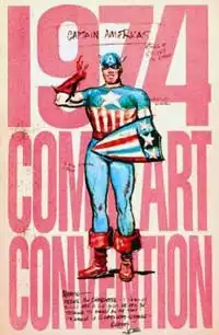
As we discussed earlier, the first shield that fans witnessed the iconic all-American superhero wielding was a heater shield, which is a kite-shaped shield commonly associated with the term. However, when rival MLJ comics claimed that this shield was similar to the one sported by their superhero, called The Shield, Timely Comics had to change it.
Jack Kirby, the designer at that time for Captain America, came up with the round shield that we all know today. And with this new symbol of American patriotism on his arm, Captain America became a superhero that established the core of Marvel’s primary superhero teams.
Over the years, the design of the shield has varied slightly, with the basic design premise being the same in every iteration. A single five-point star is always in the middle, colored white over a dark blue background. After that, alternating bands of red and white encircle the shape until the edge of the shield, with various iterations changing the width and number of the bands on the shield.
As for the heater shield design, it made a once-off comeback in The Avengers #71, released in December 1969. However, the next edition reverted the character’s shield back to the round design.
The color scheme, and its use by the Captain as both an offensive and defensive tool, made it the perfect choice for the shield to be considered the symbol of the superhero – The Captain America logo.
Evolution of Captain America’s Iconic Symbol Over the Years
Now that we have taken a look at the inception of the Captain America character, as well as the origin of their logo’s design, we know that the design has changed slightly in eight decades of the character’s run. And today, we cannot think about the Marvel logo without the Captain’s shield coming to mind.
However, what we need to know, is how has the Captain America logo managed to appeal to its multi-generational fan base over such a long period of time, with only slight changes? Considering that the American involvement, and later the Captain’s involvement in the Korean War and Vietnam War, and the sudden shift of the character from Nazis to communists didn’t go over so well.
Let’s dive in and discuss the secrets that made the Captain’s logo so iconic over all these years.
Captain America Comics #1 (March 1941)
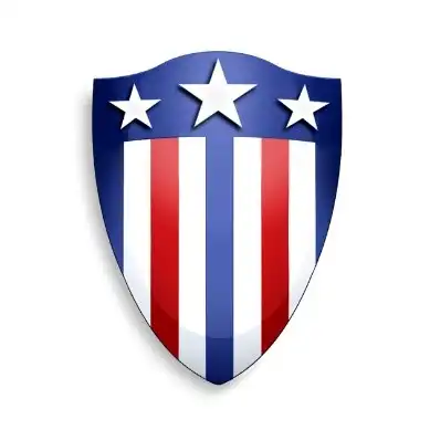
The first iteration of the shield wielded by Captain America was this heater shield. Now, as far as monogram logos go, this is one perfect design, especially for an all-American hero. With its clear and natural shape, the highly visible red, white, and blue stripes, as well as the three stars at the top of the shield, this would have been a great logo.
Unfortunately, Timely Comics, who owned the character, were hit with claims by MLJ, now known as Archie Comics, that the shield was similar to the one used by their hero, The Shield. And a glance at that character’s design, a design released quite a while before the inception of Captain America, would show that to be true.
Therefore, to avoid any potential legal activity, artist Jack Kirby was asked to redesign the shield for the second edition onwards. Rather than tweaking the design to make it less similar to The Shield’s, Kirby went a different route. He changed the entire style of the shield, which went from a heater shield to a round shield.
The resultant design opened up a lot of opportunities, besides just its defensive capabilities. However, it wasn’t until Stan Lee was brought on that those opportunities were realized, and the result was the Cap now using it both as a shield and as a throwing weapon.
Incidentally, you can see the Captain, in his guise as the Nomad, using a similar, but smaller sized shield in MCU’s Infinity War. That is because at the end of Civil War, Cap gave back the shield to Iron Man, and it wasn’t until they reconciled in Endgame that Captain America gets the shield back.
Now it may seem like this is focusing too much on the design of the shield rather than the logo itself. However, you need to understand that when it comes to Captain America, the two elements are one and the same. The shield is the logo, and the logo is the shield. There is no differentiation between the two. And as such, as the design of the shield changed, so did the logo.
Captain America Comics #3 (May 1941)
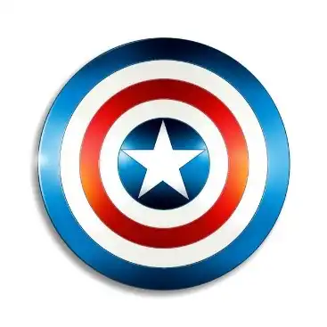
Once Timely Comics addressed the grievance of MLJ comics regarding the similarity to their character The Shield, the logo was redesigned for subsequent editions. The round design first featured in Captain America #3, released in May of 1941. At that time, it was a direct derivation of the previous heater shield, meaning that it used the same artistic elements, including the colors However, the result was a little lackluster in our opinion.
This version of the Captain America logo and shield featured the classic round shape, with the innermost circle having a five-point white star over a dark blue background. Surrounding it, were alternating circles of the colors of the American flag as its color combinations, in the order of blue, white, and red, starting with blue from the innermost circle.
The prevalence of blue over red and white made the shield look more British than American in our opinion, especially if the star hadn’t been there in the middle. However, this design was used for a few decades, on and off. That is because what it lacked in individual character, it made up for it by helping make Steve Rogers into USA’s own Captain America.
The Avengers #4 (March 1964)
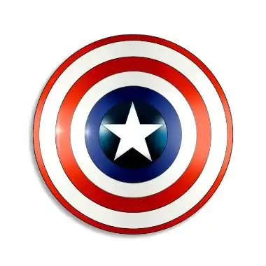
The next true redesign we know of is the one revealed in The Avengers #4, released in March of 1964. In the more than two decades since the inception of the first round-style Captain America logo, the shield had seen virtually no change. Especially as in the 1950s, during the American involvement in the Korean War, as well as Kirby’s departure from the company, fans opinion started to cool towards the superhero.
The result was a declining reader base, and as such, lower sales. This meant that the comic book creators didn’t think about changing the design of the shield, as it was the one element that had appealed to the consumers initially.
However, in the early to mid 1960s, the company saw a slight uptick in changing public opinion. And with that, the company decided that a little tweak to the design was necessary to keep it relevant to the new and old readers alike. They didn’t change the circle logo design, but tweaked the color scheme.
The new logo changed the order and width of the colored bands on the shield. Now, instead of a white band surrounding the white star on a blue circle, a blue ring encircled it. Moreover, the order of bands, from inside to out, was in order of blue, white, red, white, and red. The outer ring was made substantially thinner, so that it mimicked an outline more than a concentric band.
The Avengers #71 (December 1969)
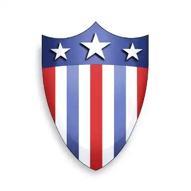
In December 1969, The Avengers #71 was released, and it featured a slightly modified version of the original Captain America logo, the heater shield. Now, color scheme had been made more in line with the modern colors of the American flag, a symbology we similarly see in designs like DC’s Superman logo.
The shield was made rounder at the bottom, which made the shield more aesthetically pleasing. Moreover, the red and blue bands from the original design were swapped, which made the red more prominent in the design, a common color theme from many of Marvel’s heroes, such as the Spiderman logo.
Silver Age Style 1941 – Present
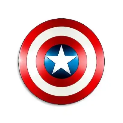
Finally, we come to the Silver Age style of the logo. The silver age Captain America logo is the round shield that we all know today, used in both the comics and live-action/animated adaptations of the character.
The design is quite iconic, as is common with other silver age hero symbols, like DC’s Wonder Woman logo. As a patriotic icon, the shield for Captain American is made to resemble the flag of the United States. And it does so quite well, with a giant white star at the center of the shield over a blue background, and white alternating bands of red and white encircling the design.
This bulls-eye style design of the shield makes for one of the greatest superhero logos of all time, a fact that is undeniable whether you are a Marvel or DC fan. And it set the foundation for many of Marvel’s do-gooders, inspiring them to be better, and expect more of themselves no matter what.
FAQs
| Who designed the Captain America logo? The logo design for Captain America was created by cartoonist Jack Kirby, and Timely Comics executive Joe Simon. They originally came up with a heater shield style logo, but soon changed it to a round design after competitor MLJ complained for similar designs. |
| What is Captain America’s real name? The real name of the original Captain America is Steve Rogers. |
| Who was the very first avenger in Marvel? Captain America, aka Steve Rogers, is considered the first Avenger in Marvel continuity. |
Discover More Superhero Logo Designs:
Conclusion
To sum it up, the Captain America logo is considered an allegorical display of American might. As the shield and the logo came to represent the transition of Steve Rogers into Captain America, transforming from a scrawny, sick little kid into a powerful superhero, it mirrors USA’s transition.
From a land colonized by the British, this ragtag bunch of people came together and persevered against their colonizers, and managed to set themselves up into becoming a veritable power of the world. And there is no better symbolism between its rise, and the rise of Captain America, in both the good and the bad aspects.

Logopoppin
Logopoppin is a graphic design agency that specializes in logo designing, web development, video production and advanced branding services. We love to innovate businesses with new age technologies, allowing them to improve their visual reputation.

