Table of Content
Explore the Complete History of Carhartt Logo Below
Carhartt is widely recognized as one of the leading workwear brands in the world, consistently ranking at the top when discussing high-quality and durable work apparel. Established in the United States, Carhartt has built a strong reputation for providing rugged, reliable clothing designed to withstand the toughest working conditions. With a commitment to functionality and longevity, the Carhartt logo has become a symbol of trust among workers in industries such as construction, manufacturing, and agriculture.
With a legacy spanning over a century, Carhartt has played a significant role in shaping the workwear industry. Since its founding in 1889, the company has continuously evolved to meet the changing demands of hardworking professionals while maintaining its core values of durability and comfort. The brand’s dedication to innovation has allowed it to remain a leader in the field, offering a wide range of products that cater to various trades and work environments.
Created by professional logo design services, the Carhartt logo has become an emblem of quality and reliability. Its reputation extends beyond the workforce, as Carhartt’s rugged aesthetic has also gained popularity in streetwear and casual fashion. If you want to know about the complete history of Carhartt logo, read this article in detail. It will let you know how this workwear symbol evolved over the years, making trust and durability as its core components.
What is Carhartt?

Carhartt is a renowned American workwear brand known for its durable and high-performance clothing. Founded in 1889 by Hamilton Carhartt in Detroit, Michigan, the company initially focused on producing heavy-duty overalls for railroad workers. Over the years, Carhartt has expanded its product line while staying true to its mission of providing rugged and reliable apparel for individuals working in demanding environments. The brand has become synonymous with toughness, and longevity, making it a top choice for workers across various industries.
Carhartt manufactures a wide range of workwear products designed to withstand harsh conditions and provide maximum comfort. Its product lineup includes heavy-duty jackets, overalls, bibs, vests, and work pants, all made from durable materials like duck canvas and heavyweight cotton. The brand is also known for its insulated outerwear, which offers protection against extreme cold, as well as flame-resistant clothing for workers in hazardous environments.
Beyond traditional workwear, Carhartt has also gained popularity in casual fashion and streetwear. The brand produces everyday essentials such as hoodies, t-shirts, beanies, and caps, appealing to both workers and style-conscious consumers. Carhartt WIP (Work in Progress), a sub-label launched in Europe, brings a modern and urban twist to its classic designs, making the brand even more versatile. Whether for work or casual wear, Carhartt remains a symbol of durability, practicality, and timeless style.
What Makes Carhartt Workwear Highly Durable?
Carhartt workwear is renowned for its durability due to its high-quality materials and rugged construction. The brand primarily uses heavyweight cotton fabrics, which is tightly woven to resist tears, abrasions, and wear from demanding work environments. Many of their garments are also reinforced with triple-stitched seams, ensuring added strength and longevity. This meticulous attention to material selection and stitching makes Carhartt workwear ideal for physically demanding jobs in industries like construction, farming, and manufacturing.
Beyond materials, Carhartt incorporates functional design features that enhance durability. Their workwear often includes reinforced pockets, double-layered knees, and riveted stress points to prevent premature wear. Some jackets and pants also have water-repellent coatings, making them more resistant to harsh weather conditions. These thoughtful design elements ensure that the clothing withstands heavy use while maintaining comfort and flexibility, allowing workers to move freely without compromising protection.
Lastly, Carhartt’s commitment to quality control and innovation further enhances durability. The company continually tests its products under real-world conditions. Many of their garments are pre-washed to reduce shrinkage and improve softness without compromising strength. Additionally, Carhartt offers a variety of fits and styles to accommodate different job requirements while maintaining the brand’s signature toughness. This dedication to quality and functionality has solidified Carhartt’s reputation as a leader in durable workwear.
History of Carhartt Logo
Carhartt has a rich history in the workwear manufacturing industry. To keep this legacy intact, the brand has tried to keep its abstract logo simple and clean over the years. If you want to know the complete history of this logo, take a look at the timeline given below.
Carhartt Logo – 1920

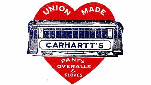
Carhartt’s first logo prominently featured a large red heart, a design choice directly inspired by the company’s name. The heart symbol was likely chosen as a visual representation of the “Hartt” in Carhartt, reinforcing the brand identity in a simple yet memorable way. This early logo helped establish brand recognition, making Carhartt stand out in the workwear industry even in its early days.
The bold red heart served not only as a symbolic connection to the name but also as an eye-catching element that made the logo easily recognizable. The use of a bright, strong color like red conveyed energy, passion, and resilience—qualities that aligned well with the company’s mission to create durable and reliable workwear for hardworking individuals. The heart shape, often associated with strength and endurance, subtly reflected the toughness and longevity of Carhartt’s products.
Over time, Carhartt evolved its branding, moving away from the original heart logo to a more industrial and minimalist design that better represented its rugged image. While the red heart was eventually replaced, its presence in Carhartt’s early branding played a significant role in shaping the company’s identity. The transition to a more illustrated logo mirrored the company’s growth and focus on functionality, but the legacy of the original design remains an interesting part of Carhartt’s history.
Carhartt Logo – 1940

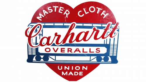
During the 1940s, Carhartt underwent a significant logo redesign, refining its visual identity to better reflect the brand’s evolving image. One of the most noticeable changes was the transformation of the heart symbol, which took on a softer, rounder shape. This adjustment gave the logo a more polished and modern look while maintaining the brand’s connection to its original design. The redesign aimed to create a more visually appealing and recognizable logo that would stand out in an increasingly competitive market.
In addition to the changes in the heart shape, the text elements within the logo were also updated. The written sections were modified to feature the phrases “Master Cloth” and “Union Made,” emphasizing the high-quality materials and craftsmanship that Carhartt was known for. The inclusion of “Master Cloth” reinforced the brand’s commitment to producing durable and reliable fabrics. These textual updates aligned with the company’s mission and values, strengthening its reputation in the workwear industry.
Another key aspect of the redesign was the update to the tram imagery within the logo. The tram was refined and modernized to better fit the overall aesthetic of the new design. This update likely symbolized the company’s continued progress and adaptation to the changing times while still honoring its roots. By incorporating these design enhancements, Carhartt successfully maintained a balance between tradition and modernization.
Carhartt Logo – 1970

In 1970, Carhartt introduced its final and most minimalist logo, the one that remains instantly recognizable today. This redesign marked a significant moment in the company’s history, as it established a strong, timeless visual identity that would carry the brand into the future. Unlike previous iterations, which featured a heart shape and other intricate details, this new logo took on a more minimalist and modern design.
The new Carhartt logo was crafted to exude a sense of timelessness, reflecting the brand’s longstanding reputation for producing high-quality workwear. Its sleek and simple aesthetic made it versatile and easily adaptable across different types of clothing and marketing materials. By stripping away unnecessary details and focusing on a bold yet clean design, the logo conveyed strength and dependability—qualities that resonated with Carhartt’s loyal customer base.
Ultimately, the creation of the 1970 Carhartt logo was a defining moment that cemented the brand’s visual identity. The decision to embrace a more classic and enduring design reinforced Carhartt’s status as an industry leader in durable workwear. Over the decades, the logo has become synonymous with quality, embodying the very essence of what Carhartt stands for.
Frequently Asked Questions
| What is Carthartt? Carhartt is an American workwear brand known for its durable, high-quality clothing designed for tough jobs and outdoor wear. Established in 1889, it has become a staple for workers, outdoor enthusiasts, and streetwear fashion. |
| Why Carhartt workwear is popular in the world? Carhartt workwear is popular worldwide due to its exceptional durability, comfort, and timeless design,. Its blend of functionality and rugged style has also made it a staple in streetwear fashion. |
| What is the color of Carhartt logo? The Carhartt logo is typically yellow or gold, often set against a black or brown background. This warm, bold color reflects the brand’s strength, durability, and heritage in workwear. |
Final Words
That takes us to the end of this blog in which we have discussed the complete history of Carhartt logo. It is undoubtedly a famous brand that is known for manufacturing high quality workwear. Over the years, people have shown trust on the Carhartt logo because it represents a brand identity that emphasizes durability and strength. The legacy of this logo is certainly very huge, representing a classic clothing brand that pioneered the concept of robust workwear fashion.

Logopoppin
Logopoppin is a graphic design agency that specializes in logo designing, web development, video production and advanced branding services. We love to innovate businesses with new age technologies, allowing them to improve their visual reputation.


