Table of Content
Discover How the Famous American News Channel Logo Evolved
CBS (Columbia Broadcasting System) is one of the oldest and most prominent television and radio networks in the United States. Founded in 1927 as a radio network, CBS transitioned into television in the 1940s and quickly became a major force in American broadcasting. Known for its wide-ranging programs, CBS has produced and aired many iconic shows during the last few decades. It is a key part of Paramount Global (formerly ViacomCBS) and continues to be a cornerstone of American mass media.
One of the most recognizable branding elements of the network is its iconic CBS logo. Introduced in 1951, the Eye logo was designed by William Golden and based on a Pennsylvania Dutch hex sign and a Shaker drawing. Its simplicity and visual impact made it instantly memorable and unique among broadcast logos. Over the decades, the Eye has become synonymous with trust, reliability, and high-quality programming, maintaining its fundamental design while being subtly modernized to stay current with visual trends.
The CBS Eye is more than just a logo—it’s a symbol of the network’s enduring presence and identity. It has stood the test of time in an industry known for rapid change, serving as a creative and consistent emblem that communicates both tradition and innovation. If you want to know about the complete history of CBS logo, read this blog in detail.
The Concept of CBS Logo

The concept behind the CBS logo, known as the “Eye,” is centered on the idea of constant observation and presence. Created by professional logo design services, it is a symbolic representation of the network’s role in delivering content to the public. Created in 1951 by William Golden, the logo was inspired by a combination of a Shaker drawing and a Pennsylvania Dutch hex sign. Golden wanted a design that was simple, memorable, and visually meaningful. The Eye was intended to symbolize vigilance and clarity, reinforcing CBS’s position as a reliable and watchful broadcaster.
The Eye also conveys deeper themes of trust, vision, and transparency. During a time when television was becoming a dominant force in media, CBS needed a logo that would instill confidence in its viewers. The Eye represents a direct, visual connection between the audience and the network, suggesting openness and a commitment to presenting the truth. This concept supported CBS’s brand identity as a source of news and entertainment that could be trusted to observe and report with integrity and accuracy.
While the design has seen minor refinements over the years, the fundamental concept of the CBS Eye has remained consistent. Its minimalist design helps it stand out in a crowded media landscape, and its universal symbolism as an eye makes it instantly recognizable. The logo’s endurance is a testament to the strength of its original concept, which continues to reflect CBS’s mission to watch over, inform, and connect with its audience in a clear and meaningful way.
History of CBS Logo: Exploring the Evolution
The CBS logo we know today is not the same one that was introduced way back in 1927. The broadcasting company has used different types of logos over the period of time, showcasing its diversity in designing and branding. Let’s take a look at the history of CBC logo below.
CBS Logo: 1927

The Columbia Broadcasting System, now widely known as CBS, introduced its very first logo in 1927. This early design marked the beginning of the network’s visual identity and served as a representation of its emerging presence in the American broadcasting landscape. At the time, CBS was primarily a radio network, and the logo reflected the design sensibilities of that era, likely incorporating formal typography and a straightforward layout.
This original logo remained in use for a period of four years. During this time, CBS was rapidly expanding its influence and building a reputation as a major force in national radio broadcasting. Although the design itself was eventually replaced, it played a foundational role in shaping the company’s brand identity.
CBS Logo: 1931

In 1931, the logo of the Columbia Broadcasting System underwent a significant redesign that reflected a more modern and forward-thinking aesthetic. This update marked a shift in the company’s visual identity, aligning it with the evolving trends of the early 20th century and the growing sophistication of the broadcasting industry. The redesign introduced cleaner lines and a simplified layout, moving away from the traditional and formal look of the original logo.
Just like Fox news logo, the modernized CBS emblem not only gave the channel a refreshed appearance but also helped the company strengthen its brand presence during a time of intense competition and expansion in the media world. As the network continued to grow in popularity and influence, especially in radio, the updated logo played a crucial role in making the CBS name more visually appealing and memorable to the public.
CBS Logo: 1935

In 1935, the Columbia Broadcasting System introduced a notable redesign of its logo that marked a turning point in the company’s branding strategy. One of the most significant changes in this version was the shortening of the full name to the simple and concise acronym “CBS”. This decision reflected a broader trend in corporate identity at the time, where companies began adopting abbreviated names to create memorable brand recognition.
This streamlined approach also symbolized the network’s growing confidence and prominence in the broadcasting world. By 1935, CBS had firmly established itself as one of the major players in radio, and the new logo helped position it as a modern, forward-looking organization. The use of the acronym gave the company a sleek, contemporary feel while also making it easier for audiences to identify and remember.
CBS Logo: 1938

In 1938, the CBS logo experienced another significant transformation. This redesign introduced a bold change in shape, replacing the previously used circle with a downward-pointing triangle. The triangle offered a fresh, geometric form that was visually striking and distinct from earlier versions of the logo. This shift not only gave the logo a more stylized appearance but also aligned with emerging design trends of the late 1930s.
The downward-pointing triangle may have also been intended to symbolize direction, reflecting CBS’s role as a media broadcaster delivering content to its audience. This updated design helped reinforce the network’s image as a leader in innovation and creativity within the broadcasting industry. It allowed CBS to stand out visually in a growing media landscape that was also becoming highly competitive.
CBS Logo: 1941

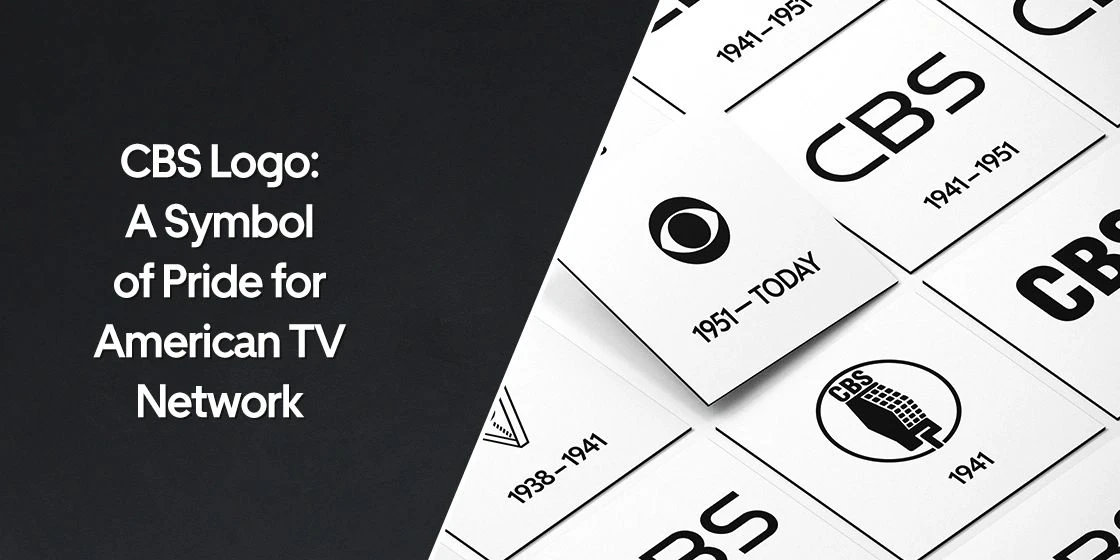
In 1941, CBS introduced a new design that featured a clean and modern black wordmark logo set against a white background. This redesign was a deliberate move toward simplicity and clarity, reflecting the company’s desire to establish a more professional and streamlined brand image. The use of a monochromatic palette gave the logo a timeless quality, ensuring that it would remain visually effective across various media formats.
This updated logo design came at a time when CBS was expanding its influence in both radio and the emerging field of television. The minimalist approach not only conveyed a sense of authority and confidence but also allowed the network to present itself as a reliable and forward-thinking organization.
CBS Logo: 1951 – Today

In 1951, CBS introduced what would become one of the most iconic symbols in broadcasting history—the circular eye logo. This distinctive design was created by William Golden, the network’s pioneering art director. Golden drew inspiration for the logo from a combination of sources. The design was striking in its simplicity and effectiveness, offering a powerful metaphor for a television network that aimed to keep a constant watch on the world.
The CBS eye logo was not just a stylistic choice but a strategic branding decision. It debuted during a period of rapid growth in television viewership and technological innovation, allowing CBS to position itself as a leader in modern broadcasting. The eye symbol quickly became synonymous with the network’s identity, appearing across television screens, promotional materials, and corporate communications.
Frequently Asked Questions
| Why CBS channel is popular in the US? CBS is popular in the US for its long-standing reputation for high-quality news and entertainment programs. It has consistently delivered top-rated shows and trusted journalism to a wide national audience. |
| When was the first CBS logo introduced in the market? The first CBS logo was introduced in 1927, the same year the company was founded. It marked the beginning of the network’s visual identity during its early radio broadcasting era. |
| What is the color of CBS logo? The CBS logo is typically black and white, emphasizing simplicity, clarity, and timelessness. This monochromatic color scheme enhances its bold and instantly recognizable design. |
Final Words
That concludes our entire article in which we have discussed the complete history of CBS logo. It is one of those emblems that is highly famous in the American news broadcasting industry. The organization has made a reputable name over the course of decades, which is why its logo has become popular among the people. It looks quite unique among other news channel logos, giving the CBC Network a great branding edge in the market.

Logopoppin
Logopoppin is a graphic design agency that specializes in logo designing, web development, video production and advanced branding services. We love to innovate businesses with new age technologies, allowing them to improve their visual reputation.


