
Table Of Content
Discover How the Chevy Logo Came to Be & It’s Evolution Through the Years
Who doesn’t know the Chevrolet brand nowadays? As one of the brands that make up the General Motors, Chevrolet has risen up through the decades, to become an international brand known far and wide. Today, the Chevrolet logo can be seen on consumer vehicles nearly everywhere, from Asia and America, to even Oceania.
Over the years, the Chevrolet emblem was featured on some truly iconic vehicles, such as the Camaro, Corvette, Impala, and more. Even today, Chevrolet-branded trucks like the Silverado are some of the most popular buys for those looking for great value for their money. After all, it is the company that beat GM-opponent Ford to become the largest automobile seller in the world just a few years earlier.
But do you know what that bow-tie Chevrolet emblem design means? That little yellow design with a silver-chrome outline is one of the greatest mysteries regarding any automobile logo. So, let’s dive in and discover the origins and the meaning behind the iconic Chevy logo, and see how it has evolved over the years to become the icon that it is today.
1- The Inception of the Chevrolet Brand
As the first decade of the 20th century came to a close, brands like Oldsmobile, Buick, and Ford were well on their way producing automobiles for their consumers. However, at that time the vehicles being produced were expensive. It wasn’t until 3 years later when the Ford Model T was released that an economical automobile was developed.
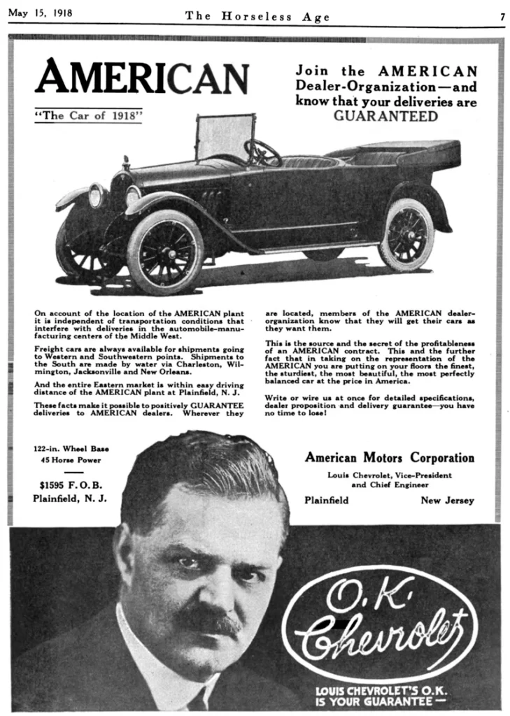
Around November of 1911, sacked GM executive William Durant, who wanted to start a new automobile company, approached Swiss race car driver Louis Chevrolet. As a co-founder of General Motors who was unceremoniously removed from the company, Durant wanted to capitalize on Chevrolet’s talent and name to create a new automobile company. And he did.
Naming it the Chevrolet Motor Company, the company was owned by Louis Chevrolet and his brother Arthur. Other investors included Durant, William Little of the Little Automobile, Durant’s son-in-law Dr. Edwin Campbell, James Whiting who was the former owner of Buick, and R.S. McLaughlin who was CEO of GM Canada.
Now, although the first prototype for the company’s inaugural car was already developed months before the company was registered, production wasn’t started until 1913. Originally, the first year of their automobile production saw a simple wordmark of the company name as the logo. However, in 1914, the company revealed the iconic bowtie shape for the first time.
Featured on the new H Series and L Series models, the design was an outline of the bowtie with the name of the company written in all uppercase letters inside. At that time, there was no specific color scheme for the logo, rather an outline that marked the vehicles as Chevrolets. Keeping up with the trend of that era, the design was inspired by something Durant saw, who drew it up for the logo. And while now the company may have hired a professional logo design company to tweak the symbol, the fact is that it wasn’t the case at the logo’s inception.
Since then, the company has released multiple iterations of that logo. For a long time, Chevrolet used different colors for the logo outline based on the category of vehicles. For example, blue meant that it was a passenger car, red meant that the vehicle had a performance package, and gold was usually seen on trucks. And it wasn’t until 2004 that the company unified the identity with a solid gold bowtie, in order to stand out against Ford and Dodge, American car brands who used blue and red respectively.
2- History of the Chevrolet Logo Design & the Bowtie Chevy Badge
After the start of the business, and once consumers started to patronize the business, Chevrolet used the bowtie logo for the first time ever. Featuring on the all-new H series and L Series of automobiles, the logo was subtle.
The iconic shape of the logo was an interesting one. For example, according to company sources, the logo design came about from Durant, who saw something similar while on vacation on France. Originally, the ad was for a company called Coalettes, a coal briquettes company. Assuming that it would look good for the company logo, Durant brought the design back to the company, and decided to incorporate within the brand and its automobiles.
However, there is another theory that lends credence to the first one. According to some sources, the design is a slightly modified Swiss cross, which represents the Swiss roots of founder Louis Chevrolet. Whatever, the reason for the adoption of this logo design may have been, the fact of the matter is that today, even decades after the logo was first used, the bowtie logo is still there in its modern form. Therefore, despite the different interpretations of the Chevrolet logo, the symbol has persevered to represent the Chevrolet brand today.
Over the years, the company has used various iterations of the logo, using a variety of styles and colors to denote different categories of vehicles produced by Chevrolet. Starting from 1914 when the company first debuted the logo, to 2004, when Chevrolet reunited the brand under one, yellow-gold bowtie symbol, the logo has gained a massive fan following.
2.1- Meaning Behind the Chevrolet Logo – Demystifying the Bowtie Emblem
There is no special meaning attributed to the logo by the company itself. For the most part, since William C. Durant came up with the design, people have been speculating and associating different attributed to the bowtie.
However, despite the company never clearing up the mystery of the Chevrolet logo, the fact is that the symbol is one of the most easily recognizable car brand logos in the world. And even without the accompanying wordmark, consumers are able to identify the brand as Chevrolet quite easily.
So whether it is just a coincidence that the founder liked the design, or whether it is a subtle nod and homage to the Chevrolet brothers’ Swiss heritage, the bowtie design is one of the most iconic car logos in the world.
3- Discovering the Evolution of the Chevrolet Logo
Now that you know how the design came into being, let’s dive in and take a look at different evolution of the Chevy brand logo over the years. Its very rate that a brand goes on for decades and decades, without changing its brand logos and symbols.
That is because the design aesthetic of consumers changes over time. However, the nostalgia of seeing an old version of the logo from the car from their past is one that people really love. So, from 1914 to today, let’s take a look at various Chevrolet logos to grace the company cars at one time or another.
3.1- The Original Chevrolet Logo 1911
The first Chevrolet logo was simply designed to mimic the signature of Louis Chevrolet, in the similar style to the Ford logo later. It was designed to look stylish and unique, while still retaining a high visibility and recognition score.
The wordmark was written in a stylized serif script, spelling out the name of the company. The logo was in no way a bad looking design, especially when we look at other car logos from that era such as Cadillac, Oldsmobile, Ford, and more. However, it was only used for the first three years of the brand’s life, and was soon replaced by the iconic bowtie we all know today.
3.2- The First Major Revamp of the Chevy Logo 1914
In 1914, the fourth year of the brand’s launch saw them reveal a new and updated logo to the consumers. Gone was the stylized wordmark as the logo, leaving in its place a bright and visible blue design with white serif lettering spelling out the brand’s name. The bowtie design was an instant hit, as it added another element to help the consumers recognize their cars on the road.
That is an advantage that many logo symbols have over simple, wordmark-based logos. And Chevrolet exploited that to the best. It is said that one of the owners of the company, William Durant saw this design while on vacation in Paris, and decided that it would make a great logo. However, others believe that he was inspired by the logo for a local charcoal briquettes company called Coalettes. Whatever the truth may be, the fact of the matter is that the design worked well for the company.
3.3- The Return to Black 1934
Up until 1934, Chevrolet used the highly popular blue bowtie for their logo. However, the changing aesthetic of the consumers, and the modern style and color schemes of cars called for something a little more neutral. The blue colored design, while popular, had a tendency to clash with the new style of automobiles.
However, changing the bowtie was out of the question, as that been what Chevrolet identified with for around two decades by then. So the company decided to tweak the logo’s color combinations. Moreover, they also tweaked the font for the logo, with simpler, sans serif letter instead of the previous serif font.
The new logo now features a jet-black design with a gradient gray outline. Moreover, the sans-serif wordmark inside was colored white, making it stand out instantly, and go well with virtually any color scheme.
3.4- Going Back to the Blue & the Large V Wordmark 1940
Despite the new white over black logo design seemingly working well, the post-depression era in the United States was excess. After almost a decade of hardships and limitations, the US citizens were now ready to indulge in luxuries that they could now afford.
The old black and white wasn’t what people desired at the time. They wanted flashier cars and items, and a flashy car requires a logo that stands out in the crowd. The company came up with a revamped color scheme. The black of the logo was replaced with a bright blue, while the gradient outline with a dark yellow-gold.
Similarly, the introduction of the Chevy’s high-powered V6 and V8 engines, the company needed a badge to tell consumers what specific cars were fitted with these special engines. The secondary logo for the company featured a tall, serif font spelling out the name of the brand. However, the letter V in the middle of the name was blown up in order to help it stand out easily.
3.5- Arrival of the Reds for the Chevy Logo 1950
In 1950 the logo was redesigned a little in order to add a little pop of color to it, while still highlighting the bowtie and the wordmark. The new logo featured a dark red oval that contained a thick white bowtie symbol within it, joining the ranks of the few automotive red logos of that time.
The wordmark inside now featured serifs yet again, and was colored the same dark red as the logo’s background. Finally, the wordmark was also made italic, which made the design of the wordmark follow the same angle of tilt as the sides of the bowtie design, making for a great visual impact.
3.6- Going Back to the White 1964
In 1964, the company again decided to change its logo and implement the element of minimalism in its design. The new design featured a thin black outline over a plain white background. The wordmark within featured a thick, sans serif font that spelled the name of the company in all uppercase.
The new design was created to highlight the wordmark more than the design of the logo, as many cars of this era featured designs that focused more on the car standing out without being marred by logos and badges. This made it one of the only minimalist logos used for automobiles at the time, as most of them either used elaborate script typefaces or intricate designs.
In these years up until the early 2000s, Chevrolet used different color variants of the Chevrolet logo to denote different trim levels, like performance, luxury, utility, and more. and This could only have been made possible when the logo design itself was simple enough to adopt a variety of color palettes without affecting its message.
3.7- The Last of the Wordmarks within Symbol Designs of Chevrolet Logo 1976
In 1976, the last design featuring the wordmark within the bowtie logo was released. A great departure from the minimalist style of before, this one took a different track compared to all other logo designs before it.
For one, the dark blue colored bowtie now had pinstriped borders, which separated the main bowtie from the outer blue line. Moreover, the wordmark, for the first time in company history, featured letters that were not all in uppercase. Except for the first letter of the word, the rest of the letters were written down in lowercase letters.
3.8- The Blue & Red Combination Mark 1988
In 1988, Chevrolet released the red and blue combination logo that featured the bowtie and the wordmark separately for the first time in company history. This design, with the symbol in a thick blue outline, and the sans-serif wordmark written in a dark red, makes for a visually striking logo, no matter the vehicle.
Incidentally, this is also the logo that many millennial fans of NASCAR would remember seeing, gracing the cars of some truly great racecar drivers of the decades past. The design looked modern and easy to identify, even from afar, which is the hallmark of a truly great logo.
3.9- The Blue Metallic Logo Brand for Chevrolet 1994
The 1994 logo for Chevrolet was a truly unique design. The gradient blue of the bowtie had streaks that mimicked the warp speed graphics. Moreover, the design looked like a car coming up the rise of a hill towards a sunrise, or a spaceship orbiting around the globe to see a glimpse of the sun.
The wordmark beneath it said simply “Genuine Chevrolet”, with the first letter of each word made uppercase while the rest look small. It was this overcomplicating of the design that made it one of the least liked of all Chevrolet logos over the years. The overall design is one that makes it one of the most unique Chevrolet logo designs on this list.
3.10- Metallic Red Bowtie Design of the Chevy Logo 2001

For Chevrolet fans, the metallic red bowtie outline is one that would be easily recognizable from the grilles of the Camaros from the start of the 21st century. The bold, matt metallic shade is highly attractive, and makes for a great contrast against dark, light, or chrome backgrounds.
The design of the logo makes the vehicle sporting it look powerful, with the red shade evoking feelings of passion and power in the consumers, according to color theory. All in all, this was the last logo variant before the introduction of the golden bowtie that we all know and love today.
3.11- Metallic Light Gold Bowtie 2002

While the red outline logo released in 2001 was a great choice, the company decided to forgo colors like red or blue for their logos, as they were now more associated with Dodge and Ford logo respectively. They needed something that would unite the Chevrolet brand without clashing with the color scheme of other American car companies.
To that end, they decided to go for a metallic gold gradient for the bowtie, with a silver-chrome outline that emphasized the edges of the logo.
3.12- Dark Gold with Heavy Silver Outline Chevy Logo 2010
In 2010, Chevrolet tweaked the logo to make the golden color darker, the bowtie a little thinner, and the silver edges thicker. This logo did not draw away from the impact of the previous design. In fact, it helped towards refining the design and modifying it according to the design aesthetics of the 2010s.
3.13- Modern Yellow-Gold Chevrolet Logo with Wordmark 2013
The modern Chevrolet logo has an overall matt design, despite being made to look metallic. Using a dull silver outline with varying stroke widths that mimics a tilted viewing angle and relief, the golden color of the bowtie is now more yellow than true metallic gold.
Moreover, the accompanying wordmark is more modern, with the letters joining strokes where their ends meet. Moreover, the inside of the bowtie was no more smoothly metallic, but instead looks as if it is faceted to allow for a dull brilliance of the shiny metal.
4- Popular Chevrolet Badges Associated With the Primary Chevy Emblem
When we talk about the Chevy logo, and we take a look at cars that have sported various logo variations over the years, we come up with something exciting. Among those iconic automobiles of Chevy’s yester years, there are some that sport additional badges or emblems.
These emblem logos specified that the car was no ordinary Chevrolet, which, mind you, does not mean that the base model Chevrolets were any bad. But these special cars were something else, something only those who understood their greatness, could enjoy.
Let’s take a look at some of the popular badges that accompanied the Chevrolet logo on cars.
4.1- SS or Super Sport
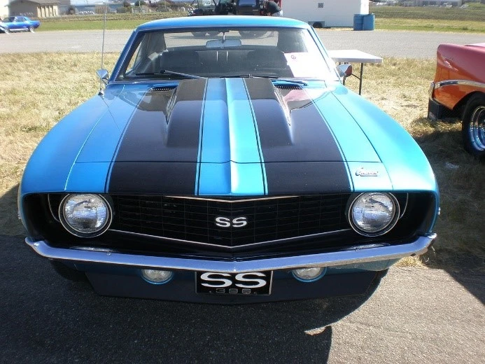
The SS emblem is arguably one of the most iconic non-car logo that automotive fans are aware of. Denoting “Super Speed”, cars with the SS badges were equipped with Chevrolet’s powerful V8s, like the Chevy 328, 405, and more. Today, the Camaro SS, the Chevelle SS, and many other variants have achieved the cult status, with fans ranking them among the best of the muscle car era.
4.2- Impala – From a Trim Level to a Separate Car
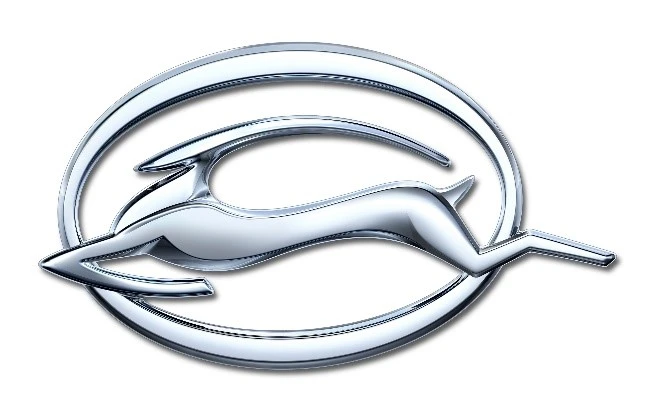
Initially, the Impala was the top-of-the-line trim level for the Chevrolet Bel Air. Compared to its lower priced variants, the Bel Air Impala differed in its body style too, rather than just interior trim or cosmetic changes.
The car, named after the graceful African antelope, was highly popular among consumers, especially with the iconic impala badge and symbol attached to it. In fact, the car was so popular that it helped Chevrolet get the top producer stop in 1958, despite it being a year of recession.
4.3 Corvette – A One-Off Car that Spawned an Entire Sub-Brand
The Corvette is another car that turned into an entire brand in itself. Originally, the Chevrolet Corvette was released as a sports car for the brand, with sleek lines, futuristic designs, and high performance. Through the years, the Corvette brand has showcased some great cars, with the current Corvette being a highly demanded sports car with great performance.
As the focus was on performance with the introduction of the Corvette, the company decided to capitalize on that and came up with a custom badge. The badge displayed a pair of crossed flags, with the checkered race flag on one side and a red flag with the Chevrolet logo on the other side. The crossed flags also mimic the shape of the letter V, which is a callback to the car itself, which is called the Vette as a nickname.
Conclusion
In short, when we take a look at the Chevrolet logo history and talk about its evolution, there is a long history of changes that add to the meaning of the logo’s current form. It is easy to imagine that a brand that has been in business for more than a decade, and in a highly competitive niche as well, will have modified their logo. Some of these changes might be major, while others more subtle.
But whatever the change they implement, their goal would have been to connect better with their consumers while still portraying their brand message and values. And that is what you too should aim for when building your own brand and brand logo.
Frequently Asked Questions
| What is the meaning of the Chevy logo? There are multiple trains of thought behind the Chevy logo. According to official sources, the design was something that the brand’s co-owner Bill Durant saw in a Parisian hotel’s wallpaper. Tearing off a piece of this wallpaper, he used it to create the company’s bowtie logo on returning to the States. However, some believe that the logo also signifies Louis Chevrolet’s and his brother Arthur’s Swiss heritage. |
| Why is Chevrolet called Chevy? Chevy is just the nickname for Chevrolet, as people found it easier to the say Chevy than to properly pronounce the Swiss-French origin Chevrolet name. |
| Who made the Chevrolet logo? Chevrolet co-owner William C. Durant designed the logo. |
Latest news you want to know!
Subscribe for cutting-edge design inspiration at Logo Poppin! Elevate your brand with updates on logos, branding, web design, and video animation.
Note that by clicking “subscribe,” users may agree to our privacy policy and consent to Logo Poppin to use your contact data for newsletter purposes.
Logopoppin
Logopoppin is a graphic design agency that specializes in logo designing, web development, video production and advanced branding services. We love to innovate businesses with new age technologies, allowing them to improve their visual reputation.

