
Table of Content
Discover How the Chicago Bears Logo Came Into Its Current Phenomenal Shape
Chicago Bears have always remained at the top of the league as one of the most reputable football franchises in the league. And one of the top reasons for that is their iconic Chicago Bears logo. The logo designs sported by the franchise have been highly popular with the masses over the years, and a massive reason for that has been team’s win streak, as well as overall performance.
To big to be loved only by Chicagoans, the Chicago Bears have got immense support from all over Illinois. And in fact, if you take a look at the Chicago Bears logo history, you will see that their wishbone-C design on their helmets is actually adopted from the University of Illinois too.
Just like Miami Dolphins logo, the emblem of Chicago bears is also quite unique. The whole story behind the evolution of the Bears old logo is indeed quite interesting. So, if you are a Bears fan and want to know more about the history of its logo, read on with us.
We will explore the evolution of the team and its logo, as well as how its custom chicago logo design transformed to emerge as one of the top sporting symbols in the US.
Exploring the Chicago Bears Logo History and the Team it Represents
Let’s begin exploring the origins of our Chicago Bears team and logo.
The history of the Chicago Bears goes back to the early 1900s. Originally founded in 1919, it started out as a company team for Decatur’s A.E. Staley Company, a food starch manufacturer. In 1920, they hired George Halas and Edward “Dutch” Sternaman, and gave the team in their care to turn it pro.
Named the Decatur Staleys after its parent company, the team played their first season as part of the new American Professional Football Association, which was renamed to the National Football League two years later. Their first logo was simple, designed in the colors of the company, and featuring their company sponsored name.
This early start to the professional football and relative success in later years for the Bears meant one thing – today, they are one of two teams from the NFL’s formation that are still active in the sport, the other being the Cardinals.
The team moved to Chicago their very next season, looking for a larger market to attract. Renamed the Chicago Staleys, and then renamed the Bears a year later, they also revamped their symbol after looking at their rivals’ NFL logos.
And they performed well. One of the two teams from Chicago, the other being the Chicago Cardinals, they scored a strong points record, cementing themselves as a skilled professional football team. Their third season, and their first as the Chicago Bears, was the cornerstone of their successful legacy, from where the Chicago Bears logo history actually starts.
The Rise of the Chicago Bears as an Inspirational Franchise in the NFL
Chicago Bears is termed as the second most successful football franchise in the history of the NFL due to the sheer fact that they have been playing for more than a century now. Their dominance in the American football circuit can be seen by the number of titles they have secured over the years, with eight of their nine wins in the pre-Super Bowl era. Only the Green Bay Packers, one of the Bears’ oldest rivals in the sport, have achieved more wins in the league, with 13.
As for the team, it remained a strong contender in the coming years. However, it wasn’t until 1940 when the first true Chicago Bears logo was revealed that the team’s brand got the exposure it needed. And it ignited a new fire in the players and the fans alike.
That same fire has now burns in the blood of the modern Chicago Bears team. Each member knows what’s expected of them when they wear the Bears logo. It is this fire that has kept them in the sport all the decades, through thick or thin. It has allowed them to conquer the NFL circuit every season with great passion.
Chicago Bears always come out as a potent force in the NFL every year. They regularly show their class and historical value to beat any side with wide margins. That has always remained their core strength and the reason for their prominence in the field.
The Chicago Bears Logo History and Evolution over the Last Century
Since 1920, the Chicago Bears logo has seen continuous changes in its design from time to time. As the team evolved, and the design aesthetic of their fans changed, so did their symbol. Let’s take a look the Chicago Bears logo history year-wise in detail below, and see why it’s considered as one of the best sports logos of all times.
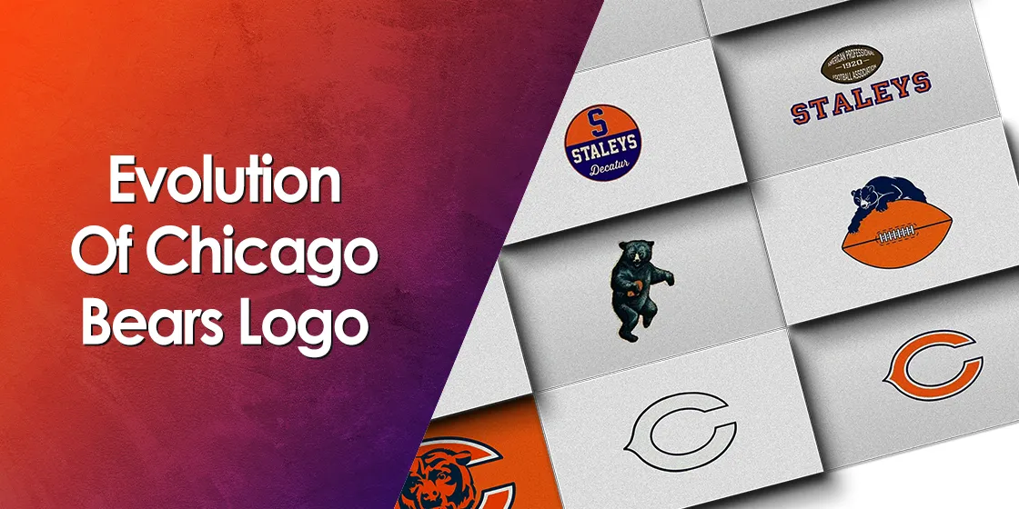
1920 — 1921 (Staleys Decatur Era Old Bears Logo)
As we mentioned earlier, the club was founded in 1920 with the name of Decatur Staleys. At that time, the club was represented by a monogram logo that represented the name Staleys prominently. This logo was basically designed to promote the brand of A.E. Staleys in the market.
It was a two-tone color logo having the combination of orange and blue. Meanwhile, the home city’s name ‘Decatur’ was also mentioned at the bottom of the design.
1921 — 1940 (Evolution into the Chicago Staleys and the New Bears Logo)
In 1921, the club suddenly took a huge stride by shifting entirely to the city of Chicago. It was a big change, and one that was timely needed for the prosperous future of the club. Moving to Chicago, the club was quickly renamed as Chicago Staleys
And the logo part? Here’s how it also changed.
The new Bears logo was designed with a huge difference as compared to its early version. It had a big football in the center and Staley written underneath it. On the ball, the name of the league was written in white uppercase letters, and the inaugural year for the franchise written in the middle of the ball. It was widely appreciated by the local fans of the team, and it was used unchanged until the 1939 season.
1940 — 1945 (Renaming the Team to Chicago Bears and Introducing the First True Bears Logo)
The glorious years for the Chicago Bears finally started from the beginning of the 1940s. It was a time when the Chicago Bears were now renowned as ‘The Monsters of the Midway’ due to their aggressive and no-hold-barred style of gameplay.
Incidentally, this was also the time in the Chicago Bears logo history when the club finally decided to represent the caricature of a bear in its logo.
As a result, the logo of the team got a complete overhaul. Now, a huge black bear holding a football was introduced as the main identity of the franchise. The design was quite unique and distinctive, and it represented the team for the next five years or so. And even today, decades after its removal as the team logo, this old bears logo is still remembered fondly as the first true representation of the Chicago Bears.
1945 — 1972 (Revising the Old Bears Logo into Amplifying the Football Connection)
The team revised the Chicago bears logo again in 1945. This time, the purpose of the redesign was to highlight the football connection, and to make the logo more versatile and visible.
Well, you must be thinking how? Here’s what it looked like.
The two basic attributes that highlighted the old bears logo, was the football, and the bear itself. In this design, the football was made bigger, and the bear comparatively smaller, yet more aggressive looking. The design, although less realistic in its imagery, portrayed a greater aggression in play, similar to the modern Bears logo.
The growling crawl of the Bear over the ball made the logo look awesome. Football fans across the US gave this design a lot of love. However, the color combinations of the logo remained the same. The blue and orange were widely touted as the best shades for the Chicago Bears logo.
In 1962, a new black and white Chicago Bears logo came into the market as an experiment. This time its representation got completely changed, and the designers of the logo went for a more simpler design.
A stylized design of the letter ‘C’ was used in the logo denoting the name of Chicago in particular. It was purely white with the borders of C designed in black. This particular design didn’t have any presence of the bear but still got massive appreciation from the fans, especially when used in on the helmets.
And surprisingly, it looked highly sophisticated and decent. Going forward, the club took the same approach in 1973 and introduced another version with slight changes.
1973 — 2022 (The Massive Bears Logo Change That Payed Off
The logo again changed in 1973, but with a slight modification. The standard orange and navy blue colors were again introduced in the logo to give it a more interactive look, with the latter replacing the black in the previous iteration. This made the letter ‘C’ look more engaging as per the old Bears logo.
And until the 2022 season, the Chicago Bears used the same Bears logo for their franchise. It looks quite simple but has got the required intrepid factor that shows the iconic strong values of the club. And incidentally, this simplistic style is also used by their old rivals for the Green Bay Packers logo.
2023 – Today (The Culmination of the Chicago Bears Logo History)
The modern Bears logo was revealed in for the 2023 season, and featured a snarling bear’s head. Rather than going for a side profile of an animated character like their old rival the Arizona Cardinals logo, the design for the Bear’s logo features a highly detailed front profile of the bear’s head.
Changing the design after nearly five decades, the new logo is released in order to create a more distinctive and easily recallable brand profile, with this design fitting the bill perfectly.
Deciphering the Design Elements of the Modern Chicago Bears Logo
Now that we have seen the Chicago Bears logo history, you might be wondering what was it about the Bears logo that made it so relevant in the NFL for more than a century. Well, for each iteration of the Bears logo, there were two major elements that were optimized for maximum impact. Those elements are the wordmark for the Chicago Bears, and secondly, their symbol itself.
Now, for those iterations of the logo where the wordmark and the symbol were combined into one, the connection between the two was apparent. However, for designs where the logo symbols were separate from the wordmark, that is where the importance of smart design came in. The designers needed to incorporate the same visual identity into both so that when a fan looks at either element, they would be reminded of the other, as well as the franchise.
So, let’s take a look at how this worked for the Chicago Bears logo.
The Bears Logo Symbol
The C-wishbone in the previous logo was smartly introduced to represent a sign of good luck for the team. Many people term this introduction as a way of showcasing the culture of continuous hard work for the Chicago Bears. On the other side, it also presents a bold and distinctive image over teams that were opting for heavily designed symbols such as the Philadelphia Eagles logo. This precisely shows the true side of this legendary franchise.
However, with better graphic capabilities today, the franchise has reverted to a more overt bear’s head for its logo symbol. The reasoning behind it is to make the connection between the team’s brand and the symbol stronger, thus improving recall times in viewers.
The Chicago Bears Wordmark
The current wordmark of the Chicago Bears is written using the team’s signature typeface. It looks very bold showcasing a perfect image of the club. As it is considered a secondary logo for the team, besides the bear’s head symbol, its typography is made a little subdued compared to the likes of the Washington Commanders logo, whose primary logo is a wordmark.
Despite that, both of the wordmarks mentioned above represent a strong identity for their brands, and are thus used for various types of merchandise sales as well.
Achievements of Chicago Bears in NFL
Chicago Bears are widely touted as the second-most successful team in the history of the NFL. Their range of titles highlights their dominance in this league.
Till date, Chicago Bears have won nine NFL titles. While eight of these have been before the Super Bowl era, they have also won one Super Bowl, the Super Bowl XX.
Besides it, the club has also won 19 division titles. Furthermore, they have also reached the playoffs 21 times in their overall history. All of these records prove the fact that they are one of the leading the American football circuit. They can be truly named as the giants of football in the US.
Final Words
The rise of the Chicago Bears has remained unprecedented and unmatched. Their iconic logo has become a symbol of dominance in the American football circuit. Over the years, they have won countless titles in the US showing their true prominence in the field.
To modernize its branding, the club also rebranded its logo from time to time. In this detailed blog, we have covered various types of old Chicago Bears logos. Starting from the 1920s, the club remained popular among the fans due to its different logos. It is the major reason why all of them are still regarded highly in the team’s hall of fame. Having all said that, you might also be interested in exploring history of other prominent NFL teams such as San Francisco 49ers logo and LA Rams logo.
Frequently Asked Questions
| What does the Bears logo mean? The colors of the Chicago Bears logo are carefully picked to demonstrate particular messages. The orange colors show the energy and dynamism, whereas the blue color shows the historical grace of the club. Combining both, it becomes a complete emblem for the team. |
| What is the font of the Chicago Bears logo? The font name of the Chicago Bears logo is London Black. It is quite unique and looks bold, which is why it is preferred especially for the merchandising of the club. |
| When was the Bear introduced in the club’s official logo? At the start, the club didn’t have the representation of Bear in its logo. However, in 1940, the owners of the team decided to introduce the iconic Bear in the logo. |
| What is the meaning of wishbone in the Chicago Bears logo? The wishbone in the Chicago Bears logo means good luck. It also represents the culture of hard work in the team which perfectly drives them towards success in the field. |
| How many types of logos have been introduced by the Chicago Bears till to date? Starting from the 1920s, Chicago Bears have introduced around six types of logos. The last one was introduced in 1973, denoting a ‘C’ of Chicago. |
Final Words
The rise of the Chicago Bears has remained unprecedented and unmatched. Their iconic logo has become a symbol of dominance in the American football circuit. Over the years, they have won countless titles in the US showing their true prominence in the field.
To modernize its branding, the club also rebranded its logo from time to time. In this detailed blog, we have covered various types of old Chicago Bears logos. Starting from the 1920s, the club remained popular among the fans due to its different logos. It is the major reason why all of them are still regarded highly in the team’s hall of fame. Having all said that, you might also be interested in exploring history of other prominent NFL teams such as San Francisco 49ers logo and LA Rams logo.
Latest news you want to know!
Subscribe for cutting-edge design inspiration at Logo Poppin! Elevate your brand with updates on logos, branding, web design, and video animation.
Note that by clicking “subscribe,” users may agree to our privacy policy and consent to Logo Poppin to use your contact data for newsletter purposes.
Logopoppin
Logopoppin is a graphic design agency that specializes in logo designing, web development, video production and advanced branding services. We love to innovate businesses with new age technologies, allowing them to improve their visual reputation.

