
Table of Content
Best Practices to Design Catchy Covers for All Types of Children’s Books
Every bookstore wants to keep a huge stock of children’s books written on different types of topics. They know that these books always remain in demand, as children really like to buy and read them in their leisure time. Mostly, books with catchy covers get the most attention, especially if they are related to comics or cartoons. So, designing children’s book covers creatively is extremely important. It is the first thing that comes into the notice, influencing kids and youngsters to buy the books immediately. There are some other factors as well that contribute a lot in the selling, but captivating book covers is always considered important.
Just like magazines and business books, the visual content of children’s books holds a lot of value. These visuals are not just created for fun, but they depict some kind of story through the graphics. Usually, kids are fascinated by these visuals, as most of them like funny cartoon characters designed in the book. This works perfectly to grab their attention, and hook them up towards reading. Same strategy is often used in the designing of children’s book covers. It immediately gets into their notice whenever they visit any bookstore, provided the kids’ books are not kept in any corner of the shop.
So, designing children’s book covers with creativity is quite important. Generally, book publications often take professional eBook design services from the reputed agencies to get perfection in covers. However, if you are not fond of such practice, and want to design book covers yourself, you need to first learn some principles of the design. You need to find catchy ideas that can help you to design quality book covers. In this blog, we will discuss some of them, so that you can understand which ideas can make your book cover designing perfect.
Let us first start from the basics below, understanding why a cover design is considered important for any book, brochure or magazine.
Importance of a Cover Design for Books

A compelling book cover design serves as the initial point of contact between a book and its potential readership. In a crowded marketplace where numerous titles vie for attention, a catchy cover plays a pivotal role in grabbing the reader’s eye. Humans are visual creatures, and a well-designed cover serves as a visual hook, enticing individuals to pick up the book and explore further. It acts as a silent ambassador, conveying the essence of the story, genre, or theme, and creating an instant connection with the target audience.
Beyond mere aesthetics, a catchy cover design acts as a marketing tool for the book. In the age of online shopping and digital libraries, covers are often the first visual representation of a book potential readers encounter. A visually appealing and thematically relevant cover can significantly impact a book’s discoverability, increasing its chances of being noticed amid the vast array of choices available to readers. Moreover, social media sharing and online reviews frequently include cover images, making the design a crucial factor in the book’s online presence and potential for going viral.
A well-crafted cover design also conveys a sense of professionalism and signals the quality of the content within. Readers often associate an attractive and professionally designed cover with a well thought out and polished book. It builds credibility and sets expectations for the reader, suggesting that the author and publisher have invested time and effort in ensuring a comprehensive and enjoyable reading experience. This visual cue can influence the reader’s perception of the book’s value and contribute to positive word-of-mouth recommendations.
How to Design Unique Children’s Book Covers?
Creating a cover design for children’s art book cover often looks to be an easy task. However, it requires a proper understanding of graphic design, which is sometimes missing in beginners. They try to go with random plans while designing children’s book covers. It just does not allow them to come up with something good, because design knowledge is considered necessary for every project.
If you are also one of those who does not know how to design a cover for a children’s book, this article is precisely written for you. Take a look at the key tips defined below to understand how children book covers can be designed creatively.
Start with a Comprehensive Research

Designing a cover for children’s books requires a deep understanding of the target audience’s preferences, interests, and developmental stages. Extensive research plays a pivotal role in ensuring that the cover design resonates with the intended age group. Children’s literature spans a wide range, from picture books for toddlers to middle-grade novels for pre-teens. Research helps designers identify age-appropriate themes, colors, and imagery that will captivate and engage the specific age group the book is targeting.
For example, a cover for a picture book might need vibrant, playful colors and simple, bold illustrations to attract younger children, while a middle-grade novel cover could incorporate more intricate designs and themes relevant to the target readers’ interests.
Incorporating educational and developmental research is crucial when designing covers for children’s books. Understanding cognitive and emotional milestones for different age groups helps create covers that not only appeal visually but also align with the cognitive abilities and emotional sensitivities of the intended readers. For instance, a cover for early readers might emphasize simple, clear typography and illustrations that support emerging literacy skills, while a cover for middle-grade readers might leverage more sophisticated visual elements that align with their expanding cognitive abilities and interests.
Understand the Book Theme

After conducting a brief research, you need to start building plans about book cover designing. In this regard, you need to first pay attention on the understanding of a book theme. It is very important, because having a clear understanding allows you to know which type of cover design is required for the book. You can then make plans according to that, choosing colors, styles and other attributes properly. If you do not know what the book is all about or what type of theme it is following, then you will certainly get no idea of designing, taking all your thoughts into utter confusion.
A lot of times, beginners do this exact mistake while starting the designing of book covers. They don’t understand the theme at all, and try to create designs with their random thoughts. This practice is certainly not recommended, as it does not takes you anywhere in the design.
It is therefore recommended to first get a complete understanding about the book. You need to know which genre it is related to, and what type of story is defined in it. If the book is centered around an action theme, then you need to design covers accordingly. Similarly, if the book is covering any other topic, then you need to create catchy covers keeping that in mind.
Pick Catchy Colors

Next up, you need to move towards the actual cover designing tasks. In this regard, you need to pick tasks one by one. The first thing that becomes important here is the selection of colors. It is a known fact that colors play a vital role in making any visual attractive. They make the graphics interactive with their lively shades, which is why they are noticed quickly by everyone. The selection of colors for books or magazine is therefore considered important. It provides an impact into the visuals, provided their core design also looks attractive.
For children’s book covers, you need to think differently while selecting colors. A lot of times, designers think that they can design these book covers as the way they do for other items. This is a wrong perception, because the designing of children books is slightly different from branding materials. It does not needs glitzy colors, as that makes no sense with theme of children books.
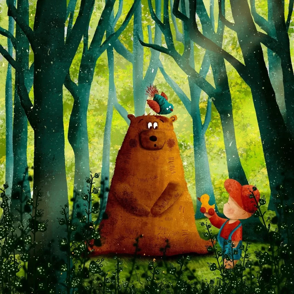
Ideally, children’s book covers should be designed with light colors. It is a tried and tested theme that works with all types of children’s book covers. The books containing cartoons are specially designed with a light theme. In this case, there are various colors to choose from, including light blue, pink, green, grey and more others.
Bring Uniqueness in the Design

The designing of book covers should also be unique, as that gives your products a better chance to standout among others. Likewise we defined above, covers are the first thing that come into the notice of people. This makes their designing very important, because it has the tendency to attract eyeballs quickly. There are various traits that can make the covers look attractive, such as having sheer uniqueness. It is quite an obvious fact, yet it is often ignored by the designers while creating children’s book covers.
To make the covers a bit different, you need to work with some out of the box ideas. That is where your creativity as a designer will come into play. It is the most important factor that allows you to bring uniqueness in the design. Whether it’s a book cover or a banner design, the understanding to make anything look different becomes important to design book covers with uniqueness.
Meanwhile, if you are running short of unique ideas, try to evaluate the design market and observe which things can make your design look different. This is the best way that works for all types of graphic design. Irrespective of the genre, category and style, this practice can help you to come up with a quality design that can attract attention quickly.
Use Visually Appealing Fonts

Next up, you need to select a font style that can properly exhibit your book title and tagline. Nowadays, there are plenty of typography options available online. From amazing styles of Helvetica to bold masculine fonts, you can choose anything that fits according to you requirements. However, before selecting, try to make sure that the font will not create much distinction with the actual design. This sort of thing only does not connects all the elements of the design, which is why such practice should be avoided by all means. You can also checkout some amazing typography book cover ideas for inspiration.
If you do not have any idea how to select fonts for children’s book covers. Take a look at the cover templates available on different design sources. It will let you know what type of attributes professional designers have used on their designs. This will give you a good inspiration how fonts, colors and different graphical elements should be selected for any cover design.
Design According to Hierarchy

It is a lesser known fact that every branding material should be designed keeping a hierarchy in focus. Now, many beginners even do not know what the hierarchy is in a graphic design. Putting it in simple words, a hierarchy is a structure in which you illustrate different things in the design. This means that your most important thing comes first in the design. It could be anything including title, author name, genre, exclusive tagline and more others. The basic purpose of using this hierarchy is to display things one by one, so that they can get proper attention.
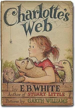
Generally, the title of the book is always displayed on top of the cover. This title is designed prominently, so that everyone can read it easily. After that, an optional tagline can added beneath the title. This tagline should be small and short, taking max five to six words. Both of these things cover the first part design hierarchy, hence they should be always illustrated strongly.
After that, you need to add visuals in the cover design. These graphics should be designed keeping the background and theme of the book in mind. It will help you to create visuals that can let the people know what is inside the book. This is how a great cover design can be created that can attract people at the first glance.
Keep the Design Simple

Another important thing that should be kept in mind is the illustration of a clean and simple design. This is one of those principles that should be followed in all types of brand design. From brochures to business cards and logos to advertisement banners, the simplicity in design is recommended for every material. Unfortunately, many beginners do not understand this fact. They try to fill up every space on the covers with some of kind of design or colors. This only makes the covers look more gaudy, having no sense of cleanliness in the design.
This type of practice should be avoided by every means. If you will not keep the design simple, the whole visual illustration will look cluttered. It will not help to grab any attention. Also, it is an outdated practice that does not hold much value in the modern design world. Nowadays, simple whitespaces are encouraged more, as they bring a unique touch of decency in the design.
Keeping this in mind, try to create clean covers that can prominently highlight each and every detail of the book. It is quite a simple thing that could be done easily if you’ve understood the right concepts of graphic design.
Further Reading:
Final Words
That takes us to the end of this article in which we have discussed different tips related to the designing of children’s book covers. It is a known fact that these books are demanded heavily in the market. A lot of kids are simply crazy for these books, as they illustrate some of their favorite cartoon characters. It is therefore important to design their covers properly, so that they could get the required attention. This blog has defined some of the best tips that could help you to design quality covers for children’s books. They are pretty obvious, hence it would be easy for beginners to read and understand them accurately.
Meanwhile, if you are looking for an agency that could help you to design catchy eBook covers in affordable pricing, get in touch with us today. We will assist you to design different types of eBook covers perfectly as per the given requirements.

Logopoppin
Logopoppin is a graphic design agency that specializes in logo designing, web development, video production and advanced branding services. We love to innovate businesses with new age technologies, allowing them to improve their visual reputation.


