
Table of Content
Discover the Evolution of the Chrysler Car Logo, and American Classic
The United States of America has a rich automotive history that spans across a century, with classics like Ford and Oldsmobile to the modern options like Rivian. And while many old options like Hudson, AMC, Plymouth, Pontiac, the aforementioned Oldsmobile, and more have gone out of business, there are some names that are still going strong, including Chrysler.
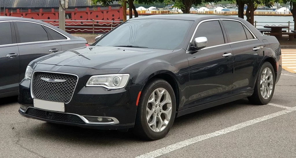
The Chrysler logo, just like that of Bentley in Britain, or the Ferrari logo in Italy, is often associated with luxury automotive options. And since its inception, the company has consistently put out great cars, even when part of the Fiat group. Even today, with the company releasing extremely limited number of automotive models, cars like the Chrysler 300 are considered the perfect blend of style and power. So how has this automotive giant, a member of the famed “Detroit Three”, manage to stay relevant with its consumer base?
Discover the evolution of the Chrysler logo into the legendary symbol it is today. We will discuss the history and inception of the brand into an automotive conglomerate that competed against big names like General Motors and the Ford Motor Corporation. We will also learn why today, no brand can establish as huge a presence without the help of a professional logo design company.
The Formation and History of Chrysler – A Pillar of the American Automotive Industry
The Chrysler Company was founded in mid-1925 by Walter Chrysler, who benefitted from the financial woes of the Maxwell Motor Company to reorganize it into Chrysler Corporation. It established its headquarters in Detroit’s Highland Park area, where it remained for the next seven decades until it moved to its Auburn Hills site in 1996.
Known for rescuing the Willys-Overland automotive company from its operational issues, Walter Chrysler was hired by the Maxwell-Chalmers company to help them with a similar issue in early 1920s. However, by late 1923, the company’s operations had ceased. In 1924, as part of the impending reorganization, Chrysler introduced his first automobile, starting an automotive pioneering tradition that shaped the modern automotive industry.
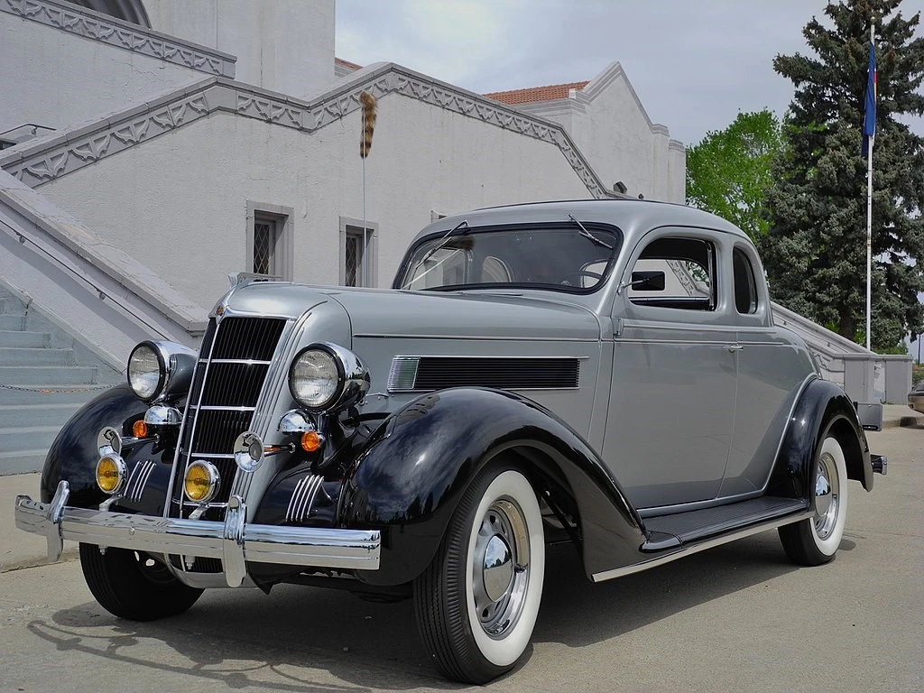
The Chrysler Six was a great car, which featured a number of first for the American automotive companies, and some even for the global industry. With a high-tech, well-engineered car at an affordable price the goal for Chrysler, the new car fit the bill perfectly.
It featured a carburetor air filter, a high compression engine block, a changeable oil filter and fully pressurized oil system, four-wheel hydraulic brake system, and more. While these options may seem commonplace, and in some cases downright obsolete, they were absent from most consumer cars at that time.
Some of the pioneering features of the car that was unique to Chrysler’s automobiles, were engine mounts made of rubber to reduce vibrations, and a ridged car wheel to stop a flat tire from flying off. These features were later adopted by many automakers across the globe, a tribute to the visionary genius of Walter Chrysler.
With this first experiment being a massive automotive success, Chrysler took over the company properly and released a series of new automobiles, mostly rebadged Maxwells. However, the strong focus on engineering and testing resulted in the brand becoming the second-highest grossing automotive brand in the US by 1936, a position it held until after the end of World War II till 1949.
With Chrysler now being deemed a luxury vehicle brand, Walter decided it was time to cover automotive categories they had largely avoided before. In the late 1920s, Chrysler started Plymouth as its economy brand, while he unveiled DeSoto that targeted the mid-range market. Meanwhile in 1928, Chrysler also bought the Dodge Brothers Company, which added Dodge automobiles and Fargo trucks to the Chrysler lineup.
The result was that Chrysler now had a luxury line, an economy line, two mid-range lines (DeSoto and Dodge), and a truck line. Moreover, the company decided to split the Imperial, until then the name used for the top trim level of Chrysler automobiles, into its own brand. This decision was taken by Chrysler to better compete with its local luxury rivals, Cadillac and Lincoln, as well as luxury British and Italian car brands of that time. With the deal signed in 1955, the company now had five separate brands, ranging from the economical, all the way up to ultra-luxury.
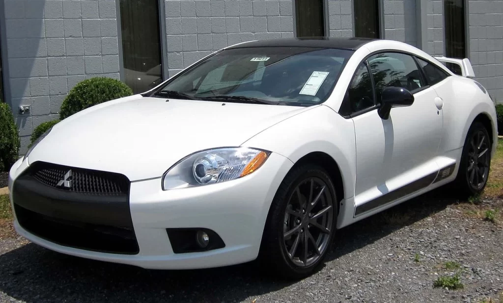
Since then, the company has incorporated or worked with many different brands under its umbrella, such as partnering with Mitsubishi Motors to develop cars like the Mitsubishi Eclipse. They were also the ones who redefined the family automotive market by inventing and popularizing the minivan, under the leadership of visionary Lee Iacocca. But despite the massive lineup of vehicles it produced, the 2008 economic crisis forced the company to file Chapter 11 bankruptcy, which required a government bailout in order to keep the company afloat.
Today, it is part of the Fiat S.p.A, which later became the FCA US, after Fiat and Chrysler had a merger in 2014. The brand, more popularly known as Stellantis North America, now sells vehicles under the brands of Chrysler, Dodge, Jeep, and Ram, as well as owning the parts company Mopar, and the performance division SRT.
A Look at the Classic Chrysler Symbol and its Significance
The Chrysler logo is considered one of the more popular car logos with wings, giving a luxurious, regal feel to the brand. The classic design of the logo gives it a distinguished look that perfectly portrays the rich history of the brand, as well as the image of luxury automotive experience that the brand has cultivated.
The modern Chrysler logo presents an aviator-style design to the symbol where the straight-lined wings spread to both sides of the badge make for a sleek look. This style of symbol is great if you want to incorporate the essence of power and luxury within the same design, a design aesthetic that carries over to their vehicle styling.
As a parent company that owns and operates multiple brands underneath its umbrella, the corporate identity the logo represents is perfect, capable of competing with its contemporaries in the US. However, over its long history in the automotive industry, the company has used many different logos, from a simple ribbon-badge to the Pentastar design, and eventually the winged style we know today.
This evolution shows that over the years, the company has adapted to its brand evolving, as well as the changing aesthetics of its consumer base, and has tweaked its logo accordingly. This is something that many brands fail to consider, which sees them fall from the consumers’ grace as they fail to ignite the desired passion. However, some automotive brands have symbols that have proven themselves to stand the test of time without much change, like the Honda logo.
Evolution of the Chrysler Logo through the Decades
So far, we have seen the inception and the evolution of the Chrysler Company as a whole as well as an independent car manufacturer, and the idea behind its winged brand symbol. However, in order to understand truly the journey of the company from a pioneer in automotive technology to the giant it is today, we need to study the evolution of its logo over the years.
Many brands, especially ones that have been in business as long as Chrysler has been, have often sported different types of logos over the years. That is because as time goes on, and the company becomes older, it starts to come into its own self. They start to understand their mission and goal better, and thus manage to create a logo that represents that.
So, let’s take a look at the evolution of the Chrysler logo, and see how it has transformed into its current form.
1924 – 1927
The first logo for the Chrysler brand was revealed in 1924, when the first of Chrysler automobile, named the Chrysler Six, was released. While still under Maxwell Motors, Walter Chrysler had, in all essence, taken over the company, and wanted to test the waters by producing a high-tech yet affordable car for the masses.
The symbol that represented it heralded the start of one of the greatest American car brands. However, compared to the current Chrysler logo, the design was quite different. The initial design was made to mimic the look of a golden wax seal, combined with the style of a fair ribbon one wins for a tournament.
The logo however, was perfect for an automobile company at that time, as the design aesthetics of the early to mid-1900s were different from the ones today.
1928 – 1929
A few years later, in 1928, the company made the logo silver and added wings to the top of the logo. This was the start of Chrysler’s logo featuring wings, a design feature it is known for today.
This new design, while not that different from the previous one, was not as successful however, and the company had to change it again after a couple of years to a design people were more familiar with. Despite that, the idea of adding the element of flight to the design would come in useful later.
1930 – 1935
In 1930, the logo was changed back to a previous design, where the bright golden color of the first Chrysler logo was replaced with a dull, brownish-gold shade. Moreover, the design also featured just red accents, omitting the blue of the ribbon altogether.
The new design, or rather the old design now revamped, was a success, albeit only for a few years. As the automotive industry evolved, so did the design aesthetics of people, and they demanded that their new, sleek luxury automobiles had badges that that reflected that aesthetic.
1936 – 1954
The next 18 years, from 1936 to 1954, the Chrysler logo featured its first modern winged design to the public. So popular was the design that since then, only the 1962 iteration of its logo has been the one to beat its run.
This design combined the aesthetics of the first and third iteration of the logo, made it smaller, and gave it chrome aviator-style wings on both sides. This turned the somewhat simple brand design into a true luxury automotive logo.
This was the first time that the Chrysler logo had included modern-style wings in its design. However, this would be the next step for the brand making it a permanent part of its design.
1955 – 1961
1955 saw the release of a completely new and unique logo design. This Chrysler logo featured two boomerangs over each other, facing the same direction. Both had different shapes and angles, and even had different colors.
The color combinations used here were a distinct departure of previous designs, where the company had used gold, red, and blue, or silver-chrome for accents or wings. However, this logo design was meant to represent a meteoric rise, with the design mimicking a speeding rocket with its red and black. Overall, while not so great for Chrysler’s luxury aesthetic, the logo would have been perfect for another car brand looking for an expressive and well-designed logo.
1962 – 1992
The Chrysler Pentastar logo is one of the more popular designs that many diehard fans of classic American car logos know quite well. The blue pentagram with a sharp, five-pointed star enclosed within was a great design, representing the five marquees under the Chrysler brand.
Under Pentastar, the company rebranded itself and partnered with brands like Mitsubishi Motor Company, handling the company do business in the US. The primary purpose for the logo however, was for the company to have a logo that would represent all of Chrysler’s holdings across the globe. And it wasn’t until Chrysler’s merger with Daimler in the late 1990s that the logo was finally retired.
1993 – 1997
While the Pentastar logo was used as a secondary badge on most Chrysler vehicles, often appearing on the left or right front fender, or later as a hood ornament, there was a separate Chrysler logo as well. In 1993, a new, upscale Chrysler logo design was revealed, which represented a new phase for the company.
A ring and a horizontal oval now encircled the badge from Chrysler’s earliest design, but with the central wordmark now placed over a blue strip. The logo had a distinctly luxurious feel, with the logo reiterating Chrysler’s commitment to the luxury automotive category, similar to the Porsche logo shield.
This design was also used until the Chrysler-Daimler merger in 1998, when it was phased out in favor of a new logo.
1998 – 2007
After the company’s merger with Daimler in 1998, the Chrysler logo was revamped again to give it a truly modern and luxury feel. The new design, while stylistically quite different from other car symbols, was aesthetically quite similar to the Cadillac logo of that time. That meant that both logos had a distinctly luxurious feel, with an elegance that was often missing from other car brands in the US at the time.
The aviator-style wings made a comeback in this design, which now featured a small, round, bubble-like middle badge, flanked by a pair of stylized chrome wings. The logo was small, and seemingly unassuming. However, it emphasized the car’s styling and design far better than other, more popular automotive badges.
2008
2008 saw the revival of the Pentastar logo. This time however, the design was made a gray instead of blue, bringing vintage vibes to the automotive company similar to how the Ford logo does.
This revived design however, was only used for one year, before the modern winged Chrysler logo was revealed to the public. And considering that the Pentastar had a huge part in shaping the brand’s legacy, it’s no wonder that it was revived, even if it was for a year.
2009 – Present
The modern Chrysler logo has a design that is both luxurious and sporty at the same time. The smooth curves of the design, its sleek profile, and the judicious placement of the wordmark in the middle of the chrome design, makes it quite similar in aesthetic to sports car logos like that of Aston Martin or Jaguar.
Overall, the modern design is the amalgamation of all the best elements of Chrysler’s brand logos over the years, such as the aviator wings, the wordmark on a blue strip, and the use of chrome as accent. That makes it the best iteration of the company’s logo, and the design that arguably represents the company aesthetic the best.
2023 – Onwards EV Concept Logo (Experimental)
From 2023 onwards, Chrysler is looking to focus on its electric-powered vehicles rather than fossil fuels ones. This drive is in answer to the rising trend of people opting for electrical or hybrid vehicles across the US, with companies like Tesla seeing massive popularity.
To signal this shift in ideology, the company unveiled a new, modern iteration of the logo to represent its new line of electric vehicles. Taking after the aesthetic of modern electric car brand logos, this new design features the shadow outlines of the winged design using two different lines, using negative space to envision the rest of the logo
This new style of flat, simplified logos using simple lined designs is an aesthetic that many car manufacturers are now adopting, as well as featured in the design of modern automakers. Coincidentally, this style of design can also be seen in the Rivian logo.
Conclusion
To sum it up, the iconic Chrysler logo we all know today is a symbol of American automotive excellence. However, it isn’t just known in the United States. All over the world, automotive aficionados are familiar with the winged design often associated with American luxury vehicles, with Cadillac and Chrysler being the two big names that come to mind in that category.
Unlike the bowtie from the Chevrolet logo that managed to establish a brand presence across its history with more or less the same design, the Chrysler logo has had to evolve significantly to achieve that. However, its continuous evolution resulted in it coming up with a design that perfectly represents its aesthetic vibe.
Latest news you want to know!
Subscribe for cutting-edge design inspiration at Logo Poppin! Elevate your brand with updates on logos, branding, web design, and video animation.
Note that by clicking “subscribe,” users may agree to our privacy policy and consent to Logo Poppin to use your contact data for newsletter purposes.
Logopoppin
Logopoppin is a graphic design agency that specializes in logo designing, web development, video production and advanced branding services. We love to innovate businesses with new age technologies, allowing them to improve their visual reputation.

