Table of Content
Learn Some Useful Tips to Create a Circle Logo Design
The representation of any brand depends largely on its logo. This is just not a symbol that is created randomly. Instead, it is the illustration of an entire business identity that showcases the real worth of a company’s branding. This makes them hugely important for all types of businesses as they cannot compromise anything on their quality. From shapes to colors, everything is picked accurately to portray the right brand image. Generally, circle logo design is preferred more by the logo design services as it looks sophisticated & neat to the eye. It can be used to portray the identity of any company, provided all the other attributes are also chosen correctly.
If you analyze some of the logos of renowned world brands, you will find plenty of them designed in a circular style. For instance, the logos of PepsiCo, Nivea, Starbucks and more are quite evident in this regard. They have been beautifully designed using a circular shape, showcasing a complete solid image of their business. Though these logos have also seen countless moderations in the last few years, but the core of their design i.e. circular shape always remained the same.
This showcases how commonly designers prefer to go with a circle logo design. It gives them ease to design any type of brand emblem, illustrating a perfect image of that business. In this article, we will discuss precisely about the tips of designing a circle logo. Furthermore, we will also look into the examples of popular brand logos that are made in a circular style using catchy colors. Let’s take a look at them in detail below.
Quick Analysis of a Circle Logo Design

A circle logo design is quite different from a square or triangular design. It exhibits an idea of inclusiveness through its appeal. Unlike the other shapes, the circular design does not lack any type of toughness or blockings. Instead, it showcases a streamlined image of the business rounded inside a great figure of an artistic design.
The angular shapes basically convey an idea of security, traditionalism and strength. In contrast to it, the circular design promotes the idea of power and comprehensiveness. This is what makes it a perfect pick for many brand emblems, as businesses love to show a complete sense of inclusivity using the circular logos. They are always combined with other elements, as they help to give the logo a more consistent look. It depends on designers what type of elements they want to use in the logos. Their selection is purely based on the requirements of the theme, as well as the motives of the company’s branding.
Top Examples of Circle Logo Design
Being a budding designer, you could face a lot of difficulties at the initial stage if you are not well versed with the right designing tips. Therefore, it is best recommended to learn from the examples of proven market work, so that you can get the right knowledge about masterful logo designing.
This also applies in the case of circular logos, as you can learn a lot from those professional emblems that are made in a circular style. Here are some examples that will give you some good tips about how to logo using a creative circular shape.
Starbucks
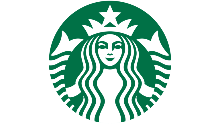
The stardom of Starbucks does not need any kind of introduction. It is one of the top coffee brewing companies in the world that is loved by millions of people. Over the years, the company has established a strong hold in the market, outclassing all others in the race. From Europe to America, Starbucks is popular everywhere, and is continuously moving forward to capture more markets as well.
Besides offering great quality, the branding of Starbucks has also played a major role in achieving this huge feat. The circle starbucks logo design is itself a biggest example of the company’s prolific branding. It is designed beautifully using the color combination of green and white. Moreover, the iconic illustration of the lady called “Siren” is yet another important thing that makes the logo famous among the people.
The circular shape of the logo is precisely picked to make the emblem look like a monogram. This shows the real art of creativity behind the logo, which indeed offers some great learning to the designers.
PepsiCo
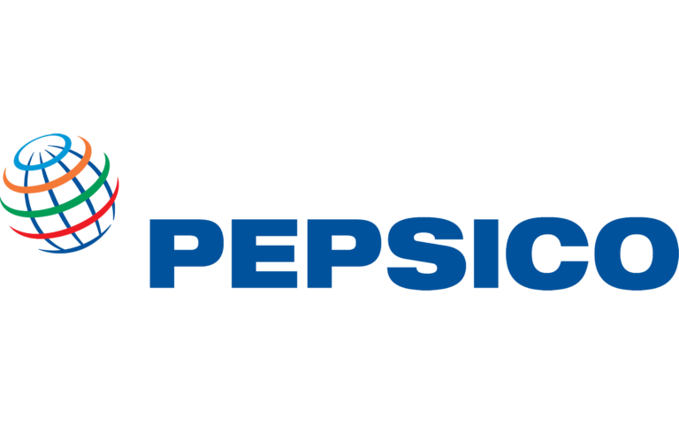
PepsiCo is a renowned name in the global beverage industry. It has ruled the market for the last many decades, precisely by offering top quality beverage products. Looking at the company offerings, you can find many popular beverage products in the line. This includes soft drinks like Pepsi, Mountain Dew, 7up and several more others.
Considering the Pepsi logo, you can find a great deal of inclusiveness in its overall design. It offers a great sense of compactness in the design, giving the whole company identity a catchy look. The colors selected for the logo also look very exquisite. The combination of red and blue gives the whole logo a very stunning appeal, rightly as per the modern styling standards.
Spotify

Spotify is termed to be the number one music streaming application in the world. It has established itself as a true leader in the market, covering all types of music genres and categories. This has made their platform really interesting for the users, as they can find different types of music on Spotify easily. From hip-hop to classical, people can find complete albums of their favorite singers on Spotify on the go, making it one of the top apps to listen music.
Looking at the Spotify logo, you can certainly feel a unique touch in its design. The light green color chosen for the logo looks very aesthetic to the eye. This is indeed their main branding color, as the company chooses the same green shade to create their other branding elements as well. This shows the impact of the Spotify logo on the branding theme of the whole company. It is quite catchy, as well as looks clean to the eye from all the angles.
WordPress

WordPress is one of the top CMS platforms used by developers around the world. It is mostly loved by the people due to its ease of usage. The platform offers tons of plugins, themes, widgets and other features to facilitate the development process. That is the major reason why developers love using WordPress, as it offers them super easy methods to build a website within minutes.
The logo of WordPress is also designed in a beautiful style. Its circular shape includes a “W” letter designed inside the outline. The main color of the logo is blue, however sometimes it is also represented using black color. This illustration looks very simple, yet bold in appeal. It has undoubtedly become a top symbol of trust among the developers, as it gives them plenty of good reasons to choose and work with WordPress for developing different types of websites.
Best Circle Logo Design Tips
Designing a circle logo could be difficult sometimes if you don’t have much knowledge about it in the first place. This type of problem usually arises when designers try to work without having any major plan. If you are also one of them that is finding difficulty in creating a circular logo, take a look at the tips given below.
Keep the Logo Short & Concise
The first thing you need to do while designing a circular logo is to keep its size short and small. It is not one of those logos that requires a large area of demonstration. Instead, it is designed in a concise manner, keeping all the elements at minimum.
If you will analyze some of the popular circular logos like Pinterest, Beats and more others, you will see this particular practice in all of them. They are not designed with a huge size, instead they have been kept small to keep the illustration simple and decent.
Considering this thought, you also have to keep the circular logo short, so that their appeal can look clean to the eye. These types of logos can also be printed anywhere, as it is also one of the perks of designing them in a small size.
Pick the Colors Precisely
Colors play an important role in the designing of logos. Their appeal is hugely dependent on them, and designers must need to know about this fact. A lot of times, people do not pay attention to the selection of colors. This eventually creates a problem for them at the backend, when the theme of the logo looks unconnected with the selection of color.
To avoid having this situation, try to pick the color for a circle logo design right at the start. This will clear all your styling confusions that could arise later in the end. Meanwhile, also keep in mind to pick the right combination of colors considering the main theme of the brand. This should always look relevant, so that a definite sense of singularity can be portrayed in the overall brand theme.
Styling the Text
Selecting the right typeface and placing it inside a circle logo design is yet another challenging job. It can also be simplified easily by knowing the right tips of curving a typeface. This is certainly a great technique to mold and place any lettermark inside the circular shape. All of this is done to keep the overall design inclusive, allowing people to easily understand the name written in the logo.
Meanwhile, just make sure to keep the wordings short, so that it could be easily aligned inside the circle. It will also help to make the letter styling clean, giving the overall logo a great decent appeal.
Frequently Asked Questions
| 1. Why do businesses like to go with a circle logo design? Brand logos with a circular shape has become a standard thing in the market. That is the core reason why businesses like to design their logos in a spherical shape, so that it can offer a clean standard identity. |
| 2. How to design a circle logo design? To design a circle logo design, you have to first finalize the color and styling elements needed in the logo. This will help you to come up with the right concept that could be later converted into the design. |
| 3. What type of size should be preferred for a circle logo design? A circle logo design should be created in a standard size. This means that it should neither be too small, nor too big. It should be designed with a normal size that could be easily placed in every branding material. |
| 4. Which type of companies can use a circle logo design? Every company can use a circle logo design. There are no restrictions for any business, as it is a standard shape that fits perfect for everyone. |
| 5. How many types of other shapes are used for logo designing? Beside the popular circle logo design, designers also choose other shapes to create brand emblems. It includes square, triangular, pentagon and more other shapes respectively. |
Conclusion
That concludes our entire article in which we have discussed different ideas about how to represent your brand using a circle logo design. Many businesses prefer to make their emblems in a circular style. It could be termed as a standard shape for designing brand logos. Furthermore, it gives designers an opportunity to keep the emblems simple yet bold in appeal.
If you are also looking to design your logo in a circular shape, contact us today. Our expert designers will help you to create a circle logo with immaculate perfection. It will cover all your branding requirements, so that you can portray a solid brand personality in the market.

Logopoppin
Logopoppin is a graphic design agency that specializes in logo designing, web development, video production and advanced branding services. We love to innovate businesses with new age technologies, allowing them to improve their visual reputation.

