Table of Content
Discover How the Cisco Logo Has Evolved to Be One of the Most Famous IT Icons
The Cisco logo stands as one of the most recognizable symbols in the technology industry, representing a company that has fundamentally shaped how the world connects and communicates. What makes this logo particularly fascinating is its deep connection to San Francisco’s most famous landmark – the Golden Gate Bridge. This seemingly simple design of vertical blue lines carries profound meaning about connectivity, innovation, and the company’s Silicon Valley roots.
Since its founding in 1984, Cisco Systems has grown from a Stanford University startup to become the world’s largest networking company, with nearly 80,000 employees and annual revenues exceeding $50 billion. Throughout this remarkable journey, the Cisco logo has evolved while maintaining its core identity, serving as both a tribute to its birthplace and a visual representation of its mission to connect the world through technology.
The evolution of the Cisco logo reflects not just changing design trends, but the company’s transformation from a niche router manufacturer to a comprehensive technology solutions provider that powers the internet’s backbone. Let’s take a look at it from a logo design agency’s perspective.
The Inspiration and Ideation Behind the Cisco Logo: A Look at Its Transformation
The story of the Cisco logo begins with a drive to Sacramento in 1984, when company founders Leonard Bosack and Sandy Lerner were struck by the beauty of the Golden Gate Bridge bathed in sunlight. This moment of inspiration led to both the company’s name – derived from the last five letters of “San Francisco” – and its iconic visual identity. Originally, the company insisted on using the lowercase “cisco,” reflecting the informal culture of early Silicon Valley startups.
John Morgridge, who became Cisco’s first CEO, played a crucial role in formalizing the logo concept. He recognized that the Golden Gate Bridge represented more than just a local landmark; it symbolized connection, progress, and the bridging of distances – precisely what Cisco’s networking equipment accomplished for computer systems. The bridge metaphor perfectly captured the company’s core mission of connecting disparate networks and enabling communication across vast distances, thus creating one of the best tech combination logos of all time.
The Cisco Logo Origins: How It All Began

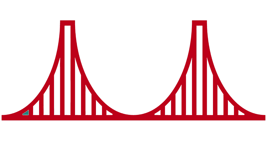
The original 1984 logo featured a stylized red illustration of the Golden Gate Bridge, executed with elegant thin lines that closely resembled the actual structure. This realistic representation celebrated not only the company’s Silicon Valley heritage but also established a visual connection between physical infrastructure and digital connectivity. The choice to omit text from this early version emphasized the power of pure symbolism in brand communication.
Cisco Logo Evolution Through the 90s: From Startup to Tech Giant

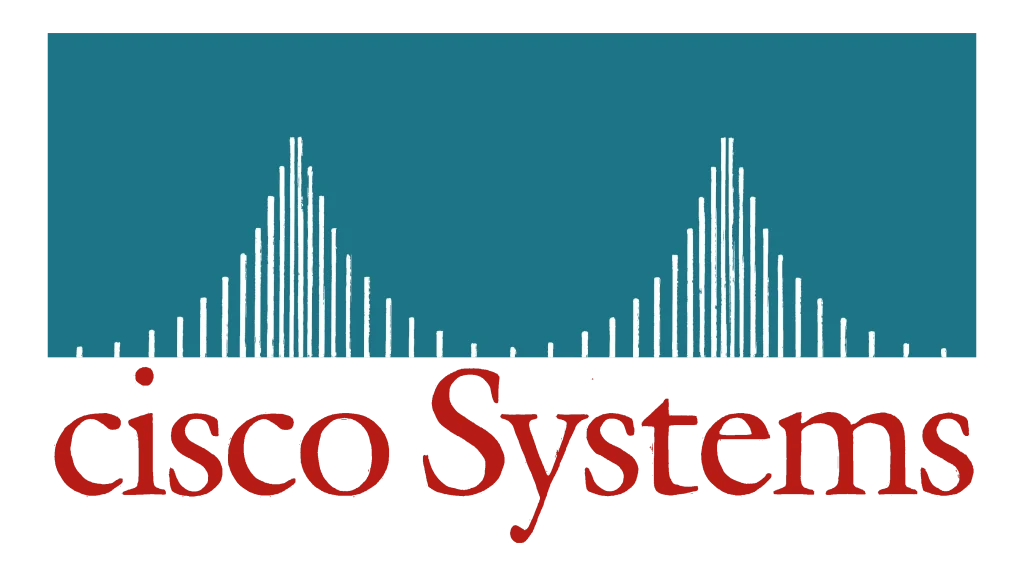
The 1990 redesign marked Cisco’s transition from startup to serious enterprise player. The logo gained a more abstract interpretation of the Golden Gate Bridge, featuring white vertical lines of varying heights against a sea-blue rectangular background. The addition of “Cisco Systems” in red lettering below the symbol reflected the company’s growing ambitions and need for professional credibility as it entered the corporate networking market.
This color scheme carried deep symbolic meaning. The sea blue represented trustworthiness, protection, and prosperity – essential qualities for a company asking businesses to entrust their entire communication infrastructure to its products. The white symbolized loyalty and clarity, while red conveyed passion, responsibility, and the energy needed for continued innovation. This combination created a visual identity that balanced technical expertise with approachable professionalism.
Slight Tweaks and Changes in the Cisco Logo with the Times

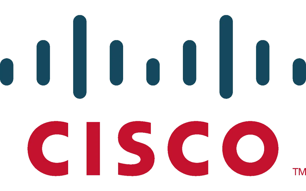
The 1996 refinement further polished this concept, with a darker, more luxurious shade of blue and cleaner, more distinct white lines. The company name moved above the rectangular emblem, with “C” and “S” rendered in larger capitals to create visual hierarchy and improve brand recognition. This version represented Cisco’s growing confidence as it positioned itself as the leader in internet infrastructure during the early days of widespread internet adoption.
The 2006 Transformation: Simplicity and Modern Appeal

The 2006 logo redesign represented perhaps the most significant transformation in Cisco’s visual identity. Created through collaboration between the Cisco branding team, this new version dramatically simplified the design while strengthening its symbolic power. The company dropped “Systems” from its name, becoming simply “Cisco,” and introduced a cleaner, more contemporary aesthetic.
The new design featured nine bold vertical strokes that simultaneously represented the Golden Gate Bridge and Wi-Fi signal bars – a brilliant dual metaphor that connected Cisco’s heritage with its technological focus. This abstraction made the logo more versatile for digital applications while maintaining its core meaning.
The typography also received significant attention, utilizing a custom version of Futura Bold that projected strength and modernity. This marked a strategic shift from positioning Cisco as merely a technology vendor to presenting it as a company that transforms how people connect and communicate.
The Modern Cisco Logo: Simplification of an Already Minimalist Design

The current Cisco logo operates on multiple symbolic levels that reflect the company’s comprehensive role in global communications. The color combinations of the logo were changed to a simple bright, light blue over a white background. This simplification is in line with modern design aesthetics, where monochrome logos with simple, scalable designs are the norm for businesses across digital and print mediums. The removal of the red and the shift from dark blue made the Cisco logo more prominent, thus improving its visibility.
The Symbolism of the Cisco Logo
The vertical lines primarily represent the Golden Gate Bridge towers, maintaining connection to the company’s San Francisco origins and founding inspiration. However, these same lines also unmistakably resemble Wi-Fi signal strength indicators, creating a modern technological association that reinforces Cisco’s position in wireless and networking technology.
This dual symbolism demonstrates exceptional design sophistication – the logo simultaneously honors the company’s heritage while speaking directly to contemporary technology users. The varying heights of the lines suggest dynamic signal strength and robust connectivity, key selling points for networking equipment. The spacing between lines creates a sense of openness and accessibility, reflecting Cisco’s commitment to making advanced technology solutions available to organizations of all sizes.
The bridge metaphor extends beyond mere visual representation to embody Cisco’s fundamental business philosophy. Just as the Golden Gate Bridge connects San Francisco to Marin County, Cisco’s products connect people, businesses, and ideas across geographical and technological barriers. This symbolism has proven remarkably durable, remaining relevant as the company has expanded from simple routers to comprehensive cybersecurity, cloud computing, and Internet of Things solutions.
Color Psychology and Brand Recognition
The strategic use of color in the Cisco logo demonstrates sophisticated understanding of brand psychology and market positioning. The company offers its logo in three color variations: all black, all blue, and blue with red text, allowing for flexibility while maintaining brand consistency across different applications and contexts.
Blue dominates the current color palette, specifically chosen for its associations with trust, reliability, and technological competence. In the networking industry, blue communicates the stability and dependability that decision-makers seek. The specific shade of blue used in the logo has been carefully calibrated to work effectively across digital and print media while maintaining maximum impact.
The optional red elements add energy and urgency to the brand, suggesting innovation and forward momentum. This combination creates a balanced emotional response that appeals to both technical professionals who need reliable solutions and business leaders who want cutting-edge technology. The color choices also ensure excellent visibility and recognition across various backgrounds and media formats, from business cards to stadium-sized displays.
Typography and Design Elements
The typography in the Cisco logo reflects careful attention to both aesthetic appeal and functional performance. The Futura Bold typeface chosen for the wordmark projects authority and reliability while maintaining excellent readability across various applications. Its geometric design aligns perfectly with the technical nature of Cisco while its clean lines ensure the logo is legible is all sizes.
The decision to use sentence case reflects broader trends toward humanizing technology brands and making them more accessible to diverse audiences. The spacing between letters has been optimized to work harmoniously with the bridge, creating visual balance and ensuring both elements complement rather than compete with each other.
The overall layout demonstrates sophisticated understanding of visual hierarchy and brand architecture. The bridge symbol and logo fonts are proportioned to work effectively both together and independently, providing flexibility for various applications.
Global Recognition and Cultural Significance
Today, Cisco logo ranks among the top symbols in global business, transcending its origins as a simple startup to making history by becoming an icon of technological progress and connectivity. The brand appears on equipment in virtually every major corporation, government facility, and educational institution worldwide, making it one of the most widely deployed brands in existence.
This ubiquity has transformed the logo into a cultural symbol representing the infrastructure that enables modern digital life. While consumers may not directly purchase Cisco products, they benefit from Cisco technology countless times daily through internet access, video calls, and digital services. The logo has become associated with the invisible but essential technology that powers global communication and commerce.
Frequently Asked Questions
| What landmark does the Cisco logo represent and why was it chosen? The Cisco logo represents the Golden Gate Bridge in San Francisco. It was chosen because the company name “Cisco” is derived from the last five letters of “San Francisco,” and founders Leonard Bosack and Sandy Lerner were inspired by the bridge’s beauty during a drive to register their startup. The bridge symbolizes connection and bridging gaps, which perfectly represents Cisco’s core business of connecting computer networks and enabling communication across distances. |
| How has the Cisco logo evolved since the company’s founding in 1984? The Cisco logo has undergone four major iterations since 1984. It started as a red stylized Golden Gate Bridge silhouette, evolved to white vertical lines on a blue background with “Cisco Systems” text in 1990, was refined in 1996 with darker blue and improved typography, and reached its current form in 2006 with simplified vertical strokes and the shortened “Cisco” name. Each evolution maintained the bridge metaphor while adapting to contemporary design trends and business needs. |
| What do the vertical lines in the current Cisco logo symbolize? The vertical lines in the current Cisco logo serve a dual symbolic purpose. They primarily represent the towers and suspension cables of the Golden Gate Bridge, maintaining connection to the company’s San Francisco heritage. Simultaneously, these lines resemble Wi-Fi signal strength indicators, creating a modern technological association that reinforces Cisco’s position in networking and wireless technology. This clever dual symbolism connects the company’s history with its current technological focus. |
| Why does the Cisco logo appear in different colors, and what do they represent? The Cisco logo appears in three primary color variations: all black, all blue, and blue with red text. Blue represents trust, reliability, and technological competence – essential qualities for networking infrastructure. Red symbolizes responsibility, passion, and innovation energy. The multiple color options provide flexibility for different applications while maintaining brand consistency. The color choices were strategically selected to communicate stability and dependability to business decision-makers who rely on Cisco’s networking solutions. |
| Who designed the current version of the Cisco logo? The current Cisco logo was designed in 2006 through collaboration between the Cisco branding team and two designers: Joe “Phenom” Finocchiaro and Jerry “The King” Kuyper. This design simplified the previous versions while strengthening the symbolic connection between the Golden Gate Bridge and modern networking technology. The 2006 redesign coincided with Cisco’s “Human Network” campaign and the company’s decision to drop “Systems” from its name, representing a broader brand modernization effort. |
Conclusion
The Cisco logo represents far more than corporate branding – it embodies the story of how technology connects our world and the vision of founders who saw potential in bridging digital divides. From its origins as a simple red bridge silhouette to its current status as a globally recognized symbol of networking excellence, the logo has maintained its core message while adapting to changing times and technologies.
The success of the Cisco logo demonstrates the enduring power of meaningful symbolism in brand development. By choosing the Golden Gate Bridge as inspiration, the founders created a visual metaphor that remains relevant and powerful across decades of technological change. The logo’s ability to simultaneously represent heritage and innovation shows how thoughtful brand design can provide both stability and flexibility for growing companies.
As Cisco continues evolving its technology solutions and expanding into new markets, the logo will undoubtedly continue adapting while preserving its essential character. The bridge symbol that inspired two Stanford researchers in 1984 continues to represent the fundamental human desire to connect, communicate, and collaborate – ensuring the Cisco logo’s relevance for generations to come.

Logopoppin
Logopoppin is a graphic design agency that specializes in logo designing, web development, video production and advanced branding services. We love to innovate businesses with new age technologies, allowing them to improve their visual reputation.


