Table of Content
Know How the Famous Club America Logo Evolved to the Global Prominence
When it comes to football, everyone knows the Mexico is a top nation that houses many famous football clubs. Among the various reputable names, Club America is a team that has a rich history in the Mexican football circuit. The Club America Logo is one of those emblems that is seen in the Mexican football since early 1916. This defines the historical value of this team, as why it is considered a highly prestigious football club in Mexico.
Speaking about the Club America logo, it has been changed various times since it was first introduced in 1916. As per the current logo, it can be said that the identity of the emblem has been complete revamped as compared to its very first version. Designed by professional logo design services, the current Club America logo exhibits style, as well as a historical class of the club. It is widely popular among the fans, because Club America is also a leading football team in the Mexico.
If you want to know about the complete history and timeline of the Club America logo, read this article in detail. It will let you know how the logo evolved in different times, catering to the needs of emerging trends and club requirements. Let’s start from the basics understanding why Club America logo is popular in the world.
Understanding the Popularity of Club America Logo

Club America, one of Mexico’s most successful and storied football clubs, enjoys global popularity due to its rich history, consistent success, and deep cultural significance. Founded in 1916, the club has become a symbol of excellence in Mexican football, boasting a record number of Liga MX titles and numerous domestic and international trophies, including multiple CONCACAF Champions League titles. Their legacy of success has made them a beacon of Mexican football, drawing fans not only from Mexico but from across the Americas and beyond.
The club’s intense rivalry with Chivas Guadalajara has also played a significant role in its global recognition. This rivalry transcends sport, symbolizing regional and cultural divides within Mexico, and has become one of the most-watched football matches in the Americas. The passionate fanbase is not limited to Mexico but extends into the United States and other countries. Their matches, broadcast internationally, draw millions of viewers, further solidifying Club América’s presence on the global football stage.
Club América’s global appeal is also bolstered by its association with the prestigious Estadio Azteca, one of the world’s most iconic football stadiums. The venue, which has hosted two FIFA World Cup finals, serves as the club’s home ground and adds to its legendary status. Additionally, América has participated in international tournaments, such as the FIFA Club World Cup, where they’ve had the chance to face top European and South American clubs, showcasing their talent and passion on a global platform.
History of Club America Logo
The history of Club America logo is quite diverse, as it has been changed multiple times since 1916. If you do not know much about the circular logos that came before the current one, take a look at the complete list given below.
Club America Logo – 1916

Club América’s very first badge, created in 1916, was a modest yet meaningful representation of the club’s identity. Designed during the team’s founding year, the emblem featured a simple yet elegant composition of two overlapping capital letters. The simplicity and charm of the inaugural design remain an important part of Club América’s storied history, marking the beginning of a legacy that would grow into one of Mexico’s most recognized football institutions.
Club America Logo – 1917

The 1917 Club América logo marked a significant step in defining the club’s thematic visual identity, establishing a foundation that would influence its crest for decades to come. This emblem was far more intricate than its predecessor, blending symbolism and purpose in a cohesive design. Over time, while various iterations of the logo would emerge, the foundational elements introduced in 1917, such as the circular frame, the continents, and the initials, would remain central to Club América’s visual legacy.
Club America Logo – 1919

In 1919, Club América adopted a remarkably distinctive and unforgettable badge that stood out for its simplicity and elegance. The design featured a highly minimalistic logo that conveyed a sense of modernity and sophistication for its time. By employing the dark blue and white color palette, the badge projected a professional and cohesive image, embodying the ideals of strength, pride, and ambition that defined Club América during this formative season.
Club America Logo – 1920

In 1920, just a few months after their previous emblem, Club América introduced a new logo that reflected a deeper connection to Mexican heritage and cultural symbolism. This redesigned badge featured bold, Aztec-stylized dark blue lettering arranged across two distinct levels. The thoughtful integration of cultural artistry with modern design elements made this version of the badge not only a visual icon but also a representation of the club’s evolving spirit and enduring legacy.
Club America Logo – 1923
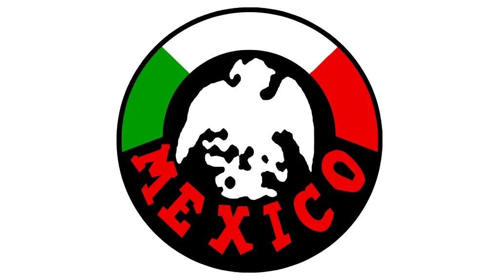
In 1923, Club América unveiled a striking new logo that boldly embraced the vibrant colors of the Mexican national flag. This iteration marked a departure from the previous monochromatic designs, introducing a rich and dynamic color palette that symbolized national pride. By adopting such a powerful and colorful design, Club América succeeded in creating an emblem that went beyond being a simple team crest.
Club America Logo – 1925
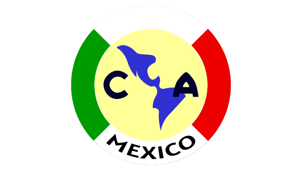
In 1925, Club América introduced a redesigned logo that carried a bold and patriotic aesthetic. This updated emblem prominently featured the vibrant colors of the Mexican national flag, symbolizing unity, pride, and resilience. Together, the balanced tricolor layout and the robust lettering created a logo that was not only visually striking but also rich in symbolism.
Club America Logo – 1926

In 1926, Club América opted for a refined redesign of their logo. It certainly marked a return to a more streamlined and focused design, as the circular frame that had been introduced in previous iterations was entirely removed. The decision to return to this earlier design proved to be a wise one, as it provided a timeless visual identity that resonated deeply with club supporters.
Club America Logo – 1938
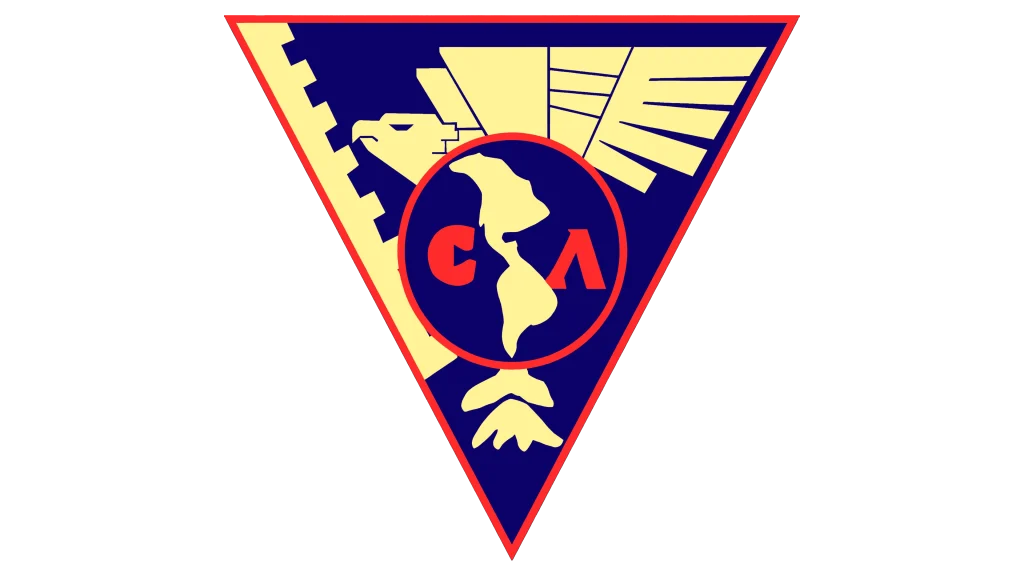
In 1938, Club América unveiled a radically different logo. This emblem broke away from the traditional circular and monogram-based styles, introducing a striking triangular shape framed in a vivid red border. Together, the triangle, eagle, and map conveyed a narrative of ambition, strength, and international presence. This 1938 logo was not just a visual identifier, it became a declaration of Club América’s bold aspirations and its readiness to rise to the prominence.
Club America Logo – 1947

In 1947, Club América introduced a redesigned soccer logo that would mark the beginning of the emblem we recognize today. This version gradually evolved into the familiar round shape, paving the way for the club’s iconic visual identity in the years to come. The combination of the updated color scheme not only gave the logo a fresh look but also symbolized the club’s growing stature and its determination to remain at the forefront of Mexican football.
Club America Logo – 1959

In 1959, Club América underwent a significant rebranding that introduced both a fresh emblem and a new nickname, Los Millonetas. This new identity was part of the club’s broader efforts to redefine its image and solidify its status as a dominant force in Mexican football. The combination of this bold geographical representation, along with the new nickname captured the club’s aspirations for greatness, wealth, and influence.
Club America Logo – 1981
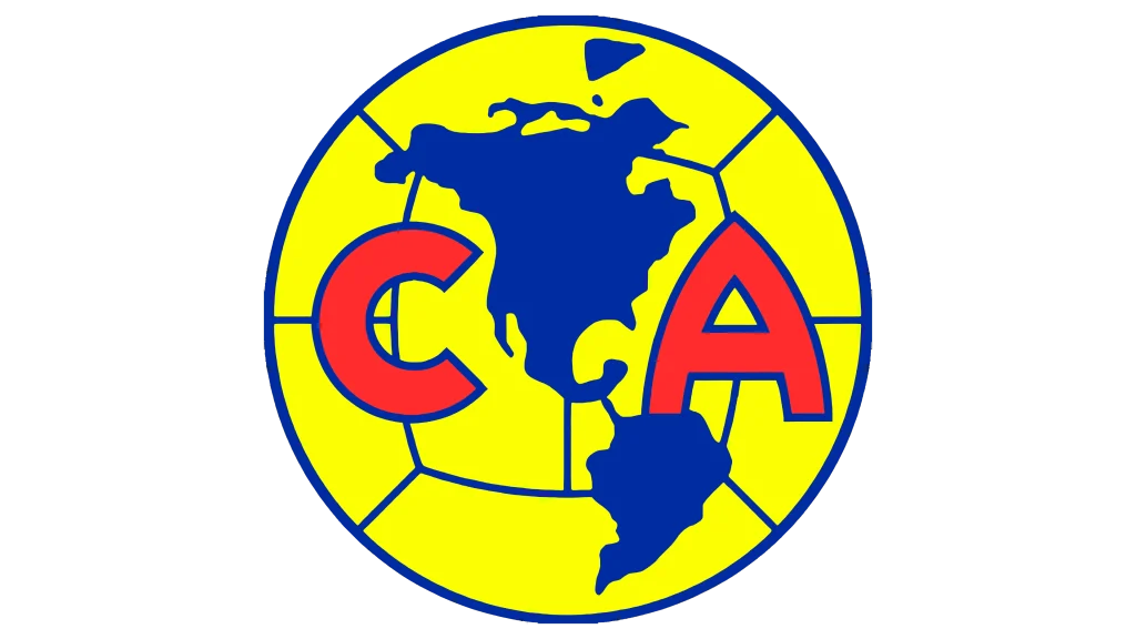
In 1981, Club América unveiled a subtle yet impactful redesign of its logo. While the overall design and styling remained consistent with the previous iterations, the updated version made a bold statement through its enhanced use of color. The redesign of 1981 showcased how small tweaks to the color palette could rejuvenate the emblem while maintaining its foundational visual identity.
Club America Logo – 1994
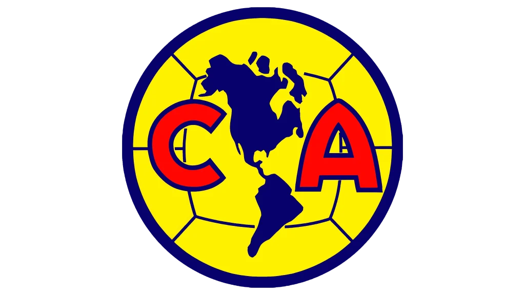
In 1994, Club América underwent a major redesign of its logo, resulting in a more powerful and dramatic visual identity. The emblem’s lines were significantly bolder, giving the badge a much stronger and more assertive presence. The 1994 redesign successfully transformed the emblem into a striking and memorable symbol, one that captured both the energy and the prestige of Club América as it moved into a new era.
Club America Logo – 2017
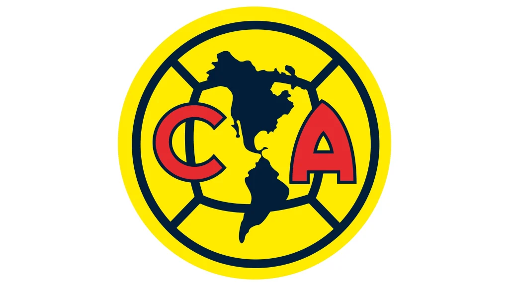
The 2017 redesign of the Club América logo brought about significant refinements to its typography and overall color scheme. One of the key updates was the alteration of the red letters in the emblem. These letters were made smaller, yet they were also solidified, which allowed them to stand out with a stronger look. Overall, the 2017 redesign enhanced the emblem’s boldness and elegance, ensuring that it remain representative of the club’s enduring legacy.
Frequently Asked Questions
| Why is Club America is famous in the football circuit? Club América is famous for being one of the most successful and popular football clubs in Mexico. Its passionate fanbase and historic rivalries, particularly with Chivas, add to its prominence in Latin American football. |
| How many major titles Club America has won? Club América has won a total of 13 Liga MX titles, making it one of the most successful teams in Mexican football. Additionally, the club has secured numerous other major trophies, including Copa MX, CONCACAF Champions League, and others. |
| What is the color of Club America logo? The Club América logo features a combination of yellow and blue. The dominant color is yellow, with blue accents highlighting the club’s initials and geographical representation. |
Final Words
That concludes our entire article in which we have discussed the history of Club America logo in detail. It is one of the most famous football clubs of Mexico that has a rich legacy of brilliance. The logo of the club has seen many changes since its first introduction, which is why its range of versions are quite extensive as compared to other logos. This blog has discussed all of them, so make sure to look at all the previous Club America logos to understand how the famous team emblem evolved over the years.

Logopoppin
Logopoppin is a graphic design agency that specializes in logo designing, web development, video production and advanced branding services. We love to innovate businesses with new age technologies, allowing them to improve their visual reputation.


