
Table of Content
Discover How the CNN Logo Transformed Into an Iconic Brand Symbol Today
In the world of broadcast journalism, few symbols are as instantly recognizable as the CNN logo. This simple yet powerful red and white design has become synonymous with breaking news, 24-hour coverage, and global journalism excellence for over four decades. What makes the CNN logo particularly fascinating is its remarkable consistency—unlike many major brands that undergo frequent redesigns, this iconic mark has remained virtually unchanged since its creation in 1980.
The story behind the CNN logo is as compelling as the news stories the network covers. Created under intense time pressure in just 24 to 48 hours, this design would go on to become one of the most enduring and recognizable logos in television history. From its humble beginnings as a last-minute necessity to its current status as a global media icon, the CNN logo represents far more than just corporate branding—it embodies the evolution of modern news broadcasting itself.
As we explore this transformation, we’ll discover how this simple three-letter logo has maintained its relevance, from a professional logo design agency’s perspective. And all that while adapting to changing media landscapes, technological advances, and shifting viewer expectations across multiple generations of news consumption. Let’s begin.
What is CNN? Overview of the News Brand and the Birth of 24-Hour News Broadcasting
Cable News Network (CNN) revolutionized the media landscape when it launched on June 1, 1980, as the first 24-hour news channel in the United States. Founded by media mogul Ted Turner and journalist Reese Schonfeld, CNN fundamentally changed how people consume news by providing continuous coverage around the clock. Before CNN’s arrival, news broadcasts were only available at scheduled times on major networks like ABC, NBC, and CBS, leaving significant gaps in real-time information delivery.
The network’s pioneering approach to continuous news coverage established CNN as a trailblazer in broadcast journalism. The first broadcast featured anchors David Walker and Lois Hart, with Ted Turner’s opening statement setting the tone for what would become a revolution in television news. CNN’s ability to provide live, continuous coverage during crises and breaking news situations set it apart from traditional broadcasters who relied on scheduled news programs.
CNN’s reputation was solidified during several landmark news events that demonstrated the power and importance of continuous news coverage. The network made history during the 1991 Gulf War by being the only television network to broadcast live from Baghdad as U.S.-led forces launched airstrikes against Iraq.
The September 11, 2001 terrorist attacks marked another defining moment for CNN, as the network was among the first major news organizations to break the news. CNN has also revolutionized political coverage with innovations like the “Magic Wall” interactive electoral map, becoming essential for election night broadcasting and democratic engagement.
Evolution of the CNN Logo Over the Years
Let’s take a look at the evolution of the CNN logo, and discover how this iconic example from three letter logos has transformed since its earliest interpretation in 1980, when the channel debuted. Let’s begin.
The Original CNN Logo (1980)
The original CNN logo made its debut alongside the network’s launch on June 1, 1980, designed by Anthony Guy Bost of Communication Trends, Inc., an advertising agency in Atlanta, Georgia. The creation story of this iconic logo is remarkably dramatic.
According to Toni Dwyer of Communication Trends, the need for a logo was realized at the eleventh hour, giving the design team only 24 to 48 hours to create and present a design for the new network. This intense time pressure resulted in one of the most enduring logos in television history.
The original design featured the letters “CNN” in black with a distinctive white cable line running through the letters, symbolizing the network’s cable news identity. Anthony Guy Bost designed the logo to be simple and bold, making it easily identifiable and memorable. The interconnected style of the letters represented the network’s continuous news flow, while the clean, straightforward design communicated reliability and professionalism.
The design philosophy behind the original CNN logo emphasized practicality and cost-effectiveness. This practical approach resulted in a wordmark logo design that was not only economical to reproduce but also highly functional across various media applications. The simplicity ensured excellent readability and recognition across different screen sizes and broadcasting contexts.
1984 CNN Logo Update
In 1984, CNN made its first significant modification to the logo, though the changes were relatively subtle and maintained the essential character of the original design. However, the shift from black and white color scheme to bold red and white color combination was notable. This change gave the CNN logo a more powerful and memorable appearance, helping it stand out.
The red color choice was strategic and symbolic, representing urgency, passion, and the immediate nature of breaking news coverage. Red is psychologically associated with alertness and importance, making it an ideal choice for a news organization that needed to capture viewers’ attention quickly.
With the color change, the 1984 update included a minor structural modification—the extension of the lower part of the “C” that connects with the first “N” was shortened slightly. This subtle adjustment improved the logo’s balance and readability while maintaining its distinctive interconnected character.
2014 CNN Logo Refinement
The most recent significant update to the CNN logo occurred in 2014, representing another subtle but important evolution in the logo’s development. The primary change involved adjusting the color combinations once again, shifting from the bright red to a deeper, more sophisticated shade of burgundy. This darker shade added professionalism and stability to the visual identity while maintaining the energy and urgency that red represents in news broadcasting.
It also included minor adjustments to the logo’s proportions, with the top of the “C” being slightly shortened to improve overall balance and visual harmony. These modifications, while barely noticeable, demonstrated CNN’s attention to detail in maintaining and perfecting its iconic logo.
By maintaining the essential character of the logo while making carefully considered refinements, CNN preserved the equity built up in its visual identity over more than three decades. And that allowed the network to modernize without losing instant recognition.
Other Variations and Limited-Time CNN Logos Used By the Channel
Throughout its history, CNN has occasionally created specialized variations of its logo for major events and special programming coverage. These versions maintain the core CNN logo design while incorporating additional elements that reflect the specific nature of the coverage or event.
During Olympic Games coverage, CNN has created variations that incorporate Olympic rings or other event-specific graphics alongside the standard logo, demonstrating the mark’s flexibility. Election coverage too has provided opportunities for CNN to create dynamic logo variations that emphasize the network’s comprehensive political reporting capabilities.
These special editions often feature modified color schemes, additional graphic elements, or animated treatments that highlight the significance of election night coverage. The modifications are always carefully designed to enhance rather than compete with the core CNN logo, ensuring that brand recognition remains paramount.
Understanding the Design Elements of the CNN Logo
Now that we have seen the various CNN logo variations sported by the channel over the years, let’s take a look at the design elements that make the symbol so iconic.
CNN Logo Color Scheme
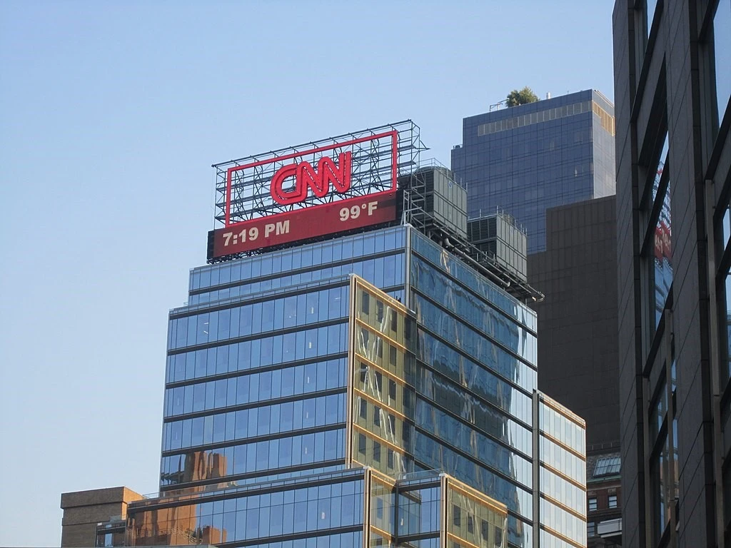
The CNN logo color scheme represents one of the most recognizable combinations in broadcast journalism, with red and white creating a powerful visual impact that communicates urgency, credibility, and professionalism. The current red color, called “Boston University Red” (PANTONE PMS 2347 C, HEX #CC0000), provides strong contrast while maintaining excellent visibility across different broadcasting and digital contexts.
Red color psychology plays a crucial role in the logo’s effectiveness, as the shades of red color are universally associated with urgency, importance, and immediate attention. For a news organization, red serves as an ideal brand color that subconsciously signals viewers to pay attention. The white elements in the CNN logo provide a necessary contrast for readability while representing clarity, truth, and objectivity. Moreover, the white cable line and negative spaces within the letters ensure that the logo maintains clarity even when reproduced at small sizes or against complex backgrounds.
CNN Logo Fonts and Typography Systems
The CNN logo uses a custom typeface specifically created for the network. The design was probably inspired by Teruoki Yagi’s Yagi Double typeface from 1968. The letterforms feature bold, clean lines with carefully engineered proportions that optimize readability across various media applications. Each letter maintains consistent weight and stroke width, creating visual harmony while ensuring legibility at different sizes.
The interconnected nature of the letters creates a sense of continuity and flow that represents the network’s continuous news coverage. The white cable line that connects the letters serves both as a design element and a conceptual representation of CNN’s cable news identity.
In 2016, CNN introduced “CNN Sans,” a custom corporate typeface inspired by logo fonts like Helvetica Neue and developed after consultations with Troika Design Group. This font family consists of 30 different versions with varying weights and widths to facilitate use across print, television, and digital mediums.
This represented a strong investment in brand consistency, allowing CNN to maintain complete control over its typographic identity while ensuring optimal performance across diverse media applications.
Frequently Asked Questions
| Who designed the original CNN logo and how long did it take to create? The original CNN logo was designed by Anthony Guy Bost of Communication Trends, Inc., an advertising agency in Atlanta, Georgia. Remarkably, the logo was created in just 24 to 48 hours because CNN executives realized they needed a logo at the “eleventh hour” before the network’s launch. Despite this time pressure, the design became one of the most enduring logos in television history. |
| How many times has the CNN logo been significantly changed since 1980? The CNN logo has undergone only two major color changes since its creation in 1980. In 1984, the logo changed from black and white to red and white, and in 2014, the red color was adjusted to a deeper, burgundy-like shade. The basic design structure and typography have remained virtually unchanged for over 40 years, making it one of the most consistent logos in media history. |
| What font does the CNN logo use? The CNN logo uses a custom typeface specifically designed for the network, not a commercial font. The design was likely inspired by Teruoki Yagi’s Yagi Double typeface from 1968. For other applications, CNN developed “CNN Sans” in 2016, a custom corporate typeface inspired by Helvetica Neue, which comes in 30 different versions for use across print, television, and digital platforms. |
| What do the colors in the CNN logo represent? The red color in the CNN logo (officially “Boston University Red” – PANTONE PMS 2347 C) represents urgency, passion, and the immediate nature of breaking news coverage. Red is psychologically associated with alertness and importance, making it ideal for a news organization. The white elements represent clarity, truth, and objectivity—core values in journalism—while providing necessary contrast for readability. |
| How much did CNN pay for their logo design? According to Toni Dwyer from Communication Trends, the design team originally wanted $5,000 for the CNN logo, but CNN executives “threw a fit” and the final bill was between $2,400 and $2,800. This makes it one of the most cost-effective logo investments in corporate history, considering the decades of brand equity and global recognition it has generated. |
Conclusion
The transformation of the CNN logo and the evolution of the news brand represent a remarkable case study in effective brand management and design longevity. The logo’s journey from a hurried design created in 48 hours to one of the world’s most recognizable media symbols illustrates the power of simplicity, consistency, and purposeful design in building lasting brand equity.
The evolution of the CNN symbol—from black & white to red & white, and later to a refined burgundy shade—shows how good logos can be carefully tweaked without losing their character or value. These minimal changes have allowed CNN to modernize its appearance while preserving the brand equity built up over decades of global news coverage and major event reporting.
Logopoppin
Logopoppin is a graphic design agency that specializes in logo designing, web development, video production and advanced branding services. We love to innovate businesses with new age technologies, allowing them to improve their visual reputation.
