Table Of Content
Discover How These Coffee Shop Logos Make Their Mark in the Industry
Who doesn’t love coffee? The hot cup of java in our hands as we start our day, or the energizing shot of espresso or ice coffee to pick us up around midday, coffee is to us humans as fuel is to our cars. And with more and more ways to make coffee emerging, as well as the trend of patrons moving towards organic, fair trade options over large chains, we have started seeing many more cafes opening in recent years.
And with those cafes come a variety of innovative coffee shop logos. In today’s world, the product is just one part of the overall business experience, with everything from the transaction experience, to the feel or vibe of the logo or the color theme affecting how successful your business is.
That is why large chains like Starbucks, with its collection of over 15,000 outlets across the US alone, strive for consistency in their operations. This ensures that no matter where the customer may be, they will get to have the same experience, a familiar one.
So how do these new shops manage to make their mark? How can they beat the big chains with established clientele? The answer, great brand logos and branding strategies.
Let’s take a look at some of the top café and coffee logos, to see how expert logo design services capitalize on innovative designs and sentimentality to capture the market.
1- Why Does a Coffee Shop Need a Logo?
When it comes to the question of why coffee shops need a logo in the first place, the answer is simple – they need it for the same reason that other businesses do. A business needs a logo, no matter what its niche, in order to create a strong base for their brand.
When it comes to coffee branding, an innovative logo is necessary. Almost every small shop or café around the world uses the same kind of imagery – a steaming cup of coffee. In today’s world, this is highly unimaginative, especially if you plan to build a brand out of your coffee shop.
That is because your logo would be the primary visual design that your consumers will associate with you. So if the design is generic and unimaginative, it isn’t going to make a strong impact on your consumer. And in the worst case scenario, it may actually turn them away from your brand entirely.
That is why it is important to have an innovative and unique logo designed or your café or coffee shop.
2- 7 of the Best Coffee Shop Logos and What We Can Learn From Them
Now that you know for sure that a coffee shop needs an imaginative and inviting logo, the question is – how to design a logo for your coffee shop that will have the desired impact on your target consumers. Now, one of the best ways to research what elements work and don’t work in your industry, is to look at your competition and see what is successful about their designs.
So, let’s take a look at some of the most unique and interesting coffee shop logos to see what can we add to our own brand symbol.
Starbucks
When we talk about coffee shops and cafes, no list can be complete without mentioning the king of the industry. Today, Starbucks is potentially the largest and most popular coffee shop in the world, with thousands of outlets across the globe.
The design of the Starbucks logo is quite simple, and frankly has nothing to do with coffee at all. Yet despite that, one look at the logo today and the first thing that comes to mind is coffee itself. Why is that? Why has this white on green image of a mermaid become the most iconic image of a coffee shop?
That is because the company went for a relatively simple design that could be printed on a variety of mediums, both physical and digital, without losing its impact. That allowed the brand to print it on everything from packaging to their uniforms.
Moreover, the color combination used in the logo and the brand, a mix of green, white, and brown, have the perfectly soothing impact upon people, so that consumers feel safe and taken care of. This is what has made the logo so universally accepted.
Calienna
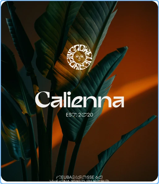
The logo for this Calienna Coffee shop features a dynamic yet minimalist design. The combination mark features a unique wordmark which features contrasting curves and sharp angles. With the wordmark, there is a small graphic, which features a ring with abstract design along the edge, with the middle featuring a mask-like face.
The color scheme is a high contrasting white and brown, which makes the logo look homely and comfortable, while at the same time the sharp, arrow-like angles of the wordmark beckons them onwards.
Using this eclectic mix of unique fonts and logo symbols, the logo for Calienna is one that calls out to the adventurers, always on the lookout for the next thrill.
The Coffee Bean & Tea Leaf
The Coffee Bean & Tea Leaf is the perfect logo for a quaint little café, nestled among the hubbub of the big city, offering a simple and easy solace to its patrons from the harshness of their daily lives. The simplistic design, with its script-like curly wordmark, and its simple imagery of a coffee bean and tea plant, this is as simple as a brand logo can get without losing its impact.
First, the vintage fonts used are perfect for a logo that wants to add a bit of history and legacy to the design. Next, the obvious imagery of a coffee bean and a tea plant says a lot by itself. But when combined with the wordmark, and the light and dark brown color palette, it makes for a great brand logo for a café.
The Ugly Mug Coffee
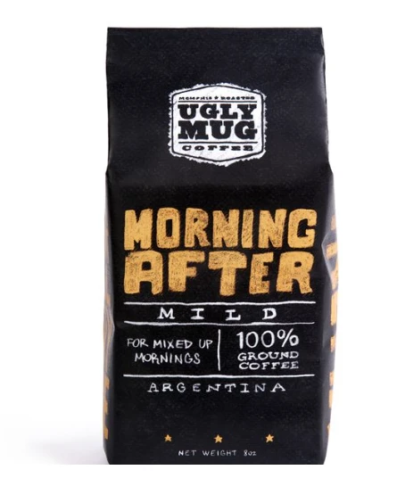
Source: Pinterest
When we talk about coffee shop logos, one of the primary mediums we should test the design on is our product packaging designs. For a coffee shop, that means testing it out on everything from packs of roasted coffee beans, to your to-go cups, napkins, and more, like the logo above for the Ugly Mug Coffee.
The reason for that, especially for a smaller café, is that having people carry around materials with your logo on it will help get the word out faster to your prospective consumers. In fact, it is also a great way to allow consumers to initiate word of mouth marketing on your business’s behalf.
Now consider that you have created a logo that looks good on your website and social media. But when it comes to your to-go cups, the logo doesn’t have the same impact as your coffee cups are made up of a recycled material that isn’t the same shade as your website’s background.
The result would be a logo that washes out on your merchandise and packaging, and fails to have the intended impact from the medium that will help you get the most consumers.
Handmade & Damn Handsome Coffee
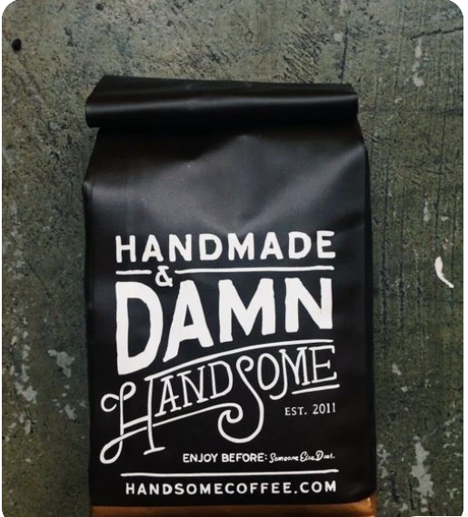
Continuing in the same vein as above, this logo for Handmade & Damn Handsome Coffee shop is also designed according to how well it performs on the packaging. This is extremely important if your café uses a variety of coffee and tea packaging for good like roasted beans or tea leaves.
The logo above may not exactly be one of the classic minimalist logos you are used to, but its impact is the same as if it features a plain yet striking design. The mix of straight typeface with a loopy, script-like font to enhance one word of the wordmark offers a strong impact, one that is hard to miss.
Little Town Coffee Shop
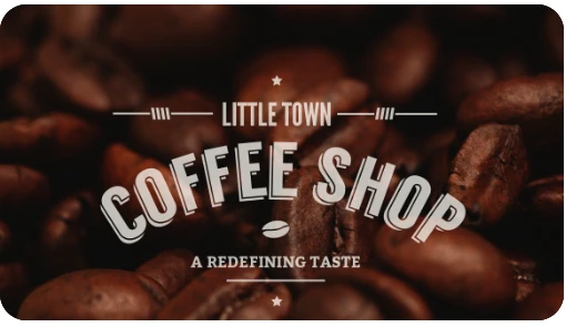
This logo for the Little Town Coffee Shop may be one of the simplest business logo ideas you may have seen, yet somehow it still works great for its niche. The design features a hierarchal font structure, which gives us a nice visual contrast while at the same time emphasizes the core feature of the business.
The design is subtly supplanted with a small coffee bean in the middle of the design, which ties together all the design elements, such as the wordmark’s 3D logo design, and the simple white on brown color scheme.
This type of old school logos are quite popular with the millennial crowd, as it is the perfect blend of nostalgia and modern minimalism, which gives a warm organic feel to the business it represents.
Forty Ninth Parallel Coffee Roasters
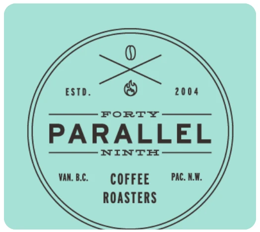
Finally, this logo for the Forty Ninth Parallel Coffee Roasters is something that would go over well with the hipster crowd. The fine lines and minimalist design, with clear negative space bringing everything to the front and center of the design, is something that is quite difficult to pull off.
However, if a designer carefully plans the design of the logo, and knows what to highlight and what to bring to the back, finding the right balance in this type of logo can be achieved. And as you can see from the logo above, the symbol can be easily taken for a crest or an emblem logo, and an effective one at that.
3- Branding Tips to Know When Designing Your Café & Coffee Shop Logos
Knowing how the top brands have created their brand logos, you can see it takes more than simple design chops to create an effective coffee shop logo. In fact, here are some branding tips to ensure that your café logos are top tier, every time.
- Choose a logo symbol that looks great across a variety of mediums
- Use suitable brand colors and incorporate them throughout, from your website to packaging, and even your brick and mortar store
- Make sure that your print mediums such as product packaging is eye catching and attractive to give your logo a boost
- Look for co-branding ideas to incorporate to grow exponentially as a business
- Make your logo design suitable for intuitive social media use such as for Instagram or TikTok
- Tailor your design to your target market
- Highlight your business’s roots and values through design and effective branding
Conclusion
In short, there are some truly great coffee shop logos that you can use for inspiration in order to create your own brand logo. However, if you do not know where to start, or how could you ensure that your logo design is a success, use the tips above to help you guide and tweak your café logo design.
People Also Ask (FAQs)
| 1- How can I create a logo for my café? The best solution is to hire a professional logo designer to create your café logo for you. However, if that is not something you prefer, then you can use an online logo maker tool to create a brand icon for yourself. However, be warned that logos designed by such tools often use generic design elements, which can dilute the impact of your brand’s message. |
| 2- What should I name my café or coffee shop? You should use keywords related to brewing coffee, or related to the feel or scenario around the practice of drinking coffee, such as sunrise, Moka, Java, Caffeine, and more for a successful coffee shop name. |
| 3- What is the best color combination for a coffee shop logo? Some of the best colors that represent successful coffee shop logos are warm shades of brown like beige, caramel brown, and more. Moreover, muted shades of green, like the one used by Starbucks, are also a great option as a secondary or even a primary brand color. |

Logopoppin
Logopoppin is a graphic design agency that specializes in logo designing, web development, video production and advanced branding services. We love to innovate businesses with new age technologies, allowing them to improve their visual reputation.

