Discover How to Develop the Perfect Color Combo to Enhance Your Designs
Finding the right color combination is one of the most important yet difficult task of creating a design. Graphic designs like logos, illustrations, or even web and app designs can embody a new sense of being when you use the best color combinations.
Essentially, colors can give your design a life and an identity. Its shades can affect and influence the way you feel, and even the way you act. Take the example of Superman’s symbol, one of the most iconic entries in any list of popular superhero logos.
The character was portrayed as a quintessential all-American guy who bought peace to the people. His actions combined with the red-and-blue color combo made him the perfect embodiment of the peacekeeping identity the US wanted to portray at the time.
Let’s take a look at how you can choose good color combinations to elevate your design’s impact.
Color Psychology: How Does Different Color Combinations Affect and Influence Us?
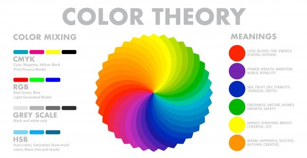
Color psychology is a part of color theory, and deals with how different color combos affect the perception of their users. It also deals with how different shades can be used to influence the way we feel and act.
Oftentimes, amateur designers and newcomers tend to ignore this important aspect. However, many successful and professional graphic design services that have worked with a top-notch branding team know that the right color combo can make or break your design.
Suppose the example of the bright red and yellow color scheme used by McDonald’s. According to researchers, the color red tends to bring out certain elements of their viewer’s personality. The color is often associated with passion, desire, and hunger. Essentially, it helps keep their consumers hungry.
The bright yellow is meant to evoke feelings of happiness, calm, and joy. When we combine the two, it makes the perfect symphony of perceptions favorable to a fast food business. That is why many fast food places tend to use shades of red in their designs, like Wendy’s, Pizza Hut, Burger King, Sonic, KFC and many more.
Similarly, businesses and designers who factor in the psychology of individual shades, tend to create graphics that are better suited to their viewers and consumers. Bright and colorful brand colors are great for businesses who target a young and fun crowd. However, a more subdued combination of colors is necessary when going for the more serious corporate vibes.
A similar concept is necessary to create the perfect color combinations not only for other types of logos, but also for various graphics and other design projects.
What Are the Popular Types of Color Combinations?
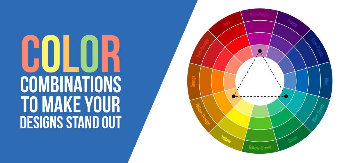
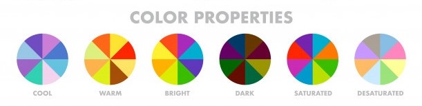
Now let’s come to the various styles of color combinations that a designer or an illustrator might use to create a color palette for their art. While a designer has a number of color schemes at their disposal, we are going to discuss the three most famous of these options.
Each of these combination of colors and hues adds a value to your design. And that is why choosing the style of the color scheme is necessary before we get on to selecting the perfect shades for our graphic design project.
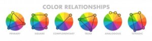
Generally speaking, these color combos often rely on the placement of the various shades and hues on a color wheel, and the names of these combination types are based on the pattern that is used to select the perfect hues for use.
Let’s take a detailed look and understand what each of these styles of color schemes bring to the table in terms of value.
Complementary Color Combinations
The name of this type of color combination says it all. This technique relies on selecting hues of colors from the complementary sides of the color wheel – that is from opposing ends. Now, the two colors you choose may vary in tint strength as well as other aspects, and it is up to the designer to select the best shades that contrast each other without clashing.
This style of color combinations provides the most amount of contrast among any of the other techniques. That is because you get to choose from all the shades from the central point of the circle, all the way to the apex of the color wheel. And that too on both opposing ends.
Therefore, many designers are often wary of using this technique when deciding on a color scheme. The best way to use it, however, is to choose one of the best color combinations as primary, and use the other as accent to enhance the design.
The complementary color combinations are often used in graphs, infographics, and the like where a high contrast color scheme is needed to emphasize the important points or key takeaways from your project.
Analogous Color Combinations
This is another popular color combo in style. In this technique, the designer chooses one color as their primary from the color wheel. Next, you choose the two colors on either side of the primary shade, thus making a three-color combo.
However, if you still feel as if your design needs more variety in combination of colors, then, you can choose one more color from the outside edge of the secondary colors. Now you have a five-shade color palette, instead of just three hues to bring your art to life.
Unlike complementary color combinations, this style generally does not create a high contrast color palette. That is why it is used where a softer and warmer color scheme is needed. For example, if you want your design to be colored in warm spring hues, or a cool and fresh winter shades, then this is the type of color mixing you require.
The general tone of analogous shade palettes is generally slow transitioning overall. That means that reds are paired with yellows and oranges, rather than blue or purple.
Triadic Color Combinations
Finally, the triadic combination of colors gives us the best of both worlds. It gives us the freedom to use high contrasting colors, while allowing us to use more than two shades in our design palette. So if you are creating an illustration or piece of art that could use a high-contrast shade selection, but requires three or more shades, then this is the option for you.
The concept behind it is simple. Just like in complementary color combo, the colors for the triadic scheme are taken from equidistant points on the color scheme. However, unlike the former, the latter choses a minimum of three colors.
One of the three needs to be selected as the primary color of the color palette, while you can choose one to two different shades from the other two points. There is a catch, however. The colors chosen have a tendency to overpower each other, considering that they are taken from equidistant points of the color wheel.
The best to avoid that, is to use the primary shade you have chosen as you like, but use the other two sparingly. However, if you feel that using the secondary shades is necessary in your design, then you can choose softer tints of the chosen colors. That will help you use them as accents better, such as in the various logo fonts used in the design.
This color combination is best used when a high contrast is necessary, such as in pie-charts and infographics etc. It will help you make each item distinct without clashing.
Color Accessibility: Creating Inclusive Color Combinations
Designing inclusive color combinations ensures your content is accessible to all users, including those with visual impairments and color vision deficiencies. Creating accessible designs isn’t just ethically important – it’s also legally required in many jurisdictions and expands your potential audience significantly.
Understanding Color Vision Deficiencies
Approximately 8% of men and 0.5% of women have some form of color vision deficiency. The most common types affect red-green color perception, making it difficult to distinguish between certain shades of red and shades of green. When selecting color combinations, avoid relying solely on red-green contrasts to convey important information.
WCAG Guidelines and Contrast Ratios
The Web Content Accessibility Guidelines (WCAG) specify minimum contrast ratios between text and background colors. For normal text, the contrast ratio should be at least 4.5:1, while large text requires a minimum 3:1 ratio. Use tools like WebAIM’s Color Contrast Checker to verify your combinations meet these standards.
Safe Color Combination Strategies
Focus on combinations that provide strong luminance contrast rather than just color differences. Shades of blue paired with shades of yellow typically provide excellent accessibility because they differ significantly in both hue and brightness. Dark shades of gray on light backgrounds offer universal accessibility.
Beyond Color: Alternative Design Elements
Never rely on color alone to convey information. Use additional visual cues like icons, patterns, textures, or typography variations. For example, if your logo color meanings include status indicators, supplement colored elements with symbols or text labels.
Testing for Accessibility
Use tools like Color Oracle or Sim Daltonism to simulate how your color combinations appear to users with different types of color vision deficiency. These tools help you identify potential problems before your design goes live. Additionally, consider user testing with individuals who have visual impairments to gather real-world feedback.
Inclusive Design Benefits
Creating accessible color combinations doesn’t limit creativity – it enhances it by forcing you to consider fundamentals of color theory more deeply. Many of the most iconic and memorable designs use high-contrast, accessible color combinations that work for everyone.
Catchy Blend of 2 Color Combinations
Using 2 color combinations are one of the easiest ways to elevate a monotone design. if you think that your logo could use a splash of color for contrast, then have a look at the popular color combinations below.
Pink and Raisin – Perfectly Feminine

While at first glance, many might associate this color combo as feminine, that is far from its only use. The dark yet still bright pink is the perfect accompaniment for the darker raisin is the perfect embodiment of lush indulgence and youthfulness.
Although we don’t deny that it is a color scheme often used to represent the feminine, that is not its only use. Many salons, health studios, and even jewelry logos use it, as well as cafes and stores that represent decadence, such as ice cream and frozen yoghurt shops, patisseries’ etcetera.
Mustard and Black – The Age Old Safety Colors

Yellow and black are a high contrast color combo that has been used for ages. That is because while these two provide a striking difference that make designs pop, the visual clash they provide is easy on the eyes, making for a more comfortable viewing experience.
Historically, the color scheme has been used for industrial uses, and you will often see industrial and construction logos sporting a yellow-black color palette, such as the Caterpillar company. As they are often used as a warning or hazard, they are also usually accompanied by blocky masculine fonts.
A Mix of Pinks and Browns – Subtle Yet Uplifting

The various shades of pink are often associated with youth, luxury and decadence, or femininity. And adding the different shades together often enhances the effect. Browns however, are often used to embody a relation with the Earth and nature, sustainability, and simplicity.
However, when you combine the pinks with the browns, you discover something unique, something awesome. The first thing you notice is the brown brings out and emphasizes the pink. Moreover, the brown shade itself is elevated in impact by the contrast provided by the pink. Overall, it is a good color combination.
Raspberry and the Various Shades of Blue – Add a Splash of Color to Your Designs

Blue is well rusted color. It often represents, calm, cool, and serenity. It is a good color combination if you want your design to develop a sense of trustworthiness. And that is what makes the various shades of blue so perfect for brand logos and other sustainable branding designs.
For this color palette, the shade of blue chosen provides a trusty backdrop, and the light and bright tones added by the inclusion of the pink-purplish hue of raspberry is quite literally the cherry on top. When used as an accent, it perfectly emphasizes the design and gives it the perfect depth.
Turquoise and Violet – Cool and Elegant

Both violet and turquoise are dark and cool combination of colors. That makes many think that combining the two into a color palette might not be the best idea, as that will tend to make the resulting graphics seem dull and boring due to a very minor visual contrast.
However, that is far from the truth. When used correctly, the darker violet tends to bring out and enhance the lighter turquoise, making it glow. Conversely, the turquoise emphasizes the darker violet, making it stand out instead of melding into the background.
Different Shades of Blue and Green – Vibrant and Energizing

The various shades of blue and green work great together, aesthetically. Look around at nature. Blue skies over lush green forests in varying shades of the color, bracketed by a body of water a darker and deeper shade of blue. Just imagining this is relaxing.
When used right, the color combination can emphasize and build on each other, thus making it one of the best color palettes to use when cool and vibrant tones need to be combined. A few shades of green and blue can even seem fluorescent when used together, due to the sharp contrast they provide.
Yellow and Blue – Trustworthy and Calming

Various shades of yellow color are bright hues that tends to draw attention immediately. And when set against the authoritative and confident dark blue, the combination is one to know about. The resultant graphics are quite adept at gaining the trust of their viewers and consumers.
Many famous logos use this color combination, such as Sonic and IKEA. The calming and trustworthy mix of colors is the perfect choice to create logos, as it helps brands gain the trust of their customers for a lasting relationship.
Navy and Teal – Cool and Calm, or Eye-popping Exuberance

While many consider these two as shades of the color blue, there visual contrast is one that is rarely found within such closely linked hues. And moreover, the two ways to use them together create quite different results, which can even be considered opposing reactions.
When using the color combo over a navy backdrop, the result is one of cool and calm comfort for the senses. However, if the shades are flipped, the result is an astounding eye-popper. The navy over teal combo results in catchy graphics that are guaranteed to attract viewers.
Black and Orange – Impactful and Energetic

The lively and eye-catching orange provides the perfect contrast to the dark black. This gives it an aura of mystery and intrigue. While on lighter backgrounds, the color orange tends to fade or meld into the backdrop. However, against the powerful black shade, the color stands out like a beacon.
This color combination works well where the graphics promise a sense of adventure, mystery, and an adrenaline rush. That makes it perfect for nightclubs, extreme sports and the like, basically places designed to pump up your heart rate.
Maroon and Peach – Zen and Elegance Combined

This color combination of peach and maroon is rarely seen, yet it goes together quite wonderfully. The mix of these shades is quite soothing to the viewer, making it perfect for graphics designed to put their viewers at ease.
While it is rare, in no way does it mean that is a less effective or boring color combo. If you are creating graphics for the fashion industry, a home-makeover or interior decorator setup, or even a health spa, this color scheme could work wonders for your logos and other types of graphic designs.
Navy and Orange – Whimsically Impactful

While visually these color combinations have quite opposing effects, when used together properly the result is one full of fun and uniqueness. And what a match they make. The color orange is often associated with energy, youth, and impulsiveness. Navy, on the other hand, is suave, elegant and calm.
When we combine the two shades in our graphics, the two lift and elevate each other to make a combination that has more of an impact than either of them individually. Orange softens some of the strictness of blue, and gives it a little spontaneity. Blue tempers the impulsive nature of orange and gives it a fruitful direction.
Sapphire Blue and Light Blue Gray – Shades That Command Respect

Another color combination like the navy and teal, which belong to the same color family, sapphire blue and light blue gray work great together. Both of these shades are used to embody a sense of calm and serenity.
The visual contrast this color combo provides is quite striking yet subtle. That makes it one of the best color combinations on our list, if your design is meant to be inviting yet mature. The deep sapphire blue exudes calm and serenity, and the blue gray embodies a flighty elegance within it.
Powder Blue and Chetwode Blue – Calmly Welcoming

Another type of 2 color combinations, the powder blue and Chetwode blue are a curious bunch. Both of these are lighter, more pastel shades of the color, yet they still provide ample visual contrast. The combination brings to mind the calm and serenity of nature – the still pools of clear blue waters in locations untouched by humanity and their harmful ways.
This color palette however, works well only when we use the darker shade over the lighter backdrop. Designs tend to stand out better when used this way, and exude a certain sense of peace and relaxation. That makes it perfect for uses such as spa logos, as well as graphics for similar businesses.
Desert Sand Beige and Emperor Gray – Elegant, Sophisticated, Unique

The Desert Sand Beige is a unique shade in our collection, and looks more pink than beige. Similarly, Emperor Gray is a dark shade of the color, with a slight tint of lilac in it. With names like these, you would have thought that they might not, but their unique characteristics make them perfectly suited for each other.
Designers tend to avoid the different shades of brown, especially when creating logos. However, that is mostly because using it well requires a lot of skill. And when used well, with suitable colors, the effect is one of understated elegance, that speaks highly of the sophistication this color palette contains.
Indigo and Lavender – Fit for Royalty

Working on a similar concept as discussed above, the Indigo and Lavender color palette is quite eye-catching, making any design look premium and elegant. Often considered a loud color that tends to makes it mark over other shades, Indigo has long been associated with royalty, especially in eastern cultures.
However, when used to provide a backdrop for the softer and more sophisticated lavender, it tends to soften its garish look to look more refined and sophisticated. On the other hand, the darker background also tends to emphasize and elevate the impact of the softer lavender.
Sundown Pink and Burgundy – Charming and Sweet

This is a uniquely heartwarming color combination, one of the few best ones on this list of color combinations, made up of tertiary colors. The sundown pink is a deeper shade of pink, which teeters on the edge of being considered dark pink. This makes it quite impactful, when used right.
Burgundy is always an elegant addition to a design. and when combined with the sundown pink, it makes for a very strong palette. The pink is charming, yet somewhat subdued. Burgundy on the other hand, is quite intense. And the sundown pink makes it softer and more elegant.
Light Blue and Crimson Pink – Easy to Notice

This combination of colors might sound garish or too loud to many. However, in reality these two complement each other perfectly. Visually, the shades are quite different, with the light blue being quite bright and airy. The Crimson pink on the other hand, is deep and dark, and brings a sense of lush decadence to the duo.
Individually, both of these hues make it easy to stand out quite noticeably. When combined, you would think that the effect would be multiplied. However, that is not the case. When used together, both these shades tend to temper these effect slightly, just enough to make the design inviting and friendly.
Popular List of 3 Color Combinations
If your design could use more than two colors to bring out its essence, then have a look at these trusty three-tone color combinations.
Gold, Charcoal, and Gray

The perfect contrast between the bright sunny tones and the darker cool shadows. The combination of gold, charcoal, and gray is quite a well-known and used color palette. The lighter and brighter gold elicits feelings of happiness, energy, and life. The darker gray and charcoal acts as accents to emphasize the contrast between them and the cheery gold.
Moreover, the use of two different dark shades add a layer of depth to the overall effect of the color palette. The gradient they present give your designs a soft touch of shadows, which enhances the overall effect to give those graphics a mature look.
Tan Brown, Deep Turquoise, and Black

This color combination is often considered masculine, due to the dark tan and black shades combined with a deep turquoise. However, its proper usage dictates whether this color combination works well for you. When you use the tan and black on a turquoise background, the colors tend to blend together, with the design having no impact whatsoever.
However, over a tan background, a deep turquoise design stands out well. And when it is emphasized by the dark black, the resultant effect is where each line of the design stands out in a way that draws the eyes.
Mauve, Sapphire, and Powder Blue

This is one of the best color combinations where the deep and lush shades are offset by the lighter and more delicate shades. The overall effect is meant to give a softer, more feminine vibe, which screams of trust and reliability.
The rich tint of mauve, combined with the soft powder blue is a provides a strong contrast subtly, without being too harsh on the eyes. And the addition of the bright and energetic sapphire adds another layer of contrast and emphasis to the design that uses the color palette.
Blue, Maroon, and Indigo

Any color combination that uses blue as its primary color benefits greatly from the trustworthy vibes it embodies. That is also the case with this color palette. The blue shade acts as the perfect backdrop for the design, which greatly uplifts the darker maroon.
The maroon stands out in a cool and subtle manner, which is further enhanced by the darker shade of the blue color gradient, namely indigo. This deeper color might not be so great when used with just blue in the design. However, the addition of maroon into the palette lets it shine.
Deep Pine Green, Orange, and Light Peach

Orange is one of those shades which is rarely used in designs, especially branding elements. However, it is also a color that stands out quite easily. The connotations of the color with citrus automatically makes us equate the color with vibrancy and energy.
Now what do you pair with such an invigorating color? light peach adds a lighter and more youthful accent to the designs that use this color palette. and when combined with deep pine green, it adds a sense of cool and comfort to the color combination.
Sea Foam, Salmon, and Navy Blue

The perfect color combination for beachy and aquatic designs, this combination uses a mix of softer pastel shades. The entire vibe of the palette is one of calm and relaxation. The light blue sea foam is the perfect color to convey the feelings of a bright morning sun at the beach, but that is not all.
When it is combined with salmon, the contrast that results become quite distinct despite both being bright colors. Yet as the chosen shades are pastel, the overall effect is still soft. Finally, navy is added to mix to provide much needed darker contrast. It also adds a feeling of trust, something all shades of blue add to their various color combinations.
Rouge, Green, and Magenta

Another palette with sharp and vibrant contrast, the combination of rouge, green, and magenta is one truly wonderful. The combination of the sharp green and lush magenta gives the design a sense of elegance and luxury.
The addition of rouge, which might seem like a garish choice to many considering magenta makes it two shades of pink color in the trio, ends up enhancing the overall effect of the design. The already bold and energetic vibes of the color palette are elevated by the darker rouge, providing the much needed darker tones to the hues.
Beige, Black-Brown, and Tan

Just like the various color combinations of blue we have discussed throughout the topic, this color combo is made up of three different shades of brown color. The theme that is portrayed by this color palette is vintage and classic, and embody a serious vibe.
However, while this seemingly monotonous color combination might seem serious, the earthly tones in it also give a sense of warmth that welcomes the viewer towards your design. That is why these shades are often used to brand and market liquors like brandy and whiskey among others.
Yellow-Green, Olive, and Forest Green

Another three shade combination of colors, this palette of different shades of green color is designed to convey a sense of refreshing nature. Often used for branding all-natural or environmentally sustainable products, the colors are also used to represent drinks made from mint and limes, such as Sprite by the Coca-Cola industry.
By combining yellow-green to the darker olive and forest green, the overall result is one of excitement, and youth combined with the seemingly contrasting vibe of relaxation. While it may seem somewhat boring compared to the other interesting color combos on our list, this is one of the most popular palette in use today.
Fuchsia, Yellow, and Magenta

By using the darker fuchsia from colors starting with F as the backdrop, the bright yellow and lush magenta are used as emphasis to enhance the visual impact of your designs. The mixture of bright and eye-popping shades is one that no one will be able to ignore, no matter how hard they try. But how does this bright palette avoid overwhelming its viewers?
By using the darker fuchsia as the backdrop, the bright yellow and lush magenta are used as emphasis to enhance the visual impact of your designs. Conversely, the turquoise emphasizes the violet, one of the richest shades of purple color, making it stand out instead of melding into the background
Mustard, Sage, and Forest Green

Mustard, a darker tone of yellow, when combined with the pastel sage and forest green, is the perfect example of an earthy tone color combination. Each color represents an article from nature, such as leaves, trees, and other shrubbery.
Quite a rugged and calming color palette, it works great for natural and herbal products, such as hand and face creams, soaps, and other cosmetic products. Moreover, it can also be used as the color theme to brand an environmentally sustainable company.
Beige, Slate, and Khaki

This color combination uses a two-toned brown color, which is used to portray an earthy vibe. The shades chosen are pastel, and the resultant image is one of soft naturalism. And when used over an elegant slate backdrop, the effect is transcendent.
The color theme is often used to market products which are considered manly luxuries. Custom shaving boxes, men’s cosmetics, and even to package expensive liquors such as Gin and Vermouth. Overall, the intended effect is one of masculine luxury.
Light Pink, Green, and Sea Foam

Unlike the many other 3 color combinations that pair lighter shades with dark, this color palette uses a triad of three light shades. The overall vibe of the designs that use this combo is one of delicate softness and femininity, which is enhanced by the addition of the light pink in pastel shade.
The combination of the natural greens and the sea foam blue is one that brings bubbling brooks running between the trees in the woods. Essentially, it gives us an image of serenity and calm. By adding light pink to the color combo, the effect is enhanced to now include femininity and homeliness to the mix.
Scarlet, Light Olive, and Light Teal

A seemingly dull set of color combination, this color palette is an example of subtle elegance. Using very unique shades of the three primary colors, the designs that use this color palette find that it adds to their image, making it more luxurious.
Over a scarlet backdrop, the light olive and light teal combo makes the perfect accents to any design, especially that want to portray a low visual profile without sacrificing their appeal. The end result is one of mystery and decadence.
Olive, Beige, and Tan

This is one of the few truly professional color themes, perfect for corporate businesses. This combination of browns makes for one truly beautiful color palette, portraying qualities such trust, earthiness, and a connection with nature.
The muted pastel shades give a soft vibe, which is perfect in a corporate setup to ensure a vibe of no-nonsense attitude, professionalism, and maturity. Moreover, the subtle soft tones of the color theme are perfect to portray a caring and welcoming effect.
4 Color Combinations and More: Are They Worth It?
Generally, logo designers prefer to use a maximum of three shades within their designs, in order to avoid making it too overwhelming for the viewer to comprehend. However, if you know that you can use four-tone color combinations to enhance your design’s impact, then take a look at some of the most popular palettes made up of four attractive hues.
Red, Sea Foam, Jade, and Violet

This is a color combo derived using the triadic method. In this color palette, we have a set of four floral shades in slightly muted tones. The shades chosen are those used in classic settings that bring to mind vintage revival.
The deep red is offset by the darker jade and violet, which makes the color seem even more muted. However, the addition of sea foam is a welcome addition. It adds a sense of brightness to the design, making the color combination easy on the eyes.
Yellow, Magenta, Cyan, and Black

This is one of the best color combinations that is used in all color based printing today. By combining these four shades in a variety of ways, you can make up any color you might want to use in your design. Take a look into the color printer you have at home. See the cartridge? That contains vials for these four colors.
This set of bright and dynamic colors are quite powerful in their own rights as well. Take any of them, for example. Yellow is bright and full of life. Magenta is lush and decadent. Cyan is light, airy, and promises trust. And black is the backbone that binds all these colors together.
Magenta, Goldenrod, Turquoise, and Brick Red

This color palette is a mix of bright and muted tones. One of the most popular color combinations in east Asian and subcontinental cultures, the mix of magenta, goldenrod, turquoise, and brick red is an interesting one.
Mostly used with the goldenrod as the base color, the magenta and brick red might seem likely to clash. That is why turquoise is used, to provide a buffer between the two, and add a brighter tone to the overall design. this eclectic mix makes it perfect for celebratory designs.
Navy, Almond, Reddish-Orange, and Mango Yellow

Another palette which offsets a dark shade with a mix of bright and light colors, the mix of navy almond alone is a good color combination. However, it still misses a bright component. And that is what is provided by the addition of mango yellow and reddish orange.
These bright and energetic shades are the perfect combination to elevate the austere navy blue, and the neutral almond. This gives your designs a mix of vibes. Trustworthiness from the use of the navy, the minimalism characterized by the almond, fiery passion and energy via the reddish-orange, and a youthful energy and cheerfulness through mango yellow.
Navy Blue, Ochre, Burnt Sienna, and Light Gray

It is one of the best color combinations that expertly matches and mixes neutral and dark backgrounds in a way that still keeps the design interesting. The mixture of ochre, light gray and burnt sienna portray an earthy vide, that is characterized by sustainability and masculinity.
However, when we add the backdrop of elegant and dark navy to the mix, the entire color palette is elevated to new heights. Now the most prominent vibe portrayed by your designs is one of elegance and luxury, opting for muted and regal shades of the color spectrum.
Teal, Coral, Turquoise, and Gray

Using different shades of the blue-gray spectrum, the color palette creates a mix of teal, turquoise, and gray. But these similar cool tones need something to make it pop, a pick-me-up of sorts. That is where coral adds its magic. The pastel shade provides the perfect contrast to the design.
While a blue-toned color combo is nothing new, and we have seen many innovative variations of that, the fact remains that the addition of the pinkish coral shade adds a splash of welcome difference to the color palette. And when used correctly, provides the perfect desired accents.
Fuchsia, Sepia, Hot Pink, and Dark Violet

This color combination mixes three dark and deep shades with one light tone to offset the color palette. The mix of fuchsia, dark violet and hot pink is an interesting choice, as they are all darker shades that provide very minute contrast.
That is why the sepia tone is needed to add the desired contrast. Used sparingly, it is a great color to add accents to the design, as it matches the color tone achieved by mixing the other three colors, that is a dark pink-purplish hue.
Light Pink, Sage, Sky Blue, and Grape

A bright and light color palette, one of the few color combinations that relate to nature and its various aspects. The sage and grape, when mixed with light pink, are the perfect embodiment of an open sky at dusk. When combined with the sky blue, the overall image is one of a tropical paradise at dusk.
The three shades of blue are often used together, especially when a design warrants the use of similar hues. However, these kinds of color combos often need another color to offset their monotony. That is why this palette uses the light pink to add a certain brightness to its designs.
Red, Yellow, Cyan, and Bright Purple

Finally, the party color combo is here. This eclectic mix uses a combination of four loud and bright colors. That gives it the perfect vibe, one full of energy and excitement. These four colors are often what many of us in our childhood are most often exposed to, in the forms of toys and parties.
As such, we often associate them with enjoyable vibes, full of friendly cheer and celebration. The red is passionate, the yellow bright and cheerful. Cyan adds a light and free vibe, while purple is all about decadence.
Seasonal Color Combination Trends: What Works Best Throughout the Year
Aligning your color combinations with seasonal trends can dramatically improve audience engagement and brand relevance. Each season brings distinct color preferences that smart designers leverage for maximum impact.
Spring Color Palettes: Fresh Beginnings
Spring calls for fresh, rejuvenating color combinations that mirror nature’s awakening. Popular spring palettes include soft shades of green paired with delicate shades of pink. Light shades of yellow combined with pastel blues create an optimistic, forward-looking mood perfect for new product launches and fresh marketing campaigns.
Summer Combinations: Energy and Vibrancy
Summer demands bold, energetic color combinations that capture the season’s excitement. Vibrant shades of orange paired with tropical shades of teal create summer-perfect palettes. These combinations work exceptionally well for outdoor brands, travel companies, and recreational businesses looking to capture summer’s adventurous spirit.
Fall Color Schemes: Warmth and Sophistication
Autumn color combinations draw from nature’s rich tapestry of changing leaves. Deep shades of burgundy combined with warm shades of brown and golden yellows create sophisticated, welcoming palettes. These combinations are perfect for luxury brands, food and beverage companies, and businesses wanting to convey reliability and tradition.
Winter Palettes: Elegance and Calm
Winter color combinations emphasize sophistication and tranquility. Cool shades of blue paired with crisp shades of gray and pristine shades of white create clean, professional aesthetics. Deep shades of purple combined with metallic accents add luxury and exclusivity to winter campaigns.
Implementing Seasonal Strategies
Consider creating seasonal variations of your brand colors while maintaining brand recognition. Many successful famous blue logos adjust their shade intensity seasonally – lighter blues for spring and summer, deeper blues for fall and winter. This approach keeps your brand fresh while maintaining consistency.
Bad Vs. Good Color Combinations: What Makes a Color Combination Effective?
After studying all the color combinations, we discussed above, you can see that all have one thing in common. They all complement each other, and enhance the effect of each shade to be more than it was before. But how can we actually judge if a color palette is good?
A good color combination is one that has all its colors complement and build on each other. Essentially, the impact should be one where the negative aspects of each individual color is tempered, while the positive aspects are enhanced. The resulting color theme would be one that would be considered good.
A bad color combination, on the other hand, is one that has clash with one another, or else add no value to the overall color theme. Remember, each color is added to your combination to serve a specific purpose. If a shade has no specific job, then it is useless, and it makes the color palette useless.
Cool Color Combinations for Logos
Logos often rely on simpler color combinations, from monochromatic to two or maximum three-tone color schemes. However, some brands prefer to use four or more shades in their design as well, if they think they can pull it off successfully.
The color choices for logos are often those with a softer contrast instead of a sharper one. That helps people remember all details instead of the visual contrast overpowering all other aspects of the design.
Shades That Set the Gaming Environment: MTG Color Combinations
There are many color combinations named within Magic: The Gathering board game world. Some of the most popular ones include:
- Grixis: Blue-Black-Red
- Jund: Black-Red-Green
- Naya: Red-Green-White
- Abzan: White-Black-Green
- Jeskai: Blue-Red-White
- Sultai: Blue-Green-Black
- Mardu: Red-White-Black
- Temur: Green-Blue-Red
- Azorius: White/Blue
- Boros: Red/White
- Dimir: Blue/Black
- Golgari: Black/Green
- Gruul: Red/Green
- Izzet: Blue/Red
- Orzhov: White/Black
- Rakdos: Black/Red
Manually Selecting Complementary Shades Vs. Using a Color Combinations Generator
As a designer, you might decide on your color palette by using best color combinations to create your designs. However, there is one drawback to that. With the number of shades available today, it would take a long time to come up with a suitable color scheme that works the same across a variety of mediums.
The best option is to use a color combinations generator tool. These types of tools are designed to choose suitable shades of color, depending on factors such as the tone of the design, the numbers of colors you want to use etcetera. By factoring in all the important details needed, these tools can help you create new and innovative color palettes.
How to Test Color Combinations with Your Target Audience
Before finalizing your color combinations for any design project, testing them with your actual audience can save you from costly mistakes and ensure maximum impact. Understanding how your target demographic responds to different color meanings is crucial for creating effective designs that resonate and convert.
A/B Testing Your Color Schemes
Start by creating two versions of your design using different color palettes. For example, test a warm combination like shades of orange and shades of red against a cooler palette featuring shades of blue and shades of green. Monitor key metrics like click-through rates, time spent on page, and conversion rates to determine which combination performs better.
Focus Groups and Surveys
Organize focus groups where participants can provide feedback on different color combinations. Ask specific questions about how the colors make them feel, which combinations seem most trustworthy, and which they find most appealing. This qualitative data complements your quantitative A/B testing results.
Tools for Color Testing
Use tools like Hotjar or Crazy Egg to create heatmaps showing how users interact with different colored elements. Google Optimize and Optimizely are excellent for running sophisticated A/B tests on color variations. Additionally, consider using online survey platforms to gather broader feedback on your logo color meanings and overall color strategy.
Cultural and Demographic Considerations
Remember that color preferences vary significantly across cultures and age groups. What works for a young, urban audience might not resonate with older, rural demographics. Research shows that cultural background heavily influences how people interpret different fundamentals of color theory, so always consider your target market’s cultural context.
How to Choose Color Combinations for Websites and Apps?
Your websites and mobile apps should use the color combination decided in your branding strategy. Your website and apps will either use that color scheme, or will come up with complementary shades of color which are the perfect fit for your brand colors, without clashing visually.
When we consider the different types of websites, the primary purpose when creating a design brief is to make sure that the user experience is good. That is why softer colors that match your brand themes are necessary to create your website or app’s color palettes.
Choosing the Best Color Combinations That Will Enhance Your Design Project
Now that you know what is required to create various color combinations for your designs, as well as a veritable list of the popular two-tone, tri-tone and four-tone color schemes, you can now create your own perfect color palette.
Do you require a graphic design agency to create a variety of graphics featuring your brand colors? Logo Poppin can help you develop the perfect items to represent your brand effectively.
Here’s a suggested heading and organized internal links section to add to your color combinations blog:
Related Color Guides: Explore Our Complete Color Library
Dive deeper into the world of color with our comprehensive collection of color guides and resources. Whether you’re looking for specific shade names, exploring color meanings, or seeking inspiration for your next project, these resources will expand your color knowledge.
Color Theory and Fundamentals
Specialty Color Guides
- Shades of Turquoise Color
- Shades of Gold Color with Names
- Shades of Bronze Color with Names
- Shades of Silver Color
- Shades of Maroon Color
- Shades of Taupe Color with Names
- Shades of Tan Color with Names
- Soft Shades of Nude Color with Names
- Shades of Aquamarine Color
- Top Shades of Beige Color with Names
- Shades of Cyan Color
- Shades of Salmon Color
- Shades of Black Color with Names
Colors by Alphabet
- Colors That Start with A
- Colors That Start with B
- Colors That Start with C
- Colors That Start with D
- Colors That Start with E
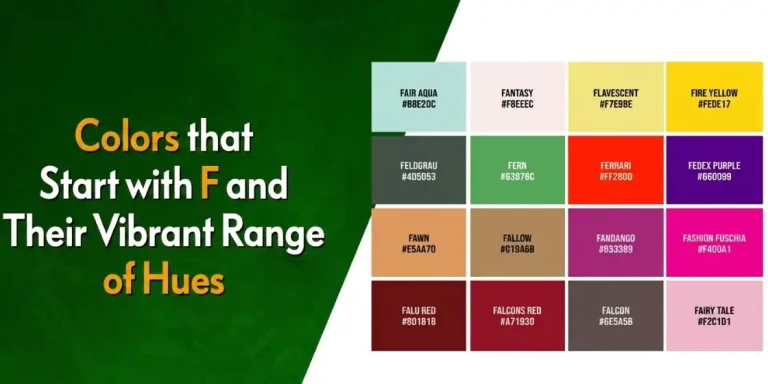
- List of Colors That Start with F
- Colors That Starts with G
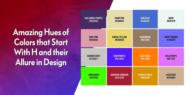
- Colors That Starts with H
- Colors That Starts with I
- Colors That Starts with J
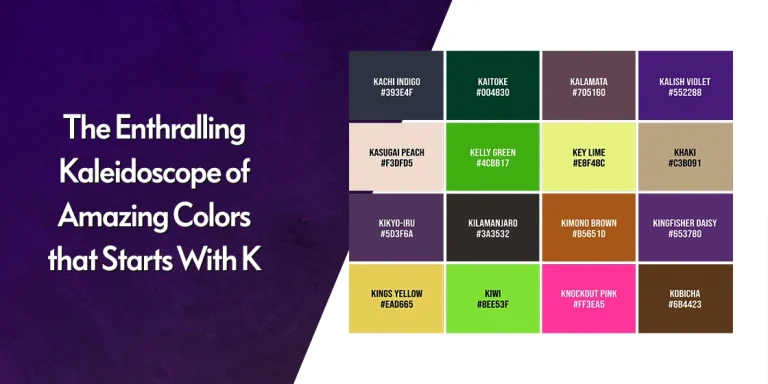
- Colors That Starts with K
- Colors That Starts with L
- Colors That Starts with M
- Colors That Starts with N
- Colors That Starts with O
- Colors That Start with P
- Colors That Start with Q
- Colors That Start with R
- Colors That Start with S
- Colors That Start with T
- Colors That Starts with U
- Colors That Starts with V
Color Applications and Branding
- Red Logos
- Yellow Logos
- Purple Logos
- Interior Design Color Palette
- What Color Goes with Dark Green
- Mood Ring Colors and Meanings
Frequently Asked Questions
| What are color combinations? Color combinations are sets of contrasting shades and hues that elevate a design’s impact. They bring a lively effect in designs, provided their combos are picked and used effectively. |
| Can color combinations be trademarked? Specific shades of colors designed custom can be trademarked, however, although it is very rarely done. That is because the color combination needs to prove that its purpose is identification. Not cosmetic. |
| Can you copyright color combinations? No you cannot copyright color combinations. There is no such rule or law introduced anywhere as of yet related to that. |
| What are some good color combinations? There are different types of color combinations you could try on your designs. Some of the top suggestions include: – Brown and red. – Pastel green and light blue. – Teal and red. Via HGTV. – Olive and terracotta. – Mustard and wine. |
Logopoppin
Logopoppin is a graphic design agency that specializes in logo designing, web development, video production and advanced branding services. We love to innovate businesses with new age technologies, allowing them to improve their visual reputation.