Table of Content
Know How Color Meanings Can Stimulate Variety of Reactions
Being a designer, you should always know about the importance of colors. It is an essential part of designing that must be understood perfectly according to the requirements. Many times, people do not pay attention towards the color meanings. They tend to use colors without any proper understanding of their impact. This results in the wrong selection of colors that eventually produces an effect on the overall design.
Not only designing, but the psychology of colors helps us to understand its usage in a variety of things. As humans, we know how these colors can impact our minds. From stimulating reactions to influencing thought processes, colors are responsible for different types of human behavior.
That is the reason why their usage is termed important in every type of aspect. They provide us a way to share thoughts and describe our messages in a strong creative manner. If you also want to know green color meaning and what other shades describe, below given details would be a great explainer to you.
Let us first understand why these colors are important for branding and how they can describe different ideas.
The Importance of Color Meanings in Art
Whether you are a branding agency or a designer, it is highly important for you to understand the color meanings. It is something that should be used with proper knowledge, rightly because it defines your messages.
Knowing the importance of pink color meaning and others, you can pick and choose the desired shades wisely. You need to ensure what type of visual depiction they will give to the users. That is necessary because it helps you to know about their impact. It will let you understand how they can influence users’ reaction and can prompt them to do certain things.
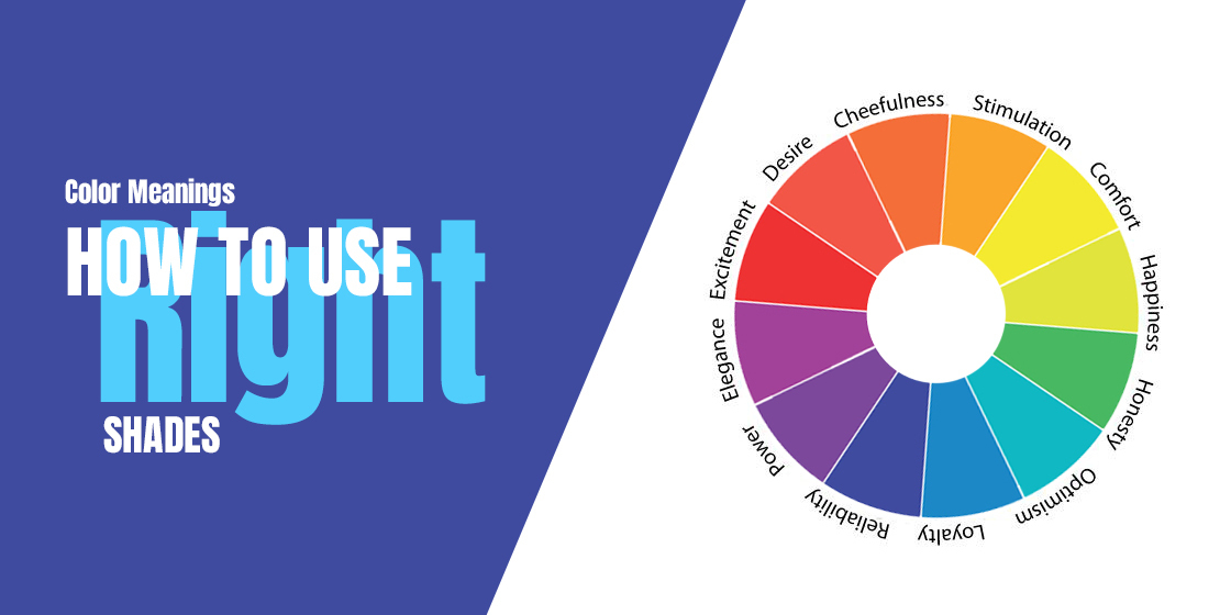
As a human, we all know how colors persuade the minds of people. It can change moods and provoke specific emotions depending upon the type of color used. This is why using them in your company’s branding or graphical materials always looks like a tricky job. These colors should never be picked randomly, but should always be chosen depending upon the targeted impact.
Sometimes, we wonder how these shades can be understood with specific color meanings. Well, that is not a difficult job because every shade such as orange color meaning invokes certain kinds of emotions. These feelings are then translated into words, letting us know what every color means. It makes up our mind with certain thoughts which eventually helps us to understand their color meanings.
Color Meanings and Emotions According to Cultures
We all know how cultural differences have always impacted the understanding of various subjects. Considering color meanings, it is a known fact that every culture and sect of people builds their own idea about the colors.
For instance, red is understood as the color of good luck in China. But in South Africa, it is seen as a sign of mourning. Similarly, Americans love to relate green with money as it gives a representation of dollars.
The black and grey color meaning refers to the sign of mourning in the West, whereas white is considered as an indication of grief in the Asian countries. Basically, all of these dissimilarities in color meanings showcase the level of perception in different human races. It defines how people look at one thing in different types of ways, giving its whole spectrum a variety of views.
Understanding the Color Meanings in Design
Having a good knowledge about green color meaning and others helps you to predict their impact on different types of graphic designs. Being a brand owner, you must need to know about these color meanings and how they can be useful in your logos, business cards, etc.
Red Color Meaning
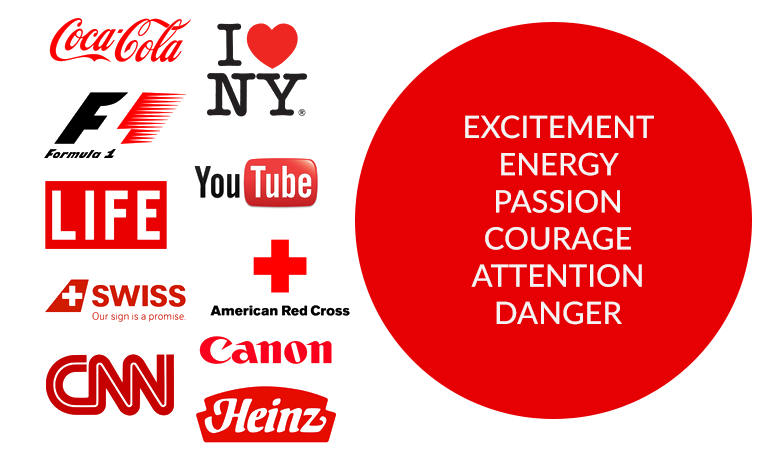
We all know how popular red color is among the people. It is commonly used in different types of designs, ranging from logos to banners etc. It looks vibrant and energetic, offering a bold view of the picture. Using red, designers try to imitate a strong view of their work. This helps them to get people’s attention and grab more eyeballs easily.
If seen historically, red color meaning has always remained a sign of heat and energetic. It has also been primarily used as a sign of love. We have always seen the imitation of hearts with red colors, showing its true relation with love. This basically illustrates how red color is used by the people in different types of conditions.
How to Use Red Color
People often ask how to design a logo using the red color. That is because it can demonstrate a strong view that can help them to get a bold representation in the market. Many businesses also use red to showcase their Call to Action (CTA) messages. It highlights their sales messages in bold, allowing them to grab the attention of the people quickly.
Some of the top brands like Coca Cola, Netflix and more others precisely know the red color meaning. They have chosen red color due to this same perspective. Using red, they have given their logos a spectacular look, precisely according to their branding needs.
Orange Color Meaning
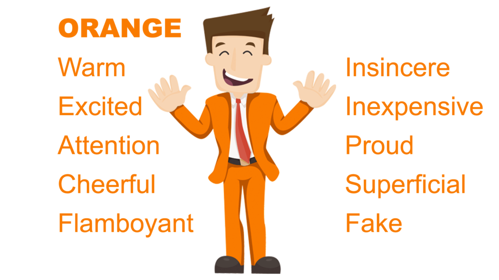
Orange is always looked at as a color of enjoyment and excitement. It is specifically associated with the youth due to its glitzy look. Though it is not as bold as red, but still it gets the attention of the people due to its eye-catching shade.
It can be said that orange color meaning precisely combines the heat and passion of red with its own flare of playfulness. This results into a great presentation of creativity that looks fascinating to the eye. It is the major reason why orange is also associated with the youth. The creative nature of the youngsters is the main factor that builds its association with them. Moreover, it also demonstrates how lively they are.
How to Use Orange Color
As defined above, orange is best suited for those brands that are related with youth. It is a great color that helps you to get instant attention and stunning presence among others.
Just make sure to select the perfect secondary color combination with it, as sometimes it becomes necessary. The example of drinkware brands like Fanta and Mirinda are quite clear in this case. They are also primarily preferred by the youngsters, rightly due to their taste and engaging look.
Yellow Color Meaning
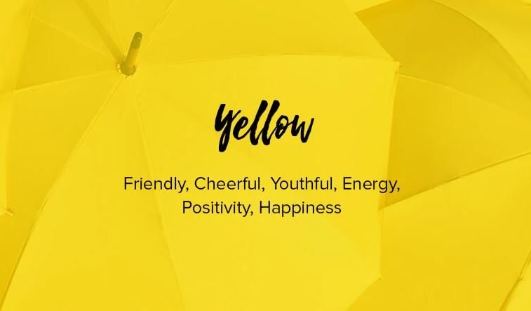
Shades of yellow color can also be considered as a great option to demonstrate fun and liveliness. That is why smiley faces are also represented by yellow colors. It has the basic ingredients of excitement and is preferred more to showcase the character of youth.
Yellow color meaning precisely present hope and positivity. That is what makes its relation with the youth pretty evident. It is one of those colors that will grab your attention quickly and will encourage you to take certain actions.
When talking about the relevance of colors with seasons, yellow fits perfectly with summers. The demonstration of the sun with yellow colors is the clear depiction of summers. That is why businesses usually try to enrich their branding with yellow colors during the summer season. They know that this color relates directly with it, and is undoubtedly a great choice to grab youngster’s attention.
How to Use Yellow Color
Yellow color meaning can be easily used to showcase a sparkle of fun in your design. It helps you to connect with the people quickly and get more eyeballs towards the design. That is why many fashion companies love to use yellow colors to solidify their brand archetypes. They have got the exact knowledge of how it can engage people and influence actions properly.
Green Color Meaning
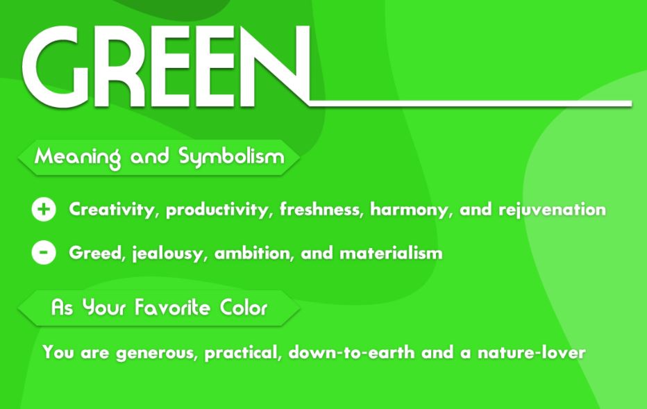
Green is often termed as the color of nature. It provides a feeling of calmness and serenity. Some people also refer green color meaning with the idea of growth. This could be understood by looking at various natural objects like trees, plants, grass etc. All of these things are green in color and grow rapidly with time. This precisely shows the connection of green with nature and its utmost calmness.
Meanwhile, the green color is also associated with health and harmony. We have seen a number of times how different health institutions use green in their logos. They also utilize green in their branding materials to showcase the idea of positivity. That is what makes this color very decent and fit for all types of natural objects depiction.
How to Use Green Color
As stated above, the connection of green with nature is quite self-explanatory. This is the main reason why it is considered primarily to design objects related to nature. Those brands that are working in the health and wellness sector can use various shades of green color to enrich their branding. It looks clean to the eye and can represent any business in this sector perfectly.
Blue Color Meaning
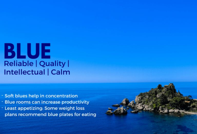
If green color is used to represent nature, then blue color meaning is used to demonstrate harmony and peace. It is also utilized to showcase a relaxing feel of coolness. This could be related to the color of the ocean which is also blue.
Those companies that are linked to the drinkware industry, prefer to use blue in their marketing campaigns. The primary idea behind it is the demonstration of coolness and relaxation to the people. It offers a fresh view to them, so that they can get attracted towards it.
Meanwhile, blue also illustrates a sign of intelligence that is why it is also preferred by the tech companies. It has the capability to align with different types of thoughts, giving the whole design a fresh look.
How to Use Blue Color
Like as defined above, the blue color means a sign of freshness. It can be used to represent the idea of brightness, giving the onlookers a great presentation. This could be very beneficial for those companies that are related with the tech and fashion circuit. They can easily use this color to illustrate their sparkling background and true connection with the innovation.
Purple Color Meaning
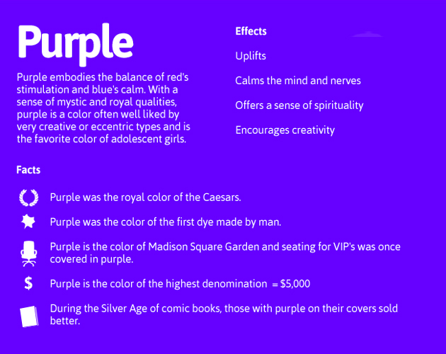
Purple is quite an interesting color and can be used at a variety of places. This is because historically different shades of purple color were used for this specific purpose.”
Combining the warmth of red and coolness of blue, purple color meaning brings out a mixture of serenity. It is also one of the reasons why purple looks a bit unique and luxurious among others. It can be used to provide a lavish feeling to the design, so that it can grab people’s attention instantly.
How to Use Purple Color
Purple color can be used to define indulgence in the design. It looks very majestic and should be used with a proper combination of secondary colors. Meanwhile, you can also use it solely on banners, but make sure to keep the contrast dark to bring that royalty factor.
Pink Color Meaning
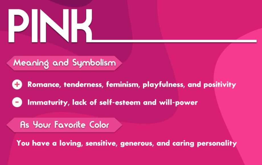
We all know very well about the pink color meaning. It is especially associated with the girls due to their historical affection with it. From Barbie dolls to nail colors, we have always seen how different girl-specific objects are made using pink colors. That is because these tertiary colors and shades help to drive their hearts and encourages them to relish their inner belief.
Besides being favorite girls, pink is also used to describe the emotion of love. This makes it a good partner for red color when designing pictures related to love. The artwork of valentine’s day is a clear example in this regard. Most of them are designed using pink and red colors, showing the true essence of love.
How to Use Pink Color
Pink color should be used to define the feeling of love. This makes it a perfect fit to express the inner emotions in a design. Besides that, pink is a flawless color pick for girls which is why it can also be used to design their fashion accessories. Shades of pink color should be used to define the feeling of love.
Brown Color Meaning
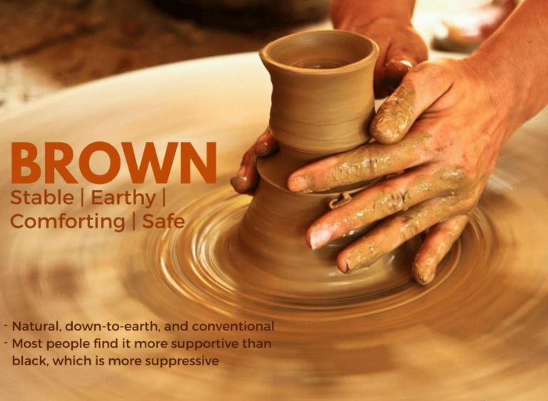
Brown is also one of those colors that provides an essence of nature. It is also termed as a color of reliability and stability. Some experts also relate brown with earth as the color of soil is also brown. It is not commonly used in designs. However, it is used in some specific abstract art illustrations.
Being a seasoned graphic designer, you would know how shades of brown color can bring a feel of warmth in the picture. But to do so, you need to learn the art of its proper usage. Once you will get it, your artwork will become more flawless and decent in looks.
How to Use Brown Color
Brown color should be used to design natural objects. It is the reason why elements like rock, soil and mountains are created with brown color. It provides an agricultural look to the design, provided you craft them properly with right sketches.
Black Color Meaning
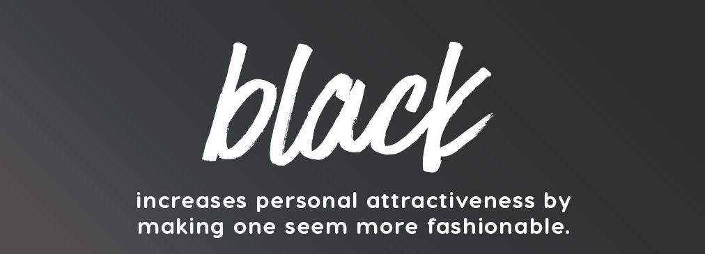
Black is one of the most loved and preferred colors in the designing world, especially among colors that start with B. It comes as an instinct in all of us to love black attires, cars, pictures etc.
When it comes to branding, no one can beat the dominance of black color. It is preferred by all types of marketers and business owners for branding. From logos to visiting cards, the splash of black can be seen in every type of material. It is a symbol of versatility and elegance, which is why it can be used in any type of designing.
How to Use Black Color
Black can be used in a variety of places. As compared to other colors, there is no limitation to use it at any particular place. Whether you are creating a banner or a simple business flyer, you can play with different shades of black according to the given requirements. This is one of the best features of black that makes it a top choice for all types of designers in the world.
White Color Meaning
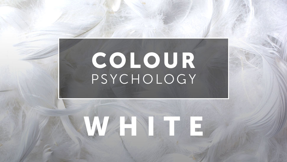
White is the color of simplicity and purity. It can be used to balance the mixture of different colors. That is why using white even in small spaces is a must recommended option in every type of graphic design.
White color symbolism brings cleanliness and clarity to the eye. It provides a simple and fresh look, allowing any type of design to look great. When used in branding materials, it provides a minimalistic touch that makes the whole design look flawless.
How to Use White Color
Just like black, white color can also be used anywhere depending upon the design requirements. It is something that creates balance in colors, giving designers a flexibility to use a blend with a combination of whites.
That is why you have always seen different types of colorful logos having white spaces. Besides them, you would have seen business cards, envelopes, flyers and other branding items in white colors. They are carefully made with white colors to keep the simplicity and bring decency in a professional material.
Grey Color Meaning
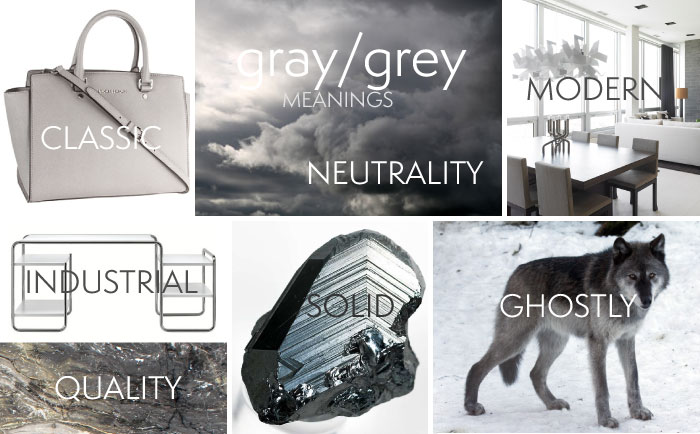
Grey is often considered as a secondary shade of black color. It is definitely extracted from the roots of black, but is always used in a different manner. Generally, grey color defines the formality and matureness in a design. It is used to bring contrast in colors, allowing people to understand the difference between various shades.
How to Use Grey Color
Grey color stands for conventionality and is used to bring simplicity in designs. You can use them with different types of shades in a design. That is why many people prefer to go with light grey colors to bring cleanliness in pictures.
You can use the grey colors to bring a stunning flare of serenity in a design, depending upon the requirements. It is best recommended to use with a contrast of black or white colors, as it looks much better with them.
Frequently Asked Questions about Color Meanings
| Why is it important to understand the meaning of colors? Understanding the color meanings gives you a better chance to know about their best usage. It helps you to know what each of them really say and how they can impact the overall design. |
| What is the meaning of red color? The red color generally demonstrates the idea of passion and love. It has the capability to make any design look bold, if used with the right gradient. |
| What is the meaning of the color blue? The blue color generally stands for intelligence and freshness. It is used to bring innovation in designs and make them unique to grab people’s attention quickly. |
| What does the green color mean? The green color is said to be related with the nature and it generally means calmness. Using green color, you can bring decency as well as proper calming perfection in your designs. |
| How can colors impact people’s minds? We all know that every color has its own meaning. Some represent love, while some illustrate the feeling of purity. That is why it is said that every color can invoke particular emotions in human minds. They can stimulate specific reactions and behavior upon seeing any special color. |
Conclusion
Summing up all above, understanding color meanings play an important role in graphic designing. They can change the whole perspective of a picture if used with the right combination. That is why it is always recommended to understand their meaning before using them in any kind of design. Every color stands for a particular meaning and should be used for a specific purpose.
Being a designer, it is your responsibility to understand green color meaning and others properly. This will give you a better idea how to use them in specific cases and bring more creativity in the designs.
If you are not good at designing and selecting colors properly, get in touch with one of our designing experts today. We will make sure to bring your ideas to life and give your branding a strong edge in the market.
Logopoppin
Logopoppin is a graphic design agency that specializes in logo designing, web development, video production and advanced branding services. We love to innovate businesses with new age technologies, allowing them to improve their visual reputation.