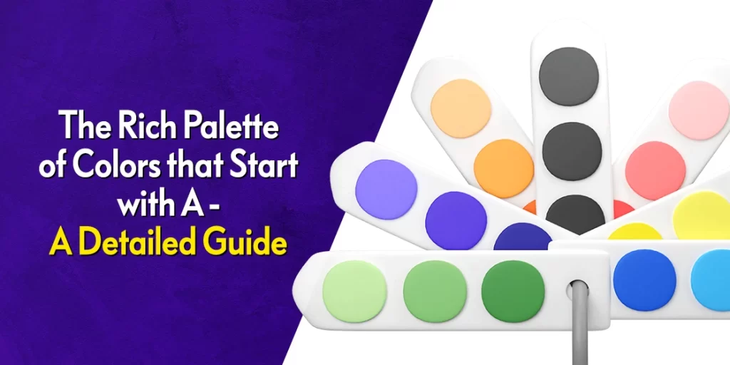
Discover the Amazing List of Colors Starting With A to Enhance Your Shading Arsenal
Colors are an inherent part of daily life for a vast majority of people. These shades influence our emotions and color our perceptions; in fact they even affect our ability to make decisions. This is often why professionals in the brand design and marketing industries often emphasize the careful selection of colors to evoke specific feelings and associations to convey their brand message in a memorable fashion.
Now, there are many different colors to choose from nowadays, with many shades having minor differences between them. However, If you know how to look for them, you will be able to find a variety of shades in a list as restrictive as colors that start with A.
So, how are you to go about it then? How can you know what colors to use in your designs, whether its colors that with B, or S, or even Z?
Well, that’s what we are here for.
This article, the first in our new series of design resources, will take you through the a diverse palette of shades that start with the letter A, exploring their context and attributes. From the warm glow of amber to the tranquil blue of azure, discover what shades a professional graphic design agency would use for their designs.
Understanding Color Psychology
Before we dive into the list of colors starting with A, it’s important that we understand the basics of color theory, and why is it needed.
Colors evoke emotional responses from their viewers; that is something we all know and agree with. We also know that their subtle influence can affect how we perceive the world around us. In fact, the right colors can improve your brand awareness and recognition by a whopping 80%.
For example, warm colors like red and orange are often associated with energy, passion, and excitement. The result is that viewing these shades around us makes us feel vitalized as well. Cool colors like blue and green, on the other hand, evoke feelings of calm, soothing our minds.
By understanding this psychological impact of colors, designers and marketers can use them strategically to improve the delivery of their brand message, by evoking the desired emotions. And this can be extremely useful in designs with themes such using only using colors that start with D, for example. If you know how specific shades within each grouping work at influencing consumers, you will be able to find the right shades for your design easily.
The Cool Embrace of Colors That Start With A
Now that we have taken a brief overview of color theory and its influence on human psychology and behavior, let’s take a look at cool colors that start with A, for a refreshing start to this article.
One thing to note before we start, is that the ability of a shade to be considered warm or cool depends upon its HSL rank. HSL stands for Hue, Saturation, and Light. The higher the HSL level, the colder the shade. And the lower the HSL level, the warmer the shade.
So, while a color itself may be considered warm or cold, specific shades may have a different lean to them. This difference in shade perception is very important when we talk about color meanings. With that in mind, let’s begin.
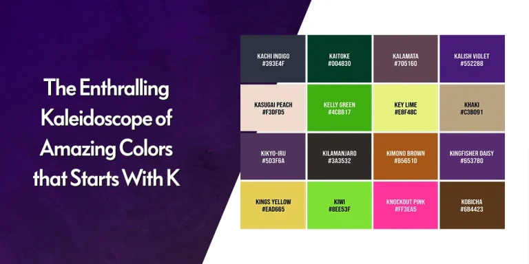
Capturing the Serenity of the Skies with Azure (#007FFF)

Azure embodies the serene beauty of a clear blue sky, representing calm and tranquility. Symbolizing a vastness and infinity, azure brings out feelings of peace and clarity. In interior design color palettes, azure is used to create open and airy spaces, while in branding, it conveys trust, stability, and reliability.
The Subtle Elegance of White with Alabaster (#EDEADE)

Alabaster embodies the subtle elegance of white, exuding purity and refinement, unlike the rustic vibe of dirty white, a close shade from colors that start with D. Representing clarity and simplicity, alabaster creates a sense of peace and sophistication. In architecture and interior design, alabaster is used to create timeless and elegant building spaces, adding a touch of delicacy and grace. With its understated beauty, alabaster adds a touch of timeless elegance to its designs, a feat often found in many shades of white color.
The Tranquil Blue of the Sea with Aquamarine (#7FFFD4)

Aquamarine is one of the most beautiful shades of blue color, which represents the tranquil blue of the sea found in the island paradises of the likes of Maldives or Madagascar. Symbolizing clarity and purity, aquamarine inspires a sense of peace and harmony. In jewelry and fashion, aquamarine is prized for its ethereal beauty and soothing tone, while in interior design, it creates refreshing and serene spaces.
The Charismatic Dark Gray Shade of Anthracite (#353C40)

Anthracite is a charismatic dark gray color, often considered among the less saturated shades of black color, representing strength and sophistication. A symbol of resilience and elegance, anthracite adds a touch of mystery and intrigue to any design, and is far better than any shade of gray you’ll find in colors that start with G. In industrial design and fashion, anthracite is prized for its sleek and modern aesthetic, while in automotive design, it lends a sense of luxury and prestige. With its bold presence, anthracite commands attention and leaves a lasting impression.
The Icy Cold Nature of Arctic Blue (#95D6DC)

Arctic blue captures the icy coolness of blue, evoking feelings of tranquility and serenity of the arctic tundra. Symbolizing purity and clarity, arctic blue creates a sense of haunting calm. In winter-themed designs and decor, arctic blue creates an enchanting ambiance, while in fashion, it adds a touch of light elegance to counter darker shades. With its cool charm, arctic blue transports us to the serene icy plains of the Arctic glaciers.
The Subdued Elegance of Ash Gray (#B2BEB5)

Ash gray embodies the subdued elegance of shades of gray color, with a lighter hue representing an understated sophistication and refinement. Considered a symbol of balance and neutrality, ash gray creates a sense of calm. In interior design and fashion, ash gray is prized for its versatility and timeless appeal, while in graphic design, it serves as a neutral backdrop for bold accents and vibrant colors. With its understated charm, ash gray adds a touch of tasteful elegance to any setting.
The Cool Freshness of Mountains with Alpine Green (#1B5448)

Alpine green captures the freshness of mountain meadows, bringing up feelings of rejuvenation and vitality as one of the coolest and relaxing shades of green color. Symbolizing the evergreen lushness of alpine landscapes, alpine green infuses spaces with a sense of everlasting peace and steadfastness. In interior design and decor, alpine green creates serene and refreshing environments, while in fashion, it adds a touch of organic, regal. With its crisp impact, alpine green celebrates the lasting power of alpine flora, inviting us to immerse ourselves in its vibrant greenery.
The Warm Shades of A and its Associated Colors
Cool shades and colors that start with A are great at creating a soothing, calming effect. But what if you want something more vibrant? What if you want to use shades that evoke feelings of dynamic energy and life into your consumers?
Well, in that case, you need to choose warmer shades available on the color palette. By including warm colors in your color combinations, you will be able to give your viewers a burst of energy and life, giving your brand a dynamic vibe.
Let’s take a look at the following list of colors starting with A that have a warm feel to them.
The Warm Autumnal Glow of Amber (#FFBF00)

Amber is a color that reminds us of the golden tones of a setting sun, radiating warmth and a dazzling array of shades. Amber blends shades of yellow, orange, and brown, which brings to mind the cozy vibe of autumn’s glow found in various shades of yellow color. Representing a stolid strength, amber is often used in interior design to add a touch of earthy elegance. In fashion and jewelry, amber exudes a timeless allure, infusing accessories with a sense of warmth and life.
A Delicate Hue of Freshness with Apricot (#FFB16D)

Apricot radiates a soft and inviting glow, resembling the delicate blush of a ripe fruit. Combining shades of orange color and pale pinks, apricot gives a sense of sweet warmth and positivity. In interior design, apricot gives spaces a sense of vitality, while in fashion, it adds a subtle pop of color to otherwise neutral palettes. Symbolizing joy and optimism, apricot brightens any environment with its cheerful hue. Symbolizing joy and optimism, apricot is one product of tertiary colors that brightens any environment with its cheerful hue.
The Richness of Nature’s Bounty with Avocado Green (#B2C248)

Avocado green is a rich and vibrant hue, bringing to mind the anticipation of almost-ripe avocados. Symbolizing growth and abundance, avocado green infuses spaces with amazing vitality. In interior design and fashion, avocado green creates bold and unique environments, while in culinary arts; it adds a fresh and vibrant touch to dishes. With its charm, avocado green celebrates the richness of nature.
The Bright Pink – Orange Burst of Atomic Tangerine (#FF9966)

Atomic tangerine is a bright and vibrant pink-orange color, exuding soft energy and vitality. Symbolizing enthusiasm, atomic tangerine adds a bold and playful touch to any design, similar to egg yolk sunrise from colors that start with E. With its vibrant charm, atomic tangerine celebrates the joy and energy of creativity.
The Timeless Elegance of Antique Brass (#6C461F)

Antique brass, one of the more popular metallic shades of brown color, embodies the timeless elegance of brass, exuding warmth and sophistication. Symbolizing tradition and a rich heritage, antique brass adds a touch of vintage charm to any design. In interior design and decor, antique brass is used to create elegant spaces with a classic vibe, while in jewelry; it adds a sense of timeless beauty and refinement. With its classic charm, antique brass adds a touch of old-world charm to any design.
The Soft Neutrality of Soft Beige with Blanched Almond (#FFEBCD)

Blanched almond embodies the soft neutral vibe of beige without the earthy tone, giving a sense of warm elegance. Symbolizing simple sophistication, the shade creates a sense of calm serenity. In interior design, almond is used to create light and elegant spaces, while in fashion, it serves as a versatile backdrop for garments and accessories. With its understated charm, almond adds a touch of timeless elegance.
The Earthy Warmth of Brown Tones of Autumn Leaf (#9D513A)

Autumn leaf is a dark earthy brown color, evoking the deep shades of fall foliage. Symbolizing stability and grounding, autumn leaf creates a sense of comfort in the circle of life. In interior design, autumn leaf is used to create an earthy warm backdrop, while in fashion, it adds a touch of rustic charm to designs. With its natural allure, autumn leaf celebrates the beautiful cycle of nature.
The Bold Neon Shade of Acid Green (#8FFE09)

Acid green is a bold and vibrant neon green color, which gives of a feeling of tireless vitality and energy. Symbolizing freshness, acid green adds a bold yet playful vibe to any design. In contemporary art and graphic design, acid green is used to create eye-catching visuals and dynamic designs, while in fashion, it serves to make bold statements. With its vibrant hue, acid green celebrates the vibrant aesthetic of modern life.
Design Applications: How to Use Colors Starting with A in Interior Design, Fashion, and Branding
Understanding color theory is just the beginning—knowing how to apply these A colors effectively transforms spaces, wardrobes, and brands. Here’s how to harness the power of these distinctive hues across different design disciplines.
Interior Design Applications
Azure works beautifully in bedrooms and bathrooms, creating spa-like tranquility. Pair it with crisp whites and natural textures for a coastal aesthetic, or combine with deeper navy blues for sophisticated depth.
Amber brings warmth to living spaces and dining rooms. Use it as an accent wall color or in lighting fixtures to create cozy evening atmospheres. It pairs exceptionally well with shades of blue color and creates stunning interior design color palettes.
Alabaster serves as an elegant alternative to stark white in formal spaces. Its subtle warmth prevents the sterile feeling common with pure white, making it perfect for galleries, studies, and powder rooms. Consider it among the sophisticated shades of white color for your next project.
Fashion and Styling
Amethyst adds luxury to evening wear and formal occasions. This rich purple works beautifully in silk fabrics and pairs with metallic accessories for sophisticated elegance.
Apple Green energizes spring and summer wardrobes. Use it as a statement color in casual wear or as subtle accents in professional attire. It complements both neutral tones and creates vibrant combinations with earth tones.
Anthracite provides a refined alternative to black in professional settings. This sophisticated gray works across all seasons and pairs beautifully with both vibrant accent colors and muted earth tones from shades of gray color.
Branding and Marketing Psychology
Colors starting with A offer unique branding opportunities. Azure conveys trust and reliability ideal for technology and healthcare brands. Amber suggests warmth and approachability, perfect for hospitality and food industries.
Atomic Tangerine captures attention and conveys energy, making it excellent for sports brands and youth-oriented products. Understanding logo color meanings helps you make strategic choices that align with your brand message.
For comprehensive branding applications, explore how these A colors work within professional brand style guides.
List of Colors Starting With A with Passion Unmatched
Finally, we come to the last set of colors that start with A. Few shades have the ability to encompass passion and strong emotions. And the reason is that in order to use them to their maximum potential, you need to find the right balance in design for your color palette.
But in order to find that balance, you need to know what colors have the ability to stoke those passionate feelings, from love to anger. Let’s take a look at the list of passionate colors starting with A.
The Regal Elegance of Purple with Amethyst (#9966CC)

Amethyst embodies the alluring beauty of purple gemstones, showcasing a range of shades of purple color, from deep violet to soft lavender. Symbolizing luxury and spirituality, amethyst exudes a sense of mystery and enchantment. In jewelry, amethyst adds a sense of sophistication and opulence, while in fashion, it lends a regal vibe to designs. With its ability to mesmerize its viewers, amethyst captivates the imagination and inspires creativity.
The Revitalizing Natural Hue of Apple Green (#76CD26)

Apple green is a vibrant and refreshing shade of green, evoking the tart crispness of fresh Granny Smith apples straight from the orchard. Symbolizing growth and vitality, apple green infuses spaces with energy and rejuvenation. In interior design, apple green creates lively and energizing spaces, while in branding, it conveys a sense of eco-friendliness and sustainability.
With its lively charm, apple green revitalizes any design with its vibrant allure. The impact of this color is quite similar to forest green, a darker and deeper shade from colors that start with F. However, while apple green is about revitalizing energy and growth, forest green conveys an adjacent aspect of harmony with nature and a sense of peace
The Bold Pink Depth of Amaranth (#E86EAD)

Amaranth is a bold and vibrant hue from shades of pink color, representative of endless and intense passion.” Pink is one of those colors that starts with P, whose various shades are quite effective at denoting passionate emotions. A symbol of love and desire, amaranth adds a bold and playfully coy vibe to any design. In graphic design and branding, amaranth is used to create eye-catching designs and memorable logos, while in fashion, it makes a bold statement. With its bold presence, amaranth celebrates the power and beauty of love.
The Deep Red of Passionate Alizarin Crimson (#E32636)

Alizarin crimson is a deep and vibrant red color, representing a greater intensity of passion. Although crimson is considered a shade of red, crimson is one of those colors that start with C that has a shade in nearly every alphabet group. In art and graphic design, alizarin crimson is prized for its rich and deep hue, while in fashion, it makes a bold and powerful statement. With its fiery presence, alizarin crimson celebrates the power of intense, lusty passion common in deep shades of red color.
A Unique Flair of Purple with African Violet (#B284BE)

African violet is a uniquely vibrant purple color, representing a standout personality. Violet, often considered as just a shade of purple, is one of the most mesmerizing colors that starts with V. Symbolizing a sense of creativity and individuality, African violet adds a playful touch to any design, which is different from the regal vibe of most purples. In natural and graphic design, African violet creates a striking and eye-catching display, while in fashion and decor, it adds a vibrant pop of color to outfits and interiors. With its bold presence, African violet celebrates the beauty and diversity of nature’s charms.
Cultural Meanings and International Perspectives of A Colors
Colors transcend mere aesthetics. They carry deep cultural significance that varies dramatically across societies. Understanding these international perspectives enriches our appreciation of colors starting with A and informs more thoughtful design decisions.
Eastern Interpretations
In many Asian cultures, Azure represents immortality and spiritual elevation, often seen in traditional ceramics and temple decorations. Chinese culture particularly values this blue for its association with healing and protective qualities.
Amber holds special significance in Baltic and Slavic traditions, where it’s considered a protective stone bringing good fortune. In Turkish culture (a harfiyle renk), amber symbolizes solar energy and masculine strength, differing from Western interpretations found in color meanings.
Western Cultural Context
European traditions view Amethyst as the color of royalty and spiritual wisdom. Medieval Christianity associated this purple with penitence and humility, while modern Western culture connects it with creativity and luxury.
Apple Green in Western contexts suggests growth, freshness, and environmental consciousness associations that have strengthened with modern ecological awareness movements. This connects beautifully with contemporary brand positioning examples that emphasize sustainability.
Regional Variations
Indonesian color traditions (warna dari huruf a) often incorporate Aquamarine in ceremonial contexts, representing the life-giving properties of water in island cultures. This differs markedly from Mediterranean interpretations, where the same blue-green suggests leisure and coastal lifestyle.
Autumn Leaf brown carries seasonal significance in temperate climates but may represent permanence and earth connection in desert cultures where seasonal change is less prominent.
Modern Global Applications
Contemporary global brands must navigate these cultural nuances carefully. What reads as trustworthy Alabaster in Northern European markets might appear clinical in warmer cultural contexts that prefer earthier neutrals.
Understanding these perspectives enhances your color psychology knowledge and ensures culturally sensitive design choices across international projects. Learn more about essential branding elements that consider cultural context.
Color Pairing Guide: Perfect Combinations with A Colors
Creating harmonious color combinations elevates any design project. These strategic pairings with A colors follow proven color theory principles while offering fresh, contemporary appeal.
Complementary Combinations
Azure + Coral: This blue-orange pairing creates vibrant energy perfect for modern branding and summer fashion. The cool tranquility of azure balances coral’s warm enthusiasm.
Amber + Deep Navy: A sophisticated combination for professional environments. Amber’s warmth prevents navy from feeling too corporate, while navy grounds amber’s golden intensity, making it ideal for types of graphic design projects.
Analogous Harmony
Aquamarine + Apple Green + Alpine Green: This blue-green progression works beautifully in spa environments and nature-inspired branding. Each shade flows naturally into the next, creating serene continuity perfect for brand design projects.
Amethyst + Amaranth + Atomic Tangerine: Bold and artistic, this purple-to-orange progression energizes creative spaces and youth-oriented designs.
Seasonal Palettes
Autumn Collection: Combine Autumn Leaf brown with Amber and Antique Brass for rich, harvest-inspired schemes. Add touches of shades of red color for sophisticated depth that works beautifully following web design principles.
Spring Fresh: Pair Apple Green with Alabaster and Apricot for renewed, optimistic energy. This combination works exceptionally well in lifestyle branding and interior refresh projects, especially when combined with shades of yellow colors.
Professional Applications
For corporate environments, Anthracite pairs beautifully with crisp whites and subtle blue accents. This combination conveys reliability without appearing sterile, making it ideal for corporate logo design projects.
Wedding and event design benefits from Amethyst combined with Alabaster and metallic gold accents, creating timeless elegance that photographs beautifully. Explore shades of gold color for perfect metallic complements.
Understanding fundamentals of color theory enhances these pairing strategies, while applying core principles of design ensures professional results across all applications.
Frequently Asked Questions
| What color is azure? Azure is a shade of blue that represents the deep, clear hue of the morning sky. It is considered a cool shade due to its comparatively high HSL score. |
| What color is a fig? Figs come in many different shades, based on their ripeness, ranging from green, to purple, and finally brown. |
| Is terra cotta a shade of orange or brown? While many people consider terra cotta to be a shade of brown, its array of hues ranging from orange red to pink orange means that it is actually part of the orange family. |
Conclusion
Coming to the end of this article, our journey through the various colors that start with the A revealed a dazzling array of shades, each with its own unique personality and significance in design. Ranging from the warm glow of amber to the deep, still blue of azure, these colors enrapture our minds and evoke a variety of emotions within us.
Whether used in logo design, or graphic design in general, the list of colors starting with A discussed above offer an array of possibilities for creative expression. So, stay with us on our journey to explore further the amazing shades of colors, from A to Z.
Latest news you want to know!
Subscribe for cutting-edge design inspiration at Logo Poppin! Elevate your brand with updates on logos, branding, web design, and video animation.
Note that by clicking “subscribe,” users may agree to our privacy policy and consent to Logo Poppin to use your contact data for newsletter purposes.
Logopoppin
Logopoppin is a graphic design agency that specializes in logo designing, web development, video production and advanced branding services. We love to innovate businesses with new age technologies, allowing them to improve their visual reputation.