Table of Content
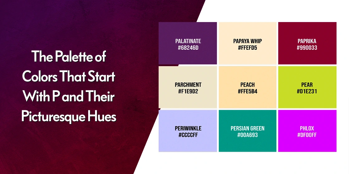
Discover How the Top Colors That Start with P Can Make Your Palettes Stand Out
The world of color is a vast one, filled with shades that influence the way we see our surroundings. Among these hues, the colors that start with P hold a unique charm and allure. From the serene, calming tones of Pacific blue and pale green to the vibrant, energetic shades of paprika and papaya, the array of colors starting with P offer a diverse and captivating spectrum.
Each hue carries its own unique personality, capable of coloring the way we see the world around us. Whether you’re a designer seeking inspiration or simply someone who appreciates the beauty of color, the P-colored palette has something to offer you.
In this exploration of the picturesque P-color palette, we will explore their individual characteristics, their psychological impact, and discover how to use them in various fields. From the classically elegant to modern sophistication, each shade has its own story to tell. Let’s uncover the allure of these captivating colors used by professional graphic design services, and discover the ways in which they can enhance our lives.
Need a Color Scheme That Pops, But Can't Find the Right Shades?
Our free color shade generator provides endless possibilities to create stunning and cohesive palettes for your project.
Color Match!
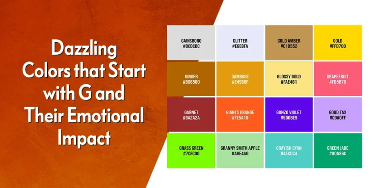
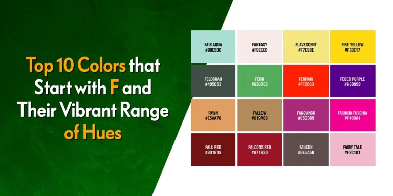
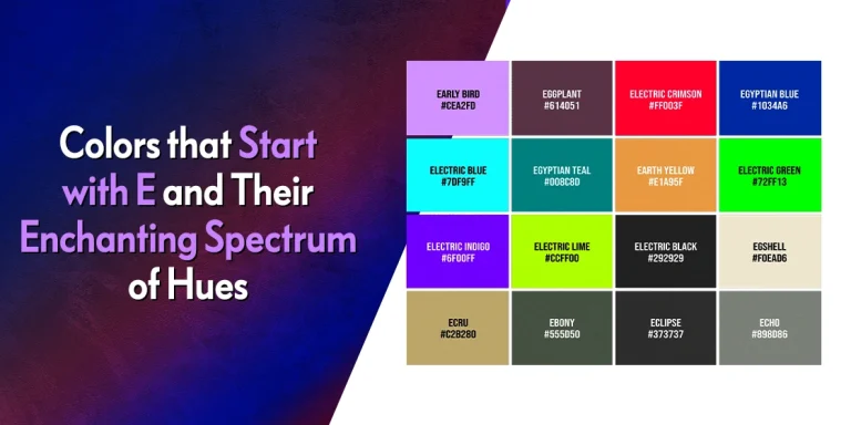
Popular Colors That Start With P and Their Picturesque Vibes
In every color group, there are some shades that are more popular, or rather well-known compared to their fellow hues. Designers, artists, and other creatives use these hues in their color combinations quite frequently. And it hold true for colors that start with P as well. Let’s embark on a journey through the picturesque palette of colors starting with P, exploring their captivating shades and the enchanting vibes they exude.
Pacific Blue (#009DC4)

A deep and calming shade of blue, Pacific blue is reminiscent of the vast Pacific Ocean. It evokes a sense of peace, tranquility, and serenity. This color is one of the many shades of blue color often used in home decor, fashion, and branding to create a serene and inviting atmosphere.
Pacman (#FFCC00)

One of the bright and cheerful shades of yellow color, Pacman is named after the famous video game character. It evokes a sense of nostalgia, fun, and childhood. This color is often used in branding for children’s products, games, and entertainment.
Pale Green (#98FB98)

A soft and delicate shade of green, pale green is often associated with nature, growth, and vitality. It’s a popular color for spring and summer fashion, as well as for home decor and branding that aims to create a fresh and uplifting vibe. And it pairs equally well with light and dark shades, something many of the deeper shades of green color cannot.
Pale Magenta (#F984E5)

A softer shade of magenta, pale magenta is still a vibrant and energetic color. It evokes a sense of femininity, romance, and excitement, without the eye-searing impact of its parent hue. This color is often used in fashion, home decor, and branding that targets a female audience.
Palm Green (#09230F)

A deep and earthy shade of green, Palm Green is named after palm trees. Moreover, just like forest green from colors that start with F, it evokes a sense of nature, tropics, and relaxation. This color is often used in branding related to travel, tourism, and exotic destinations.
Pansy Lavender (#7E648B)

A vibrant and feminine shade of purple, Pansy Lavender is named after the pansy flower. A shade of lavender from colors that start with L, It evokes a sense of romance, elegance, and beauty. This color is often used in fashion, home decor, and branding that targets a female audience.
Papaya (#F7A100)

A vibrant and cheerful shade of orange, Papaya is named after the papaya fruit. It evokes a sense of energy, enthusiasm, and happiness, bringing with it the summer vibes found within many such shades of orange color. This color is often used in food packaging, branding related to healthy foods, and fashion that aims to create a positive and uplifting vibe.
Peach (#FFCBA4)

A soft and delicate shade of pink, peach is named after the peach fruit. It evokes a sense of warmth, comfort, and sweetness. Peach is a popular hue from shades of pink color for home decor, fashion, and branding that aims to create a gentle and inviting atmosphere.
Palatinate Purple (#682860)

A deep and rich hue from shades of purple color, Palatinate purple is named after the early Roman Empire’s royal color of choice. It evokes a sense of luxury, sophistication, and elegance. This color is often used in fashion, home decor, and branding that aims to create a sophisticated and glamorous atmosphere.
Unknown Shades and Colors That Start With P and Their Prismatic Hues
Now that we have explored some of the more common shades found in colors that start with P, we are now ready to enter the realm of the lesser-known P colors. Join us as we dive into this amazing array of shades and hues, and discover how to give our color palettes a distinct vibe.
Parrot (#E91B27)

A vibrant and energetic hue from shades of red color, Parrot is named after the red color of the African gray parrot. It evokes a sense of joy, excitement, and tropical paradise. This color is often used in branding related to travel, tourism, and exotic destinations.
Paco (#411F10)

A deep and rich hue from shades of brown color, Paco is named after the Spanish word for “package.” It evokes a sense of warmth, comfort, and nostalgia. This color is often used in home decor, fashion, and branding that aims to create a cozy and inviting atmosphere.
Painted Park (#90C090)

A vibrant and cheerful green from shades of turquoise color, Painted Park is named after a park in Australia. It evokes a sense of nature, growth, and vitality. This color is often used in branding related to parks, nature, and outdoor activities.
Palladium (#79846A)

A neutral and metallic hue from shades of gray color, Palladium is named after the element palladium. It evokes a sense of modernity, sophistication, and elegance. This color is often used in industrial design, technology, and branding that aims to create a sleek and modern aesthetic.
Pampas (#F4F2EE)

A soft and neutral hue from shades of beige color, Pampas is named after the Pampas grasslands in South America. It evokes a sense of nature, openness, and tranquility. This color is often used in home decor, fashion, and branding that aims to create a calm and serene atmosphere.
Paolo Veronese Green (#009B7D)

A vibrant and earthy shade of green similar to many medium shades of teal color, Paolo Veronese green is named after the famous Renaissance painter. It evokes a sense of nature, growth, and vitality. This color is often used in fashion, home decor, and branding related to environmental or health initiatives.
Paradise (#009DE2)

A vibrant and tropical shade of blue quite near Pacific blue discussed above, Paradise is named after a fictionalized idea of paradise. It evokes a sense of happiness, relaxation, and escape. This color is often used in fashion, home decor, and branding related to travel, tourism, and vacation.
Paprika (#8D0226)

A fiery and spicy red from shades of burgundy color, paprika is named after the spice. It evokes a sense of energy, passion, and excitement. This color is often used in food packaging, branding related to spicy foods, and fashion that aims to create a bold and attention-grabbing statement.
Paradise Pink (#E63E62)

A vibrant and cheerful shade of pink, Paradise Pink is named after the pink coral from colors that start with C found in many tropical paradises. It evokes a sense of happiness, romance, and excitement. This color is often used in fashion, home decor, and branding that aims to create a positive and uplifting vibe.
More Shades and Colors That Start With P
Besides the shades and colors that start with P we have discussed above, the world of P-colors is a vast one. Here are some other amazing shades from the P family that you can use in your designs today.
Prussian Blue (#003153)

A deep and rich shade of blue, Prussian blue is named after the Prussian blue pigment. It evokes a sense of mystery, sophistication, and elegance.
Plum (#8E4585)

A deep and rich shade of purple, Plum is named after the plum fruit. It evokes a sense of luxury, sophistication, and elegance.
Persimmon (#EC5800)

A vibrant and cheerful shade of orange, Persimmon is named after the persimmon fruit. It evokes a sense of energy, enthusiasm, and happiness.
Patina (#639A8F)

A muted and earthy shade of green, Patina is named after the greenish coating that forms on copper or bronze. It evokes a sense of history, tradition, and authenticity.
Patriarch (#800080)

A deep and rich shade of purple similar to imperial purple from colors that start with I, Patriarch represents the head of a community, or church. It evokes a sense of authority, wisdom, and tradition.
Patrick (#F88870)

A vibrant and cheerful shade of orange-pink, Patrick is named for the cartoon character Patrick Star, the pink starfish who is the best friend of SpongeBob Squarepants. It evokes a sense of energy, enthusiasm, and happiness.
Paua (#260368)

A deep and rich shade of blue, Paua is named after the iridescent abalone shell. It evokes a sense of mystery, elegance, and sophistication.
Pavlova (#D7C498)

A soft and creamy shade of nude-beige, Pavlova is named after the eponymous meringue dessert. It is a subtle hue from shades of nude color evokes a sense of comfort, warmth, and indulgence.
Payne (#40404F)

A deep and dark shade of gray, Payne is named after the English artist William Payne. It evokes a sense of mystery, sophistication, and elegance.
Pea (#99BD4B)

A light and cheerful shade of green, Pea is named after the pea vegetable. It evokes a sense of freshness, nature, and vitality.
Peacock (#23B3E7)

A vibrant and colorful blue from shades of aquamarine color, Peacock is named after the peacock bird. It evokes a sense of beauty, elegance, and royalty.
Pearl Aqua (#88D8C0)

A soft and delicate shade of blue, Pearl Aqua is named after pearls and aqua. It evokes a sense of calmness, purity, and elegance.
Pearl Gold (#D9BF62)

A warm and inviting gold hue from shades of gold color, Pearl Gold is named after pearls and gold. It evokes a sense of luxury, elegance, and sophistication.
Pearl Pink (#BDA2B5)

A soft and romantic shade of pink, Pearl Pink is named after pearls and pink. It evokes a sense of femininity, elegance, and sweetness.
Peat (#716B56)

A muted and earthy hue from shades of taupe color, Peat is named after the organic material formed from decayed plant matter. It evokes a sense of nature, history, and tradition.
Pencil Lead (#282828)

A dark and neutral shade of gray-black, Pencil Lead is named after the graphite used in pencils. A popular color from shades of black color, it evokes a sense of simplicity, practicality, and classic style.
Peony Pink (#E74173)

A vibrant and cheerful hue from shades of pink color, Peony Pink is named after the peony flower. It evokes a sense of femininity, elegance, and romance.
Peridot (#E6E200)

A vibrant and zesty shade of green, Peridot is named after the Peridot gemstone. It evokes a sense of energy, vitality, and happiness.
Conclusion
The world of colors that start with P is vibrant and diverse, offering a wide range of hues that evoke different emotions to influence the way we perceive our surroundings. From the calm of pale green to the royal energy of palatinate purple, the P-colored palette has something to offer for everyone.
By understanding the nuances of these colors, designers, artists, and individuals can harness their power to create captivating and impactful designs that resonate with their target audience. And this guide can be a great start to your journey into this color group.
Latest news you want to know!
Subscribe for cutting-edge design inspiration at Logo Poppin! Elevate your brand with updates on logos, branding, web design, and video animation.
Note that by clicking “subscribe,” users may agree to our privacy policy and consent to Logo Poppin to use your contact data for newsletter purposes.
Logopoppin
Logopoppin is a graphic design agency that specializes in logo designing, web development, video production and advanced branding services. We love to innovate businesses with new age technologies, allowing them to improve their visual reputation.