| Quick Answer Yes, plenty of colors start with the letter J. The most popular ones are Jade, Jet Black, Jasmine, Jonquil, Jungle Green, and Jasper. This guide covers 25+ colors that start with J, including hex codes, emotional meanings, and where each one works best in design. From cheerful jonquil yellow to dramatic jet black, you will find a J shade for every mood and project. |
Imagine a world where every color carries a story and stirs an emotion. That is exactly what happens when you start exploring colors that start with J. This letter might feel uncommon at first glance, but it hides some of the richest hues in the color wheel, from cheerful jonquil yellow to moody joker purple.
Like the color families we have covered before, from colors that start with A all the way through colors that start with I, the J spectrum is full of surprises. You get the familiar (jade, jet, jasmine) alongside rare gems (jacaranda, jazzberry jam, jonquil) that most palettes overlook.
In this guide, we will walk through 25+ colors that start with J, share their hex codes, and explain how a professional graphic design agency would actually use each one. By the end, you will have a ready-to-use reference for your next branding, web, or interior project. Let’s dive in.
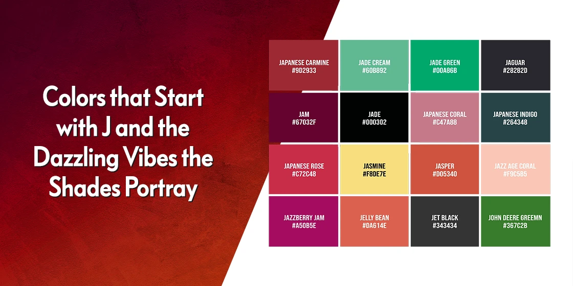
Colors That Start With J: Quick Reference Table
Before we dig into the meaning behind each shade, here is a scannable list of the most common colors that start with J, their hex codes, and where they fit best. Bookmark this table for your next design sprint.
| Color Name | Hex Code | Color Family | Mood / Best For |
| Jade Green | #00A86B | Green | Calm, trust, wellness brands |
| Jade Stone | #74BB83 | Green | Luxury, balance, jewelry |
| Jade Glass | #00CED1 | Blue-Green | Serenity, spa-like interiors |
| Jungle Green | #29AB87 | Green | Eco, adventure, outdoor brands |
| John Deere Green | #367C2B | Green | Heritage, agriculture, outdoors |
| Jasmine | #F8DE7E | Yellow | Warmth, elegance, spa décor |
| Jonquil | #FADA5E | Yellow | Joy, optimism, new beginnings |
| Jonquil Yellow | #F4CA16 | Yellow | Bold cheer, children’s branding |
| June Bud | #BDDA57 | Yellow-Green | Freshness, spring energy |
| Jesus Red | #D51B04 | Red | Passion, bold CTAs, faith themes |
| Jasper | #D73B3E | Red | Grounding, earthy, rustic décor |
| Japanese Carmine | #9D2933 | Red | Traditional, refined, formal |
| Japanese Rose | #C72C48 | Pink-Red | Romance, elegance, beauty |
| Japanese Maple | #780109 | Brown-Red | Autumn, drama, art gallery |
| Jam | #67032F | Red-Purple | Indulgence, warmth, bakeries |
| Jazzberry Jam | #A50B5E | Pink-Red | Bold, youthful, fashion |
| Joker Purple | #4A0336 | Purple | Mystery, theatrical, Halloween |
| Jacaranda | #2E0329 | Dark Purple | Royalty, luxury, weddings |
| Japanese Violet | #5B3256 | Purple | Sophistication, mystery |
| Japanese Indigo | #264348 | Blue | Calm, tradition, high-end brands |
| Jordy Blue | #8AB9F1 | Blue | Friendly, open, tech brands |
| Jasmine White | #EDECBC | White | Purity, minimalism, worship |
| Jet Black | #343434 | Black | Elegance, luxury, minimalism |
| Joss | #B9A896 | Brown | Vintage, warmth, earthy décor |
| Japanese Coral | #C47A88 | Pink | Soft, warm, feminine branding |
Pro tip: If you need a wider palette to match any of these J shades, try our free color shade generator to build cohesive combinations in seconds.
Popular Colors That Start With J and What They Mean
Let’s start with the familiar faces. These are the colors that start with J that most designers already know, and they carry strong emotional weight in color theory. Each one earns its place on this list because it shows up again and again in branding, fashion, and interior design.
Jesus Red (#D51B04)

Jesus red is a deep, vivid shade of red that signals passion, sacrifice, and religious devotion. Think of the crimson robes of a cardinal or the red garments worn by Jesus in centuries of church art. It is one of the boldest shades of red in the J family.
In design, Jesus red works beautifully for a strong call-to-action button, a website banner that demands attention, or a logo that wants to convey power and conviction.
Jasmine (#F8DE7E)

Jasmine is one of the softest yellow-white hues you can find, close to the gentle shades of nude color. Named after the jasmine flower, it carries feelings of purity, innocence, and sweetness.
Picture a jasmine blossom opening at dusk, releasing its soft fragrance into the night. Designers reach for jasmine when they want a serene, welcoming feel, making it a natural fit for spas, relaxation rooms, and beauty packaging.
Jam (#67032F)

Jam is a rich, fruity red-purple that feels warm and nostalgic. Think of a bluish purple tone blended into burgundy from colors that start with B, and you have jam. It evokes indulgence, comfort, and slow mornings.
The color pulls up memories of homemade jars bubbling on a farmhouse stove. In design, jam brings warmth and welcome, which is why you will see it used by bakeries, cafés, and boutique food brands.
Jade Stone (#74BB83)

Jade stone is a soft green with a whisper of blue, and it is probably the most iconic J color of them all. It sits alongside the most captivating shades of green and signals luxury, harmony, and Eastern wisdom.
Imagine a carved jade ornament resting on black satin in a museum case, believed to bring good fortune. Jade stone adds sophistication to any palette, so it works well for high-end jewelry brands, wellness studios, and meditation spaces.
Jet Black (#343434)

Jet black is a timeless, slightly warmer cousin within the shades of black color family. It is named after the jet gemstone, which is actually a fossilized form of coal, and it signals formality, drama, and mystery.
A sleek jet black dress on a red carpet, a matte jet black car, a minimalist jet black website: this color is built for statement moments. Use it when you need contrast or a luxury feel without going harsh.
John Deere Green (#367C2B)

John Deere green is a specific, heritage shade tied to the John Deere tractor brand. It evokes reliability, tradition, and a strong connection to the land. The tone reads like a saturated fern green from colors that start with F.
Think of a green tractor rolling across a wheat field under an open sky. In design, this green fits gardening retailers, agriculture brands, sustainability campaigns, and any identity that wants to feel grounded and trustworthy.
Joker Purple (#4A0336)

Joker purple is a playful but unsettling shade from the shades of purple color family. Borrowed from the DC comic book villain’s costume, it carries an edge of chaos, eccentricity, and mischief.
Because it is so theatrical, joker purple can feel too intense for everyday branding. Use it sparingly: Halloween campaigns, children’s amusement parks, gaming logos, and nightlife marketing all love this shade.
Jack-o-Lantern Orange (#F4781E)

Jack-o-lantern orange is one of the most festive shades of orange in the J family. The name alone tells you what it is for: Halloween, autumn, and the spooky spirit of October.
Picture a carved pumpkin glowing from a candle inside, flickering on a porch. The color adds playful energy to costume shops, candy brands, fall menus, and seasonal packaging.
Rare and Lesser-Known Colors That Start With J
Now for the hidden gems. These J colors do not get the same airtime as jade or jet, but they carry unique design potential, especially for brands that want to stand out. Interior designers love pulling these shades into an interior design color palette because they feel fresh and unexpected.
Jade Green (#40726D)

Jade green is a deeper, more muted cousin of jade stone. It shares territory with the darker shades of teal color and signals growth, prosperity, and renewal.
Imagine a bamboo forest filtered through cool green light, swaying gently in the breeze. The color grounds a space and invites calm, which is why spa treatment rooms and eco-friendly clothing brands lean on it so often.
Jungle Green (#29AB87)

Jungle green is a cool, lush green that feels alive. With 16% red, 67% green, and 53% blue, it leans slightly toward teal without losing its leafy character. This is the color of tropical canopies and rainforest shade.
Use jungle green for adventure travel brands, eco-tourism, plant shops, and any identity that wants to feel wild without feeling harsh. It pairs beautifully with warm terracotta or deep rose-red.
Jasper (#D73B3E)

Jasper is a captivating stone that can show up in yellow, brown, green, and blue, but this particular shade is a warm earthy red. The color comes from iron compounds inside the stone, landing somewhere between red and the deeper shades of pink color.
Picture a polished jasper stone in an antique shop, each swirl telling a piece of the earth’s history. In design, jasper adds stability and natural charm to rustic living rooms, craft brand packaging, and jewelry lines that celebrate raw materials.
Japanese Indigo (#264348)

Japanese indigo is a deep, rich hue from the shades of blue color family. It evokes peace, tranquility, and quiet wisdom, tied to centuries of Japanese dye tradition.
Think of an indigo dye vat passed down through generations of artisans. Designers use Japanese indigo when they want a serene, sophisticated feel, especially for meditation apps, luxury clothing boutiques, and minimalist brand identities.
Jonquil (#FADA5E)

Jonquil is easily one of the cheeriest shades of yellow color. It takes its name from the Narcissus jonquila flower, originally native to Spain and Portugal, and carries feelings of happiness, optimism, and new beginnings.
Because jonquil signals fresh starts, it is often used as a color of spring and renewal. It adds a burst of energy to children’s playrooms, positivity-focused branding, and wellness campaigns.
June Bud (#BDDA57)

June bud sits between yellow and green, a fresh, spring-like shade with 74% red, 85% green, and 34% blue. It feels like the first leaves pushing out in early summer.
June bud works well as a pop of color in garden brands, children’s products, and wellness packaging. Pair it with deep navy or charcoal grey for a balanced, modern palette.
Jazzberry Jam (#A50B5E)

Jazzberry jam is a bold, fruity blend of red and blue with subtle green undertones. It is one of the most playful colors that start with J, yet it still feels grown-up and confident.
Designers pick jazzberry jam for fashion branding, beauty packaging, and music festival posters. It looks especially striking against cream or soft pink.
Japanese Carmine (#9D2933)

Japanese carmine is a refined, slightly muted red with traditional Japanese roots. It is deeper and more controlled than Jesus red, which makes it feel formal rather than loud.
This shade is a go-to for restaurant branding (especially Japanese cuisine), luxury packaging, and editorial layouts that want a touch of heritage.
Japanese Rose (#C72C48)

Japanese rose is a vivid pink-red that falls between carmine and jazzberry. It has romance built in, with just enough edge to avoid feeling saccharine.
Use Japanese rose for beauty brands, floral packaging, Valentine’s campaigns, and elegant wedding invitations.
Jacaranda (#2E0329)

Jacaranda is a deep, dark blueish-violet, surprisingly different from the pale lavender flowers the name usually brings to mind. It carries the same royal weight as imperial purple from colors that start with I.
Jacaranda brings an instant sense of luxury and wisdom. It is ideal for wedding invitations, high-end hotel branding, and perfume packaging that wants to feel mysterious and premium.
Japanese Violet (#5B3256)

Japanese violet is a muted, sophisticated purple with a grey undertone. It has a quiet confidence that pairs well with neutrals.
Think stationery brands, moody editorial photography, and refined packaging. Japanese violet looks especially polished next to soft cream or warm ivory.
Jade Glass (#00CED1)

Jade glass is a bright blue-green with a milky, luminous quality. It is often confused with turquoise from the shades of aquamarine color family because the hues run close together.
Jade glass feels clean and serene, making it a favorite for bathroom renovations, spa interiors, beach-themed branding, and anything that needs to feel like fresh water.
Jordy Blue (#8AB9F1)
Jordy blue is a softer, slightly muted sky blue. It is approachable, friendly, and modern without feeling corporate. The slight grey undertone gives it depth that plain sky blue lacks.
Tech startups, children’s brands, and mental health apps all lean on Jordy blue because it feels open and non-threatening.
Japanese Maple (#780109)

Japanese maple is a fiery, red-tinted shade of brown named after the tree’s dramatic autumn leaves. It feels passionate and transformative.
Picture a Japanese maple in mid-October, every leaf blazing. In design, this color adds drama to art galleries, fashion collections inspired by nature, and statement walls.
Jasmine White / Jesus White (#EDECBC)

Jasmine white, sometimes called Jesus white, is a soft, creamy off-white with a yellow undertone. It fits neatly among the warmer shades of white color.
The tone evokes purity, innocence, and a quiet kind of reverence. Use it for wedding stationery, minimalist interiors, and places of worship where plain white would feel too clinical.
Which Colors That Start With J Are Blue?
| Blue J Colors at a Glance The main blue colors that start with J are Japanese Indigo (#264348), Jordy Blue (#8AB9F1), and Jade Glass (#00CED1). Japanese indigo is the deepest, Jordy blue is the friendliest sky shade, and jade glass leans into turquoise territory with its bright, glassy finish. |
If you need a blue that starts with J for your palette, your options are limited but powerful. Japanese indigo is perfect when you want authority and calm. Jordy blue works for modern, friendly brand identities. Jade glass is the pick when your project needs a lighter, almost turquoise feel.
What Green Colors Start With J?
| Green J Colors at a Glance Jade (#00A86B), Jade Stone (#74BB83), Jade Green (#40726D), Jungle Green (#29AB87), John Deere Green (#367C2B), and June Bud (#BDDA57) are the core green colors that start with J. They range from cool teal-adjacent jades to earthy, nature-driven greens. |
Green is where the J family really shines. Jade and its variations dominate, but jungle green brings the tropical adventure vibe, John Deere green brings heritage, and June bud brings a fresh, spring-like lift. Together, these greens cover everything from wellness branding to outdoor gear.
Red and Pink Colors That Start With J
| Red and Pink J Colors at a Glance Jesus Red (#D51B04), Jasper (#D73B3E), Japanese Carmine (#9D2933), Japanese Rose (#C72C48), Jam (#67032F), and Jazzberry Jam (#A50B5E) cover the warm end of the J spectrum. Jesus red is the loudest, Japanese carmine is the most refined, and jam is the most comforting. |
These reds and pinks all share warmth and emotion, but each one has a different personality. Pick Jesus red for bold statements, Japanese carmine for heritage brands, and jazzberry jam when you want bold without going aggressive.
How to Use Colors That Start With J in Your Design
J colors tend to feel grounded and emotional, which makes them powerful in the right hands. Before dropping jade green or jet black into your next project, think about the mood you want and the audience you are speaking to.
Match the J Color to Your Brand Personality
- Wellness and eco brands: jade green, jungle green, jasmine, jasmine white
- Luxury and premium: jet black, jacaranda, Japanese carmine, Japanese indigo
- Energetic and youthful: jonquil, June bud, jazzberry jam, jack-o-lantern orange
- Heritage and traditional: John Deere green, Japanese carmine, Japanese violet, joss
Build J Color Palettes That Actually Work
Stick to two or three J shades per palette and let one dominate. A few combinations that work out of the box:
- Calm nature palette: Jade Stone + Jungle Green + soft beige
- Happy and fresh: Jasmine + Jonquil + light grey
- Bold and modern: Jet Black + Jazzberry Jam + crisp white
- Elegant and moody: Jacaranda + Japanese Rose + ivory
For a deeper dive into how color choices influence brand perception, check out our guide on logo color meanings and explore how to stretch any shade into a full interior design color palette.
Frequently Asked Questions About Colors That Start With J
| Is there really a color that starts with J? Yes, there are more than 25 recognized colors that start with J. The most common ones are Jade, Jet Black, Jasmine, Jonquil, Jungle Green, Jasper, and Jacaranda. You can also find less common variations like Japanese Carmine, Jordy Blue, and June Bud. |
| What is the most popular color that starts with J? Yes, there are more than 25 recognized colors that start with J. The most common ones are Jade, Jet Black, Jasmine, Jonquil, Jungle Green, Jasper, and Jacaranda. You can also find less common variations like Japanese Carmine, Jordy Blue, and June Bud. |
| Is jam a color? Yes, jam is a recognized color. It is a rich, fruity red-purple with the hex code #67032F. The color is named after the look of homemade fruit jam and is often used for warm, nostalgic designs like bakery branding or café interiors. |
| What color represents new beginnings? Jonquil (#FADA5E) is commonly associated with new beginnings. Named after the bright yellow jonquil flowers that bloom in early spring, this cheerful yellow shade symbolizes hope, renewal, and fresh starts, which is why it shows up often in spring campaigns and wellness branding. |
| Are there any blue colors that start with J? Yes, the main blue colors that start with J are Japanese Indigo (#264348), Jordy Blue (#8AB9F1), and Jade Glass (#00CED1). Japanese indigo is a deep, calming blue with cultural heritage, while Jordy blue is a soft, friendly sky blue. Jade glass leans toward turquoise. |
| What gemstones start with the letter J? The main gemstones that start with J are Jade, Jasper, and Jet. Each one lends its name to a corresponding color: jade for cool greens, jasper for earthy reds, and jet for deep black. These natural stones have inspired color palettes in jewelry and interior design for centuries. |
| What is the difference between joker purple and joker green? Joker purple (#4A0336) is the deep, moody purple from the Joker’s costume, while joker green is a bright, electric lime green associated with his hair. Both colors come from DC’s iconic villain and are often used together to signal chaos, theatricality, and mischief. |
| Can I use J colors together in one palette? Absolutely. J colors are unusually cohesive because many of them come from nature (jade, jasmine, jonquil, jungle green). Just limit your palette to two or three J shades and add a neutral like cream, grey, or black to anchor the combination. |
Final Thoughts on Colors That Start With J
The world of colors that start with J is smaller than some letters but punches well above its weight. From the serene depth of Japanese indigo to the playful burst of jack-o-lantern orange, each J hue brings its own story and emotional charge. Whether you are designing a logo, styling a room, or building a brand identity, there is a J color that can carry the mood you want.
The next time you plan a project, try pulling one or two unexpected J shades into your palette. And if you want to see how these colors connect to the rest of the alphabet, browse our guides on colors that start with H or jump ahead to colors that start with K.
Ready to build a brand palette that actually pops? Our designers at Logo Poppin craft custom color systems for logos, websites, and full brand identities. Get in touch for a free consultation and turn your favorite J color into a brand people remember.
Need a Color Scheme That Pops, But Can't Find the Right Shades?
Our free color shade generator provides endless possibilities to create stunning and cohesive palettes for your project.
Color Match!
Latest news you want to know!
Subscribe for cutting-edge design inspiration at Logo Poppin! Elevate your brand with updates on logos, branding, web design, and video animation.
Note that by clicking “subscribe,” users may agree to our privacy policy and consent to Logo Poppin to use your contact data for newsletter purposes.
Logopoppin
Logopoppin is a graphic design agency that specializes in logo designing, web development, video production and advanced branding services. We love to innovate businesses with new age technologies, allowing them to improve their visual reputation.