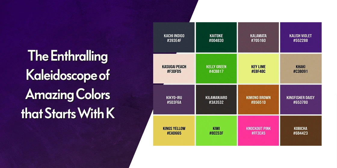
Looking for colors that start with K? You are in the right place. From the earthy charm of khaki and the bold pop of Kelly green to rare gems like Klein blue and Kamehameha gold, K colors offer designers a surprisingly versatile palette. In this guide, we break down 22 of the most useful colors that start with the letter K, complete with hex codes, color families, and real-world design use cases you can apply today.
Whether you are building a brand palette, picking paint for a room, or completing a color reference list, this article gives you everything you need in one place — names, codes, meanings, and pairing ideas. Let us dive into the full list of K colors.
Quick Answer: Common Colors That Start With K
The most well-known colors that start with K are khaki, Kelly green, kiwi green, kumquat, Kona brown, Klein blue, Kalamata, kohl, and Kamehameha gold. Khaki is the most widely used K color in fashion and design, while Klein blue is the most famous K color in fine art.
All 22 Colors That Start With K at a Glance
Use the quick-reference table below to scan every K color in this guide. Each entry includes the hex code, the color family it belongs to, and the most common design contexts where it works well.
| Color Name | Hex Code | Color Family | Best Used For |
| Khaki | #C3C38B | Earthy / Tan | Apparel, military, outdoor branding |
| Kelly Green | #43CD82 | Green | Sports, nature, eco brands |
| Kiwi Green | #C4DC02 | Green / Yellow | Youth, summer fashion, beverages |
| Kalamata | #343357 | Purple | Luxury, fashion, premium packaging |
| Kirsch | #8E443E | Red / Brown | Autumn themes, food, home decor |
| Kumquat | #F2A344 | Orange | Kids brands, summer, citrus packaging |
| Kona Brown | #543D26 | Brown | Coffee, rustic, artisanal brands |
| Kilo Lime | #B5E040 | Green | Health food, eco, freshness |
| Kaki | #8E6247 | Brown | Interior design, fashion, organic brands |
| Kohl | #000000 | Black | Cosmetics, luxury, minimalist design |
| Kirin | #975A38 | Brown | Storytelling, mythology, warm decor |
| Karamel | #8A4629 | Brown | Coffee shops, confectionery, bakery |
| Kalahari | #B5A373 | Beige | Travel, safari, outdoor apparel |
| Katmandu | #B59277 | Tan | Wellness, yoga, spiritual branding |
| Kyanite | #B0D4B0 | Teal / Green | Jewelry, spa, calm interior palettes |
| Karmin | #D20000 | Red | Fashion, advertising, bold campaigns |
| Kilauea | #B22200 | Red | Dramatic design, sports, horror |
| Klein Blue | #002FA7 | Blue | Art, luxury fashion, fine design |
| Kiwano | #00FF00 | Green | Tech, gaming, vivid digital design |
| Kamehameha Gold | #F9A81D | Gold / Orange | Luxury, royalty, sports teams |
| Kevlar | #A9A9A9 | Gray | Industrial, military, minimalist tech |
| Karaka | #B5A37F | Brown / Tan | Rustic, home decor, natural fashion |
Popular Colors That Start With K (With Hex Codes and Meanings)
These are the K colors you will see most often in fashion, branding, and interior design. They are widely recognized, easy to pair, and have well-established cultural associations that designers can lean on.
1. Khaki — #C3C38B

A classic earthy shade reminiscent of military uniforms, khaki evokes ruggedness, adventure, and reliability. It is one of the most versatile colors that start with K and works equally well in casual wear, outdoor apparel, and warm interior palettes.
Khaki sits comfortably alongside soft shades of nude color and other earthy neutrals, making it a reliable base for layered, organic-looking palettes.
2. Kelly Green — #43CD82

A vibrant, energetic green with cool blue undertones, Kelly green is associated with nature, growth, and vitality. It is a favorite for sports teams, eco-friendly brands, and outdoor activity branding because it conveys strength and freshness in one shade.
For pairing inspiration, Kelly green works beautifully with shades of aquamarine color to create a refreshing, water-meets-forest palette.
3. Kiwi Green — #C4DC02

A bright, zesty green with strong yellow undertones, kiwi green is named after the fruit and brings instant energy to a design. It is a popular choice for children’s products, summer fashion, food packaging, and youthful brand identities.
If you are exploring more yellow-leaning options, see our guide to shades of yellow color for complementary picks.
4. Kalamata — #343357

One of the deepest, most refined K colors, Kalamata is a rich purple-navy named after the famous Greek olive. It evokes mystery, sophistication, and quiet luxury — perfect for high-end fashion, premium packaging, and editorial design.
See more in our roundup of shades of purple color for full palette ideas.
5. Kirsch — #8E443E

A deep reddish-brown shade, Kirsch takes its name from the German word for cherry. It carries warmth, comfort, and a nostalgic quality, which makes it a strong choice for autumnal palettes, wine branding, and cozy home decor.
Kirsch sits naturally alongside richer shades of maroon color if you want to build a deeper red-brown palette.
6. Kumquat — #F2A344

A bright, cheerful orange named after the small citrus fruit, kumquat radiates energy, enthusiasm, and happiness. It is widely used in summer fashion, children’s branding, snack packaging, and any project that needs a confident, joyful pop.
For pairing options, browse the full range of shades of orange color.
7. Kona Brown — #543D26

Named after the Hawaiian island famous for its coffee, Kona brown is a rich, earthy shade that conveys warmth, comfort, and a strong connection to nature. It is a favorite of coffee brands, artisanal packaging, and rustic interior palettes.
Kona brown pairs especially well with shades of taupe color for a layered, natural neutral scheme.
8. Kilo Lime — #B5E040

A brighter, zestier cousin to avocado green, Kilo lime brings freshness, energy, and vitality to any palette. It is a strong fit for natural products, healthy food brands, fitness apps, and eco-friendly initiatives.
9. Kaki — #8E6247

Not to be confused with khaki, Kaki is named after the Japanese persimmon and is a deeper, more saturated brown. It evokes stability, comfort, and a grounded, organic feel, which makes it useful in interior design, packaging, and fashion targeting an authentic aesthetic.
10. Kohl — #000000

Kohl is one of the deepest blacks among K colors, traditionally associated with the eyeliner used for thousands of years across North Africa, the Middle East, and South Asia. It is a foundational color in cosmetics branding and works as a strong anchor in any minimalist palette.
For nuanced near-blacks, see our breakdown of shades of black color.
11. Kirin — #975A38

Named after the mythical East Asian creature, Kirin is a warm, inviting brown that adds character and storytelling depth to a palette. It works particularly well in fashion design, packaging with cultural roots, and interior accents.
Lesser-Known Colors That Start With K (Rare and Designer-Favorite Shades)
Beyond the popular names, there is a second tier of K colors that designers, paint manufacturers, and art historians rely on. These are less common, but they often add the most personality to a palette.
12. Karamel — #8A4629

Karamel is a rich brown named after caramel candy, evoking sweetness, comfort, and nostalgia. It is a go-to choice for food packaging, coffee branding, bakery identities, and warm, inviting home decor.
13. Kalahari — #B5A373

A sandy, earthy beige named after the Kalahari Desert, this color evokes adventure, exploration, and a deep connection to nature. It is widely used in safari-themed campaigns, outdoor apparel, and travel branding.
For a wider neutral palette, explore our guide to shades of beige color.
14. Katmandu — #B59277

Named after the capital of Nepal, Katmandu is a warm tan with a hint of pink. It carries associations of spirituality, tranquility, and the Himalayan landscape, making it a strong match for yoga, meditation, and wellness brands.
See more in our roundup of shades of tan color.
15. Kyanite — #B0D4B0

Kyanite is a light blue-green pastel named after the mineral. It carries a sense of peace, tranquility, and mental clarity, which makes it a favorite for jewelry brands, spa interiors, and any product designed to feel calming.
It pairs beautifully with cooler shades of teal color if you want to deepen the palette.
16. Karmin — #D20000

Karmin is a vibrant, intense red named after the carmine dye historically derived from cochineal insects. It signals passion, energy, and excitement, which makes it ideal for bold fashion statements, advertising, and high-impact branding.
For pairing inspiration, browse our full set of shades of red color.
17. Kilauea — #B22200

Kilauea is a deep, fiery red named after the active Hawaiian volcano. It evokes power, intensity, and an edge of danger, which makes it well-suited to dramatic design, horror, gaming, and extreme sports branding.
18. Klein Blue — #002FA7

Few K colors are as historically important as International Klein Blue, developed by French artist Yves Klein in the late 1950s. It is a deep, ultramarine-like blue with extraordinary saturation and is now a touchstone in fine art, luxury fashion, and editorial design.
Klein blue anchors any palette that needs depth. Pair it with selections from our guide to shades of blue color for a refined, gallery-grade scheme.
19. Kiwano — #00FF00

Kiwano is a bright, electric green named after the horned melon fruit. It is one of the most saturated greens you can use, which makes it a favorite for tech brands, gaming UI, signage, and any high-impact digital design.
For a broader green palette, see our breakdown of shades of green color.
20. Kamehameha Gold — #F9A81D

Kamehameha gold is a warm, regal yellow-gold named after the first king of Hawaii. It signals power, royalty, and achievement, which makes it a natural pick for luxury brands, sports identities, and award-style design.
Compare it with other premium metallics in our guide to shades of gold color.
21. Kevlar — #A9A9A9

Named after the high-strength synthetic fiber, Kevlar is a balanced industrial gray. It works as a clean, modern neutral and is a strong choice for tech, defense, automotive, and minimalist editorial design.
It anchors well with other shades of gray color for a fully monochrome palette.
22. Karaka — #B5A37F

Karaka is a muted, earthy beige-brown that evokes rustic charm and natural beauty. It is widely used in home decor, soft fashion, and packaging that wants to feel quietly upscale rather than loud.
How to Use Colors That Start With K in Design
Knowing the names and hex codes of K colors is only the start. The real value comes from understanding when and how to use them. Here is a practical breakdown of how designers apply K colors across common projects.
K Colors for Branding and Logos
Earthy K colors like khaki, Kona brown, and Karamel work well for brands that want to feel authentic, artisanal, or grounded — think coffee shops, leather goods, and outdoor apparel. Bolder K colors like Karmin, Kelly green, and Klein blue are better suited to brands that want to feel confident, modern, and instantly memorable.
If you are building a brand from scratch, our guide to logo color meanings explains how to choose hues that match your brand personality.
K Colors for Interior Design
Khaki, Katmandu, Karaka, and Kalahari are ideal as wall colors and large surfaces because they read as soft, layered neutrals that age well. Kyanite and kiwi green work better as accent shades in cushions, art, or feature walls.
For inspiration on combining these into a full room palette, see our resource on interior design color palettes.
K Colors for Fashion and Apparel
Khaki remains a wardrobe staple, but K colors offer a broader range than most people realize. Kalamata, kohl, and Kona brown are excellent base colors for tailored pieces, while Karmin, Kelly green, and kumquat work as statement colors for accessories, prints, and seasonal collections.
K Colors for Digital and UI Design
On screen, Klein blue, Kelly green, Kiwano, and Kamehameha gold are particularly strong because they hold saturation well at small sizes. Kevlar and kohl are reliable neutrals for backgrounds, type, and component states. Avoid pairing too many high-saturation K colors in a single interface — pick one as a primary and use the rest as accents.
Best Color Combinations With K Colors
Color theory helps explain why some K color pairings feel natural and others fall flat. Here are five reliable combinations to start with:
- Khaki + Klein blue: A grounded neutral against a bold ultramarine. Strong, editorial, and timeless.
- Kelly green + Kamehameha gold: A rich, premium palette common in sports identities and heritage brands.
- Kona brown + Karamel + Khaki: A warm monochromatic palette that suits coffee, bakery, and artisan brands.
- Kalamata + Kyanite: A high-contrast pairing of deep purple-navy and pastel green-blue. Modern and unexpected.
- Karmin + Kohl: A dramatic, high-impact pairing built for fashion, advertising, and editorial covers.
For a deeper dive into how to combine hues, see our guide to color combinations and the fundamentals of color theory.
Need a Color Scheme That Pops, But Can't Find the Right Shades?
Our free color shade generator provides endless possibilities to create stunning and cohesive palettes for your project.
Color Match!
Explore More Color Guides
K colors are one slice of a much larger color spectrum. If you are building out a full reference, these neighboring guides are worth bookmarking:
- Colors that start with J
- Colors that start with L
- Colors that start with I
- Colors that start with M
- Color meanings and symbolism
- Tertiary colors and examples
Final Thoughts on Colors That Start With K
The world of K colors is broader than most designers expect. From the everyday reliability of khaki to the high-saturation drama of Klein blue and Karmin red, this letter offers a complete spectrum — warm and cool, earthy and electric, classic and modern.
The next time you are building a palette and need a shade that feels grounded, regal, or unexpected, return to this list. Pair these K colors with thoughtful color theory and a clear brand intent, and you will end up with a palette that does the work for you.
If you want a professional team to design your brand identity around these palettes, our logo and brand design services guide is a strong place to start.
Latest news you want to know!
Subscribe for cutting-edge design inspiration at Logo Poppin! Elevate your brand with updates on logos, branding, web design, and video animation.
Note that by clicking “subscribe,” users may agree to our privacy policy and consent to Logo Poppin to use your contact data for newsletter purposes.
Logopoppin
Logopoppin is a graphic design agency that specializes in logo designing, web development, video production and advanced branding services. We love to innovate businesses with new age technologies, allowing them to improve their visual reputation.