
Table of Content
Famous Combination Logos Including Both Wordmark and Graphical Elements
When designing a business logo, it’s essential to remain open to various styles and not restrict yourself to one specific approach. Many businesses tend to gravitate toward either wordmarks or graphical logos to represent their brand identity. Wordmarks typically focus on the company name in a unique typeface, while graphical logos rely on symbols or images that evoke the brand’s essence. Each of these styles has its own merits, but it’s important to explore other possibilities that might better capture the unique qualities of your business.
In fact, a successful logo design often comes from combining different elements to create something truly distinct. For example, blending a wordmark with a graphical element can lead to a combination logo, which merges both text and imagery into a cohesive design. This approach allows for a more versatile representation of your brand, making it easier for consumers to both recognize and recall your business. The beauty of combination logos lies in their ability to offer clarity and creativity in one unified design.
However, creating a combination logo requires professional logo design services and strategic design methodology. Simply merging a wordmark and a graphic element isn’t enough to guarantee success. To achieve the desired outcome, you need to first look at those logos that have been perfectly built in this style. In this blog, we will list down some of the best company emblems that have been created in this fashion. Let’s take a look at them below.
What is a Combination Logo?
A combination logo is a design that unifies both text and imagery to create a versatile and memorable visual identity for a brand. By combining these two elements, the logo ensures that the business is represented in a way that is easily recognizable and visually compelling. The text element, often the brand name, allows for clear identification, while the image or symbol adds a layer of creativity, emotion, or meaning that enhances the overall message.
This type of logo goes beyond simply being a visual mark. It serves as a powerful branding tool with the potential to significantly boost brand recognition. The combination of text and image can help communicate the core values, mission, or personality of a business, making it stand out in a competitive marketplace. A well-designed combination logo captures the attention of consumers and creates an immediate connection, making it easier for people to recall and associate with the brand.
Moreover, the strategic use of both textual and graphical components in a combination logo helps strengthen the overall brand presence. The dual elements work in tandem, reinforcing the brand’s identity through both word and imagery, which ultimately aids in enhancing consumer trust and loyalty. A thoughtfully crafted combination logo not only leaves a lasting impression but also serves as an essential asset in building long-term brand awareness and recall.
Famous Combination Logos that Exhibit Perfection
The best way to learn logo designing is by first taking inspiration from the established logos. In the case of combination logos, we will do the same, so that you can get an idea how these logos are professionally designed. Let’s take a look at some of the top company logos that includes both wordmark and graphical elements.
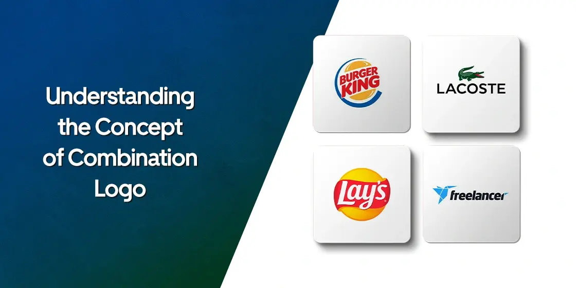
Freelancer
The logo of Freelancer effectively represents the platform’s mission of connecting freelancers with businesses in a visually striking way. The brand chose to combine an origami hummingbird with a bold masculine font to convey both creativity and professionalism. The origami hummingbird is symbolic of the freelancers themselves, embodying qualities such as strength, adaptability and more others. This symbolic choice of imagery reflects the dynamic and versatile nature of the freelance community.
The color scheme further reinforces these values, with the blue hue used in the hummingbird symbolizing trust, reliability, and confidence. These qualities are essential for building strong, professional relationships between freelancers and businesses. Complementing the bird’s calming yet powerful presence, the bold black sans-serif font adds an element of strength and modernity, enhancing the overall impact of the logo.
Lay’s
Lay’s logo incorporates a distinctive cursive font for the brand name, which is set against a vibrant red and yellow color palette. The use of cursive gives the logo a playful, inviting feel, aligning with the brand’s friendly and approachable personality. The flowing nature of the font also evokes a sense of motion. This design choice is a strategic reflection of the brand’s emphasis on creating an enjoyable snack experience for consumers.
The red and yellow color scheme used in the minimalist logo is a prime example of color psychology in action. Red is a color known for its ability to evoke strong emotions such as excitement and urgency, while yellow symbolizes happiness and optimism. Together, these colors are visually stimulating, capturing attention and encouraging action. The combination not only makes the logo stand out but also helps create a sense of warmth and energy, motivating viewers to engage with the brand.
Lacoste
The Lacoste emblem is a timeless icon that has established itself as a hallmark of both elegance and sportsmanship. The logo features a green crocodile, which is instantly recognizable and has become synonymous with the brand’s heritage. Originally chosen as a symbol to reflect the tenacity, the crocodile is now widely associated with high-end casual wear. The creature’s sleek and dynamic representation perfectly encapsulates the blend of sophistication and athleticism that defines Lacoste’s approach to fashion.
What makes the Lacoste logo particularly powerful is its ability to strike the ideal balance between luxury and casual style. The crocodile’s simple design conveys a sense of refinement and exclusivity, while the overall aesthetic remains versatile. Whether seen on a polo shirt or accessories, the logo communicates a sense of understated luxury. This balance has helped the brand remain relevant across different demographics, continuing to appeal to those who value quality, performance, and style.
Burger King
The logo of Burger King is designed to make a bold and memorable statement, effectively capturing the essence of the brand. The fire-inspired lettering, with its dynamic, flame-like shapes, evokes the idea of flame-grilled burgers, which is central to Burger King’s identity and its commitment to quality. This fiery effect not only reflects the cooking method but also symbolizes passion, energy, and bold flavors, reinforcing the brand’s reputation for serving tasty, satisfying meals.
In addition to the fiery lettering, the iconic crown featured in this restaurant logo further strengthens its visual identity. The crown is a direct reference to the “King” in Burger King’s name, reinforcing the idea that the brand is a leader in the fast food market. The combination of the bold, fiery typography with the crown creates a symbol that exudes confidence, power, and royalty. This emblem not only communicates the quality of the product but also appeals to the brand’s playful and cheeky persona.
Frequently Asked Questions
| What is a wordmark logo? A wordmark logo is a design that uses the brand’s name as the main visual element, typically in a custom or stylized font. It emphasizes clarity and simplicity, relying on typography to convey the brand’s identity. |
| What is a combination logo? Combination logos combine both text and a graphic symbol or icon to create a unified design. This style blends wordmarks with imagery, offering versatility and a memorable visual identity for the brand. |
| Why Burger King logo is popular in the market? Burger King’s logo is popular due to its bold and distinctive design. This memorable logo effectively conveys confidence, quality, and fun, resonating with consumers worldwide. |
Final Words
That concludes our entire blog in which we have listed some of the top combination logos used by popular companies. These emblems define how wordmark and graphical elements can be perfectly combined with each other. By learning the design concepts of these logos, you can also create an interactive emblem for your business based on the same design credentials. Creating combination logos is certainly not that hard, provided you follow all the design principles perfectly.
Logopoppin
Logopoppin is a graphic design agency that specializes in logo designing, web development, video production and advanced branding services. We love to innovate businesses with new age technologies, allowing them to improve their visual reputation.
