
Table of Content
Discover How to Make Comic Book Covers Stand Out & Draw in Readers
Comics are one of the most liked content mediums on the planet, and have been for nearly a century now. However, over the years, most comics have evolved from simple strips to entire volumes and series of comic books encompassing amazing storylines. Ever since the arrival or Marvel and DC comics, the content medium has evolved into an entirely new genre, and one that is made for all ages, young or mature.
Besides these big publishers, a number of smaller producers and comic artists design and release their own comics. Competing against such established players, they require some great comic book cover ideas to help their comics stand out and get a chance at success.
However, the question is what is it about these highly acclaimed comic book cover designs that make them so popular? How does Marvel, DC, or any other comic book company ensure that the comics they publish stand out amidst the dozens of similar titles at any comic book store?
Let’s dive in and discover how to make comic book covers stand out, and embody the essence of the story without giving away too much of the plot. We will also learn the important elements that professional eBook design services use to ensure that their comics and graphic novels have some of the most amazing cover art.
Let us begin.
What Defines Good Comic Book Cover Ideas?
When we talk about amazing or memorable comic book cover ideas, there is often a wide gulf between the various options considered good. Mostly, that boils down to one simple fact – art is subjective. For some fans, an example of comic cover art may be transcendent, while for others, that same cover design may be nothing special. The same goes for most of the popular superhero logos, with some liking what they represent, while others find them lacking.
However, despite all that, an unbiased yet critical analysis of all mainstream comic book covers considered great reveals that all of them embody some similar characteristics. These characteristics or features are what define specific comic cover art as “great”.
Let’s take a look at these characteristics.
Gives an Enticing Look at the Story Inside
One of the defining features of any kind of cover art for a comic is the fact that it gives just enough of a glimpse at the storyline that it urges the reader to read the entire comic. The mistake to ignore this tenet is one often made by senior comic artists as well, and can be seen in popular titles including the X-Men, which mostly feature the title characters with the X-Men logo splashed across.
The ability to tease an interesting climax while revealing very little of the storyline is an art that few can translate well to cover art. And that is why it is one of the defining characteristics of truly great comic book cover ideas.
Blends the Essence of the Character and the Storyline Seamlessly
When a comic book creator develops a character that ends up being very popular with the readers, they tend to create a comic universe centered on them. That universe is composed of different timelines and runs, all of which would have unique and distinct storylines and vibes.
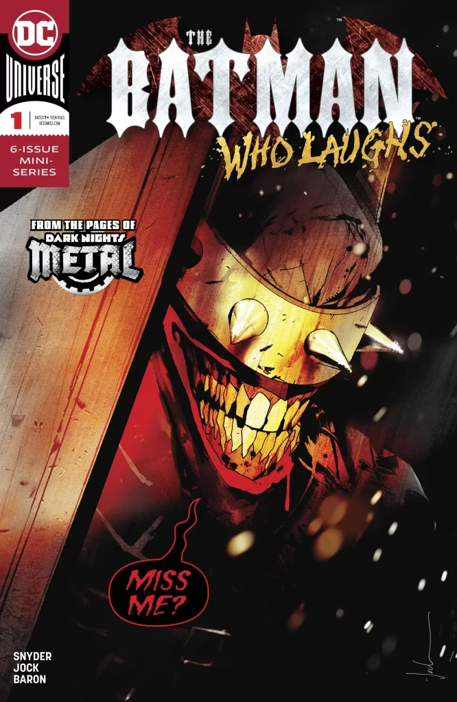
In such cases, it is important for the comic cover artist to blend the essence of the story with that of the primary character skillfully. Take for example, the majority of DC Comics’ Batman runs. As a hero that prefers to operate in the dark and the shadows, comics featuring the Batman often have dark and sinister cover art. The comics for Superman, on the other hand, have a brighter, more hopeful feel to them, as the Superman logo is supposed to be the symbol for hope and might.
Uses Visual Techniques That Strike a Chord Instantly
The impact of good art that is designed to strike should be visceral. It should immediately elicit an emotional response from the viewer, albeit often a subtle one. When we connect this theme to the concept of comic book cover ideas, we can understand that our comic cover art needs to be in a similar vein.
Take for example, the Batman storyline of “A Death in the Family”. This comic series represents a run where the Batman loses the second Robin, Jason Todd, after the Joker kills him. Still considered one of the most controversial storylines in the Batman runs, the comics in it have some of the most emotionally evocative cover art you will ever witness. The image of a helpless Batman, cradling the broken body of his dead sidekick while on his knees, is an image hard to forget for comic book fans.
Makes the Reader Think About a Deeper Meaning
Finally, we have the last characteristic that defines good comic book cover design ideas. A well-designed comic book cover art will make the reader think about the greater meaning behind its design. Sometimes, that meaning would be quite straightforward, while at other times, it would be a bit more convoluted and difficult.
For example, the cover art for Red Hood and the Outlaws #9 shows the new team of outlaw anti-heroes, Red Hood, Artemis, and Bizarro Superman, on the cover. Designed to mimic the style of the “A Death in the Family” cover art, the comic book features the Red Hood on his knees, cradling his old battered body from his time as the Robin.
This design would make someone think – why would Red Hood be holding his own shattered body, in a style similar to the “A Death in the Family” cover. The answer is that it is meant to show the war of personalities within Red Hood, with his guilt at forsaking Batman’s teachings of heroism, and his current violent actions.
Seven Amazing Comic Book Cover Ideas Inspired by the Greats
So far, we have discussed the need for effective comic book cover art, and the characteristics that define good comic book cover ideas. However, those are just the first steps towards understanding how to make a comic book cover. The next step, and one of the more important ones, is to figure out what kind of styles you can use to create these amazing comic book covers.
However, this step can be a bit difficult. With so many comic books out there, and dozens upon dozens of them being considered great, it can be next to impossible to find what you are looking for unless you know exactly where to look. So, we have compiled a list of some top-notch comic book covers from Marvel, DC, and some smaller publishers to show that amazing cover art is achievable, whether you are a big brand or a small, independent publisher.
Let’s take a look.
Invincible Iron Man – Stark: Disassembled, Vol.3
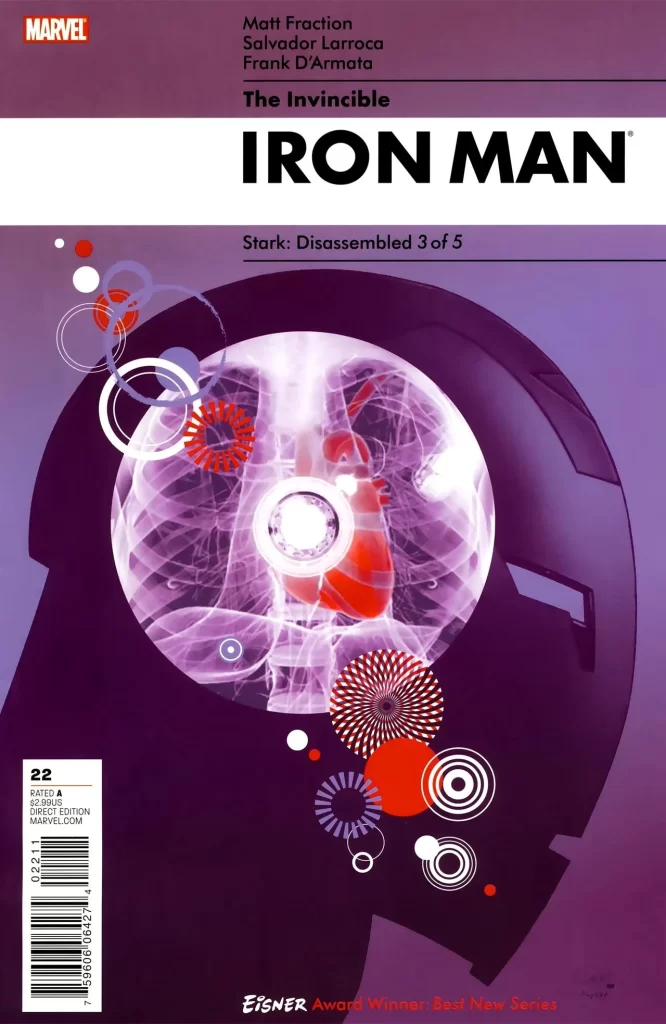
We are starting out strong, with the first entry on our list of awesome comic book cover ideas being the one for Invincible Iron Man – Stark: Disassembled Volume 3. This comic series is an interesting one, and the comic’s cover art displays exactly that.
After the events of a crisis that resulted in Tony Stark lobotomizing himself to protect the world, the comic series depicts the efforts of his friends to reboot his brain. Discovering that the true Tony Stark, AKA the Iron Man is stuck inside the subconscious, they try to revive him by bringing in Dr. Strange. This journey of understanding Stark and his mindset in order to help him defeat his demons is what is depicted on this cover art, overlaying the various mechanical, electronics, and human element.
As these elements make up who Stark is as a person, the title and the cover art perfectly represents that state of disassembly needed to understand him and his psyche.
Daredevil #12, Vol. 3
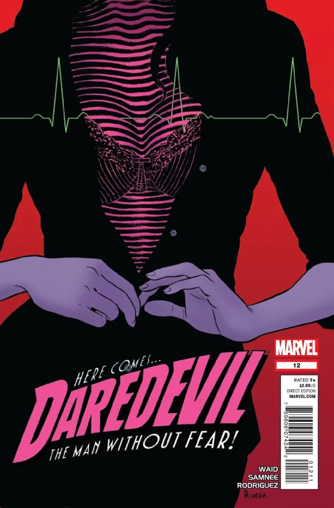
Next on our list is the cover art for Daredevil #12, Volume 3. This style of comic book cover ideas involve the melding of character personas and the storyline, something that is hard to do but well received if done well.
Daredevil is a character in the Marvel Universe, who is known as “The Man Without Fear”. It is the alter ego for lawyer Matt Murdock, who lost his sight in a freak chemical accident when he was a child. Since then, he has honed his other senses to superhuman heights in order to compensate for it, becoming one of the best hand-to-hand fighters in the universe.
As the Daredevil is known for his keen, sonar hearing, the cover art pays homage to that. The design incorporates two reminders of his special ability. The first is the Doppler-like lines that make up the body of the woman, while the second is the line depicting her heartbeat. Both elements represent the different ways Daredevil uses his heightened sense of hearing, melding for the perfect balance in design, and is a good reference to include within the cover design.
Amazing Spider Man 641, Vol. 1
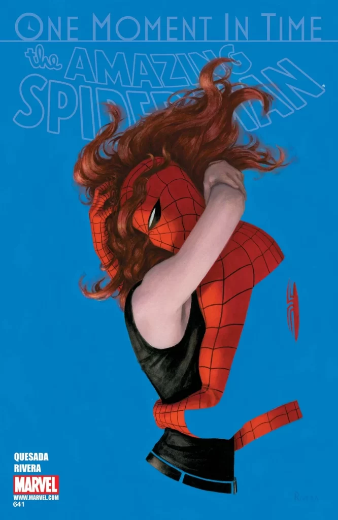
Next up is the cover art for the Amazing Spider Man 641: One Moment in Time Chapter 4. In this storyline, Spider Man is suffering from the consequences of the world knowing his secret identity. From Aunt May getting shot, to Mary-Jane Watson and her family being targeted for their association with the wall crawler, the events convince Parker that the world needs to forget he is Spider Man.
This comic series battles with the themes of abandonment and letting someone you love go. And that theme is represented in the cover as well. The cover is colored blue, the same as Spider Man’s classic suit. This means that instead of traditional art, the cover utilizes negative space to represent the ephemeral presence of Spider Man in MJ’s life, and his reluctance to let her go.
This is one of the more unique comic book cover ideas we have seen so far, showing an expert utilization of advanced principles of design that requires great skill to pull off well.
Daredevil #10.1, Vol. 3
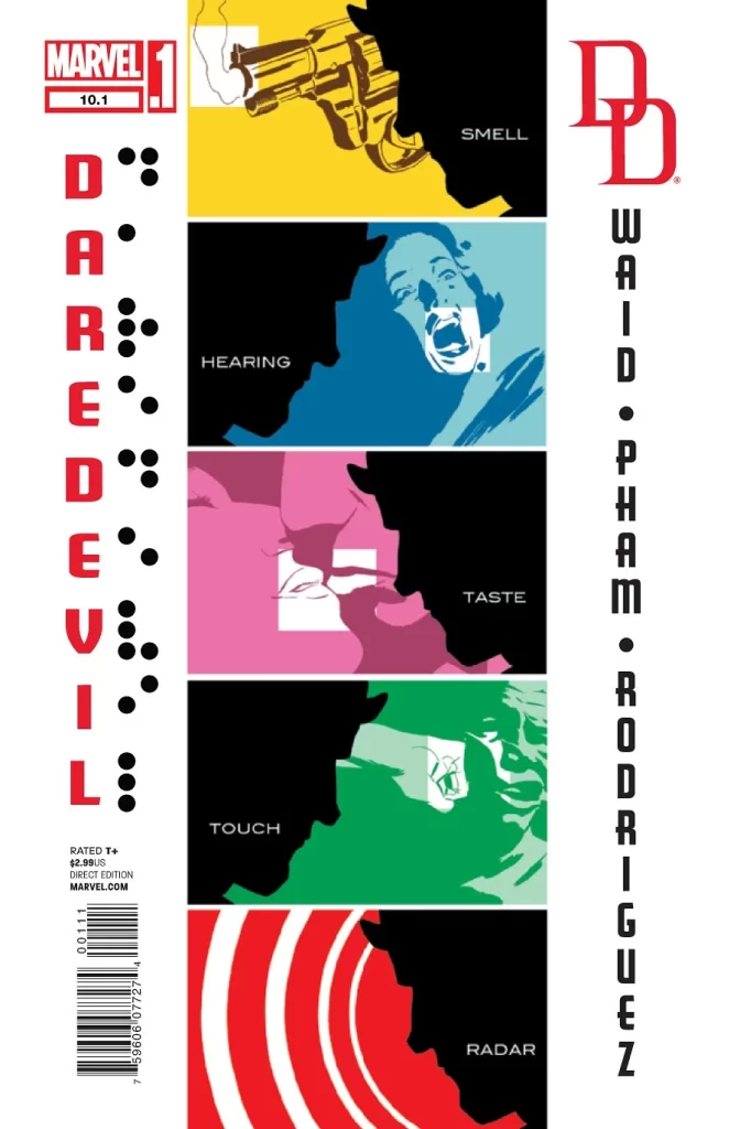
This next panel is from another one of Daredevil’s, specifically Daredevil 10.1, Volume 3. You will notice that while starkly different from the previous one on this list, both of the cover art examples for Daredevil have a noir, film-cover quality to their style.
While the previous one had a vibe similar to the detective-mystery thriller vibe with eclectic colors and line work, this one has a classic movie-poster style feel to it. Interestingly, the art depicts the fact that Daredevil is blind in two distinct ways. First, the multicolored frames represent the different senses used by the character, which incidentally does not include sight.
Next, if you look to the left of page, you will see the name of the character written vertically. In front of each letter is the collection of bumps that represent that letter in braille; a tactile language developed to help those visually challenged read.
Overall, this is a great example of comic book cover ideas incorporating a character’s identity into their design.
Sandman #1: Sleep of the Just
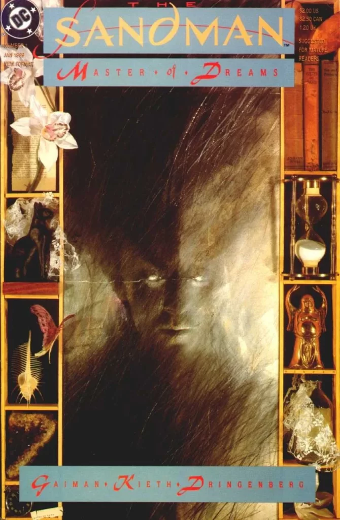
Diverging a little from the mainstream comic book publishers, Neil Gaiman’s Sandman series is a great read. Featuring a storyline with some of the greatest characters in fantasy, this comic series has gained enough of a fan following to have a live-action adaptation made of it.
Centered on the mystical character the Sandman, the cover art for the comic is something that you would expect from a vintage book, one of the rarely attempted graphic design trends. The hand drawn imagery, to the ever-transitioning formless shape of the titular character in the middle, makes this one of the top three comic book cover ideas on our list.
Monstress #15
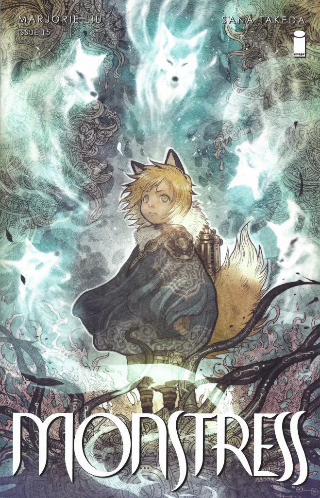
Monstress #15 is another example of a great comic book cover design from a lesser-known comic book publisher. However, the designer behind this great work of art is acclaimed artist Sana Takeda, a project that incidentally won the Hugo award.
With nearly 3 decades of experience illustrating comics, it is no wonder that the cover art for the 15th chapter of the series to have the best design of them all so far. The storyline is based on mystical, steampunk-style world, which is evidenced by the character Kippa surrounded by spirit-foxes knows as Arcanics, a race of shapeshifting magical creatures who can sometimes pass for human.
Overall, the cover art perfectly embodies the fantasy and mystic element of the series, with the design enticing the viewer to read on with its amazing color combinations.
Detective Comics #948: Batwoman Begins Part One

Lastly, we seem to have saved the best for last. The only entry from DC on this list, this cover for Batwoman Begins Part One is one of the most visceral designs on this list. It utilizes the perfect implementation of color theory, contrasting the dark black of Batman’s imagery with the bright red of Batwoman’s hair and bat symbol, making for a great design.
This contrast of color also represents the contrasting personalities of the characters portrayed on the cover as well. Kate Kane, known as Batwoman, has a fiery personality that results in her having a capricious personality. This trait is portrayed using the bright red hair of the character, against the black suit she wears.
On the other hand, Bruce Wayne, or Batman, is a character that takes self-control and calmness another level, as the only non-superhuman member of the primary Justice League trio. He is a character known to have squared up against titans like Darkseid and Superman, emerging victorious. His demeanor is characterized by the deep, flat black, unmarred by any other shade that takes away from the mystery of his character.
Overall, this deep symbolic relation between the battling natures of allies is what makes many of DC’s titles and their cover art so great.
Further Reading:
Conclusion
To sum it up, finding the perfect comic book cover ideas to inspire your own design requires you to understand the message your cover art should portray. Once you have an idea about that, only then can you begin finding suitable cover art samples.
However, if you want to know how to make comic book covers like the ones above, you need to have a clear idea of what your story entails. And then, you need to choose the core theme of that story, and use it to come up with an image that gives a small glimpse of the storyline while embodying a little of the title character’s essence into it as well.
Only then will you have a unique comic book cover that suits your comic perfectly.

Logopoppin
Logopoppin is a graphic design agency that specializes in logo designing, web development, video production and advanced branding services. We love to innovate businesses with new age technologies, allowing them to improve their visual reputation.


