Table of Content
Discover the Best Construction Company Logos to Inspire Your Own Brand Symbol
There was a time when the construction and building business was full of simple wordmark symbols, with no artistic flair or any attractive features to their name. But the construction logo aesthetic has evolved over the years to incorporate certain styles and elements that boosts their attractiveness.
But the process of finding and creating the perfect construction logos and names is far from easy. It involves understanding your market niche exactly, the customer demographic you want to target, and the style of business you want to portray in the market.
It also includes choosing the right visuals for the logo’s design, such as the perfect logo fonts, color schemes, and even the accompanying imagery if you are going for a combination logo design. That means that a lot of thought goes into the process before we begin looking for design inspiration.
But how do the professional logo design agency hired by one of the top construction businesses manages to accomplish that so easily? Well, let’s discover what it takes to create a good construction business logo every time, and take inspiration from some of the more successful logos in the construction contracting industry.
Common Design Elements of a Construction Logo
When it comes to logo design, each industry has a few design elements that are common to a vast majority of successful logos in that niche. That is because those elements are a case of trial-and-error, where the industry has worked out what works with the consumers, and what doesn’t.
Now, the construction industry too has certain design aesthetics that all members tend to embody. These elements define what a construction logo should look like, according to consumer perceptions. Let’s look at factors that dictate the success of the various types of logos in the construction business.
The Perfect Imagery That Suits the Business Niche
Choosing the right imagery is very important when we talk about a construction company logo. Consumers are visual creatures, and tend to recognize images faster than text. That means that if a restaurant doesn’t portray some related imagery in its logo, it would fail to gain any sort of traction in the market. Therefore, the right logo symbols are important here.
For construction logos, many professionals tend to incorporate elements such as the outlines or silhouettes of buildings and construction equipment to send the desired message. Even if you go for a simpler wordmark, you can add some small visual details that portray the desired message for a constructor’s or builder’s symbol.
An Attractive yet Subtle Color Scheme that Matches the Industry
Color schemes are a critical part of the logo design process, whether the logo is multicolored or monochrome. Choosing the right color combinations can make your design stand out among the sea of competitors. It also helps your logo evoke the desired emotions from its consumers, affecting the way they perceive you and your business.
The tone of the color theme depends vastly on the industry and the market niche. Corporate ventures need a simple and subdued color palette, which helps to enhance their serious approach to their work.
However, a builder that specializes in homes or other small construction can make a splashy and colorful scheme work easily. Now, like other industries, construction businesses too hold certain color palettes in high esteem in the industry. Those colors are associated with the industry, and helps customers associate them with the market niche. Therefore it’s a great idea to incorporate some of that into your own design.
Suitable, Easy to Read Fonts Perfect for Construction Company Logos
Similarly, whether it’s a combination or simply a wordmark logo design, the fonts you use are also essential to the overall construction logo’s impact. Depending on the style of logo you are trying to portray, you can choose from a number of suitable choices.
You can opt for interesting vintage fonts with a classic vibe if your logo is designed with an old-world aesthetic, or you can go for a more modern typeface if simple modernism is what you’re after. Construction businesses generally use various types of blocky and simple fonts, rather than an elaborate or intricate typeface, in order to make them easy to read in the logo.
Hallmarks of a Great Construction Logo
Now that we know the elements that make up a construction logo, you might be wondering – if that’s all it takes to create a construction company logo, how do you differentiate the good from the mediocre?
Well, we are going to discuss a few things that show you how great construction logos are immediately distinct compared to their less-successful counterparts. It may be their accompanying construction slogans, or it may be something else entirely. Now they may not be as obvious to someone who’s new to this, but for someone who knows what to look for, it will be an obvious choice.
So, the hallmarks of a great logo for a construction company are:
- It is able to quickly and easily convey what sets it apart from the competition. Basically, it has the ability to quickly highlight its unique selling point.
- It has the same visual impact no matter what color scheme it is used in, whether it is displayed in full color or monochrome/grayscale.
- It stays visually easy to see and absorb no matter its size, meaning that the logo is as scalable as the brand needs without losing its impact.
- It has an associated graphic or icon that has the ability to be iconic on its own, being memorable even when not accompanied by the business wordmark.
- Immediately shows the company vibes and values when portrayed in its full-color format, helping consumers connect with the brand.
Minimalist Construction Logo Examples for Contractors
Minimalism is the order of business today. From logo design to UI/UX designs, people prefer simple and clean designs today. That is because consumers are focused on the primary functionality and purpose of a product, and additional flairs that affect base functionality can end up distracting the viewers and consumers. However, for brands using minimalism, it usually extends to far more than just logos, including construction websites, and even branding.
So, let’s take a look at a construction logo can make minimalism work to its advantage.
Pulse Construction
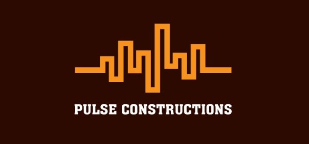
The construction logo for Pulse Constructions is quite simply, beautiful. Its minimalist design perfectly combines the image of a city skyline with the moving digital wave. This ingenious design helps people remember the name of the business, and also adds a visual pun for those who know the reference.
Pyramid Builders
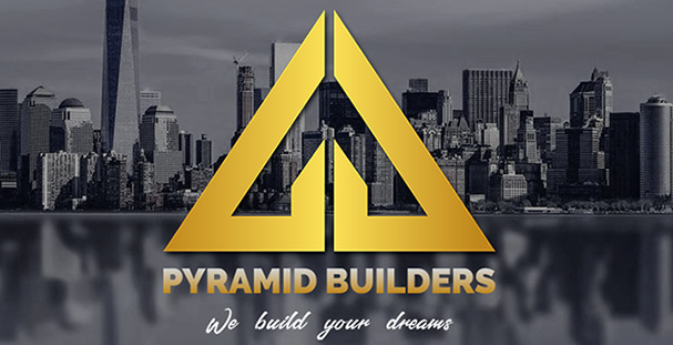
Pyramid Builders feature another simple construction company logo that conforms to the ideals of minimalism. The logo is a simple geometric design featuring a triangular shape meant to depict the outline of a pyramid. The logo refers to the brand’s name, as well as the fact that the triangle is the most stable shape in construction.
General Construction LLC
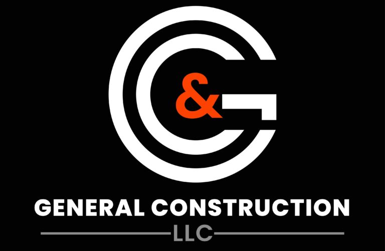
This construction logo opted for a simple wordmark design. The symbol features the stylized initials of the company, over a dark background, meant to mimic a striking bullseye. This is another way to create a logo for those who want simplicity within their designs, by opting out of using any additional imagery and adding style to the letters itself.
ILH Architecture and Design
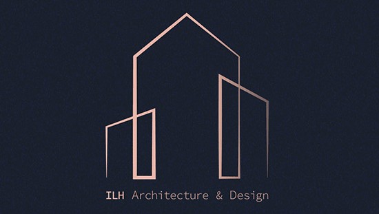
ILH Architecture and Design is a company that is more inclined towards the artistic aspect of the construction business, which is something apparent from their construction company logo. The logo draws a silhouette of a few clustered buildings, using a single stroke. The corners are angled sharp, and the stroke varies in weight throughout the design for an attractive effect.
Intricate Combination Mark Construction Logo Design
Many construction logos go for some sort of intricacy to their design, built around the concept of establishing a strong logo symbol. A construction logo that uses such a design leaves no confusion as to what industry the company belongs to, yet also manages to take their brand icon to another level. Let’s take a look at some of these amazing combination construction logos.
Strepsa Construction
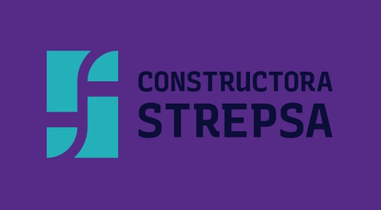
The construction logo for Strepsa Constructora is quite simple, and uses a simple combination logo for its identifier. The wordmark uses a simple, sans serif font in uppercase, and the accompanying design is a simple mix of geometric shapes arranged to form the shape of the letter S using negative space.
Conyco Builders and Contractors
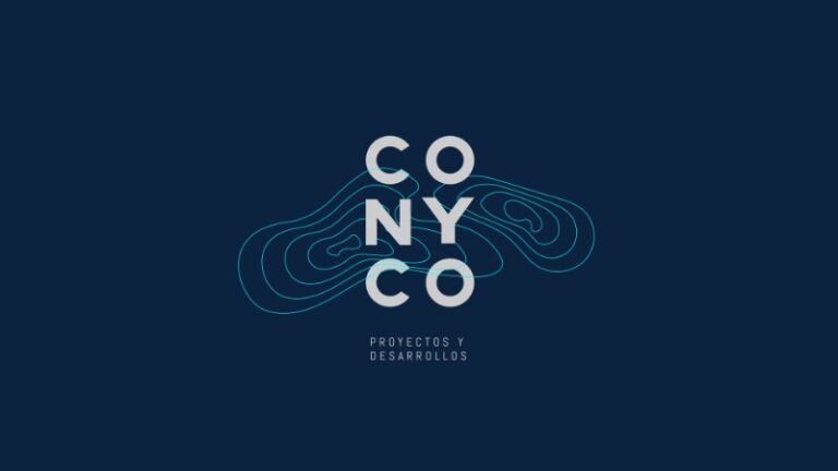
Conyco Builders are experts at constructing on a variety of land types and terrains. As such, their construction company logo’s background depicts a set of concentric circles meant to portray landforms of various elevations that the company molds for its use, a symbol often used in architectural maps. Using a de-structured method to its wordmark, the entire logo is a work of art.
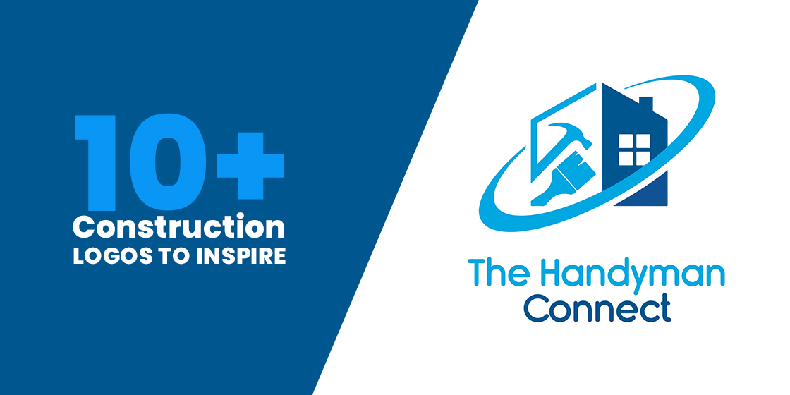
The Handyman Connect
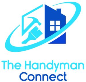
The Handyman Connect is not just a construction company. It does far more than that. Experts in all kinds of residential remodeling, repairs, and construction, their construction logo depicts the general tools necessary for their market, such as a hammer and a paint brush. The logo is simple, yet clear in its message.
Ferry Construction Works
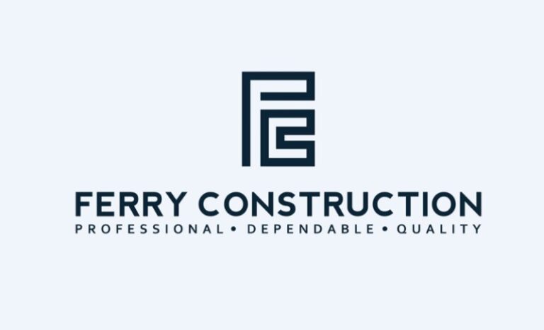
Ferry Constructions uses a simple modified logomark for its construction company logo. The design is a set of two blocky strokes combined in a way to form the company’s initials using the concept of negative spacing. The accompanying wordmark uses a blocky, sans serif typeface to round off the symbol’s design.
Modern Construction Logos with a Sleek Aesthetic
Modern designs aesthetics have changed quite drastically in the last few decades for many industries. The same is true for construction logo ideas as well. Listed below are some interesting modern construction logos representing their respective construction businesses.
DTX Engineering and Construction
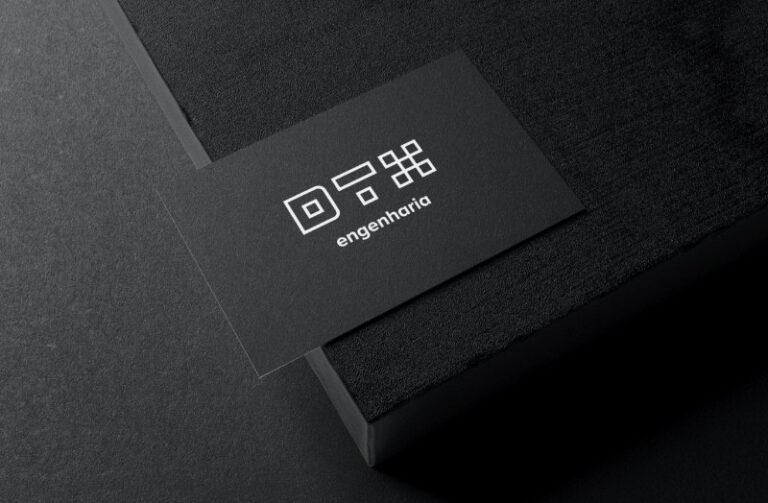
DTX Engineering is a cutting-edge civil engineering firm, which uses an interesting approach to the design of its construction logo. Using a set of quadrilateral shapes, the design spells the company’s name in a unique yet pleasing manner. The simple and clean design is quite prominent surrounded by large amount of empty spaces.
Kudo
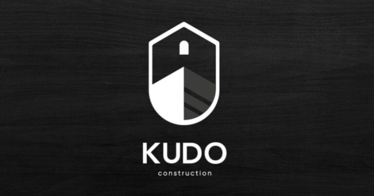
The design for the construction company logo for Kudo Construction is quite different compared to the logos we find in the industry. The image is a three dimensional illustration of a building’s corner. The image is bound within the shape of a shield, and the overall design is a great study in adding depth through contrast.
Martinez Roofingar
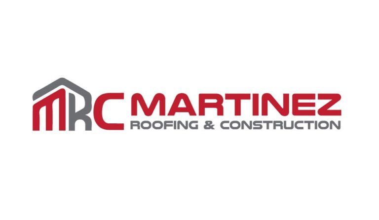
The construction logo for Martinez Roofing and Construction is a great example of an understated design that works well beyond the expected. While at first glance the design may seem simple, the continuation of the stroke of letter R over the M is a subtle nod to the company’s roofing business.
Portofina Constructora
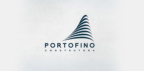
Portofino Constructora’s logo is study in simple design in abstract art. The brand’s construction company logo is made up of concentric curving lines, which when viewed together gives the effect of a stylish building. The simple monochromatic color palette accents the logo design perfectly, emphasizing the details magnificently.
How to Create a Construction Logo for Your Business?

Now that you know the importance and the process of creating an effective construction logo, the next step is to figure out how to design a logo for your business. Generally, you have a couple of options you can use for that purpose.
The first option is to go for an online logo maker tool, such as the Wix logo maker, or Canva. It is often the first option taken by those who do not understand the importance of a strong brand symbol. These tools are designed to help design amateurs and businesses create a variety of brand logos easily, and for quite cheap too. However, the resultant construction logo often looks generic, as it is an amalgamation of various premade design elements put together haphazardly.
There is no denying the quality and personalization that hiring a professional logo designer offers. These experts will combine your brand message with a custom tailored design, and create a unique identifier for your company. And while it may cost more than an AI tool, you will have a higher chance of having a successful construction company logo for your brand.
Therefore, its often recommended that you find a design firm or even a professional freelance logo designer to create your brand symbol for you, even if it costs a bit more.
Frequently Asked Questions
| 1- What is better, a free logo maker or a professional logo designer? Depending on your budget, a professional designer will create far better logos than any AI-based tool. However, if you are in a crunch, then online tools work well too. |
| 2- What kind of fonts do construction logos use? Construction logos often use a variety of masculine fonts, as well as a few elegant typefaces. It depends on the target market and aesthetics of the company. |
| 3- Where can we get a construction logo free? You can look for free construction logo images on online repositories, such as pixabay or freepik. |
| 4- Where can I get inspired to create my own construction names and logos? For logos, there are numerous AI-based tools available online, or you can hire a professional designer. To get inspired for your construction business names, you can find a number of online resources with the specific purpose to help you come up with an attractive company name. |
| 5- How do I create a construction logo? In order to create your custom construction logo, you need to start by researching your competition before having a rough idea of how you want your logo to look. Then, you need to hire a professional logo designer, whether a freelancer or a branding agency, to create a logo that both adheres to your desired logo, and your consumers’ expectations. |
| 6- What are the best colors for construction company logos? Some of the most common colors you will see in construction logos for contractors are shades of dark blue, including navy blue, as well as bright yellow. The blue establishes trustworthiness, while yellow adds a sense of energy to the design. |
Conclusion
Understanding the importance of a strong construction logo is necessary, but you also need to be inspired when creating your own brand symbol. The examples listed above are some of the most unique and successful construction logos for contractors in the industry, and have proven their worth in the market.
Want to create you’re a logo for your construction business? We can help you with that. Logo Poppin has an ace design team, which is skilled in creating brand symbols that resonate well with your target audience. So why wait?
Latest news you want to know!
Subscribe for cutting-edge design inspiration at Logo Poppin! Elevate your brand with updates on logos, branding, web design, and video animation.
Note that by clicking “subscribe,” users may agree to our privacy policy and consent to Logo Poppin to use your contact data for newsletter purposes.
Logopoppin
Logopoppin is a graphic design agency that specializes in logo designing, web development, video production and advanced branding services. We love to innovate businesses with new age technologies, allowing them to improve their visual reputation.