TL;DR: Cool logos are more than eye candy. They’re built on clever ideas, hidden meanings, and timeless design principles. This post breaks down 25 of the best cool logos in the world, covering famous brands, gaming titles, and YouTube creators, and explains what makes each one actually work. If you want to create a logo people remember, you’ll find the blueprint right here.
Your logo has about one second to make an impression.
That’s not a guess. Research consistently shows that the brain processes visual information far faster than text, and first impressions form in milliseconds. The logos that stick are the ones that use that narrow window wisely.
But most logos don’t. They’re generic, forgettable, or so packed with detail they fall apart at small sizes. The cool logos we cover today are different. They’re built with purpose, packed with meaning, and designed to work on any surface or screen.
In this guide, we’ll walk through 25 of the coolest logos ever created, explain why each one works, and give you a clear framework for building your own standout brand symbol. Let’s get into it.
What Makes a Logo Actually Cool?
A cool logo is simple enough to recognize in a second, distinct enough to own in your market, and meaningful enough to work without color. The best cool logos combine clever design, hidden storytelling, and timeless versatility.
Not every good-looking logo qualifies as cool. Cool is earned through intent. Here’s what separates the best from the rest:
- Simplicity with purpose — every element earns its place
- Hidden meaning — a story people discover and share
- Versatility — sharp on a billboard, favicon, and business card alike
- Timelessness — it won’t look dated in five years
- Instant recognition — you know the brand before you read the name
According to VistaPrint’s logo design principles guide, the strongest logos work in black and white first. Color and effects are bonuses, not the foundation. That’s a great test to apply when judging any design.
Want to go deeper on the fundamentals? Our guide to the principles of design covers the visual building blocks behind great logo work.
Famous Cool Logos with Hidden Meanings
These are the logos that have made it into the cultural conversation. Most people see them every day without knowing what’s really going on underneath.
Apple

The bitten apple is one of the most recognized marks on Earth. While many believe the “bite” was a deliberate play on the computer term “byte,” the reality is more practical. The logo’s designer, Rob Janoff, added the bite to provide scale — ensuring that even when the logo was shrunk down, it looked like an apple and not a cherry. The “byte” pun was a brilliant coincidence that the tech world (and the brand) embraced later, proving that sometimes the best brand stories happen naturally.
Want to see how the design evolved? Check out our full Apple logo history breakdown.
Amazon

The yellow arrow under Amazon’s wordmark does double duty. It stretches from the letter A to the letter Z, suggesting the brand sells everything from A to Z. At the same time, the curve of the arrow forms a smile, representing customer satisfaction.
Two meanings. One shape. Zero extra design clutter. That’s cool logo design at its best.
Sony Vaio

The Vaio logo looks like four stylized letters. But it’s actually a visual metaphor for the brand’s core technology. The letters V and A are shaped to mimic an analog wave. The I and O represent digital binary code (1 and 0).
Together, the wordmark shows the conversion of analog signals to digital, the exact technology that made modern computing possible. It’s brilliant, and almost nobody knows it’s there.
Tostitos

Look at the two T’s in the middle of the Tostitos wordmark. They’re not just letters. They form the shape of two people sharing a tortilla chip over a bowl of salsa (the dot of the lowercase i).
The logo captures the entire brand experience, sharing food with friends, in a single graphic. It’s a perfect example of meaning embedded where you’d least expect to find it.
We cover more of these types of designs in our negative space logo guide.
Simple Cool Logo Designs That Prove Less Is More
The best simple cool logos are memorable because of what they leave out, not what they include. Negative space, dual meanings, and clean geometry all create intrigue without adding visual noise.
Simple doesn’t mean boring. Some of the most iconic logos on the planet are built from a single shape or letter. Here are standout examples.
Beats by Dre
Beats by Dre are a brand of speakers and headphones which were designed by collaborating with popular music producer and rapper Dr. Dre. Today, they are considered status symbols and a cultural icon, with many celebrities and athletes often sported wearing a pair of Beats headphones when working out.
The logo for the brand is truly great. What makes it one of the cool logos is the fact that it is designed to look like the shape of the headphone itself, with the letter B mimicking the side profile of the brand’s headphones.
Nike Swoosh

Designed by graphic design student Carolyn Davidson in 1971 for just $35, the Nike swoosh is the gold standard of simple cool logos. The design was a functional response to a brief for “motion” — created to look fast and fluid on the side of a shoe, providing a sharp contrast to the static “three stripes” of the competition. Phil Knight famously wasn’t sold at first, telling Davidson “I don’t love it, but maybe it will grow on me.” It’s proof that a great concept doesn’t need complexity — or immediate approval — to be powerful.
Toblerone
The Toblerone wordmark is bold, immediately recognizable, and deceptively simple — uppercase letters in striking red with a gold outline that gives it a premium, classic feel. But the brand’s most famous design secret lives on the packaging: hidden inside the mountain silhouette is a bear, a nod to Bern, Switzerland, where Theodor Tobler founded the brand in 1908. Bern is known as the ‘City of Bears,’ and its coat of arms features the animal.
The mountain itself changed in 2023 — the iconic Matterhorn was replaced with a more generic peak after production partially shifted to Slovakia, falling foul of Switzerland’s “Swissness” laws. But the hidden bear was deliberately kept. The wordmark stays the same. The secret endures.
Baskin Robbins
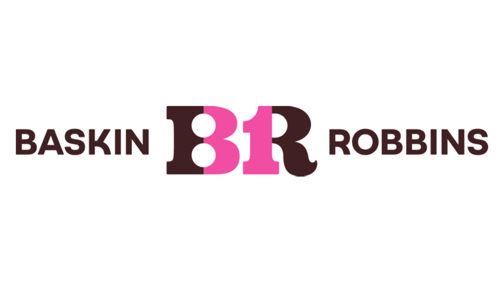
The pink portions of the B and R letterforms in the Baskin Robbins logo form the number 31, representing their famous 31 flavors. It’s baked right into the wordmark. Most customers walk past it every day without seeing it.
That’s what a well-placed hidden detail does. It rewards the curious without confusing everyone else.
For more examples like this, see our post on abstract logo design.
NBC

The NBC peacock might seem like a random choice for a television network. But there’s a sharp reason behind it. When the original peacock logo was introduced in 1956 — designed by John J. Graham and Herb Lubalin of Sudler & Hennessey — color TV was the big new thing and NBC’s parent company RCA was selling color television sets.
The rainbow-colored tail was designed to make black-and-white TV owners feel like they were missing out. The original peacock had eleven feathers. In 1980, NBC commissioned the design firm Chermayeff & Geismar to create a new identity, and designer Steff Geissbühler simplified the peacock down to six feathers — each representing one of NBC’s six divisions at the time. The peacock’s head was also flipped to face right, symbolizing the network looking toward the future. However, NBC held off on launching the new design until May 1986, timing the rollout with the network’s return to the #1 spot in ratings and its 60th anniversary celebration.
FedEx

At first glance, it’s bold orange and purple text. Look closer at the gap between the E and the X. There’s a white arrow hiding in the negative space.
That arrow was designed by Lindon Leader in 1994 and has since won over 40 design awards. It signals speed, precision, and forward momentum, everything a logistics brand needs to communicate, without a single extra graphic element.
The lesson: sometimes the most powerful design element is the space you leave empty.
Cool Logos for Gaming Titles
Gaming logos have a unique challenge. They need to feel energetic and bold while also holding up across merch, screens, and streaming overlays. The best gaming logos become cultural symbols on their own.
Street Fighter
The Street Fighter logo is a masterclass in era-defining design. The fire-textured letterforms, sharp angles, and high-contrast palette scream action and competition. It’s a logo built for the arcade era that still holds up today.
What makes it cool: it perfectly mirrors the energy of the game. You know it’s an intense fighting title before you read a single word.
Grand Theft Auto
The GTA wordmark is deceptively simple. Bold, condensed letters in a high-contrast block style. But the cultural weight behind it is enormous. The logo has become synonymous with the open-world genre it helped create.
This is a great example of a logo that gains its cool factor from context and consistency, used the same way across every game in the series for decades.
Assassin’s Creed
The Assassin’s Creed logo layers an angular wordmark over the translucent eagle symbol of the Assassin Brotherhood. The translucency is clever: it suggests secrecy and depth without making the design cluttered.
The symbol works independently as a brand icon, which is why you see it on everything from hoodies to phone cases. A logo that becomes wearable is a logo that’s doing its job.
Halo
The Halo wordmark uses a custom typeface with a glowing ring integrated into the design, a direct reference to the Halo installations in the game. It’s functional as a logo and deeply connected to the lore.
Want to explore more designs in this space? Our gaming logos guide covers the full landscape.
Cool Logos for YouTube Channels
YouTube channel logos live in a tiny circle at the top of every video. That means they need to be instantly readable, bold, and memorable at very small sizes. The best YouTuber logos are simple icons that double as personal brand marks.
PewDiePie
PewDiePie’s logo is a red background with abstract black marks. It doesn’t describe his content. But it doesn’t need to. After years of consistent use, those abstract lines have become one of the most recognizable marks on the platform.
The takeaway: consistency builds recognition. You don’t have to explain your logo, you just have to stick with it.
JackSepticEye
The JackSepticEye logo is a literal interpretation of his channel name: a cartoonish, oversized infected eye. It’s slightly gross, immediately memorable, and perfectly matched to his loud, comedic personality.
Great YouTube logos align with the creator’s personality, not just their content. This one does both.
Markiplier
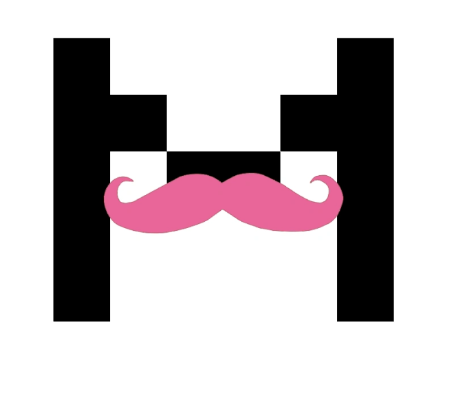
Markiplier’s logo uses a pixelated letter M with his signature pink moustache. The pixel aesthetic references gaming, his primary content category. The moustache is a recurring personal brand element.
Together, they make a logo that says ‘gaming creator with a sense of humor’ without a single word of copy.
Looking for YouTube logo inspiration? See our channel logo ideas roundup.
8 More Cool Company Logos Worth Knowing
Here are eight additional logos that deserve a spot on any list of the coolest designs in the world.
Cisco

At first glance, Cisco’s blue lines look like a simple digital signal or frequency. However, they serve a dual purpose: they also represent the Golden Gate Bridge. It’s a proud nod to the company’s roots in San Francisco (the name “Cisco” is actually taken from the end of the city’s name). It’s a perfect example of using simple geometry to tell a story of both “connection” and “location.”
Amazon (Smile)
We covered the A-to-Z meaning above. But there’s a second layer: the arrow forms a dimpled smile. Amazon wants you to associate their brand with happiness every time you see the logo. It’s emotional branding built into the letterforms.
Adidas
The three Adidas stripes are one of the most recognized marks in sports. The mountain shape they form represents obstacles and the challenge of athletics. Simple, repeatable, and globally understood.
Goodwill
Goodwill’s lowercase g doubles as a smiling face. The design was created in 1968 and communicates warmth, community, and positivity without any illustration beyond the letter itself.
Tesla
Tesla’s T logo looks sleek and futuristic, but it’s more than just a stylized letter. According to Elon Musk, the “T” represents a cross-section of an electric motor. The main body of the T represents one of the poles that sticks out of a motor’s rotor, with the second line on top representing a section of the stator. It’s a deep-tech “Easter egg” hidden in plain sight.
Tour de France
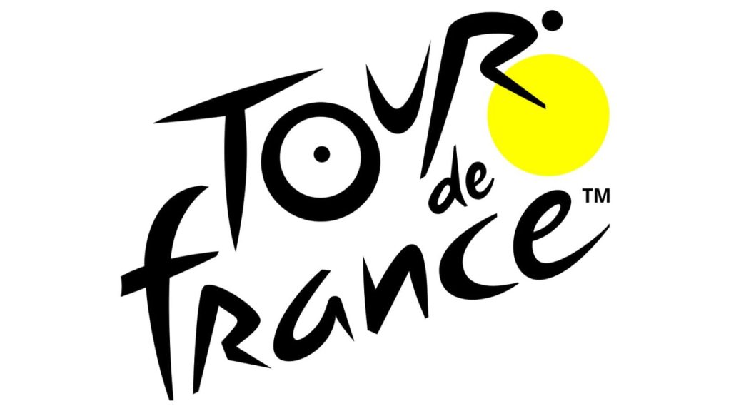
The Tour de France logo, designed by Joel Guenoun in 2002, hides a cyclist within the typography. The letters O, U, and R in the word “Tour” combine with the yellow circle to form the silhouette of a rider on a bicycle. The O suggests the rear wheel, the U forms the saddle and body, and the R depicts the rider leaning forward over the handlebars.
The yellow circle doubles as the front wheel and a reference to the iconic yellow jersey (maillot jaune) awarded to the race leader each day. It’s a complete figure hidden in plain sight inside the wordmark.
Carrefour
The French supermarket chain’s logo features two arrows pointing in opposite directions (representing an intersection, which is what ‘Carrefour’ means in French). Look at the negative space between them and you’ll see a hidden letter C.
LG
LG’s logo looks like a face when you study it. The L becomes a nose, and the G forms the rest of the expression. In 2023, the brand refreshed the design — flattening it, dropping the circular border, and brightening the red — but the friendly face at the heart of it remains. It’s subtle, human, and makes the brand feel approachable without any additional illustration.
Check out our deep dives on minimalist logos and wordmark logo design for more examples like these.
How to Make a Cool Logo for Your Brand
The process for creating a cool logo starts with brand research, moves through competitor analysis, and lands on a concept that’s simple enough to work at any size and meaningful enough to tell a story.
Here’s the step-by-step framework the best logo designers use:
- Define your brand’s core idea. What’s the one thing you want people to feel when they see your logo? Speed? Trust? Creativity? Innovation? Start there.
- Study the competition. Not to copy them, but to see what’s already been done. You need to be different, not just better.
- Choose your logo type. Wordmark, lettermark, logomark, mascot, emblem, combination mark, or abstract symbol? Each type suits different brands differently.
- Keep it simple. If it doesn’t work in black and white at 32px, it’s not finished.
- Test it everywhere. Business card. Website header. T-shirt. Social profile picture. Does it hold up?
According to HubSpot’s logo design tips, the best test is to put your logo on a page with eight competitors and show it to people for 30 seconds. Can they recall it afterward? That’s your benchmark.
For a complete walkthrough, our guide on how to design a logo for beginners covers every stage of the process with real examples.
What Are the 7 Types of Logos?
The seven logo types are: wordmarks, lettermarks, logomarks (symbols), abstract logos, mascots, emblems, and combination marks. Each suits different brand needs, and choosing the right type is the first step toward a cool, effective design.
- Wordmarks — full brand name in a custom typeface (Google, Coca-Cola, FedEx)
- Lettermarks — initials only (IBM, HBO, NASA)
- Logomarks — icon or symbol only (Apple, Nike, Twitter)
- Abstract logos — geometric shapes with no literal meaning (Pepsi, Adidas)
- Mascot logos — illustrated characters (KFC’s Colonel, Michelin Man)
- Emblem logos — badge-style designs (Harley Davidson, Starbucks)
- Combination marks — icon plus text together (Burger King, Lacoste)
See our full types of logos guide for deeper examples of each category.
Finding the Right Logo for Your Brand
The cool logos in this guide didn’t happen by accident. Every one of them is the result of a clear brand concept, a skilled designer, and a willingness to strip away everything that wasn’t essential.
The hidden meanings aren’t gimmicks. They’re design decisions made to create intrigue, deepen brand identity, and give people something to talk about. When someone discovers the arrow in the FedEx logo or the people sharing chips in Tostitos, they remember the brand differently.
That’s the power of a truly cool logo. It works on multiple levels at once.
Whether you’re starting from scratch or refreshing an existing mark, Logo Poppin’s design team creates brand symbols built to last. Take what you’ve learned here and apply it, or let us build something remarkable for you.
Frequently Asked Questions
| What are the coolest logos of all time? The coolest logos of all time include Nike, Apple, FedEx, Amazon, and the Tour de France logo. What makes them cool isn’t just their visual design but the clever ideas and hidden meanings built into each one. Nike’s swoosh suggests motion with zero complexity. FedEx hides an arrow in negative space. Amazon’s arrow goes from A to Z while forming a smile. These logos work on multiple levels at once, which is why they’ve stood the test of time. |
| How do you make a cool logo? To make a cool logo, start by identifying the core idea or feeling your brand should communicate. Then choose a logo type that suits your brand (wordmark, symbol, combination mark, etc.) and strip the design down to its simplest, most essential elements. Test the logo in black and white and at small sizes before adding color. If it works at a 32-pixel favicon, it’s on the right track. Consider adding a hidden element or dual meaning to give people something to discover. |
| What makes a logo look professional and cool? A logo looks professional and cool when it balances simplicity with meaning. It should use a clear, limited color palette, work at any size, and align with the personality of the brand it represents. Avoid trendy effects that will date the design in a few years. The best logos feel timeless and intentional, not decorated or complicated. According to VistaPrint, if your logo still works in black and white, you’ve got a strong foundation. |
| What are good cool logos to draw? Some of the best cool logos to draw are the Nike swoosh, the Apple silhouette, the Beats b mark, and the FedEx wordmark (including the negative space arrow). These are great for practicing because they look simple but require precision to pull off correctly. Drawing famous logos is an excellent exercise for understanding proportion, spacing, and the principles of effective design. You can also try logos like the Tostitos T’s once you know what you’re looking for. |
| What is the difference between a cool logo and a good logo? A good logo is functional: it’s clear, versatile, and represents the brand accurately. A cool logo does all of that and adds something extra, an unexpected concept, a hidden meaning, or a design choice that makes people stop and look twice. All cool logos are good logos, but not all good logos are cool. Cool comes from the idea behind the design, not just the execution. |

Logopoppin
Logopoppin is a graphic design agency that specializes in logo designing, web development, video production and advanced branding services. We love to innovate businesses with new age technologies, allowing them to improve their visual reputation.

