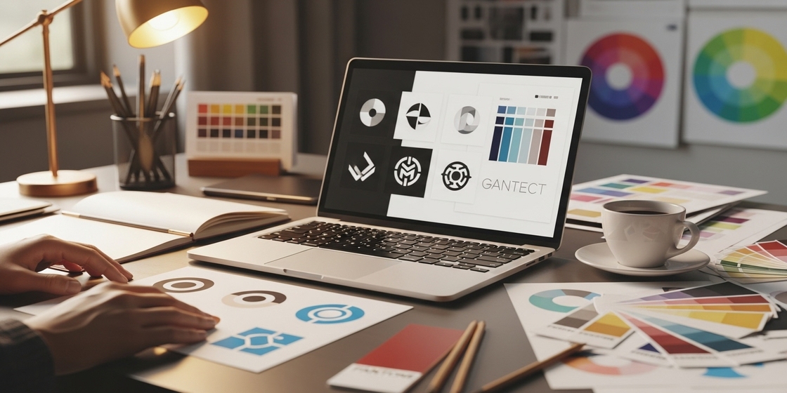
A logo is more than just a design; it’s the face of your brand. When designed well, it tells people who you are and what your business stands for, helping you make a strong first impression and build trust.
Just as a good logo strengthens brand identity, well-designed packaging does too. It reflects your brand’s style and colors while making your products look more valuable.
Learning how to design a logo that reflects your brand’s identity helps your business appear professional and memorable. And just like that, different packaging ideas can reinforce your brand every time customers see your packaging.
What Makes a Logo Reflect Brand Identity?
A great logo reflects your brand’s values and style. It connects with your audience and gives your business a consistent look across your website, marketing materials, and even your branded boxes.
Your Logo Should Be:
- Simple
- Unique
- Versatile
- Relevant
A logo helps build trust and recognition, making your brand look professional and memorable.
Step-by-Step Guide to Designing a Logo
1. Define Your Brand Identity
Before you start sketching or choosing colours, understand your brand first.
Ask yourself:
- What does my brand stand for?
- Who is my audience?
- What emotions do I want to evoke?
For example, a skincare brand might focus on purity and calmness, while a tech company might highlight innovation and speed. Your logo should reflect this feeling.
2. Find Inspiration
Look at logos in your industry to see what works. You can gather ideas from:
- Pinterest or Behance
- Brand design websites
- Everyday products and custom packaging
Collect designs that match your brand’s style: modern, elegant, playful, or minimal. This mood board will guide your direction.
3. Determine the Type of Logo
There are several types of logo designs. Choose the one that best fits your brand personality.
- Emblem: A symbol or crest that feels traditional (e.g., Starbucks)
- Wordmark: Uses your brand name in a creative font (e.g., Google)
- Letterform: Focuses on a single letter (e.g., McDonald’s “M”)
- Monogram: Uses brand initials (e.g., HBO)
- Abstract: A unique shape or symbol that represents your brand (e.g., Nike swoosh)
- Combination: Mix of text and symbol (e.g., Adidas)
Each type communicates differently; a wordmark looks clean and direct, while an emblem adds a classic, detailed feel.
4. Choose Your Colour Palette and Font
Your colours and typography should support your brand story.
Understanding Colour Principles
Two key principles guide colour selection: colour theory and colour psychology.
Colour theory focuses on how colours interact to create balance and contrast in design. Colour psychology explores how colours influence emotions. For instance, brown in the UPS logo conveys trust and reliability, aligning with its brand promise.
Selecting Typography
When choosing fonts, pick one that matches your tone. Choose bold for modern brands, serif for classic ones, or handwritten for creative ones. Keep it readable and balanced.
5. Design Initial Iteration
Once you’ve finalised your colours and fonts, then comes shapes and structure.
Outline Shapes
Shapes play a big role in how your logo feels.
- Geometric shapes like circles, squares, and triangles give a clean and balanced look
- Organic shapes with soft curves and lines add a sense of motion and creativity
- Abstract shapes mix different forms to create something unique that reflects your brand’s personality
For example, Dropbox uses simple geometric shapes to represent order and trust, while Nike’s swoosh uses an abstract shape to express movement and energy.
Create Mockups
Next, turn your ideas into mockups. Focus on:
- White space: Keep enough space so your logo doesn’t feel crowded
- Visual hierarchy: Use contrast and layout to highlight key elements
- Alignment: Keep elements balanced and aligned for a professional, polished look
This step helps you visualise how your logo will appear on everything, from your website to your custom packaging.
6. Test and Refine
Conduct Test and Feedback
Getting feedback from your team and audience is an important step in perfecting your logo design. Start by asking for team feedback through quick reviews; your teammates can help spot design issues or improvements you might have missed.
You can also conduct A/B testing by showing different logo versions to a small group of customers. Their responses will help you see which design connects best with your audience and truly reflects your brand identity.
Finalise Your Logo
After testing, finalise your logo design. Export it in multiple formats (PNG, SVG, PDF) for print and online use.
Keep a style guide to define logo colours, font, and placement rules. This keeps your brand consistent everywhere.
Why Custom Packaging Also Defines Brand Identity
While your logo sets the first impression, your packaging strengthens it. When customers receive custom packaging, they instantly connect with your brand.
Just like your logo, packaging design should use your brand colours, fonts, and style. This makes every product unboxing experience memorable and consistent.
Conclusion
Designing a logo that reflects your brand’s identity takes creativity and consistency. By understanding your brand and choosing the right logo type, colours, and typography, you can create a design that truly represents your business.
Pair it with custom boxes and smart packaging design to create a full brand experience that customers recognise and remember.


