
Table of Content
Discover the Evolutionary Journey of the Dallas Cowboys Logo, a True Texan Icon
If you have lived in Texas, visited the state, or known a Texan, you would’ve surely heard the phrase “Texas Pride”. There is no doubt that people all over the country are big fans of their home city or state, but they’ve got nothing on the Texans.
Texas is also known as the Lone Star State, a moniker that it has proudly stuck to since its days as an independent republic in the early 1800s. It’s a symbol of pride for the locals that signifies the struggles of their ancestors in fighting for freedom from Mexico. So integral to the Texas identity is this name, that the Texan flag has a single star on it as well.
And that’s where the Dallas Cowboys logo comes in. Now, for many people who do not know much about the state, the city they often associate with it is Houston. However, when we talk about the NFL, its Dallas that represents the state and its history properly.
So how is it that the Dallas Cowboys have managed to incorporate the defining symbol for Texas into their logo? How does it allow them to represent both their city, and their state in a subtle yet comprehensive manner?
Let’s read on and discover how a professional sports team like the Cowboys can utilize the expertise of a logo design company in building a simple brand symbol that connects well with your audience.
History of the Dallas Cowboys & How They Became the Lone Star State’s Representative
Before we begin to study the Dallas Cowboys logo, let’s take a gander at the history of the franchise, and the achievements that gave it the nickname “America’s Team”.
The Cowboys are a pro-football team that plays in the NFL. Based in the Dallas – Fort Worth area, the franchise became a part of the league in 1960, when the city was offered a franchise. Over the years it has become one of the few teams, alongside the Pittsburg Steelers, to have a national following rather than just a local one.
Since its inception, the team has reached the Super Bowl in eight different seasons, which ties them for second highest number of appearances with the Steelers and the Broncos, with the Patriots having the highest number of appearances with 11.
The Dallas Cowboys have won the Super Bowl five times, tying for third place for most Super Bowl wins. Moreover, they are the only team in the entire history of the NFL that has posted 20 winning seasons, only missing the playoffs twice in that entire era between 1966 to 1985.
The team is so popular across the United States, that in 2015 they became the most valuable sports team in the world according to Forbes, being valued at $4 billion. That came at the heel of the Cowboys recording a record-high revenue of $620 million for the 2014 season for any US sports team.
And keeping up with the trend, they also became the first NFL team to be valued at $8 billion in 2022, making the Forbes list for the highest valued NFL team for the 14th year in a row. Moreover, they also became the first team to earn $1 billion in revenue, bringing in nearly twice the amount of money of the next highest valued NFL team.
The franchise has also been affiliated with some big names, people who are responsible for changing the NFL into the giant we see today. The most important of these figures is Tex Schramm, who was the original president and GM of the Dallas Cowboys when they were formed in 1960.
Besides being instrumental in the bringing about the golden era of the Cowboys, he also had a hand in many of NFL’s policies today, including instant replay, 30-second clock between plays, referee mics, headsets in QB helmets, and a whole lot more.
A Look at the Modern Cowboys Logo
If we look at the Dallas Cowboys logo, the design is a somewhat simple star and a wild-west style wordmark. In essence, it may seem quite plain, just like the Green Bay Packers logo of today. However, there is a deep meaning behind it. When the team was formed in 1960, they looked to finding the perfect logo symbols that would represent the city and the state well. And the one they finalized was the one we see above.
The single, solitary star we see above is a symbol that represents the heart of Texas. The lone star is a simple design, but it holds within it all that makes Texas so special. And with all that sentiment inside its simplistic shape, its no wonder that the Texans adopted the Cowboys as their true state team.
The navy blue color pays homage to the rich military history of the Dallas – Fort Worth area, and the star represents Texas. Thus they were able to combine the essence of both the city and the state into a single, minimalist design.
The wordmark logo is quite interesting though. If you have looked at old westerns, you will see that they employed a similar style of writing, which brings the idea behind their name “The Cowboys” to the forefront. This style of writing always brings to mind canvas-shod cowboys on horses, galloping around in the flying dust rounding up large herds of cattle. And as the state is known for its cattle and horse ranches, the font choice is not a bad one.
Evolution of the Dallas Cowboys Logo Through the Years
Now that we have discussed the history and significance of the Cowboys team, and taken an-depth look at the current Dallas Cowboys logo, let’s dive in and study the evolution of this brand symbol into its current design.
Now, it’s apparent that there is not much to discuss about the evolution here, as in the previous six decades and change, the logo has changed once, and very slightly at that. However, we will take a look at both iterations individually, and try to discover the reasons why the team felt the need to modify the original design. Moreover, we will be looking at a few different alternative types of logos for the team, and see how well they worked at representing the team.
So, without further ado, let’s take a look at the various shapes the Dallas Cowboys team logo has taken through the decades, and discuss how well they worked at representing the team.
1960 – 1963 Primary Logo for the Cowboys

The first logo for the team was introduced when the franchise was inducted into the NFL in 1960. The initial design featured a simple, five-point star colored a dark navy blue. The design might have seemed too minimalistic to some, but it held a deep meaning to the people of Dallas, and Texas overall.
That was because that star represented the heritage, struggle, and independent will of the state and its resident Texans. And at that time, there was no other team that united the entire state of Texas with its symbol.
Even today, with the Houston Texans being the second team to call the state its home, there is more support for the Cowboys than the Texans. And that too despite the fact that the Texans have incorporated the flag of Texas into their design more comprehensively than the Cowboys.
Anyway, the design of the logo is a flat, five-point star. While it was perfect from the brand symbol perspective, it lacked a bit of aesthetic panache that makes a brand logo timeless. And that was something that the team realized just four seasons into the league, when they looked at some of the other NFL logos.
1964 – Present Primary Dallas Cowboys Logo
Four seasons later, in 1964, the new Dallas Cowboys logo was revealed to the public. The new design was no big departure from the original one. In fact, it essentially built upon the base of the original Cowboys logo, and added a little design flair to it to ensure that the logo looked better than the previous iteration.
Now, instead of a flat navy blue star, the design featured a revamped look. Between the edge of the logo, and the inside of the logo, a thin white band was added, which conformed to the shape of a star, but was a little smaller in size than the original star.
The addition of the white band made the logo look more dynamic. The border-like look of the new logo made it visually more stunning, adding a little contrast for the viewers’ eye to follow. This change subtly enhanced the visual impact of the Cowboys logo, and made it so timeless, that the team hasn’t felt the need to change or tweak it, even five decades later.
On the other hand, with only a decade more of playtime, the Washington Commanders logo has changed ten times. Even if we do not count the last two iterations due to the franchise having to change its name and symbol in 2020, that is still eight different iterations of the logo, in almost as many decades.
Unlike them and many others, the Cowboys have managed to create a logo that is so minimalistic that it has made it timeless, perfect enough to las them a decade or so more at least.
Dallas Cowboys Wordmark Logo
Now that we discussed the primary, or monogram logo design for the Cowboys, let’s discuss the wordmark that often accompanies it.
Taking on the primary logo’s vibe, the wordmark too is quite simple in design. Keeping with the theme of Texas, and borrowing from its rich history as a ranching country and its significance in the old west, the wordmark uses western-style logo fonts.
The visual style of typography is an important element in logo design. Using a comic-style, bubbly font for a corporate business logo would in no way seem suitable, no matter how much you tweak it. These styles act as visual cues for the consumers, adding to the message of the logo.
Take for example, the logo for Barbie. The bright pink color and the sparkly and bubbly font only add to the logo’s visual impact, telling consumers that this is a brand tailored towards little girls. On the other hand, a look at the Cowboys wordmark logo brings to mind a ten-gallon hat and shiny spurs, a billowing canvas duster, a length of rope with a lasso at the end, saddled horse, and a Dirty Harry Special.
Commemorative 40th Anniversary Dallas Cowboys Logo
In 1999, the Cowboys celebrated their 40th anniversary in the NFL. The franchise inaugurated a special commemorative Dallas Cowboys logo for that season that featured multiple design additions to the base star.
First, there is a silver round shape added beneath the star, which had the name of the team in the visible arcs between the top three star points. The arc between the bottom two points featured the tenure of the team, from 1960 – 1999.
The middle of the star had the word “40th” in slight cursive, while the word “Anniversary” was written across the two bottom arms of the star. Spanning across the top three arms was a thin, flowing banner that had the words “Super Bowl Champions” in the middle, and the roman numerals of the Super Bowl championships the team had won.
The banner was the same metallic blue-gray as the round underneath the star. The color combinations used were the same as the primary logo, navy blue and white, accented by the silvery blue-gray.
Significance of the Cowboys Logo & Why It Represent Texas Better Than Houston Texans
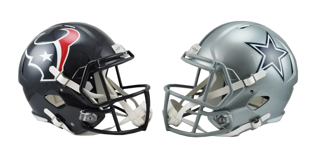
If we talk about the significance of the Cowboys logo compared to the Houston Texans logo, there are some stark differences in symbology. The Texans logo combines its iconic steer’s head imagery, an homage to its history as ranch land, with the colors and pattern of the Texas flag.
On paper, you would think that the Texans logo is a better embodiment of Texas than the Dallas Cowboys logo. However, that is not the case. The Addition of such visible Houston logo design elements like the bull’s head dilutes the essence of the Texas symbology. Which, while in no way inferior as a brand symbol, tends to alienate those not from Houston.
The plain, single star on the Cowboys logo on the other hand, having just the symbol for Texas as the core of its design, tends to speak well for a vast majority of the state. Combined with the time the team has spent representing Texas in the NFL, it is no wonder that the Cowboys have more cultural significance to the state of Texas, than the Houston Texans.
FAQs
| What is the Dallas Cowboys logo? The Dallas Cowboys logo is a single, five-point star colored navy blue with a white band inside the star just before the edges of the entire shape. |
| Why are the Cowboys called America’s team? That is because in 1978, a film narrator for the Cowboys highlight reel said that the team was on TV so much that they were now as recognizable across the US as movie stars and presidents of the US. |
| Who currently owns the Dallas Cowboys? Jerry Jones, arguably the most popular team owner currently on the NFL roster, currently owns the Dallas Cowboys. |
Conclusion
To sum it up, the Dallas Cowboys logo may be the simplest of the NFL team logos on the roster right now. However, despite that, the team and its brand symbol has fans that hail from areas far separated from its home state of Texas.
That is visible in the fact that the franchise’s matches are more often than not sold out, and its televised matches see unexpectedly high viewership numbers every time. Therefore, if you too want to know how to design a logo as simple as the one above, without losing its branding appeal, studying the Cowboys brand symbol is a great place to start.
Latest news you want to know!
Subscribe for cutting-edge design inspiration at Logo Poppin! Elevate your brand with updates on logos, branding, web design, and video animation.
Note that by clicking “subscribe,” users may agree to our privacy policy and consent to Logo Poppin to use your contact data for newsletter purposes.
Logopoppin
Logopoppin is a graphic design agency that specializes in logo designing, web development, video production and advanced branding services. We love to innovate businesses with new age technologies, allowing them to improve their visual reputation.

