
Table of Content
Discover the Inception of the DC Logo and Its Evolution into Its Current Form
People have always loved comics, whether they were published in magazines or newspapers. Even today, comic strips like the “Wizard of Id” and “Garfield” are popular among people, old or young. However, unlike those mini comic strips, the DC Comics logo is one that symbolizes a more nuanced form of this art, for readers looking for something more than a quick laugh.
Now, it is a small wonder that this symbol is so iconic. Along with fierce rival Marvel, DC Comics controls nearly 70% of the comic book market; excluding the graphic novel genre many assume to be similar. But how did it get so big? What was it that made the organization and its logo so memorable in the eyes of its fans? And how has it managed to remain relevant to its fans even after eight decades?
These questions and more will be answered in the article below. We will discover how a small company pioneered an entire subgenre of print media, and managed to evolve into a successful commercial entity that spans several mediums including print, TV, and cinema.
An Overview of DC Comics and How It Came to Be
The post-war era after the First World War was a time for reinventing for many people. Another war veteran, Major Malcolm Wheeler-Nicholson, founded the National Allied Publications in 1934. The first comic book published by the company was in 1935, and it contained a mix of the funnies, westerns, and even adventure tales. And what made their offering so unique was the fact that every one of those comics included in that publication was created specifically for it, rather than being a reprint of collected comic strips.
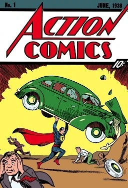
However, due to cash flow problems, the company and its comic rights were sold to recoup the debts incurred by Wheeler-Nicholson. During that time, Detective Comic Incorporated, a company co-owned by Wheeler-Nicholson who was later bought out, was publishing their own series under the anthologies and titles. Their efforts are said to result in a new type of comic protagonist called the superhero, which started with the release of the first comic featuring Superman.
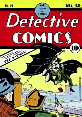
Over the years, the Detective Comics Inc. would be responsible for creating such iconic characters as Batman, Wonder Woman, and more. And in 1940 they started publishing their comics with a small logo badge that read “DC”, short for Detective Comics.
With the introduction of Superman, the company formed the DC-Superman Publications, which would be the case until 1972. That year, the company would start calling itself just DC Comics, now recognized by more characters than simply Superman. And since then, the publishing house has represented itself by just its initials.
Today, DC Comics’ plethora of characters consists of dozens of characters spanning multiple genres, including superheroes, antiheroes, supervillains, sidekicks and more. And unlike Marvel’s characterization which is often quite clear about the lines between good and evil, DC is known for expertly portraying the shades of gray that are more close to real life.
The Evolution of the DC Comics Logo Over the Years
Now, one might think that for a logo as simple as the one sported by DC comics in its earlier days would require the help of a professional logo design agency. However, considering that at the time of its inception there was no distinction between the types of designers, the fact that professional comic artists designed this logo says a lot for its success.
However, since the 70s onwards, it is important to hire a professional logo designer as the competition is very tough, and potentially small things can be the difference between success and failure. Let’s take a look at how the DC Comics logo has evolved to keep up with the times.
Birth of a Legend With the Original DC Comics Logo
Let’s start with the first of the DC Comics logo on our list. The first true symbol revealed by the budding Detective Comics Inc. was a simple round badge made up two rings, with the inner ring displaying the company’s initials, while the outer ring had the words “A Publication”.
The design was simple and to the point, perfect for a new company that wanted to break into the market. A year later, with the introduction of Superman, the wordmark in the outer ring changed to “A Superman Publication”.
In 1949, after Wheeler-Nicholson’s National Comics merged with Detective Comics Inc., the logo was changed again. The two-ring design was kept the same, with the wordmarks inside changed. The inner ring still showed the company’s initials, but now colored solid red. The outer ring now had two separate wordmarks. The first was “Superman”, which was colored red. The other was “National Comics”, colored black.
After 1949, up until the early 1970, the logo was kept the same more or less, with the removal of the outer ring from the logo from 1970 onwards. From 1970-72, the company also used a Superman logo design, which featured a flying superman over a dark circle, with the wordmark “DC Superman” in black over a yellow rectangle.
DC Bullet Logo and the Noir Transformation
The next big design change in the DC Comics logo was in 1976, where the iconic DC Bullet design was released. A stylized bullet with the letters “DC” imprinted on it characterized this logo. The bullet symbolized the dynamic nature of the superhero genre, capturing the essence of action-packed adventures undertaken by the company’s characters. This is similar to how the modern cinematic Justice League logo has a dark and gritty look, to highlight the serious storyline portrayed.
This new design overlapped a period of significant growth and innovation for DC Comics, as it expanded its character universe and introduced new superheroes and villains for its readers. This logo was a major success, as it was used for nearly three decades before being replaced by another great icon.
A Bold Entry into the 21st Century with the DC Comics Spin Logo
With the era after Y2K ushering in a new age of 21st century graphics aesthetics, the DC Comics logo was also due a much-needed refresh. And the company delivered. In 2005, DC Comics unveiled a new logo design, commonly called the DC spin.
This logo featured the letters “DC” enclosed within a tilted circle that went through the wordmark, with a stylized motion effect applied to the circle. This design aimed to represent the ever-revolving nature of the DC Universe, where stories and characters were constantly evolving and growing. The dynamic and unique visuals of the logo represented DC’s commitment to staying relevant and guiding readers into the modern age.
This is also when DC redesigned the symbols for many of their characters, including the Fantastic Four logo.
A Promise of Something New with the DC Peel Design
Keeping with the vein of ever-revolving nature and keeping themselves relevant, DC realized that the design world and the consumer aesthetics were evolving far quicker in this new era. And with Marvel successfully making an multi-billion dollar empire in the cinematic industry, which was boosting both comic and merchandise sales, DC understood that they needed another refresh.
In 2012, DC Comics introduced another logo iteration known as the DC peel. This logo retained the circular aesthetic of its predecessor but added a unique twist to it. The DC Comics logo design now had a distinctive peel effect to the letter “D”, which exposed the letter “C” under it.
This design element conveyed a sense of unveiling, hinting at the excitement and anticipation readers experience when diving into a new DC comic. The peel effect also symbolized the layers and complexity of the DC Universe, inviting fans to explore the vast depths of its stories. This also hinted at the far richer and more complex DC animated universe, which is much more extensive than Marvel’s cinematic universe.
This time also saw designs like the Nightwing logo change to appeal to the younger audience who connected better with characters they grew up with, rather than the ones from the golden age.
A Modern Take on Something Classic with the Modern DC Comics Logo
Finally, we come to the logo we know today. The subtle yet highly expressive blue symbol we see in all of DC’s holdings, whether it’s the comics division or DC Studios. This design is the perfect example of unifying and centralizing a brand identity across multiple projects, an important element to establish a strong brand identity.
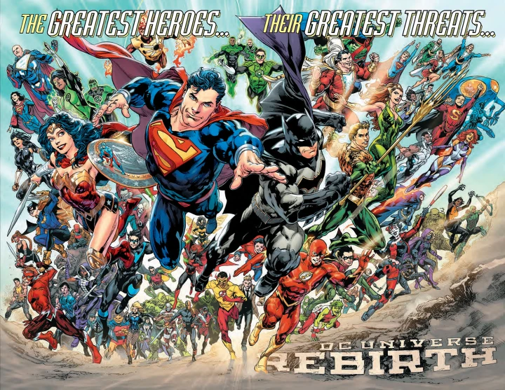
In 2016, DC Comics underwent a massive rebranding with the “Rebirth” initiative. Alongside this character and storyline, came a new logo that paid homage to the classic DC bullet while incorporating a fresh and modern aesthetic. The logo features a streamlined, simplified bullet design with the letters “DC” placed within it.
The color scheme also underwent a change, with the logo primarily colored in blue against a white background, showcasing a bold and sleek look. This redesign sought to bridge the gap between DC Comics’ illustrious history and its future endeavors, bringing in the new era of DC Universe. This simplicity in design was also carried over to their character designs as well, resulting in a simpler and more aesthetically pleasing revamps like the new Wonder Woman logo.
The Symbolic Impact of the DC Comics Logo and its Importance
As one of the earliest comic book purveyors of the superhero genre, the DC Comics logo holds a deep and significant place among the hearts of its fans. It represents a world of extraordinary superheroes, superpowers, and larger-than-life adventures.
They have a character for everyone. If you are the idealist, then you have the quintessential Boy Scout characters like Superman and Shazam. However, if you believe that the world is more shades of gray than just black and white, then you have the characters like Batman, Daredevil, and more. If empowered females are more to your liking, how about Wonder Woman, arguably the first female superhero. This shows how DC has a direct line to their fans’ heartbeat.
Each logo iteration reflects the company’s evolution, from its humble beginnings to its status as an industry leader. The designs embody the spirit of constant reinvention and innovation that keeps DC Comics relevant and captivating for generations.
Moreover, the DC Comics superhero logo serves as a powerful brand identity. It evokes a sense of trust, reliability, and quality among fans and potential readers. The familiarity and recognition of the logo draw readers into the world of DC Comics, where they can immerse themselves in epic battles, intricate storylines, and unforgettable characters.
Furthermore, the evolution of the company logo reflects the changing landscape of the comic book industry. With each redesign, such as in the case of DC Rebirth, DC Comics has demonstrated its adaptability and willingness to embrace new trends and technologies. The logos have mirrored the company’s commitment to staying fresh and engaging, catering to the fickle tastes of comic book enthusiasts.
In this digital age, the company symbol has transcended its traditional role and has become a vital component of online marketing and branding strategies. The logo is optimized for various digital platforms, ensuring its visibility and impact in the vast realm of the internet. From websites to social media profiles, the logo’s consistent presence strengthens the company’s online presence and helps foster a sense of community among fans.
FAQs
| What does the DC Comics logo mean? The DC in the logo represents Detective Comics, which was also Batman’s debut title. Incidentally, that is also the reason that Batman is considered the best detectives alive in the DC universe. |
| How long has DC Comics been producing comic books? DC has been publishing comics for over eight decades as of the 2020s. |
| Who was DC’s first superhero? The first superhero introduced by DC was Superman, introduced in late 1938. |
| Who was first – Marvel or DC? DC traces its origins to the early 1930s, while Marvel’s origins begin in the late 1930s. So DC predates Marvel by a few years at most. |
Related Superhero Logos for Inspiration:
Conclusion
To sum it up, the DC Comics logo has an impact that transcends the traditional role of a brand symbol. When it comes to media or publishing company logos that have their fans emotionally invested in their offerings, it is inevitable that modifying the logo becomes that much more a challenge. This is also the case for the Superman or Batman logo, which have seen only slight modifications rather than mainstream revamps over the years.
However, as you can see, DC has managed to do it for over eight decades now. They are a prime example of how to evolve and change your brand identity as the brand itself evolves and grows.
Latest news you want to know!
Subscribe for cutting-edge design inspiration at Logo Poppin! Elevate your brand with updates on logos, branding, web design, and video animation.
Note that by clicking “subscribe,” users may agree to our privacy policy and consent to Logo Poppin to use your contact data for newsletter purposes.
Logopoppin
Logopoppin is a graphic design agency that specializes in logo designing, web development, video production and advanced branding services. We love to innovate businesses with new age technologies, allowing them to improve their visual reputation.

