
Table of Content
Discover How the Dell Logo Has Turned Itself Into An Iconic Tech Brand Symbol
The Dell logo, a simple yet instantly recognizable blue oval enclosing the company’s name at a distinctive slant, has become a ubiquitous symbol in the world of personal computing and technology. More than just a visual identifier, this logo represents the journey of a company that revolutionized the way computers were bought and sold, growing from a dorm-room startup to a global tech behemoth.
The evolution of the Dell logo mirrors the company’s own trajectory, reflecting its changing identity, its commitment to innovation, and its enduring presence in a rapidly transforming industry. Understanding the visual history of the Dell brand provides a fascinating insight into the strategic decisions and design philosophies that have contributed to its enduring recognition and powerful market presence.
The eventual adoption of the slanted “E” within the oval became a defining characteristic of the logo we know today, symbolizing the company’s direct-to-consumer model and its commitment to efficiency. Exploring these iterations reveals the aesthetic changes and their underlying strategic considerations that helped solidify Dell’s brand identity and its position as a leading force in the technology sector. Let’s take a look at it from the practiced perspective of a logo design agency and see how we can incorporate the same timeless elegance into other logos.
History of Dell – A Brief Look At Its Journey Into Becoming a Personal Computing Giant
The story of Dell Technologies began in 1984 in a dormitory room at the University of Texas at Austin, where Michael Dell, then a 19-year-old student, founded PC’s Limited with a groundbreaking vision: to sell personal computers directly to customers, bypassing the traditional retail channels. This direct-to-consumer model, which allowed for greater customization and lower prices, proved to be a disruptive force in the nascent PC market.
By building computers to order based on individual customer needs, Dell’s initial venture quickly gained traction, attracting customers who valued personalized solutions and cost-effectiveness. This innovative approach laid the foundation for the company’s future success and its impact on the entire personal computing industry.
In 1988, the company officially rebranded as Dell Computer Corporation, a name that reflected the founder’s growing prominence and the company’s expanding aspirations. The late 1980s and 1990s witnessed a period of rapid growth for Dell as it refined its direct sales model, expanded its product line beyond PCs to include servers and storage solutions, and ventured into international markets.
The company’s relentless focus on efficiency, supply chain management, and customer service propelled it to become one of the leading PC manufacturers in the world. Dell’s ability to offer customized configurations and deliver directly to customers provided a significant advantage over competitors relying on indirect retail channels.
The Rise of Dell as a Popular Personal Computing Brand in the 21st Century
The 21st century brought new challenges and opportunities for Dell. The rise of mobile computing and the increasing commoditization of PCs forced the company to adapt and diversify its business. In 2016, Dell acquired EMC Corporation, a major player in data storage and cloud computing, in one of the largest technology mergers in history.
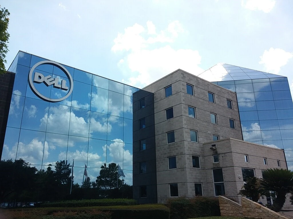
This acquisition marked a significant transformation for Dell, expanding its portfolio to encompass a comprehensive range of enterprise technology solutions, from infrastructure to cloud services. Moreover, as the trend of owning a personal computer rose across the world, so did the people’s demand to know what brands to buy. And the Dell logo on the back of all Dell products served as one of the most important branding elements for the company.
Today, as Dell Technologies, the company stands as a global tech behemoth, providing essential infrastructure for the digital age and continuing to evolve its offerings to meet the ever-changing demands of the technology landscape. Its journey from a dorm-room startup to a global leader is a testament to its innovative business model, its adaptability, and its enduring commitment to customer needs.
Evolution of the Dell Logo Over the Years
From its humble beginnings as PC’s Limited in 1984, the company’s visual identity has undergone several key transformations, each marking a significant stage in its growth and evolution. The initial logos reflected a more straightforward and functional aesthetic, typical of startups focused on product and early market penetration. As the company rebranded to Dell Computer Corporation and expanded its reach, the logo evolved to project a more established and modern image.
The Dell logo today has undergone several iterations throughout the company’s history, each reflecting its evolving identity and market position.
1984-1987 Dell Logo – Then Known AS PC’s Limited
The initial logo for PC’s Limited, the company’s original name, was a simple and functional design that prioritized clarity over visual flair. It featured the name “PC’s LIMITED” rendered in a straightforward, sans-serif typeface, often in a dark color like black or dark blue. This early logo was characteristic of many technology startups of the era, emphasizing the product (personal computers) and the limited nature of the initial operation.
The focus was on communicating the company’s name clearly and directly to potential customers. This unpretentious design reflected the company’s early, lean operations and its direct-to-consumer approach. The lack of any graphical elements in these minimalist logos kept costs low and aligned with the company’s initial focus on providing value through price and customization.
1987-1992 Dell Logo – Introducing the Company After Its Rebrand
In 1987, following the company’s official rebranding as Dell Computer Corporation, the logo underwent its first significant change. The new logo retained a simple, sans-serif typeface for the “Dell Computer Corporation” name but introduced a slightly more stylized and modern feel. The font was cleaner and more geometric compared to the PC’s Limited logo. This rebranding and logo change marked a significant step in the company’s evolution, signaling its growth beyond a limited operation and establishing a more formal corporate identity.
The emphasis on “Dell” in the new name and wordmark logo design reflected the increasing recognition of the founder’s name as the company’s primary identifier. This logo conveyed a sense of professionalism and the company’s growing presence in the personal computer market.
1992-2018 Dell Logo – Modernizing the Design
The 1989 Dell logo represented a further modernization of the company’s visual identity. While still featuring the “Dell Computer Corporation” name in a sans-serif typeface, this iteration introduced a bolder and more distinctive font. The letterforms were more substantial, conveying a sense of strength and reliability.
This logo also saw the introduction of the color blue as a primary brand color, a hue that would become strongly associated with Dell in the years to come, often symbolizing trust, stability, and technology. This design reflected the company’s increasing maturity and its growing market share, as well as a focus on sustainable branding for longevity.
The bolder font and the introduction of a consistent brand color helped to create a more memorable and impactful visual identity as Dell continued its expansion in the competitive PC market.
2010-2018 Dell Logo – Inception of the Main Design We All Know Today
The year 2010 marked a significant turning point in the evolution of the Dell logo with the introduction of the design that is most widely recognized today. This logo retained the “Dell” name in a clean, sans-serif typeface, but it was now enclosed within a blue oval. A key and distinctive element of this new logo was the slanted “E.”
While the exact origin of the slanted “E” has been subject to some debate, it is widely believed to symbolize the company’s direct-to-customer business model, suggesting a forward-leaning, efficient, and direct approach. The blue oval provided a strong and recognizable visual container for the company name, further solidifying brand recognition.
This redesign aimed to project a more modern, approachable, and dynamic image for Dell as it continued to evolve its product offerings and market strategies in a rapidly changing technological landscape. And this was especially helpful post the Dell-EMC merger in 2016.
2018-Today Dell Logo – Refining the Design for Today
The 2016 Dell logo represented a subtle but significant refinement of the 2010 design, coinciding with the company’s acquisition of EMC and the formation of Dell Technologies. The core elements of the blue circle logo design and the slanted “E” were retained, signifying the enduring recognition of these brand elements. However, the typeface used for the “Dell” name was slightly updated, becoming cleaner and more streamlined.
The blue color was also subtly adjusted, often appearing in a slightly richer and more vibrant shade. This refinement aimed to create a more contemporary and cohesive visual identity for the newly formed Dell Technologies, representing its expanded portfolio and its continued focus on innovation and customer solutions in the modern technology era. The subtle changes ensured that the logo remained familiar while projecting a sense of evolution and forward momentum.
Dell Logo Colors and Font

The consistent use of specific colors and a particular font style has played a crucial role in establishing and reinforcing Dell’s brand identity over the years. The primary color associated with the Dell logo is blue. This choice of color is strategic, as blue is often associated with trust, reliability, stability, and intelligence – qualities that Dell has consistently aimed to project as a technology provider.
The logo fonts used for the “Dell” name in the logo is a clean and modern sans-serif typeface. Over the years, the specific font has been subtly refined to reflect contemporary design trends while maintaining legibility and a sense of professionalism. The choice of a sans-serif font conveys a feeling of clarity, efficiency, and straightforwardness, aligning with Dell’s historical emphasis on directness and value.
The consistency in the font style and color, particularly in the most recent iterations featuring the blue circle and slanted “E,” has further strengthened brand recognition and created a cohesive visual identity.
FAQs
| What is the meaning of the Dell logo? It represents the company’s focus on innovative and reliable computing services, with the simple design and blue color a symbol representing Michael Dell’s original vision for his company. |
| Why is the “E” crooked in the Dell logo? The crooked “E” represents the company “Turning the world on its ear,” as put by Michael Dell. |
| Who created the Dell logo? The iconic circular Dell logo was created by Siegel+Gale in 1992. |
Conclusion
The evolution of the Dell logo is an interesting visual story that shows the remarkable journey of a company transforming from a dorm-room startup to a global technology powerhouse. Each iteration of the logo, from the straightforward typography of PC’s Limited to the globally recognized blue circle with the distinctive slanted “E,” marks a significant milestone in Dell’s history and reflects its evolving brand identity and strategic direction. This visual journey of Dell’s brand logo serves as a powerful reminder of how a well-crafted and consistent brand identity can become an integral part of a company’s success and global recognition.
Logopoppin
Logopoppin is a graphic design agency that specializes in logo designing, web development, video production and advanced branding services. We love to innovate businesses with new age technologies, allowing them to improve their visual reputation.
