
Table of Content
Discover the Great Denver Broncos Logo Creativity That Made it an Icon Today
Various athletic teams and franchises across the globe have managed to come up with truly beautiful and perfect symbols, with the NFL’s Denver Broncos logo being one of them. These kinds of sports icons are needed to represent the values and the spirit of the team they represent, as well as serve as a rallying point for their followers.
But what is it exactly about these sports logos that makes them so popular among their fans? What makes these symbols stand apart in a sea of similar-themed logos, and connect with the supporters on an intrinsic level?
Franchises often hire expert logo design services to create great designs that truly personify their team spirit and energy. Let’s find out how the Denver Broncos came up with such an iconic logo design that makes them one of the best known teams in the National Football League.
1. The History of the Franchise and How the Denver Broncos Logo Came to Be
The Denver Broncos are a pro-football team in the NFL, belonging to the AFC West division of the League. They initially started out as a franchise in the American Football League, a precursor to the NFL in 1960.
Ten years later, the team joined the NFL as part of the merger. The name of the team was chosen after a fan contest, which saw over a hundred and sixty names presented for approval. Among them, the winner was the moniker, Broncos.
Now a bronco might have seemed an odd choice for the team, but the horse, especially a bronco or a bucking horse, is something long associated with the state of Colorado. The state, with a long and rich history of ranching and cowboys, could have no better representation than the image and name of a wild, untamed horse, just like the Miami Dolphins logo highlight’s Miami’s aquatic connection.
Right from the start, with the first logo revealed by the team, it symbolized the free spirit and the wild nature of the team itself, as well as its ability to tame and go with the wildest of adversaries. And as the Colorado area including the Rockies is known for its wild-west roots, it’s was a suitable name for the local football team.
Denver Broncos Logo Font
When creating any kind of sports logos, the font is an important aspect of that process. The right font can help your brand symbol stand out, like the iconic typography of the 49ers logo. The typeface used for the Denver Broncos logo is a custom design, named the Denver Broncos Custom. It is an understated serif font, with clean lines and moderate strokes.
Denver Broncos Logo Colors
The color palette of the Denver Broncos symbol is white, navy, and orange. This color scheme has been in use for a number of decades, and has become one of the better known NFL liveries. However, its counterpart in the NHL logos, representing the Colorado Avalanche, prefers a darker, more subdued color palette.
When it comes for Denver Broncos logo usages, the design and its colors can be used in a variety of mediums, including apparel like jerseys, baseball caps, hoodies, and more. Similarly, the logo may also be found on items like souvenirs, mugs, calendars, and more.
Denver Broncos Logo Meaning
If we take a look at the logo for the Denver Broncos, you might question why the team used the image of a horse with a streaming mane. You might wonder why the team would use such logo symbols. Well, the state of Colorado has a long history of association with ranching and cattle rearing.
In the ranching industry, there is one animal that is arguably more popular than the cows and bulls themselves. And that is the horse. With the concept of cowboys associated with ranching, and the Denver area producing some of the best cowboys in the earlier days, the area has a rich association with horses.
However, the bronco refers to a bucking horse. These horses, either untamed or bred for this specific trait, require the surest of hands and expert horsemanship to tackle properly. And by adopting the name and logo of the Bronco, the team signifies that they have the grit and the ability to handle the toughest of adversaries without falling or failing.
Denver Broncos Logo Elements
In the older logos, the Denver Broncos logo had multiple elements, such as the rider/football player and the horse, or the rearing bronco and the letter D. But the modern logo consists of one simple thing – the lowered head of a horse with its mane streaming behind it.
The use of a singular element is very important when it comes to effective logo design. For one, it allows for quick comprehension of the design even with a passing glance. Moreover, the simplicity of the design makes it visible at distances and at a variety of different sizes, which makes for a great logo for a sports team.
Denver Broncos Logo Inspiration
If we look at the NFL, there are many teams that have their logos and names inspired by local history or something of significance. For Denver, one of the largest cities of Colorado, the thing that set it apart was its rich and successful ranching history.
Now, while ranching is what Colorado is known for, it isn’t the quality of its steers that make it so successful. Colorado’s ranching history is centered around its great cowboys and cattle handlers. And as such, the wild nature of the Colorado cowboys could not be better represented than by the untamed and powerful broncos. There are many great logo examples that managed to portray a rich and powerful message in the simplest of designs, and the Broncos logo is one of them.
2- Denver Broncos Logo Transformation – Understanding the Denver Broncos Logo Changes
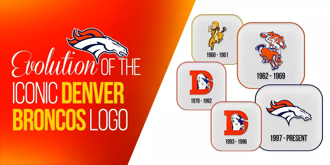
The logo for the Denver Broncos has been changed a number of times throughout their time playing as a professional football team. Some of the designs have been elaborate, while others have been simpler. The current logo is sleek, simple, yet perfectly fitting for a team named after a free, wild, and temperamental horse.
Let’s take a look at how the logo has evolved over the years.
Original Denver Broncos Logo 1960
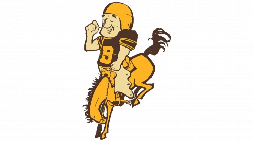
The original Denver Broncos logo was released in 1960, and featured a football player decked out in his playing gear, and riding a bucking horse. The rider wore a yellow and brown suit, with a large and blocky B emblazoned on the chest.
The design was funny to look at, yet it was a fitting reminder of the area’s natives and their long history with their mascot.
First Denver Broncos Logo Redesign 1962
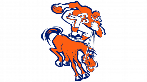
In 1962, the logo was redesigned again. This was done to reduce the nonchalant vibe of the previous symbol, and add a level of ferocity and strength to their logo. the new logo featured a bulky football player with a football in hand standing atop a bucking horse.
For the first Denver Broncos logo modification, the color scheme was changed to mix of blue and orange color combinations, and the horse was given a wide manic grin to go with the wild design.
Second Redesign Denver Logo 1970
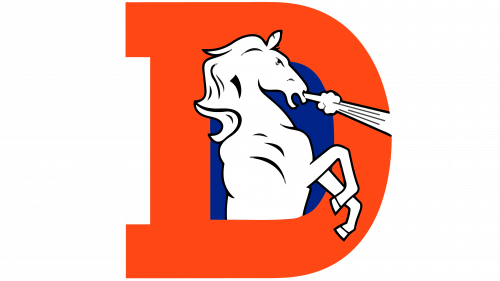
This was the first major redesign in terms of logo concept. Gone was the rider from the image, as well as the grinning horse. With this new Denver Broncos logo makeover, the new logo featured a rearing horse snorting loudly, encased within an uppercase D, which stood for the city of Denver. However, it also looked like one of the many college logos sported by collegiate-level sports teams, especially with the letter behind the horse.
The color scheme was the same for this logo, the letter in orange with the blue accenting the white horse.
Minor Redesign Denver Logo 1993
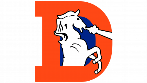
This minor redesign saw the logo’s color palette and style revamped slightly. In terms of the Denver Broncos logo background, the shades of orange and blue were lightened a few degrees. Moreover, the overall design of the horse in the logo was simplified by removing all unnecessary accents and tweaks in the design, but the outlines made thicker for the logo’s mascot.
However, the new Denver Broncos logo dimensions remained the same as the previous iteration, despite its addition to the rather minimalistic logos of the NFL at that time.
Present Denver Broncos Logo Design 1997
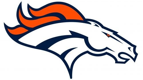
The present day Denver Broncos logo was created in 1997. It featured the head of a sprinting bronco, with its mane flapping in the wind. The lines were sharp, and the eyes of the horse were made red for a more vicious look.
The shades of orange and blue were darkened again, but the horse was still colored white while using the other colors as accents to enhance the look. The overall design was modern, strong, and most importantly, timeless and while the color scheme was similar to the Chicago Bears logo, the shades used, as well as the choice of primary and secondary shade makes it look quite distinctive.
3- Denver Broncos Logo Variations – Wordmark Logos
Wordmarks are necessary for a team, as the primary logo is not always the best medium to get your name across to new viewers. Like many other sports symbols like the NBA logos, wordmarks are often necessary when it comes to athletics, as it makes it easier to identify the teams and players during a game. Let’s take a look at the wordmark Denver Broncos logo’s evolution.
Original Denver Broncos Wordmark Logo 1968

The original wordmark for the Broncos featured a blocky, serif font that displayed the team’s name. the font was colored blue, with the design using a few different stroke sizes for add a sense of depth to the design.
Current Redesign of Denver Wordmark Logo 1997

Lifehouse is a famous spa located in Essex, United Kingdom. It is popular due to the smoothing massages and stress free environment. This logo is also a clear demonstration of this fact. It is designed neat and clean, defining the true theme of the spa center.
4- Denver Broncos Commemorative Symbols
Many teams celebrate special milestones in their careers, whether it is for a championship win, or to celebrate a number of years in the sport. Let’s take a look at some of these Denver Broncos commemorative logos.
Silver Jubilee Logo 1984
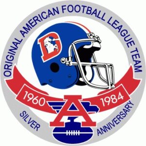
The 25th anniversary for the Denver Broncos playing pro football occurred in 1984. The logo featured a blue football helmet, with the current and starting years of the team written on a red banner below the helmet itself. The entire image was circled by a gray ring to round off the design.
Golden Jubilee Logo 2009
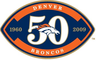
The team’s golden jubilee arrived in 2009, and the celebratory logo was in the shape of a football. The ball was colored a dark navy, and it was accented in orange to promote the five decades’ worth of legacy playing the great sport.
5- Denver Broncos Logo Evolution from Old to New – Understanding the New Denver Broncos Logo Popularity
If we look at the old Denver Broncos logo images, they featured a cartoon-like depiction of the team’s logo. While it may have been suitable for the team at that time, design aesthetics have changed. From choosing the right logo fonts, to making sure that the tone of the imagery suits your brand voice is a necessity for good logo design.
As such, it would have failed if used today. However, the current Denver Broncos icon is perfect for the modern design trends. It is sleek, simple, and uses negative space to its advantage. That is why we can say that the new Broncos NFL logos are better than the old Denver Broncos logo.
Denver Broncos Logo Representation – Who is the Horse in the Team Symbol?
Now that we have seen the Denver Broncos logo evolution, we see that a horse, specifically a powerful bronco, features front and center of that design. However, given the history of the Colorado cowboys and the Broncos team itself, many people ask the question – who is the horse modeled in the modern Broncos’ symbol?
Well, the horse in question is called Thunder, and he is the Denver Broncos’ current mascot. As the team mascot, his antics dazzle the crowd every time the Broncos score. With the horse in its fifth season as the Denver team’s mascot, he replaced his predecessor Bolt at the Super Bowl XLVIII.
Now, given its connection to one of the oldest bastions of American cowboy country, you would imagine that the team mascot would be something like a tamed mustang from the American prairies, right? However, Thunder is a purebred Arabic stallion, one of the most sought after and regal horse breeds of all time.
And with that wild and fierce spirit the Arabic horses are known for, Thunder represents the team perfectly.
Denver Broncos Logo Significance – Why A Horse?
The addition of a horse to the logo for the Denver Broncos seemed a little disconnected to many people at the start. That is because Denver was better known for its gold-prospecting, becoming a part of the gold rush of the Rocky Mountain range. So why did they prefer highlighting their cowboy skills rather than their propensity as a gold-rush town? Or even highlighting the Colorado Rockies?
Well, one of the primary reasons for that is that the San Francisco 49ers, one of the oldest franchises in the NFL, already sported a logo that highlighted their connection to the San-Franciscan gold rush. As such, having another team with similar iconography might have been counterproductive.
Similarly, as the name of the team had been chosen based on open voting, the majority of those who participated chose the name Broncos. So even if they wanted to, they could not have gone for a gold-rush-based or a mountain logo design. And with a name like the Broncos, what else besides a horse would you use for a logo?
Denver Broncos Logo Controversy
Over the years the Denver Broncos have revealed different logos representing the team and the franchise. However, not all of them have been received with as much enthusiasm as the one used today. let’s take the example of the logo that was being used before 1997.
The giant letter D with the horse in the middle did not seem to represent an entity as big as an NFL franchise. In fact, the style of the logo mimicked more that of a high school or college football team, with the letterman-style design. And while it was perfect for the old fans of the team, the logo failed to attract a younger generation of fans.
That led to a demand for a logo that managed to connect the nostalgic connection from the current logo design, and the design aesthetic of today. The logo used till 1996 was revealed in 1970, and with over two and a half decades of use, it was now time for a major revamp.
Therefore, the new design for the Broncos logo revealed in 1997 was a departure from the previous types of logos developed by the team. Gone were the elaborate cartoonish designs, or the letterman-style combination marks. In their stead, there was a digitally drawn caricature of a horse, which was future-proof enough that it is still being used today.
Denver Broncos Logo Impact
The impact of the new Broncos logo has been quite positive. With the upgraded graphics, it became one of the few teams to use an animated caricature of an animal mascot for their logo, like the Philadelphia Eagles logo, or the Cardinals logo.
The impact of updating your logo design according to the changing logo design trends is what makes a brand logo successful. And by changing their logo to a more modern design just before the end of the millennium was a great way to be at the start of the new aesthetic.
People Also Ask (FAQs)
| 1- What colors are featured in the Denver Broncos logo? The logo features a mix of orange, navy blue, and white as the official colors for the team. |
| 2- When did the Denver Broncos adopt their current logo? The Denver Broncos adopted their current logo in 1997. |
| 3- What is the meaning of the Denver Broncos logo? The Denver Broncos logo has no real hidden meaning. It just portrays the history and the connection of Colorado cowboys and their ability to tame and handle broncos, which are horses that try to throw their riders off. The logo is meant to depict the indomitable spirit of the Denver NFL team. |
| 4- Who is the Denver Broncos logo creator? The first logo for the Denver Broncos was created by a man named Edwin Taylor, who created the iconic D> for the logo. |
| 5- How has the Denver Broncos logo evolved over time? Over the years, the Denver Broncos logo has evolved from the overly-cartoonish designs of the early 1900s to the simple yet impressive digital graphics of today. In that time, the logo has improved its impact, as well as its legibility. |
| 6- What year did the Denver Broncos first use a logo? The team first revealed a logo in 1960. |
| 7- How does the Denver Broncos logo compare to other NFL logos? Compared to many other NFL logos being used currently, the Denver Broncos logo looks modern, expressive, and most importantly, perfectly suitable for the team. Some teams like the Arizona Cardinals and the Philadelphia Eagles have logos with a similar impact. However, others like the New Orleans Saints have logos that are not as expressive as the three mentioned earlier. |
Conclusion
Now that you know how the Denver Broncos logo evolved into its current form, and the inspiration behind it, the next step is to learn how to design a logo that has the potential to be equally iconic. It is not difficult to ensure that a logo remains relevant through the years, especially when you track the changing aesthetics and update your design accordingly.
However, it isn’t always easy to manage this process, especially if you do not know how to track and evaluate your design according to the trends. So, if you want help creating a logo for your athletics team, we can help you. Logo Poppin’s expert logo designers create truly unique designs that perfectly embody the team’s spirit and message.

Logopoppin
Logopoppin is a graphic design agency that specializes in logo designing, web development, video production and advanced branding services. We love to innovate businesses with new age technologies, allowing them to improve their visual reputation.

