Table of Content
A Look Into the Detroit Lions Logo History & its Evolution
The Detroit Lions are an American Football team and franchise that currently plays in the NFL. Originally founded in Ohio nearly a century ago in 1930, the franchise eventually relocated to Detroit where it started its journey as the Lions.
Now, despite being one of the oldest teams still actively playing professional football, the team has been quite unfortunate in finding success. It holds the unwanted record of being the only team who has been playing the entirety of the Super Bowl era but never qualified for a single championship match in that time.
However, despite their abysmal luck, the team and its fans stay resilient, and look towards the next day hoping for a better outcome. And at the center of that resilient spirit, is the Detroit Lions logo.
But what is it about that blue, rearing and snarling lion that brings the multitudes of Detroit natives together in support of team with such rotten luck? How has it managed to capture the essence of the people, and found the thread that links their hearts together?
Let’s dive in and discover how the Lions logo came to be, and how it has evolved to become the beacon of hope for thousands of Detroit’s football fans. Let’s find out how a custom logo design services provider can help you create a logo that connects with your audience like the Lions logo.
Detroit Lions – A Brief Overview
The Detroit Lions started out as the Portsmouth Spartans, based out of Portsmouth, Ohio. They joined the NFL in July 1930 and started playing football professionally. However, financial struggles resulted in the franchise relocating to Detroit, Michigan just four years later. Moreover, due to their move to Detroit, the team also changed its name to the Lions, as a way of connecting with the local MLB team called the Tigers.
Before the start of the Super Bowl era and between 1935 to 1957, the Detroit Lions won the NFL Championship four times. However, after the 1966 merger between the NFL and the AFL, the team has only won a single playoff game, and has never reached the Super Bowl.
To date, they are the only team from the NFC to have never played a Super Bowl match, a record that no team wants to hold, especially one as old as the Lions. Despite that, the team has a loyal fan base that supports them even in these harsh times.
Over the years, the team has been playing against teams like the Chicago Bears or the Green Bay Packers in the preseason and their rivalries some of the most renowned. And while the team as a whole has rarely seen success, the Lions have many players who have been inducted into the NFL’s Hall of Fame due to their individual prowess and success.
First Impressions of the Detroit Lions Logo
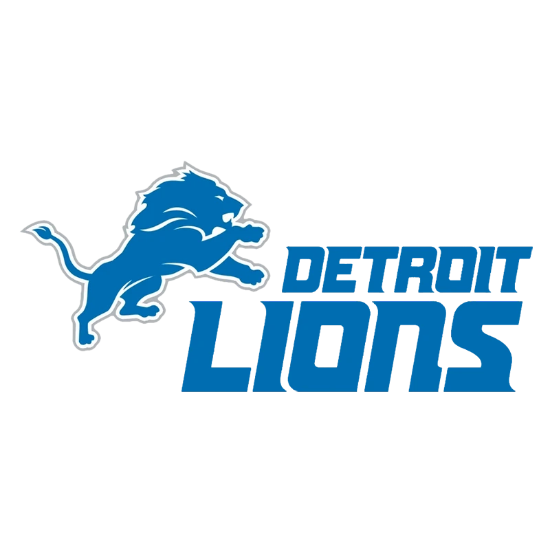
When we first take a look at the Detroit Lions logo, we see a blue lion, rearing and snarling. The imagery is something that you wouldn’t expect from a team that hails from the heart of motor city. However, the team logo suits them.
The roaring lion is the perfect example of tenacity and strength in the face of adversity. Just like the team persevering despite their consistent losing streak, the team’s fans too stand by them, no matter the scenario.
Unlike the first iteration of the logo for the team, the recent iteration is more visually stunning The design is quite simple and straightforward, which makes them one of the most interesting team logos in the NFL.
Like the Philadelphia Eagles logo, the use of a powerful imagery of animals in your design can be a huge plus for your brand, allowing it to have a greater impact. The shade of blue used for their logo, combined with the colors of their uniforms, make them one of most visually alluring teams in the league.
Evolution of the Detroit Lions Logo through the Years
Now that we have taken a look at the team and its history, let’s take a look at the evolution of its logo through the years. The aesthetically beautiful lion we see today in their logo was not there since the inception of the team.
Of the thirty two teams on the NFL roster, there are only a few teams whose logos are known far and wide. Examples like the Cincinnati Bengals or the Denver Broncos logo are team symbols which are known even to casual fans of the game.
Therefore, let’s dive in and discover how the Detroit Lions logo evolved over almost nine decades of pro football.
1952 – 1960
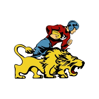
Despite the origin of the team in 1930, it wasn’t until the 1952 National Football League season that the team first introduced their brand logo. At that time, they were facing their fierce rivals the Cleveland Browns, and they believed that a team logo that allowed people to rally behind them would be a great way to build team spirit. This made them one of the later entries from the early teams to join the NFL logos roster.
The first logo introduced by the team was a roaring lion, accompanied by a football player in a red-brown jersey, blue pants, and a blue helmet. These were the colors of the Detroit Lions uniform at the time, and the colorful logo had an impact strong enough to attract viewers despite the lack of aesthetic appeal of the design.
The color combinations used in the logo, the yellow of the lion, the red and blue of the player, makes for an interesting palette, which was rarely seen before. And the cartoon-like animation of the logo, a style you would often see with old-school animators in many of that era’s comics and animations, made it all the better.
1961 – 1969
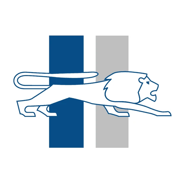
Despite the lack of aesthetic appeal of the first logo, that design was used successfully for nearly a decade by the team. It wasn’t until 1961 that the franchise launched a new logo, which featured a completely different white with blue outline lion over a colored background.
The new shape of the lion was quite interesting. The body of the lion looked elongated, especially as the profile of the animal is that of a lion stalking their prey. The background featured a pair of thick vertical bars, with each bar showing the different shades of blue used in the logo design so far. This iteration of the Detroit Lions logo is one that more similar to monograms like the Washington Commanders logo rather than traditional NFL team logos.
Overall, this was a big improvement over the previous iteration of the logo. And the clean design, combined with colors that complemented each other makes for a great team logo to represent the Detroit Lions.
1970 – 1996
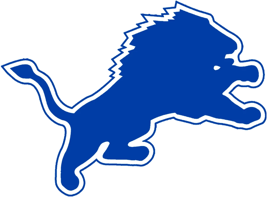
It wasn’t until the 1970 season of the NFL that the team again felt as if their logo needed a design refresh. The 1970s brought with it a renaissance of sorts in design. The style of animation was changing, and businesses were starting to understand the importance of branding themselves.
The result was a logo design that paved the way for the Detroit Lions logo we all see today, that of the rearing, roaring lion. Now, an initial glance may show you that the current design looks nothing like one you see above. However, the current logo is the natural, aesthetic evolution of the design frame you see here.
The design was inspired by the name of the team, and was colored a dark, almost royal blue, which was highlighted by the white and blue outline made it doubly attractive. Moreover, the aggressive stance of the lion made it perfect for a sports team with a long, rich history.
1997 – 2001
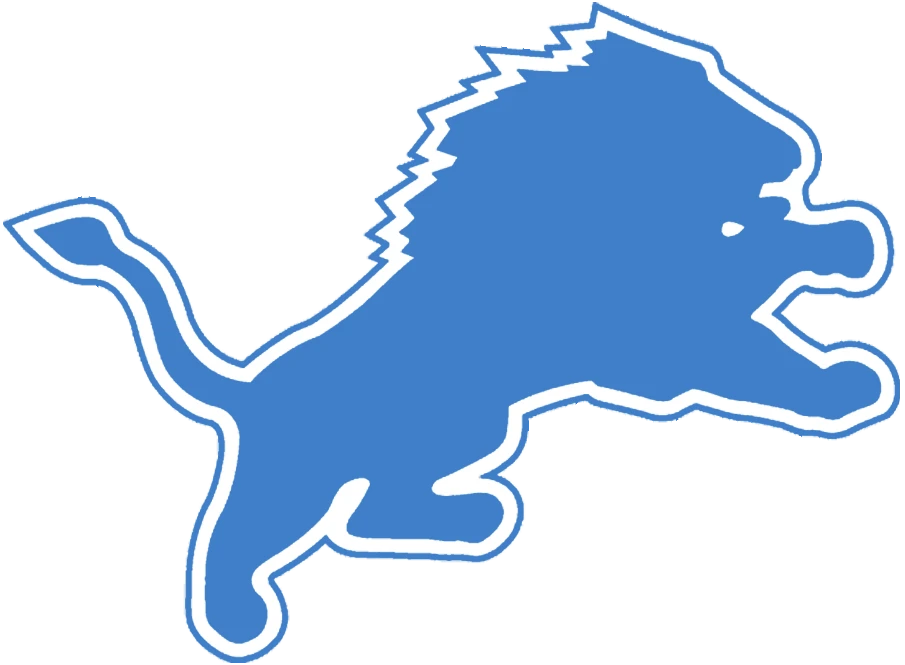
In 1997, the team decided to rework the logo again to bring some fresh perspective to the team visuals. In that respect, they decided to lighten the color of the Detroit Lions logo by several shades, resulting in the previously dark blue logo now being featured in a shade of light blue quite close to their uniform’s “Honolulu Blue”.
Now generally, you ensure that your outline is something that visibly frames your primary design, so that it is easier to see the lines and edges of your design, as in the case of the New Orleans Saints logo. And in this case, you will see that it is the failure to address the importance of the visible outline that resulted in this logo iteration failing.
The result was not what the team was expecting. The lightening of the shade resulted in the dilution of the logo’s visual impact as well. The logo no longer had that aggressive feel which it had in its previous version, despite the design not changing at all. The light blue shade of the logo was not a good aesthetic choice overall.
2002
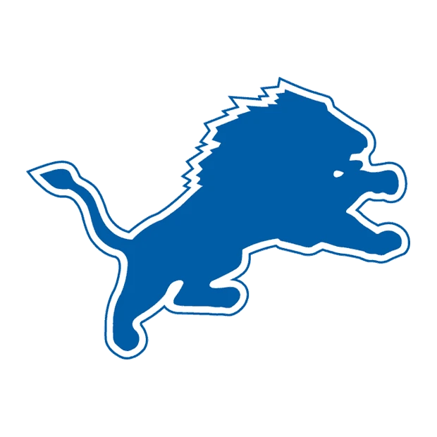
Learning from the mistakes of the previous logo redesign, the team decided to darken the shade again for the logo in 2002. Now, despite the logo not being as dark and vibrant as it had been earlier, the slightly darker shade compared to the previous iteration improved the impact of the logo.
However, the thin pinstripe outline after the white band surrounding the lion, that was colored the same shade of blue as the lion, was losing some of its visual acuity. That meant that the outline of the lion was not as apparent as the original design had managed, and needed something more, like in the case of the Miami Dolphins logo.
2003 – 2008
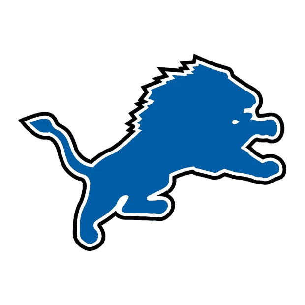
It was just a year later that the team found a solution to their problem about the fading outline. The team replaced the blue colored outline of the lion with a black colored band that surrounded the entire design.
The band was as thick as the white band between it and the lion, and made the shape of the design pop instantly. This was great visually, however the star difference in the shades of color made the design jarring for many viewers. What it needed were some lighter accents that made the overall impact softer slightly.
Despite that, the logo was used for five seasons by the team, and was only replaced with a drastically redesigned version of the logo.
2009 – 2016
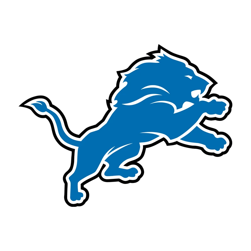
2009 saw a massively redesigned, highly detailed version of the Detroit Lions logo. the lion had smoother lines along the mane and the body, which made it seem more natural. The design was accented with white strokes, that highlighted features such as the direction of the mane’s hair, the eye of the lion, the powerful limbs coiled for action, and more.
Moreover, the surrounding white band was also made more fluid, meaning that for areas with fine details the mane, the fangs, and the claws, the band was thinner for better visual acuity. But for smoother, longer strokes, the band was slightly thicker.
This helped soften the previous iteration’s in-your-face impact, while enhancing the overall impact of the logo design by several orders of magnitude. Overall, this was one of the greatest redesigns in the NFL at that time, just like the new LA Rams logo.
2017 – Present
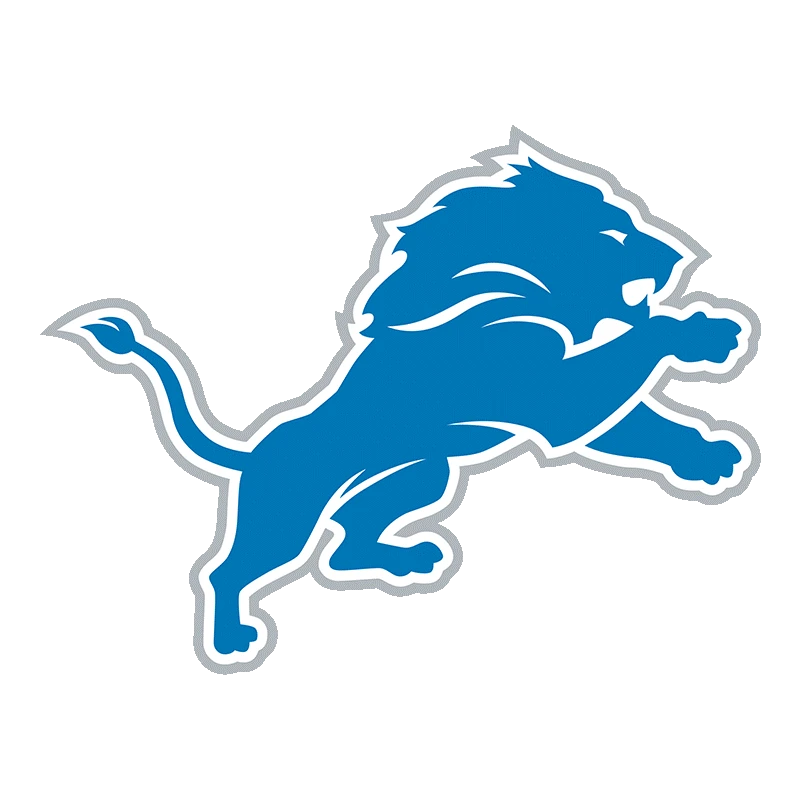
In 2017, with the NFL’s push for newer, more modern uniforms and technologies, the logos too needed a refresh to adapt to the changing aesthetics of the fans. Minimalism was the core of the design game at that time. And while the Detroit Lions logo was in no way overly complicated, the fact was that it could be made simpler without losing its inherent impact.
To counter that, the team decided to replace that outer black outline with a thin gray one. The design was supposed to give a sort of shadow to the design, making it look somewhat three dimensional despite being flat. The result was the current logo we see today. The overall design looks softer, however, swapping the black outline for the gray doesn’t seem like a bad choice due to its subtlety.
Now, we can truly say that it is a modern logo design, combining the legacy of a team with nearly a century of experience, with the modern design aesthetics of today. And while both the 49ers logo and the Lions logo encompass that legacy, both found different ways to do it successfully.
FAQs
| Are the Detroit Lions getting a new logo? No, they are not getting a new logo. The team has unveiled a new helmet design that features the vintage logo design the team used during the 60s. |
| Why is the Detroit Lions logo blue? The blue is inspired by the team color called Honolulu Blue, which is the color of the waves found off the coast of Hawaii. |
| What is the Detroit Lions symbol? The logo for the Detroit Lions is a rearing lion colored blue, and outlined in alternating bands of white and gray. The resultant outline make the design pop off the screen, giving it a three dimensional look. |
| Why are the Detroit Lions called the Lions? There are a number of reasons. One, they wanted to emulate the theme of their MLB counterpart from Detroit, called the Detroit Tigers. Second, the team owner at that time chose that name because he wanted to build a football team that would be the King of the NFL, just like the lion is the king of the jungle. |
Conclusion
To sum it all up, the Detroit Lions logo is an interesting study on how a basic idea of a logo can be truly evolved into its best iteration, rather than going for drastic redesigns. From the 70’s onwards, the team managed to tweak their basic idea of a rearing lion into the highly sophisticated logo we see today.
Some brands, as in the case of the Chicago Bears logo, find that changing to a drastically simpler design is the way to go in building brand loyalty. But while it may be true for conventional brands, that is not the case with sports teams.
Sports logos, especially for a sport like American football that is known for its aggressive gameplays, need to be more dynamic. They need to embody that aggressiveness in their design too, something that isn’t possible with simple, minimalistic designs.
Therefore, if you want to learn how to adapt and evolve your design over the years, taking a look at the Detroit Lions logo history is a great way to start.

Logopoppin
Logopoppin is a graphic design agency that specializes in logo designing, web development, video production and advanced branding services. We love to innovate businesses with new age technologies, allowing them to improve their visual reputation.


