
Table of Content
Take a Look at the Rapid Evolution of DoorDash Logo Below
The trend of online shopping and food delivery in the US is on a massive rise. People simply love to order their favorite foods from the comfort of their homes, and DoorDash is one of those apps that helps them to do that effortlessly. Though there are many other apps also active in the US, but DoorDash has become more prominent due to offering a variety of offers and benefits to the customers. The DoorDash logo has therefore become highly popular in the US, establishing its name on top of the reputed food delivery services.
Launched in 2013, DoorDash has certainly made a big name in a short period of time. The company has achieved this feat by offering great deals and offers to the customers. They specifically paid attention to the demands of the app users, which eventually gave them immense success in this highly competitive ecommerce market. Besides offering quality services, they also kept their logo branding unique, so that people can easily recognize them in the competitive industry of online food delivery.
In this article, we will discuss the history of DoorDash logo in detail. Designed by professional logo design services, we will let you know how the DoorDash logo evolved during the last few years, making the store identity precisely strong in the market. Let’s start from the basics understanding what is DoorDash and why people love its services.
What is DoorDash?
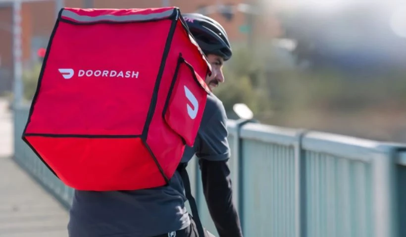
DoorDash is a popular food delivery and logistics platform that connects customers with their favorite local and chain restaurants. Through its mobile app and website, DoorDash allows users to browse a wide variety of menus, place orders, and have food delivered directly to their doorstep. The platform operates on a gig economy model, relying on independent contractors, known as “Dashers,” to pick up and deliver orders. DoorDash is available in multiple countries, making it one of the largest food delivery services globally.
In addition to food delivery, DoorDash has expanded its offerings to include grocery and convenience store deliveries, catering to a broader range of customer needs. The app features an intuitive interface, where users can search for restaurants by cuisine type, distance, or popularity, and filter results based on dietary preferences or delivery speed. DoorDash also provides subscription services like DashPass, which offers benefits such as reduced delivery fees for frequent users, enhancing convenience and cost-effectiveness.
DoorDash’s success lies in its ability to bridge the gap between businesses and consumers. It enables restaurants, especially smaller local establishments, to reach a larger audience without the need for their own delivery infrastructure. For Dashers, the platform offers flexible earning opportunities, allowing them to choose their own schedules. Through its technology-driven approach and customer-centric model, DoorDash has become a cornerstone of modern convenience in the food and delivery industry.
Why DoorDash is Popular in the US?
DoorDash is popular in the US because of its extensive reach and diverse offerings. With operations in thousands of cities across the country, DoorDash provides access to a vast selection of local eateries, national chains, and specialty cuisines. Its user-friendly app and website make ordering food seamless, while features like real-time tracking and estimated delivery times add to the convenience. DoorDash’s ability to meet the demands of busy lifestyles has positioned it as a favorite among Americans.
Another reason for DoorDash’s popularity is its affordability and value-added services. The platform frequently offers promotions, and subscription options, which provides reduced delivery fees and other perks for a monthly fee. This makes it attractive to frequent users who want to save money. DoorDash’s partnerships with restaurants and other retailers, such as grocery and convenience stores, have further enhanced its appeal, offering users a one-stop solution for various delivery needs beyond just food.
Additionally, DoorDash’s flexible gig economy model has contributed to its widespread adoption. For delivery drivers, or “Dashers,” it provides a straightforward way to earn money with the freedom to choose their hours and workload. This flexibility has helped the platform maintain a large and responsive workforce to meet customer demand. By addressing the needs of customers, restaurants, and Dashers alike, DoorDash has cemented itself as a leader in the US delivery market.
History of DoorDash Logo
DoorDash was launched in the US in 2013, so it is relatively a new player in the market compared to other established giants. This however, didn’t stopped the company to make a strong name in the market. The app has now got millions of users, making its name quite reputable in the industry. Let’s take a look at the short history of DoorDash logo below.
DoorDash Logo – 2013
The first DoorDash logo stood out for its striking simplicity and straightforward design. It consisted solely of the brand name, rendered in a clean and unembellished sans-serif typeface. The absence of any decorative elements ensured that the focus remained entirely on functionality. This minimalist approach created an uncluttered and professional visual identity, perfectly aligning with the brand’s emphasis on efficiency. By stripping away any unnecessary frills, this minimalist logo communicated a sense of clarity, making it instantly recognizable and easy to recall.
A notable feature of the design was the use of all lowercase letters, which amplified its minimalist aesthetic. This choice imparted a sense of approachability and friendliness, reflecting the brand’s intention to be accessible to a wide audience. The lack of capital letters softened the overall tone of the logo, making it feel contemporary and unpretentious. Together, the simplicity of the typeface and the lowercase styling created a logo that was both practical and effective, embodying the core values of the brand during its early stages.
DoorDash Logo – 2014
The second DoorDash logo introduced a more intricate and symbolic design compared to its minimalist predecessor, offering deeper meaning and a stronger visual identity. One notable addition was the inclusion of a red emblem positioned above the wordmark. This emblem immediately drew attention, adding a layer of sophistication and memorability to the logo. While the design appeared more detailed than the original, it reflected a deliberate effort to communicate the brand’s core values and mission more effectively.
The most prominent interpretation of the red emblem is that it represents a pair of wings. This imagery ties directly to DoorDash’s commitment to fast service, emphasizing its role in delivering meals and goods efficiently. The choice of red, a bold and vibrant color, not only reinforced the sense of urgency and energy but also made the illustrated logo more visually impactful. By combining the symbolic wings with the wordmark, DoorDash successfully transitioned to a logo that was both visually engaging and meaningful.
DoorDash Logo – 2018
The 2018 redesign of the DoorDash logo marked a significant shift towards a more streamlined and modern aesthetic design. The updated logo eliminated unnecessary complexity, focusing on clarity and cohesion. The emblem, a central feature of the logo, was refined to consist of a single, unified shape, reflecting the brand’s commitment to efficiency and simplicity. This new design not only enhanced visual appeal but also made the logo more versatile across various digital and print mediums, ensuring consistent branding.
A key change in the updated emblem was the reduction in the number of horizontal lines from four to two. This subtle modification lent the logo a cleaner, more minimalistic appearance while still conveying a sense of motion and speed. By refining the design and focusing on essential elements, the 2018 logo update successfully balanced meaning with simplicity, allowing the emblem to remain iconic and instantly recognizable. This thoughtful redesign highlighted DoorDash’s growth as a brand while staying true to its core values of reliability.
Frequently Asked Questions
| What is DoorDash app? DoorDash is a food delivery and logistics app that connects users with local restaurants, grocery stores, and convenience shops. It offers on-demand delivery services powered by independent drivers, providing convenience at your doorstep. |
| Why DoorDash app is popular in the US? DoorDash is popular in the U.S. for its vast restaurant network, user-friendly interface, and flexible delivery options. It also offers affordable subscription plans and convenience, making it a top choice for food and grocery delivery. |
| What is the color of DoorDash logo? The DoorDash logo features a bold red color, symbolizing energy, speed, and reliability. This vibrant hue reflects the brand’s commitment to fast and efficient delivery services. |
Final Words
That concludes our entire article in which we have discussed the history of DoorDash logo in detail. Launched in 2013, DoorDash has made a significant name in the US ecommerce market. The app is loved by millions of people in the US, making its logo highly popular in the industry. The logo of the company has seen some tweaks during the last few years, in which the latest re-design is stated as the best revamped version of the predecessors. The new logo has certainly become a fan-favorite emblem of foodies, which is why DoorDash is continuously witnessing rising popularity with the each passing day.
Latest news you want to know!
Subscribe for cutting-edge design inspiration at Logo Poppin! Elevate your brand with updates on logos, branding, web design, and video animation.
Note that by clicking “subscribe,” users may agree to our privacy policy and consent to Logo Poppin to use your contact data for newsletter purposes.
Logopoppin
Logopoppin is a graphic design agency that specializes in logo designing, web development, video production and advanced branding services. We love to innovate businesses with new age technologies, allowing them to improve their visual reputation.
