
Table of Content
Know How America’s Favorite Snack Emblem Evolved
Doritos is a widely recognized snack brand that has become a staple in American households. Since its introduction in 1964, Doritos has carved out a unique identity in the snack food industry, becoming synonymous with bold flavors and a satisfying crunch. Its presence in the market has grown steadily over the decades, evolving from a simple tortilla chip to a cultural icon that features prominently in media, advertising, and consumer lifestyles across the United States.
The popularity of Doritos is also reflected in the widespread recognition of its logo and branding. The bold, angular design and fiery color scheme make the Doritos logo instantly identifiable on store shelves. Created by professional logo design services, the emblem has become more than just a marketing tool—it has come to symbolize the bold and edgy character of the brand itself. This strong visual identity, combined with consistent product quality and innovative marketing, has helped Doritos maintain a competitive edge in the highly saturated snack market.
One of the defining features of Doritos is its broad appeal across different age groups. This cross-generational popularity contributes significantly to the brand’s enduring success. If you want to know more about the brand history and how its logo evolved caught the market attention, read this article in detail. It will let you know everything about Doritos branding that enhanced its position in the industry.
Why Doritos is Loved Everywhere?
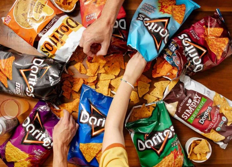
Doritos is popular and loved around the world primarily because of its bold and unique flavor profiles. Unlike many traditional snack options, Doritos offers an intense taste experience with a lot of varieties like Nacho Cheese, Cool Ranch, Spicy Sweet Chili, and more others. This adventurous approach to seasoning has set Doritos apart from other chips, attracting consumers who are looking for something exciting and flavorful. The brand’s commitment to innovation ensures that there’s always something new to try, keeping snackers engaged and curious.
Another key reason behind Doritos’ widespread popularity is its clever and impactful marketing. The brand has consistently created memorable advertising campaigns, often using humor, edgy content, and celebrity endorsements to resonate with younger audiences. Its presence in major pop culture moments, such as Super Bowl commercials, viral social media content, and collaborations with entertainment franchises, has amplified its reach and relevance.
Moreover, Doritos benefits from strong global distribution and adaptability to local markets. As part of PepsiCo, the brand has access to a vast international network. In addition, Doritos often tailors its product offerings to match local tastes and dietary preferences, making it more accessible and appealing to diverse audiences. This combination of flavor innovation, powerful marketing, and global availability has helped make Doritos not only a snack but a beloved part of food culture in many parts of the world.
History of Doritos Logo
Launched in 1964, the history of Doritos logo is quite diverse. The design of the emblem has been changed multiple times, precisely to keep the branding of the company fresh. If you want to know about the complete history of Doritos logo, take a look at the timeline given below.
Doritos Logo – 1964
The vintage logo of Doritos featured a vibrant combination of yellow and red, colors chosen to evoke energy, warmth, and appetite. These bold hues helped the brand stand out on store shelves, appealing to consumers through visual excitement. The use of these colors also reflected the bold and spicy nature of the product itself, reinforcing the sensory experience associated with eating Doritos.
Central to the design was a playful geometric banner, which gave the logo a dynamic and approachable look. The shapes and layout conveyed a sense of movement and fun, aligning with the brand’s youthful and adventurous personality. This early logo played a significant role in establishing Doritos’ identity, setting the tone for the brand’s visual style in the years to come.
Doritos Logo – 1973
In 1973, Doritos underwent a significant rebranding effort, marking an important step in the evolution of its visual identity. Recognizing the need to keep the brand fresh and aligned with changing consumer tastes, the company introduced a redesigned logo that offered a more modern and refined look. This update was not just a cosmetic change, it reflected the brand’s growth and its expanding presence in the snack food market..
The updated logo featured more structured typography and a cleaner overall aesthetic, signaling Doritos’ transition into a more mature and confident phase. By modernizing its logo, Doritos successfully positioned itself as a forward-thinking brand, capable of adapting to trends while maintaining the bold personality that had made it a household name.
Doritos Logo – 1979
The 1979 redesign of the Doritos logo brought with it a series of notable changes that marked a new chapter in the brand’s visual identity. The wordmark logo adopted a more streamlined appearance, with refined typography and a more cohesive layout that emphasized clarity and impact. These changes helped Doritos project a more professional and contemporary image while still retaining the playful spirit that defined its earlier branding.
One of the key features of the 1979 redesign was the introduction of a more structured and balanced design, which made the logo easier to recognize and remember. The updated look was also better suited for packaging and advertising across various media platforms, allowing for greater consistency in brand presentation. By embracing a cleaner and more adaptable visual style, Doritos ensured its brand could grow with the times and resonate with both existing fans and new customers.
Doritos Logo – 1994
In 1985, Doritos introduced a major redesign of its logo that would become a defining moment in the brand’s visual evolution. For the first time, a triangle shape was incorporated into the logo, symbolizing the iconic shape of the tortilla chips themselves. This addition created a stronger visual connection between the product and its branding. The triangle not only served as a clever nod to the snack’s geometry but also added a bold and dynamic element to the overall design.
This redesign aimed to give the brand a more distinctive and memorable identity, capitalizing on the chip’s unique form as a central branding motif. The new logo balanced playful creativity with a modern edge, making it more visually striking and adaptable across various marketing materials. By integrating the triangle, Doritos solidified its association with its signature product in a way that was both visually engaging and strategically smart.
Doritos Logo – 1999
In 1999, Doritos underwent another significant logo redesign, with the most notable transformation centered around its color palette. Departing from the lighter, more playful tones of previous versions, the brand introduced a darker, more intense visual identity. The most striking update was the use of a bold black background, which created a sharp contrast with the vibrant elements of the logo. This change gave the overall design a more modern and impactful look, helping it stand out in an increasingly competitive snack market.
The decision to darken the color scheme was a strategic move aimed at aligning the brand with a more edgy and adventurous image. By adopting deeper tones and stronger contrasts, Doritos appealed more directly to a younger audience that craved boldness not only in taste but in branding as well. This redesign reinforced the brand’s evolving identity, that is moving away from lighthearted imagery and toward a look that embodied confidence, intensity, and a sense of daring.
Doritos Logo – 2000
In 2000, Doritos introduced another refined version of its logo. One of the most noticeable updates was the transformation of the black background into a triangular shape, directly referencing the distinctive form of Doritos chips. This clever design choice strengthened the connection between the logo and the product itself, making the branding more cohesive and instantly recognizable.
Additionally, a blue outline was added around the triangular black background, introducing a new layer of contrast and depth to the design. This blue accent not only helped frame the central elements of the logo but also added a modern, energetic feel that complemented the brand’s dynamic image. The combination of the triangular form and the striking blue border gave the logo a more structured and polished appearance.
Doritos Logo – 2004
In 2004, Doritos unveiled a unique version of its logo specifically designed for the North American market. This distinct iteration represented a targeted branding strategy that acknowledged the preferences and cultural nuances of consumers in the region. Unlike previous versions, which were often used globally with minor modifications, this design was crafted to resonate more deeply with North American audiences.
The 2004 redesign aimed to enhance the brand’s appeal among its core demographic—primarily teens and young adults—by emphasizing a sense of excitement and intensity. The visual elements were carefully chosen to reflect the flavor-packed, edgy image of the product. This regional customization demonstrated Doritos’ commitment to staying relevant in key markets by aligning its visual identity with local logo design trends and consumer expectations.
Doritos Logo – 2007
In 2007, Doritos introduced a refreshed version of its logo that featured significant updates to its overall appearance, particularly in the refinement of its contours. The design team focused on modernizing the visual elements by smoothing out the lines and giving the shapes a more polished, contemporary feel. All contours were thickened, making the logo bolder and more pronounced, which helped it stand out more effectively on packaging and in advertising.
The thicker lines and streamlined contours gave the logo a sense of strength and clarity. The changes made it easier to recognize from a distance or at smaller sizes, improving visibility across a range of platforms—from snack aisles in supermarkets to digital screens. This redesign also maintained the dynamic, energetic essence of the brand while presenting a more confident and modern image.
Doritos Logo – 2013
The current Doritos logo marked a bold evolution in the brand’s visual identity. At the heart of the logo is a clean, white sans-serif typeface that gives it a sleek and contemporary appearance. This choice of font reflects the brand’s continued appeal to a younger, style-conscious audience while maintaining readability and simplicity. The use of white against contrasting colors helps the brand name stand out clearly across a variety of packaging designs and promotional materials.
What makes this logo especially striking is the double outline that frames the lettering. These outlines add depth and dimension, giving the logo a three-dimensional, energetic quality that mirrors Doritos’ bold and intense flavors. The combination of sharp lines, strong contrast, and vibrant color accents reinforces the brand’s daring personality and visual power. This 2013 redesign was a strategic move to ensure that Doritos’ branding remained fresh, dynamic, and unmistakable.
Frequently Asked Questions
| Why Doritos is popular in the US? Doritos is popular in the US due to its bold flavors and strong brand marketing that appeals to a wide audience. Its crunchy texture and frequent presence in pop culture and advertising keep it top of mind for snack lovers. |
| Who founded Doritos? Doritos were created by Arch West, a marketing executive at Frito-Lay, in the early 1960s. He was inspired by toasted tortilla chips he encountered in a Southern California restaurant. |
| What is the color of Doritos logo? The Doritos logo primarily features bold black lettering with fiery red, orange, and yellow accents. These colors emphasize energy, spice, and the bold flavor associated with the brand. |
Final Words
That concludes our entire article in which we have discussed the complete history of Doritos logo. It is a popular emblem that is loved by millions in the US, UK and other global regions. The logo of the brand has changed a lot during the last few years, demonstrating the idea of adopting latest designs from time to time. This blog has discussed the complete evolution of Doritos logo, so that you can understand how this iconic snacks emblem evolved and became famous.
Logopoppin
Logopoppin is a graphic design agency that specializes in logo designing, web development, video production and advanced branding services. We love to innovate businesses with new age technologies, allowing them to improve their visual reputation.
