
Table of Content
Know the Complete History of Dutch Bros Logo Below
Founded in 1992, Dutch Bros is a well-known American franchise specializing in coffee and food service. Originating in Grants Pass, Oregon, the company began as a humble pushcart operation run by two brothers. Over the years, Dutch Bros has grown into a thriving chain of cafes, becoming a beloved staple in the coffee industry across the United States. Its consistent focus on delivering a unique customer experience has played a significant role in establishing its reputation as a standout brand in a competitive market.
Designed by professional logo design services, the company’s logo has seen a noticeable transformation since its inception. Despite the updates, Dutch Bros has managed to retain the core elements of its visual identity, with authenticity remaining a key feature. The logo, often associated with a windmill, symbolizes the brand’s Dutch heritage and commitment to consistency and quality. These visual cues have not only helped create a recognizable brand image but have also reinforced a sense of trust and familiarity among customers.
Dutch Bros’ success as a major American franchise can be attributed to its emphasis on both product quality and strong customer connections. The brand’s ability to adapt to changing market trends without losing sight of its core values has been instrumental in its growth. If you want to know more about this brand, as how its logo evolved through the years, competing against the likes of Starbucks and other major coffee brands, read this article in detail.
What is Dutch Bros?
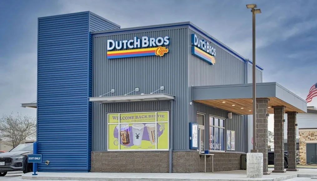
Dutch Bros Coffee is a popular American drive-thru coffee chain known for its energetic vibe, friendly customer service, and extensive menu of customizable beverages. Founded in 1992 by Dane and Travis Boersma, two brothers of Dutch descent, the company started as a single pushcart in Grants Pass, Oregon. Over the years, it has grown into one of the largest privately held drive-thru coffee chains in the United States, with hundreds of locations across the western and southwestern states.
What sets Dutch Bros apart is its diverse and creative menu. While they serve classic espresso-based beverages, their signature offerings include unique flavored drinks as well. Customers can customize their drinks with an extensive array of syrups and toppings, catering to a wide range of tastes. Dutch Bros has also cultivated a strong brand identity through its community-focused initiatives, fundraising events, and a loyal customer base that appreciates the company’s commitment to social.
Dutch Bros’ fame in the US can also be attributed to its vibrant and youthful company culture. The brand emphasizes inclusivity, positivity, and a laid-back West Coast vibe. Social media has played a significant role in spreading its popularity, with fans frequently sharing their colorful drinks and experiences online. Additionally, Dutch Bros’ limited-time drinks, and reward programs have created a sense of excitement, solidifying its reputation as more than just a coffee chain but a beloved cultural phenomenon.
History of Dutch Bros Logo
Dutch Bros is an iconic American coffee chain that has revolutionized its branding quite creatively over the last couple of decades. If you do not know how its famous Dutch coffee logo evolved through the years, take a look at the complete timeline defined below.
Dutch Bros Logo – 1992
The original Dutch Bros logo, introduced in 1992, embodies a relaxed, hand-drawn aesthetic that perfectly reflects the brand’s energetic personality. Designed with an informal, freehand script, the words “Dutch Bros” appear as if they were carefully penned by hand, evoking a personal touch that resonates with authenticity and warmth. This design choice wasn’t just stylistic, it conveyed the company’s grassroots origins and its founders’ vision of building not just a coffee chain, but a community-driven experience.
Beyond its artistic appeal, this wordmark logo effectively communicated the company’s values of friendliness, and connection. It felt less like a corporate emblem and more like a signature, something you might find on a handwritten note. This approach set Dutch Bros apart from more polished and formal coffee chain logos, aligning with their emphasis on creating genuine relationships with customers. From its humble beginnings, the logo became an important visual representation of the brand’s commitment to positivity, inclusivity, and community engagement.
Dutch Bros Logo – 1993
As Dutch Bros began to grow rapidly, the company recognized the need for a more refined and cohesive brand identity. While their original logo captured the grassroots charm, the rapid pace of growth called for a visual emblem that could better represent the brand’s evolving ambitions. In 1993, Dutch Bros took a significant step forward by introducing a new logo. This redesign was not just about visual appeal, it was about creating a symbol that could become instantly recognizable, even as the company ventured into new markets.
This new emblem brought a sense of structure and clarity to the Dutch Bros brand. The design focused on enhancing visual appeal, ensuring it could stand out across a variety of mediums, from signage to promotional materials and more. This refreshed logo wasn’t merely a cosmetic upgrade, it was a strategic move to establish Dutch Bros as a serious contender in the competitive coffee market. The emblem served as a foundation for building stronger brand consistency, enabling the company to foster deeper customer loyalty.
Dutch Bros Logo – 1999
In 1999, Dutch Bros underwent a significant logo redesign that introduced an iconic windmill graphic. The windmill became the focal point of their illustrated logo, serving as both a tribute to the Boersma brothers’ ancestry and a unique visual anchor for the growing brand. This addition was not merely decorative, it told a story, connecting the brand to its roots while offering a memorable and distinctive image. The windmill’s inclusion brought depth to the logo, infusing it with character while aligning seamlessly with the company’s commitment to authenticity.
Alongside the introduction of the windmill, the wordmark for “Dutch Bros” received a thoughtful update with a cleaner, more refined typeface. The new font prioritized uniformity and improved legibility, creating a polished and professional look without sacrificing the brand’s approachable personality. The lettering struck a balance between boldness and warmth, ensuring that the name stood out clearly whether displayed on storefronts, merchandise, or promotional materials.
Dutch Bros Logo – 2016
In 2016, Dutch Bros unveiled a redesigned logo that embraced a sleek, minimalist aesthetic, reflecting the brand’s evolution and alignment with modern design trends. The iconic windmill, a central symbol of Dutch Bros’ heritage, was simplified significantly, with intricate details stripped away in favor of clean lines and a more streamlined silhouette. This refined version of the windmill retained its recognizable form but gained versatility, allowing it to adapt seamlessly across digital platforms, packaging, and signage.
Accompanying the refined windmill icon was an updated wordmark featuring the text “Dutch Bros Coffee” in a modern, uniform typeface. The new font was clean, bold, and highly legible, shedding any traces of previous decorative or handwritten styles. This typographic choice aligned the brand with contemporary design standards, reinforcing an image of professionalism while maintaining an approachable and youthful vibe.
Dutch Bros Logo – 2021
In 2021, Dutch Bros unveiled a refreshed logo that introduced a vertical stripe as a key design element, creating a subtle yet impactful separation between the windmill silhouette and the brand’s wordmark. This stripe wasn’t merely a decorative addition; it served as a structural divider that brought clarity and focus to both elements of the logo. Colored in the same signature blue as the rest of the design, the stripe maintained a harmonious balance, ensuring that it didn’t compete with or overpower the windmill or text.
On the textual side, the wordmark retained its bold, uniform typeface, reinforcing the professional and contemporary aesthetic that Dutch Bros had been refining over previous iterations. The introduction of the vertical stripe enhanced the relationship between the wordmark and the windmill icon, giving each element its own visual space. This redesign was not just about aesthetics, it reflected Dutch Bros’ growth into a nationally recognized brand with a strong visual identity capable of resonating with a diverse customer base.
Frequently Asked Questions
| What is Dutch Bros? Dutch Bros is a popular American drive-thru coffee chain known for its energetic service, and community-focused culture. Founded in 1992 in Oregon, it has grown into a beloved brand with a loyal customer base across the U.S. |
| Why the Dutch Bros logo is famous in the US? The Dutch Bros logo is famous in the U.S. for its iconic windmill symbol, representing Dutch heritage, and brand’s energetic vibe. It’s instantly recognizable, symbolizing quality coffee and a strong community connection. |
| What is the color of Dutch Bros logo? The Dutch Bros logo features a vibrant color palette dominated by deep blue, accented with bold shades of orange, yellow, and red. These colors symbolize energy, warmth, and the brand’s lively, welcoming spirit. |
Final Words
That concludes our entire article in which we have discussed the complete timeline of Dutch Bros’ logo evolution. It is an iconic American coffee brand that is quite popular among the espresso and mocha lovers. It is been operating in the US since 1992, marking its identity as one of the esteemed pioneers in the coffee chain business. Throughout all these years, the company worked a lot on its branding, in which its logo got many re-designs from time to time. This article has listed all the previous and current logos of Dutch Bros, giving you a clear view how the famous Dutch coffee logo evolved over the years.
Latest news you want to know!
Subscribe for cutting-edge design inspiration at Logo Poppin! Elevate your brand with updates on logos, branding, web design, and video animation.
Note that by clicking “subscribe,” users may agree to our privacy policy and consent to Logo Poppin to use your contact data for newsletter purposes.
Logopoppin
Logopoppin is a graphic design agency that specializes in logo designing, web development, video production and advanced branding services. We love to innovate businesses with new age technologies, allowing them to improve their visual reputation.
